
With the majority of searches now taking place on mobile, it’s never been more important to ensure your brand’s mobile offering is up to scratch.
At Contentsquare, our mobile app analytics can help you get the most comprehensive insight into your mobile app experience, fuelling your digital teams with everything they need to improve customer journeys across all mobile devices.
Now, let’s take a look at some of the most common mobile filtering pitfalls and show you how to fix them…
“How can I help you?” These five words go a long way to making a customer in a brick-and-mortar clothing store feel more at ease when faced with the sensory overload of multiple racks of apparel and thousands of items to choose from. This assistance in guiding the customer to find exactly what they want is the real-world equivalent of filtering on eCommerce websites.
In the digital world, especially mobile, too many choices make it difficult for people to reach decisions. Often, mobile online shoppers just abandon their search if they can’t quickly and easily find products that grab their interest. Effective filtering narrows down the overwhelming choices. It’s a critical on-site feature for customers who need help coping with information overload and can increase the likelihood of them finding the product they want or need.
According to Contentsquare data, filter use is associated with a 35% increase in click-through rate on products.
According to Contentsquare data, filter use is associated with a 35% increase in click-through rate on products. Moreover, filters were found as helpful for diverse types of visitors: those who are goal-oriented and know exactly what they, as well those who are just browsing.
While filters are effective in helping customers cope with information overload, they are rarely used on mobile sites: as little as 2% and up to 10% of mobile online shoppers use filter menus, compared to 38% of desktop and tablet users.
Only 2 to 10% of mobile online shoppers use filter menus, compared to 38% of desktop and tablet users.
The low usage rate is not for lack of motivation – we found that every second customer that interacted with a filtering menu abandoned the process without filtering. By observing the behavior of filtering ‘abandoners’ we uncovered several common usability issues that block customers from effectively using filters.
Most filter usability issues stem from companies not building mobile responsive filters. As a result, customers are forced to use filtering menus designed for spacious desktop screens, now crammed onto their small mobile screen. In the mobile-first age, responsive sites warrant filters that are designed specifically for the mobile context. Otherwise, customers are likely to abandon a process that could otherwise speed up and ease their shopping experience. Here are five main problems with mobile filtering today:
1. Long and cumbersome mobile filtering menus
On a desktop computer, the vertical bar filtering menus usually appear on the left side of the product listing page, allowing customers to see most or all of the filtering options, even if the menu is long. On most responsive mobile commerce sites, the filtering menu is not exposed by default, rather, it appears as an expandable drop-down menu. Since all filtering options can’t be shown on the screen at once, customers need to scroll up and down or expand sections to explore the full range of options.
In most cases, the font size is small and limits legibility, particularly if there is glare. This experience puts a strain on customers’ short-term memory as they’ll need to remember which filters are out of sight and mentally compare them to the filters they are looking at. In cases of filtering menus with tons of options, the cognitive load often becomes too high, causing customers to abandon the process.
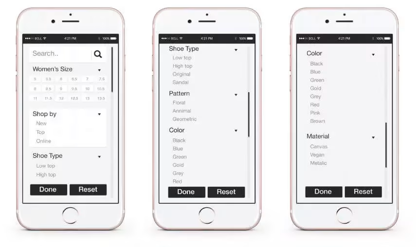
When opened, filter menus are much longer than mobile screens. Customers must scroll repeatedly to see all options.
2. Difficulty in applying multiple filters
Our research shows that visitors who apply two or more filters are more likely to continue to a product details page. However, only 2% of customers that used filters on mobile applied two or more filters. Many mobile sites lack clear visual cues indicating that multiple filters may be applied. Even when such cues exist, desktop-designed menus on mobile are often too small, which can lead to accidental taps on the wrong elements. As a result, customers may find themselves on a page they were not interested in. We also see frequent zooming and tilting behavior, which often results in misaligned page borders and misplaced elements.
Another common issue that limits multiple filter application is when pages reload after each filter is applied. This interrupts the user experience, especially when page reload times are slow. Even if the customer applied one filter, they are not likely to repeat the process if it takes too long.
3. Important filters not easily found
Filters differ in their effectiveness. For instance, we found that customers who filtered by ‘Color’ were 50% more likely to find a product. However, customers often do not reach useful filters because they are hidden at the bottom of a long menu. Filters at the top of the menu are the most used ones, but frequently they are neither the most relevant nor effective options for customers. This can cause a customer who was on the right path to finding a product to be hindered by the low discoverability of important filters.
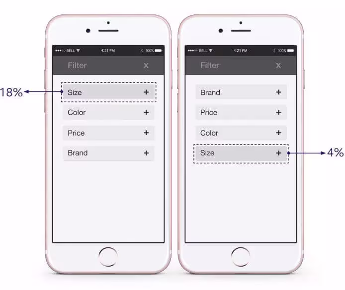
Put conversion-increasing filters like size at the top of the list, where visitors are more likely to use them.
4. Lack of feedback
Many mobile filter result pages don’t indicate which filters have been applied. While some customers may return to the filtering menu to check the filters they applied, most do not realize that they are looking at filtered results. If they can’t find the product they want, they may conclude it’s not available and leave the site.
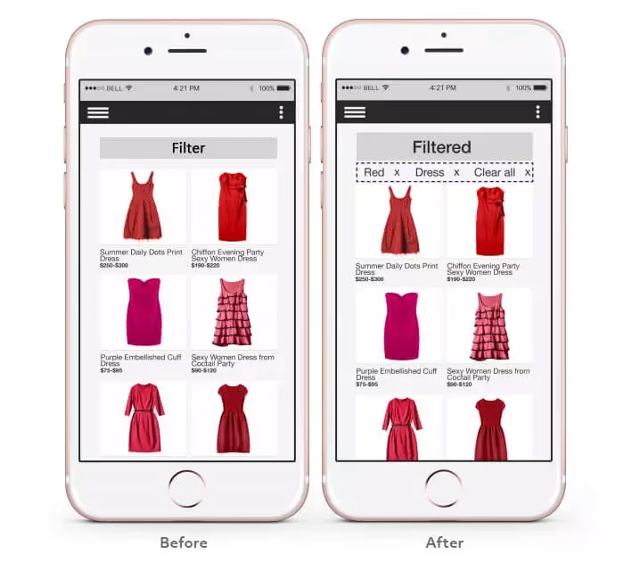
Visitors can easily lose track of which filters they’ve applied, and erroneously conclude that your site does not have the products they want. Clearly indicate which filters are active and make it simple to change or remove them.
5. Difficult to adjust filters
Often, customers only notice that additional filters will yield more relevant options after they scroll through a filtered product list page. For example, on a department store site, a customer may choose “leather” within the “purse” category – and only after scrolling three or four times, realize that also filtering on a specific style will better focus the results to only show the style of bags she likes. Or maybe she wants to apply a different filter altogether. On most mobile sites, customers seeking to add or adjust a filter must scroll all the way to the top of the page. On top of being a time-consuming and irritating task, customers might get distracted along the way and abandon mid-scroll.

Make the filter menu sticky, so it is easily available whenever visitors choose to filter.
Solving Mobile Filtering Problems
The main takeaway is that filtering menus designed for desktops can create a sub-par customer experience on mobile. As a result, a tool that is very effective in helping customers find what they want goes massively under-used. Here’s a brief look at some quick-wins you can take to solve your mobile filtering problems and better serve your customers:
1. Opt for overlay functionality over a drop-down menu.
One quick way of solving many of the usability issues outlined above is to implement an overlay functionality instead of a drop-down menu. An overlay takes up less space, allowing important elements to be larger (e.g., font, check-boxes, etc.). This can reduce users clicking on and applying the wrong filters and allow them to narrow down their search results quicker and easier than before.
2. Move popular filter options to the top of the list.
You want to give your most-used and effective filters prime real estate on your mobile filtering menu. Using an experience analytics platform, like Contentsquare, identify and evaluate which filter categories are most helpful for your customers. Then, list them at the top of your menu so they’re easier to find and use. Be sure to also remove under-performing options.
3. Allow users to see what filters have already been applied.
Within an overlay, it is also easy to see which filters were applied, review them, and then hit ‘Done’ to apply all at once. This functionality also solves the issues of slow re-loads after each filter application. After filtering, the applied filters should appear at the top of the page, so customers can easily see what they selected and quickly and easily remove any filters they don’t want to include in that search anymore.
4. Make filtering menus sticky.
Lastly, making the filtering menu sticky would help customers to access it at any point in their journey. This can save them the hassle of scrolling to the top of the page to double-check what they’re filtering by or to add or remove any other filters.
To maximize the potential of mobile eCommerce sites, equip your customers with a mobile filtering solution that is effective, efficient, and satisfying. After all, filters are the online proxy of a helpful sales associate and play a key role in giving your customers an exceptional digital experience.
[

![[Logo] CSQ - Favicon Circle](http://images.ctfassets.net/gwbpo1m641r7/3TtXqFCibupR1BU1WliUMk/ec866c9a074e71cb5f6401be7b220bdd/CSQ_-_Favicon_Circle.png?w=100&q=85&fit=scale&fm=avif)
Contentsquare has been in business for 14 years since its founding in Paris in 2012. We offer a complete understanding of customer experiences across all touchpoints, our platform is designed to help businesses understand how users interact with their websites and mobile applications.