![[Visual] NPS-Set up survey-Header](http://images.ctfassets.net/gwbpo1m641r7/4yUL28VQpZQ5gX47ULCmie/61d10007ba2aa07ec7a2f3630c214e37/pexels-rdne-7889175.jpg?w=1280&q=85&fit=scale&fm=avif)
That sinking feeling of seeing high bounce rates, low conversions, and complaints stemming from UX design mistakes is one we all recognize but want to avoid.
While some user experience (UX) design mistakes are inevitable, you can keep errors to a minimum. Adopt a proactive approach to stay ahead of the curve and remove blocks to user satisfaction.
To help you get there, we’ve compiled the 14 most common UX design mistakes—and provided solutions. Keep reading to find out what these mistakes are and why excellent UX design is vital to the success of any online business.
The importance of excellent UX design
Strong UX design is the best way to produce a customer-centric product or website that brings in new users, retains existing ones, and creates customer delight.
If customers have a positive, frictionless, and enjoyable product experience (PX), they’ll reach their desired outcomes, continue to use your product, and recommend you far and wide.
On the other hand, when users have a frustrating, confusing, or downright negative experience, they may cancel their subscriptions and stop using your product, or share negative reviews with their community.
In a nutshell, designing a great UX:
Builds trust and credibility
Saves time and money
Converts new users
Drives adoption
Boosts customer retention and loyalty
Reduces churn
Improves SEO rankings
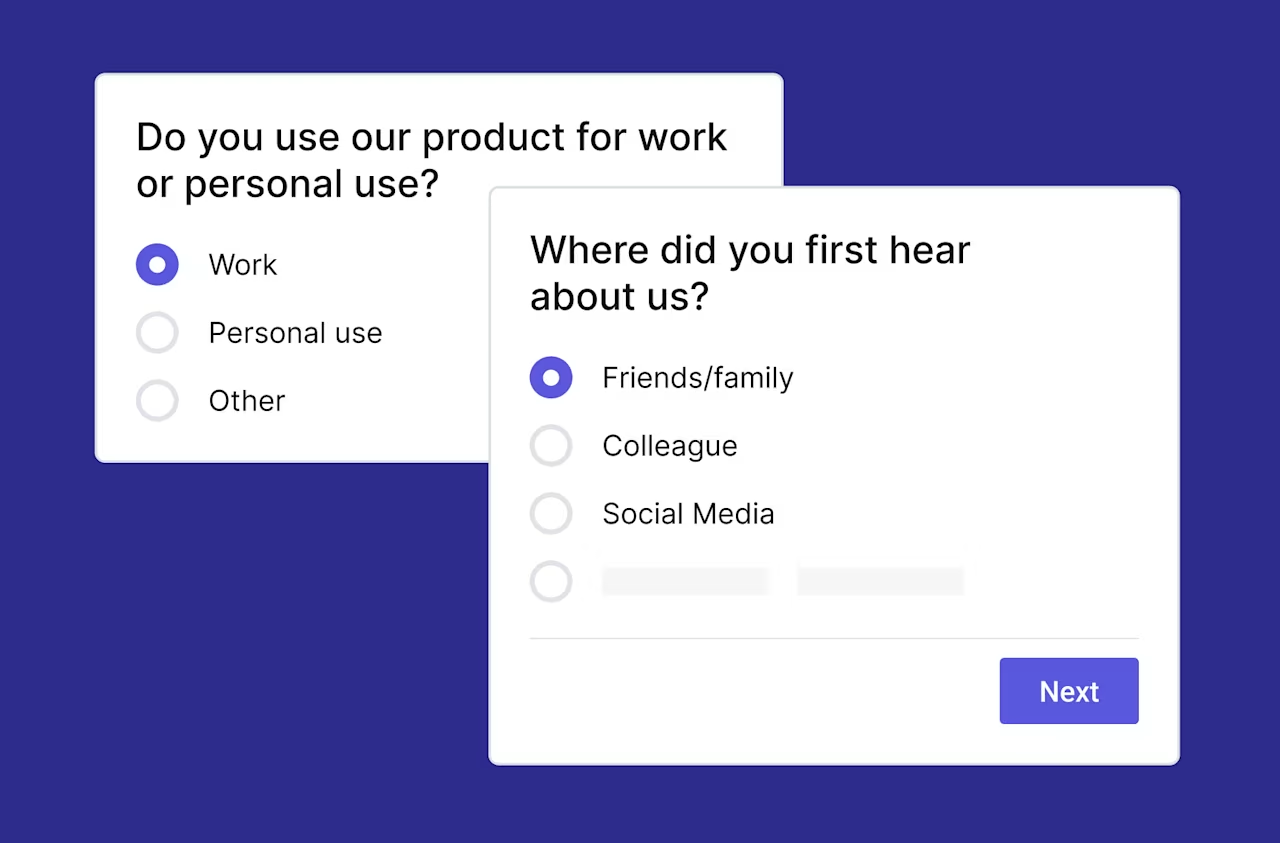
💡Pro tip: user willingness to recommend a product to their friends, family, and colleagues is a great indicator of overall customer satisfaction. It’s one of the most important questions on a Net Promoter Score® (NPS) survey.
Use Contentsquare’s Voice of Customer tools to quickly set up an on-site NPS survey to find out the likelihood of users recommending your website to others, potentially bringing in new customers.
“How likely are you to recommend us to a friend or colleague?” is one of the key questions in a Net Promoter Score survey
14 frequent UX design mistakes you should avoid
As customer pain points and needs evolve, you’ll need to optimize the UX you provide in a continuous loop to deliver the best possible product, which can be a challenge.
Rather than waiting for bumps in the road, why not take a proactive approach to UX? Use our list of the 14 most frequent UX design mistakes to develop an awareness of common UX problems and solutions—and sidestep common blunders before they happen.
1. Striking the wrong balance between aesthetics and functionality
To offer excellent UX, your product should look great and work well—not one or the other.
If you tip the scale too far in either direction, you risk customers getting frustrated with poor functionality or giving your brand a bad reputation due to a low-quality visual experience.
Usually, functionality should be slightly prioritized over aesthetics. A great-looking product is important, but if it doesn’t work well, the UX will suffer.
Let’s start with a few UX design examples. Take discount airline easyJet’s website homepage: the overall design is eye-catching, but the functionality leaves a lot to be desired.
![[Visual] Easyjet s homepage as of March 17th 2022](http://images.ctfassets.net/gwbpo1m641r7/TsgKgA6Dq9sikNuDMtuU4/a3222b803ba2c9dba88acec8182cea57/3-Easyjet___s_homepage_as_of_March_17th__2022.png?w=946&q=85&fit=scale&fm=avif)
The easyJet homepage looks great, but it distracts visitors from doing what they really want.
The majority of easyJet visitors land there because they want to book a flight. But easyJet’s flight booking form and 'Inspire Me' tools take up almost the same amount of space on their homepage, so users aren’t sure what they’re being asked to do. The site also has a busy top menu bar and excessive pop-ups and dynamic visual elements—there’s too much going on here.
Visitors are likely to get distracted or confused before they successfully book a flight. Even though the user interface (UI) looks cool, it’s not practical and leads to a confusing customer journey.
![[Visual] Skyscanner s homepage as of March 17th 2022](http://images.ctfassets.net/gwbpo1m641r7/6DcTL2PjDJVJXMH6R0ZOFe/f4aec65c31d11b99b8d556a5bbbcc9a4/4-Skyscanner___s_homepage_as_of_March_17th__2022.png?w=946&q=85&fit=scale&fm=avif)
The Skyscanner homepage gets straight to the point and focuses on the essentials.
Travel search engine Skyscanner shows a much better blend of aesthetics and functionality. Their design is straightforward and focuses on what site visitors want to do: make a booking. They get the win here.
As a general rule, make sure your users can accomplish what they’re trying to do with your product as seamlessly as possible. Start with the basic jobs-to-be-done framework in the design process. If a design element takes away from that process, remove or adjust it.
Then, confirm your product’s functionality works the way it should with a product experience insights tool like Contentsquare Session Replays, which puts you in your users’ shoes and helps pinpoint any problems or bugs.
2. Ignoring user needs and feedback
Your user should be at the center of everything you do. Don’t fall into the trap of thinking that you know better than your user or even worse, that you are your user.
It’s vital to take their feedback seriously to close the gap in understanding user needs.
Keep your product user-centered by prioritizing customers at every stage of the product design and optimization process. Ask yourself how you can optimize your product so it presents a seamless solution to user pain points.
Throughout your product’s lifecycle, be proactive about collecting feedback with UX surveys so you can create a consistent cycle of listening to your users and optimizing your product accordingly.
Contentsquare’s Voice of Customer has the surveys you need to gather long-form user input and feedback widgets to hear from your users on the go while they’re experiencing your product.
3. Bombarding users with pop-ups
Nothing turns users off like getting hit with a range of different pop-ups as soon as they land on your homepage. Rather than obtaining the information they want, they have to deal with closing or navigating away from a bunch of pop-up windows before they’ve even started their product or web journey.
Not all pop-ups are bad, but be mindful of poorly placed and poorly designed pop-ups, as well as those that can’t be closed easily.
To design UX-friendly pop-ups, consider how many you include and when. It’s best to stick with one per page and ensure that it doesn’t interrupt the UX by taking up the whole screen. Your pop-ups should also be simple to close, easily addressed in just a few clicks, and relevantly placed.
Effective pop-ups know the right problems to focus on and the right reasons to bother users.
💡Pro tip: be sure to ask users for pop-up-specific feedback during the testing phase if you want to be extra sure they’re not disrupting people. Use Contentsquare’s Voice of Customer tools like feedback widgets to learn what users like (and dislike) about your website in real time. They’re designed to be unobtrusive and addressable in as little as one click, so they fit seamlessly into the user’s web experience while providing you with valuable insights.
Contentsquare’s tool stack is designed to gather speedy user feedback without disrupting the UX.
4. Overlooking the 'in-between' states
In the design world, just like in life, things rarely turn out exactly as planned. Great UX design anticipates unexpected circumstances as much as ideal scenarios.
Consider your users’ entire experience with your product throughout the design process. This should encompass the beginning, the end, and the in-between stage.
![[Visual] In-between and empty state design examples with sad robots](http://images.ctfassets.net/gwbpo1m641r7/3Pgxf8ktHLmPdy0o9qMXje/8630980781d26e377545450074140f4f/6-In-between_and_empty_state_design_examples_with_sad_robots.png?w=689&q=85&fit=scale&fm=avif)
Your product’s empty and in-between states also contribute to overall UX. Don’t forget about them! (Source: Dribbble.com)
Imagine your user is signing up for a free trial on your website. If everything goes perfectly, the main two states your user will experience are the initial sign-up page and the success page.
But bumps in the road happen and more often than not you’ll need to spend time considering the 'in-between' states, such as:
What do users see while entering their information?
What do users see when they submit their information but forget a field?
What do users see when they submit their information but have already used up their free trial?
What do users see when there’s a system or connection error?
Always consider the full user experience. Account for the design of the in-between just as much as the main states and best-case scenarios, and build in a high fault tolerance so you’re still delivering great UX even when mistakes happen.
5. Hopping on every design trend
Just like fashion, music, and hairstyles, the design space is full of UX trends that come and go. While it’s important to stay up-to-date with trends, don’t feel pressured to go along with everything you hear about just because it’s a trend.
For instance, flat design became a popular UX trend in the early 2010s. Flat design is an offshoot of minimalism characterized by a lack of 3D visual elements. It has largely gone out of style because of the UX issues it presents, like confusing users about which elements are clickable and which aren’t.
![[Visual] raised-flat-button](http://images.ctfassets.net/gwbpo1m641r7/6rguAn1fvHlNgSo7KtUNkl/fff89e6f6a99bdd58c93e1d691ee61b2/7-raised-flat-button.png?w=946&q=85&fit=scale&fm=avif)
Consider the raised button vs. the flat button above. Which one entices you to click on it? (Source: Codename One)
Always consider how a design trend will impact your users:
Will it make your product easier to navigate, reducing friction to make your user's life easier?
Does it have better visual aesthetics and produce an improved first impression for new users?
Does it make your UX writing easier to read?
These questions keep you focused on whether a given design trend will really improve your users’ product experience.
6. Treating UX writing as an afterthought
Although UX content isn’t necessarily part of product design, it’s an essential part of the user experience. All too often, UX content is added to products as the last step or even as an afterthought. This can result in a disconnect between what users read and what the overall design is telling them to do.
To make matters worse, writers sometimes have to produce UX content without seeing the product’s design or where their copy will ultimately be placed.
To address this problem, design with the ideal placement of UX content in mind and communicate this throughout the product development process. Delivering screenshots and wireframes to UX writers can help them understand how their copy will fit into the finished design.
In addition, be sure that your writers are well-versed in the principles of visual hierarchy. Your most important UX writing should be placed in high-visibility areas, which can be evaluated with tools like Contentsquare’s Zone-Based Heatmaps.
![[Visual] Heatmaps types](http://images.ctfassets.net/gwbpo1m641r7/44qPX6Nyu2v2i9pGM8JdIE/e1ccfd573959295483bb4b867ca7e57f/Heatmaps___Engagements__3_.png?w=1002&q=85&fit=scale&fm=avif)
Zone-Based Heatmaps show you the most popular areas on a page
7. Overwhelming users with too much information
If you’re part of a product development team, you’re an expert on your product and passionate about it. So, it can be tempting to overwhelm your users with too much product information right off the bat.
This kind of data overload can quickly confuse users if they don’t have time to wrap their heads around the info you're giving them and digest it.
The first webpage or app frame your users see shouldn’t be too overwhelming. If it’s busy or contains too many different elements, users won’t know where to begin and may drop off your page before learning anything.
To sidestep this design mistake, start with the essential need-to-knows and be mindful about how much content you’re sharing at once. Great UX is when users can get started with a new product intuitively, without too much learning at the outset.
8. Including unresponsive design elements
One of the most frequently discussed responsive design mistakes is designing with desktop computers in mind and overlooking mobile. But these days, the majority of UX designers understand the importance of mobile-friendly design.
Nowadays, a bigger problem is designers who only keep mobile UX design in mind. Mobile traffic accounts for about 50% of web traffic, but that means another 50% still comes from other sources like desktops and tablets.
Often, mobile-focused design elements leave a lot to be desired when viewed on large screens. A quick peek at Instagram on your desktop computer is a great example. The large amounts of white space, poor balance, and tiny icons make it clear that this interface wasn’t designed with a large screen in mind.
Great UX design is responsive no matter what kind of device it’s viewed on. Strive to design for the medium and be sure that your product team takes the time to brainstorm and test what looks and works best on different screen sizes. If you get stuck, try using Contentsquare Session Replays and Voice of Customer tools to identify user problems.
9. Forgetting to label icons
Some UX designers either forget to label icons or simply believe it isn’t necessary, partly due to minimalist design trends.
Not labeling icons is a mistake for two main reasons:
Commonly used icons like hearts, checkmarks, or smiley faces mean different things on different websites, which can confuse users.
Overly detailed, novel, or complicated icons can be unclear so users have to spend unnecessary time and energy figuring out what they mean.
It’s also worth noting that unlabeled icons reduce your product inclusivity.
The solution to this error is simple: words and images together are a powerful force, so make sure your icons are labeled.
10. Misleading users with links and buttons
When a user clicks a button or a link on your website, they’re trusting that you’ll provide them with the information you say you will.
For instance, if a button on your website says, 'Click here to learn more about our pricing,' it should lead to your pricing page and nowhere else. Not a registration page to sign up for a free trial, not a contact information form…just information about your pricing.
Likewise, stay true to your word when it comes to different kinds of content. If you’ve got a link on your webpage that says it leads to a video, make sure that’s really the case. Don’t mislead users and offer them a blog post or a landing page when you’ve promised a video.
Be meticulous about checking your links and buttons to ensure they deliver exactly what they promised.
UX tools like Zone-Based Heatmaps and Session Replays help identify problematic links and buttons. Watch out for users clicking on something and then dropping off right away, which can indicate frustration or disappointment with where the link took them. Also, be mindful of rage clicks, which are a common indicator of poor UX and broken links.
11. Ignoring the importance of forms
Forms are boring and if not done properly, they can be the biggest deterrent for your users. Has anyone ever approached you to say how awesome filling out a form was and that you should try it out? No. No one did, everyone hates them. They just stand there, observing everything you type, and if you make even one mistake, a red error message will jump up at you (hopefully), just like a high school teacher correcting your homework.
💡Pro tip: only ask your users for information that is truly indispensable at that point in your relationship.
That said, a minimum of one form is for most sites unavoidable—so it's crucial you make it as approachable and easy to use as possible. Only ask your users for information that is truly indispensable at that point in your relationship. For instance, don't be arrogant by asking for credit card details when users are signing up for a trial. Make the form super easy to scan and assist users in any way you can by using smart defaults and providing help where needed. When designing your form, you should aim to:
Only ask what’s indispensable
Know when to ask for the appropriate information
Include trust factors
Make it easy for your users to scan the form
Order the form logically
Use smart defaults
Break complex forms in a multi-step process
Run usability testing
Carry out A/B testing
Conform to code/browser standards
12. Creating a “false bottom”
A “false bottom” occurs when it seems like a page has reached its logical end. For example, a content block may end perfectly at the bottom of the screen, thus creating an illusion that there is no other content on the page. This increases the likelihood that a user will not scroll down the rest of the page, which can cause them to miss out on engaging and relevant content. Users rely on the page design to understand whether there is additional, relevant content, both vertically and horizontally on the page. Even small cues, like an arrow, can signal there’s more content to be seen and encourage them to continue scrolling.
This can happen often when a hero image or an eye-catching, full-width video is meant to engage users without any indication of important content below the fold. Distinct borders or expansive white spaces between content may also create this illusion throughout the page.
Because of this, we frequently see low exposure rates on content below the fold but have a higher likelihood of interaction or even conversion. Through heatmapping, Contentsquare data reveals that 69% of all website content goes unseen by visitors.
![[Visual] Charity-water-image](http://images.ctfassets.net/gwbpo1m641r7/1q0sQ9YOToaWZIJd5dk3gL/b8f2562a2dc4de208a0ffb2d9da1ca43/10-Charity-water-image.png?w=1280&q=85&fit=scale&fm=avif)
Charity Water uses a smaller homepage hero image so the next section of the page is clearly visible, encouraging visitors to continue to scroll down the page.
Avoid accidentally creating a “false bottom” by providing visual signifiers that indicate users can swipe or slide horizontally, or partially bleed content off the screen. Use strong headlines and section headers to separate content, and be mindful of the content flow of your page.
![[Visual] Airbnb Gif](http://images.ctfassets.net/gwbpo1m641r7/L9GWm1fobVPkffdmab2bn/be89ed5091d458ef85dc4878f83a56c0/11-Airbnb-Mobile-Homepage-content-carousel.gif)
The Airbnb mobile homepage has carousels that use the illusion of continuity to entice users to scroll and encourage discoverability.
13. Not having a sticky main navigation
When the main navigation is not sticky to the page (on both desktop and mobile), it can be difficult for users to navigate to other areas of the site. Users can also experience difficulty when browsing lengthy content or list pages where the navigation can only be reached by excessive scrolling. This experience is exacerbated on mobile due to its limited content view.
Although there should be plenty of alternate navigation on the page that is relevant to the content, the main navigation is a universal indicator for navigation that users are already familiar with. This is also a good tool to browse areas of the site that are not accessible directly from the page they are currently on.
By making the main navigation “sticky” so it’s permanently on users’ screens even as they scroll down a page, you may see increased click rates, engagement rates, and faster time before first clicks on your content.
![[Visual] Lo-and-Sons-Sticky-Nav](http://images.ctfassets.net/gwbpo1m641r7/6DOJxpCR19Xq7WDXc3w78E/ce10434a79487349c5d1fd23fc03eed5/12-Lo-and-Sons-Sticky-Nav-573x1024.webp?w=573&q=85&fit=scale&fm=avif)
The navigation bar on the Lo & Sons site remains sticky as users scroll, making it easy to navigate to other areas regardless of where the user is on the page.
Ensure that your menu’s hierarchy is correlated to the areas your users are most interested in to least interested in, so they can more easily and intuitively find what they’re looking for. This might require you to remove sections or rearrange the architecture of your navigation bar content to match what is most useful to your user based on your visual app analytics.
Keep in mind what mental models your audience may have or terminology they are familiar with in regard to your products and content. A mental model is how a user thinks something works. For example, if the information architecture of a site uses internal company jargon, instead of the language used and expected by the customer, that can negatively affect the user’s customer journey. To avoid this, just use vocabulary that your user understands and expects.
14. Redesigning for the sake of redesigning
![[Guide] dilbert ux redesign](http://images.ctfassets.net/gwbpo1m641r7/7zq9RwaMUa7WJ3HPbex5AY/c902b924bbeb97cbbbb9f5fce632f762/13-dilbert_ux_redesign.gif)
It's not a rarity that a company or a team decides they want to redesign a website or a section of it. This is by no means a bad thing. It becomes bad when you ignore everything about the current design and why it needs to change in the first place.
Redesigns are perfect projects to conduct UX research on since you already have a fully functional site or product. User testing tools, surveys, and on-page surveys are among the many things you can do to learn what the pain points of users are when using the existing design.
What do users expect to see in this section of your website?
Do their goals and your goals align?
What elements are distracting the users from achieving their goals?
Should you add OR remove something to make it easier?
Is there any information that’s misleading or incorrect?
Is a redesign even needed or is polishing the design and fixing a few issues enough?
Doing your homework upfront will give you the data you need to learn how the current design is being used. Apart from making it much simpler to tackle the re-design project, it also gives you the leverage you need when you have to persuade stakeholders and convince others why a change is needed…or not.
Avoid these frequent design mistakes and watch your UX soar
UX design mistakes are a normal part of the design process, but that doesn’t make them a fait accompli. Instead of waiting for UX blunders to just happen, anticipate and avoid them before they cause user frustration.
Informing yourself about UX problems and solutions is a great place to start. Take note of the biggest mistakes, consider whether you’ve made them, and take action to resolve them if necessary.
Remember, excellent UX is at the heart of any product. Prioritize addressing UX mistakes, and your business and users will reap the benefits.
FAQs about UX design mistakes
User experience (UX) design is all about creating products that are easy and enjoyable for people to use. It’s a user-centered process that prioritizes providing people with seamless, intuitive product experiences.
UX design doesn’t have a beginning or an end. Rather, it’s an iterative process that constantly seeks improvement and optimization to better address user needs and pain points.
![[Visual] Contentsquare's Content Team](http://images.ctfassets.net/gwbpo1m641r7/3IVEUbRzFIoC9mf5EJ2qHY/f25ccd2131dfd63f5c63b5b92cc4ba20/Copy_of_Copy_of_BLOG-icp-8117438.jpeg?w=946&q=85&fit=scale&fm=avif)