4 Practical and Impactful Accessibility UX Design Tips

That’s why it’s important to prioritize UX accessibility in everything your company designs and develops. Web access is a basic human right and every online user deserves to be able to access the content and services they need.
The Web must be accessible to provide equal access and equal opportunity to people with diverse abilities. Indeed, the UN Convention on the Rights of Persons with Disabilities recognizes access to information and communications technologies, including the Web, as a basic human right. – W3C
Ready to build an accessible site but don’t know where to start? Here are four fixes for common website UX accessibility issues that can be easily incorporated into your site design.
1. Color Contrast
One of the biggest UX accessibility design issues I typically find on websites is color contrast. This is an often-overlooked web accessibility problem, but also incredibly common.
One in 12 men experience some form of color deficiency and over 217 million people in the world have moderate to severe vision impairment, according to the World Health Organization (WHO). By ensuring your digital properties have proper color contrast, you can ensure anyone with a vision impairment can easily interact with and use your website or app.
Where designers and brands often go wrong is that we focus on creating things that “look good,” but forget to think about how our designs could be interpreted by people different than ourselves. While a design might “look good,” how successful can it be if it’s not readable for many users.
People with vision impairments might find it difficult to read text on a background color with poor contrasting. So, make sure you have sufficient contrast between text and background and avoid inconsistent backgrounds or banners.
 Zalando uses bold colors that contrast well with both white and black fonts
When deciding on color palettes for new banners or CTAs, print your design in black and white and test it. If you don’t have a printer then ask your designer to drop the saturation down to -100%. Is it readable? If not, keep testing until it is. You can also test designs using this free Color Contrast Analyzer. This handy tool uses Web Content Accessibility Guidelines 2.1 (WCAG) that acknowledges a pass and fail based on the three levels of conformance: A (lowest), AA, and AAA (highest).
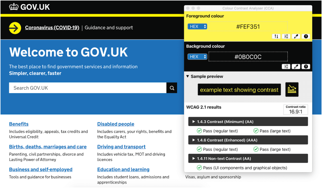 Colour Contrast Analyser (CCA) uses Web Content Accessibility Guidelines (WCAG) to help you quickly identify contrasting ‘pass’ and ‘fails’.
2. Legible Text
Small, intricate fonts can be difficult to read for the visually impaired. To improve on-page legibility, make sure the minimum size of your body text is at least 14-16 pixels. Larger text, like site headers or call-outs, should be at least 18 to 30 pixels, but these are flexible and you can always go bigger (within reason). When testing, use the Google Chrome extension Fonts Ninja to see font styles and sizes in real-time.
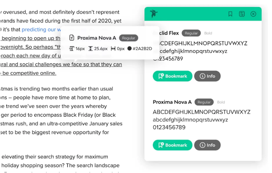 Fonts Ninja can determine font name, size, line height, letter spacing, and color.
2. Icon and Image Alternatives
When it comes to using icons on your site pages, be sure to use universally recognized symbols and ensure the color contrast inside images is sufficiently sharp. Always give a text alternative to an icon, so screen readers know to share their purpose.
A screen reader interprets elements on a screen, like text, images, and links, and translates them to speech so visually impaired people can consume and interact with content on their phones or desktops. This is why it’s so important to include alt-text and other textual cues in the code of your design, as they help visitors using screen readers to seamlessly navigate your site. Adding alt-text to your icons and images is a quick fix that takes very little time and effort to include when designing or developing a website, but can have a big impact on the UX accessibility of your site.
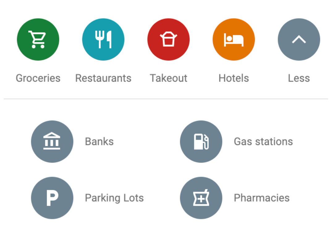
Take note of Google Maps‘ use of colors to differentiate between popular searches.
4. Designing for Mobile
Make sure links and icons are large enough to be selected regardless of whether a visitor is using a mouse, keyboard, or touchscreen. To ensure your design is compatible with small touchscreens, consider using a mobile screen reader, such as VoiceOver and Vision for Mac and Narrator for Windows, to test its functionality. Both readers are available on desktop, but best practice is to take a mobile-first approach.
Having a user-friendly website that is easy to use for all your customers can only help your business. Brands have an amazing opportunity to take control and optimize their websites not just for some, but for everyone.


