When it comes to website design, you want to strike the balance between conventional and unique. Meeting certain standards is important in order for your visitors to feel comfortable and use your site as they wish, but a little style and some modern features can help you stand out in the very crowded space that is the Internet.
We take a look at how you can get your web design just right.
Web users of habit
Why opt for conventional website design? Because web users are only human, and, after years of getting used to traditional web usability standards, they have certain expectations when they land on a website. Some common website elements that users expect to see are the top menu navigation bar or hamburger menu (complete with sections like “About Us” and “Products/Services”, a search bar (often contained in the top menu), and a standard grid layout of content.
That top menu is key because it’s the first place people look, and if they don’t find what they want quickly, they’re likely to bounce. The same can be said for the search bar; often visitors come to a website with something specific in mind to look for – so don’t make them work to find your search box. As for the grid layout, it allows a user to easily and quickly scan a webpage for content using top-to-bottom side-to-side eye movements.
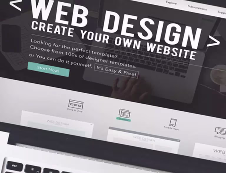
This take on conventional design, while modern in style, gives the user the top menu navigation bar, the search bar icon at top right, and makes use of a grid layout.
Breaking the mold
Although it’s wise to adhere to certain design standards, intuitive web designers are now starting to exceed visitor expectations by providing some added value and positive user experience through unique web design. When you get it right, visitors remember you and come back, maybe even doing some of your marketing for you.
In some bold designs it can work to shift the positioning of the navigation bar, or to use images as navigational elements.
This design positions new content above the navigation bar (but still above the fold).
Getting down to it: what are users looking for?
When a user visits your website, they likely have in mind an action they are looking to complete, or some information they want to find. (In fact, you can actually see from a user’s behavior what their intentions on your site are, and optimize it accordingly.) Whether your design is attractive or not isn’t their first priority: what they want is a simple design that makes their experience easier. This applies to all website design elements from layouts to graphics and color schemes.
As important as simplicity is navigability. Users tend to move around different parts of your site while exploring or looking for something specific, and your site flows should be clear and sensical. In practice this probably means having a navigation menu at or near the top of your page as well as in the footer, and having a search bar on every page. It’s also good practice to use breadcrumbs so the navigation trail is visible.
People are creatures of habit, and good web design should play into that. This means your web design should be somewhat consistent across all pages, meaning that as a user experiences your site they will get more comfortable using it. It makes no sense to surprise visitors later on and make the experience more difficult.
Psychology of web design
Let’s start on the outside. The Attractiveness Bias Principle is the term given to the idea that people are drawn to and favour attractive things. So if your web design is slick and well thought-out, your users are more likely to feel positively towards it and want to stick around. But (and this is a big but), there’s only so long that this can last. If they soon realise there’s no substance beyond the surface, they’re not going to stay with you. Keep this in mind.
Visual hierarchy is about working with your design tools (color, spacing, typography) to present information optimally. The Serial Positioning Effect tells us that our ability to remember some information accurately is subject to where it is placed in a list. You need to find helpful and effective ways to present information, especially the key information, so that it’s not lost on your users. This can be as simple as making your most important points bigger, bolder and brighter.
Clicktale was acquired by Contentsquare in 2019. Since then, tools and features mentioned in this blog may have evolved. Learn more about our Digital Experience Analytics Platform.
![[Logo] CSQ - Favicon Circle](http://images.ctfassets.net/gwbpo1m641r7/3TtXqFCibupR1BU1WliUMk/ec866c9a074e71cb5f6401be7b220bdd/CSQ_-_Favicon_Circle.png?w=100&q=85&fit=scale&fm=avif)
Contentsquare has been in business for 14 years since its founding in Paris in 2012. We offer a complete understanding of customer experiences across all touchpoints, our platform is designed to help businesses understand how users interact with their websites and mobile applications.