25+ tips for optimizing mobile and app CX
Download our ‘How to Optimize Mobile Experiences to Drive Growth’ guide

In this article, we get to the bottom of why undervaluing the space at the foot of your mobile webpages is a big mistake—and how to optimize your mobile footers for maximum engagement.
If we follow the traditional rules of web design, then the further you go down the page, the less important the information that you find.
This results in a self-fulfilling prophecy: Users expect to find less interesting and relevant information at the bottom of a webpage and therefore UX designers don’t generally give the footer space the attention it deserves.
However, the advent of the smartphone and tablet are in many ways rewriting the rules of digital customer experience. Companies are increasingly building mobile-first webpages, rather than simply optimizing a desktop version.
But there’s more to mobile-first than responsive layouts. Mobile-first best practices mean paying attention to every detail—including the mobile website footer.
Using zone-based heatmaps, we’ve made many observations about the differences between mobile and desktop user behavior on websites. One such observation is that mobile users tend to scroll much further down the page than desktop users.
In fact, most mobile users scroll straight down to the footer, which means this part of your website is almost as important as the header. UX professionals are therefore being forced to apply the same website engagement and optimization rules without discrimination to both top and bottom of the webpage.
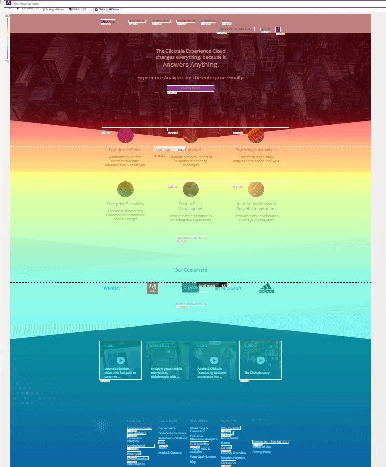
Contentsquare scroll reach heatmap for desktop sites
Here we can see a scroll reach heatmap for the former ClickTale desktop site, which shows that users stayed mainly in the top half of the page (indicated by the dark red) and scrolled less as they descended below the halfway mark (as the dark red turns into yellow).*
Now, compare this to the desktop heatmap to that of the mobile version of the same website.

Contentsquare Scroll Reach heatmap for mobile sites
In this heatmap you can clearly see that the high engagement, represented by the red coloration, continues most of the way down the page to the mobile footer.

The swipe to scroll function is the main reason why the footer gets far more exposure on mobile sites compared to desktop. It’s simply that much easier to reach the bottom of the page when a single finger swipe or two will do it.
In contrast, the often poor user experience of scrolling on desktop makes users stop scrolling far more quickly. And without mobile’s momentum scrolling, users are far less likely to ever reach the footer of a desktop site.
A further heatmap observation has to do with the layout of the webpage. Horizontal layouts tend to prevent people from scrolling and clicking, whereas vertical layouts do the opposite.
Due to the narrow shape of the iPhone screen and some other mobile devices then, a vertical layout works best—and therefore encourages further scrolling down the page!
If you find that users are just as engaged with your footer as your header, then why not adapt your mobile footer design to give them the same navigation functions at both the top and the bottom of the page?
Footers can be easily used to convey additional useful information that you can’t display on the header, including the contact form, subscriptions, blog, careers page and more.
Many sites will use the footer to promote additional content from their website, blogs, forum discussions or even external links related to the subject matter. These all help to ‘soft sell’ and nurture the visitor further.
Many sites place these functions at the bottom of the site, particularly if the page is long and content heavy.
If you lack what to place in your footer then consider something artistic or illustrative that will help to improve the overall digital customer experience of your site, and build your brand. Many sites like to include illustrations of the ground (buildings, earth, grass, trees etc.) and using the proximity to the ground and a clear differentiation in color, to clearly mark off the footer from the main body of the site.
Making better use of your mobile footers is only one small step towards optimizing your entire mobile web and app user experience.
To make a giant leap in the direction of a mobile customer experience that drives engagement, conversion and growth, you should check out our guide, featuring killer UX examples from leading brands like Evernote, Duolingo and Gucci. See below for a link—and preview some of the insights included in the guide in this article.
And if you’ve got an app, you should check out CS Apps, our mobile app analysis solution—and our blog series on the power of app analytics and CS Apps in particular, starting with this one.
25+ tips for optimizing mobile and app CX Download our ‘How to Optimize Mobile Experiences to Drive Growth’ guide
Get my free copy
*N.B. Clicktale was acquired by Contentsquare in 2019. Since then, tools and features mentioned in this blog may have evolved.