In the UX Spotlight series, we explore standout digital experience features from across the web, offering inspiration for teams looking to reduce friction and build more intuitive customer journeys.
Customers can't touch, try on, or hold your product before buying it online. That job falls to your product page—and in 2026, with shoppers arriving faster, spending less time on-site, and making decisions on a screen the size of their hand, that job has never been harder.
Fashion is the starkest example. According to our latest Contentsquare Digital Experience Benchmark, 83% of fashion visits happen on mobile—yet desktop conversion rates remain 40–70% higher across every retail sub-industry. That gap lives almost entirely on the product page. It's where shoppers either find the confidence to buy or leave to look elsewhere.
![[Screenshot] Retail benchmarks conversion](http://images.ctfassets.net/gwbpo1m641r7/7m3KPPP9m1y19wzjlLlkus/b00997a98f715e04e14c0773f7185d29/contentsquare__conversion-rate---by-device_retail__1_.png?w=568&q=85&fit=scale&fm=avif)
The good news: product page UX is one of the highest-leverage places to invest. Getting it right doesn't just improve conversion—it shortens the decision journey, reduces returns, and builds the kind of trust that brings shoppers back.
Your product page isn't just a display window. It's the moment a shopper decides whether your brand is worth believing in.
Key insights
83% of fashion visits come from mobile, yet desktop still converts 40–70% higher—a gap rooted largely in product page experience.
Video on product pages is no longer a differentiator. It's an expectation. The advantage now goes to brands that know
which
content to surface and
where
.
Shoppers cycling back and forth between product pages is a measurable signal of confusion, not curiosity. Showing more content is not the same as helping more.
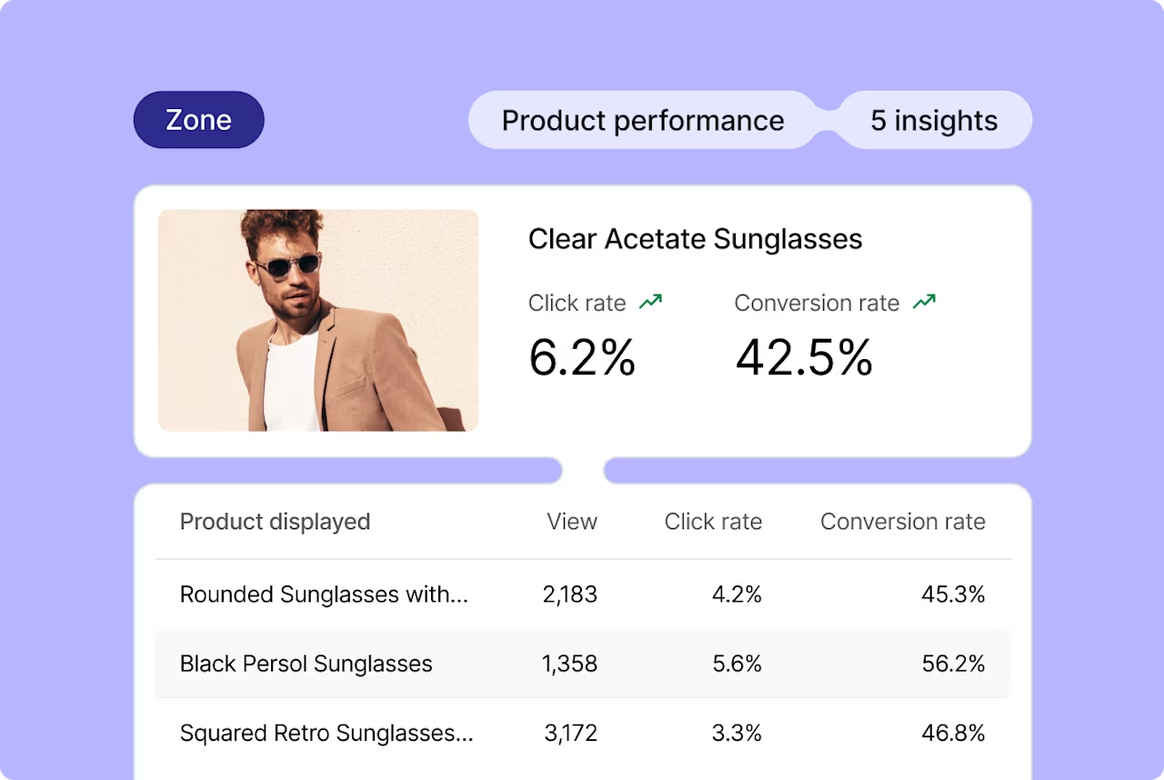
Zoning Analysis can reveal which elements on a product page genuinely drive engagement and purchase intent—and which ones shoppers scroll past without a second look.
Fashion mobile consumption fell -15% in 2026, meaning each visit is shorter and more compressed. Every element on your product page must earn its space.
Beyond the Gallery: Why Video Is Now the Minimum
When White House Black Market added short videos to their product pages—models walking and posing in garments, showing how fabric falls and moves—it was ahead of its time. Shoppers could see texture, weight, fit, and proportion in motion. It was the closest thing to a dressing room a website could offer.
That was 2018. In 2026, product video is the standard, not the standout.
Fashion, beauty, and home brands now routinely include video across product detail pages (PDPs). What set WHBM apart then is what shoppers expect now: multi-angle views, on-body demonstrations, lifestyle context. Brands that still rely on a single static hero image are leaving confidence—and conversion—on the table.
The question has shifted. It's no longer "should we have video?" It's "are we using it strategically?"
That means understanding which products benefit most from video, where in the page layout video drives the highest engagement, whether autoplay works on mobile or creates friction, and whether your videos actually help shoppers make a decision or simply add visual noise.
Showing More vs. Helping More
Here's where many brands get it wrong: they add more content—more images, more swatches, more specs, more videos—and assume the problem is solved.
The data often tells a different story.
"When we looked at Contentsquare's visualization tools, we could see customers clicking from one PDP to another and back again, unable to tell the difference between products," says Lee Frankham, Digital Director at BT Group. "It made it undeniable: showing more is not the same as helping more."
![[Visual] Heatmaps purple background](http://images.ctfassets.net/gwbpo1m641r7/48DLl2FNIKB3ej8WyOjIOc/4627722a196d94c01d9588c90aca15be/heatmaps.png?w=1280&q=85&fit=scale&fm=avif)
Product pages with high click-through rates between listings aren't necessarily a sign of engaged shoppers—they can be a sign of shoppers who can't find the information they need to commit.
Zoning Analysis surfaces exactly this kind of insight. It shows you which elements on a product page are actually receiving attention and driving action, and which are being ignored despite sitting above the fold. The results are often surprising.
Alexandra Alessi, VP Brand.com at Olaplex, found this out firsthand: "On a new product launch, we noticed the most engaged places on the product page were the 'how to use' module and FAQs. Using Contentsquare, we reordered and changed copy, and briefed social and marketing to educate on when to use a hair mask versus a conditioner."
The hero images weren't driving the decision. Context and education were. That's a completely different content strategy—and one that would have been invisible without behavioral data.
The same logic applies to video. Before investing in production, use Zoning Analysis to understand where on your product pages engagement is actually happening. Then build your visual content to support those moments, not just fill space.

The Mobile Product Page Gap—and How to Close It
With 83% of fashion traffic on mobile and session lengths shrinking, every element on your product page must justify its presence on a small screen.
Mobile product pages are often compromises: content designed for desktop, scaled down. Long description blocks that require excessive scrolling. Image galleries that work beautifully with a mouse but feel awkward with a thumb. CTAs buried below the fold.
The fix isn't always a full redesign. Sometimes it's a targeted adjustment—and Journey Analysis can tell you exactly where to look. "Journey analysis showed people struggle more on mobile and drop more on desktop," says Justyna Latko, Senior Product Manager for Tommy Hilfiger & Calvin Klein at PVH. "That insight justified differentiating designs—for example, button placement—despite our unified flow."
Same product. Same brand. Different page behavior by device. Acting on that insight—rather than designing one page and hoping it works everywhere—is what closes the mobile conversion gap.
Practically, this means thinking about the order of information on mobile: lead with the most confidence-building content first. For apparel, that might mean leading with the on-body video before specs and sizing. For beauty, it might mean surfacing the "how to use" module earlier. For electronics, it might mean moving the compatibility checker above the fold.
Whatever the category, Session Replay can show you exactly how real shoppers move through your PDP on mobile—where they pause, what they tap, and where they abandon. That's the starting point for any product page improvement worth making.
The Takeaway
Your product page is doing the work a salesperson used to do: building confidence, answering questions, and making it easy to say yes. In 2026, the brands winning at this aren't necessarily the ones with the most content—they're the ones who understand which content actually moves shoppers toward a decision.
That starts with knowing what's working. Zoning Analysis, Journey Analysis, and Session Replay give you the behavioral map of your product page as your customers actually experience it. Use that data to prioritize your video strategy, simplify your mobile layout, and surface the information that genuinely builds purchase confidence—not just the content that looks good in a product brief.
The product page isn't a display window. It's a conversation. Make sure it's saying the right things.
![[Headshot] Pola Zen](http://images.ctfassets.net/gwbpo1m641r7/2KiNKa6t0aa0IBnFMv1F5y/7ce2f65b94a00bc192cbd01a5a527f9c/pola.jpg?w=660&q=85&fit=scale&fm=avif)
Pola Zen is a former Contentsquare marketing executive who served as Director of Brand and Content Strategy from 2016 to 2018. A storyteller at heart, her work reflects a deep fascination with the power of storytelling to connect people to people, ideas, and brands.