3 Holiday UX Tips to Test before Peak Shopping Season

author

Matt Christie

August 18, 2020 | 4 min read

Last Updated: Sep 1, 2020

As a UX designer at Contentsquare, I spend most of my day speaking to clients from all industries about how to improve their user experience. I share advice, best practices, data insights, and holiday UX tips from Contentsquare to help point our clients in the right direction when it comes to UX optimization.

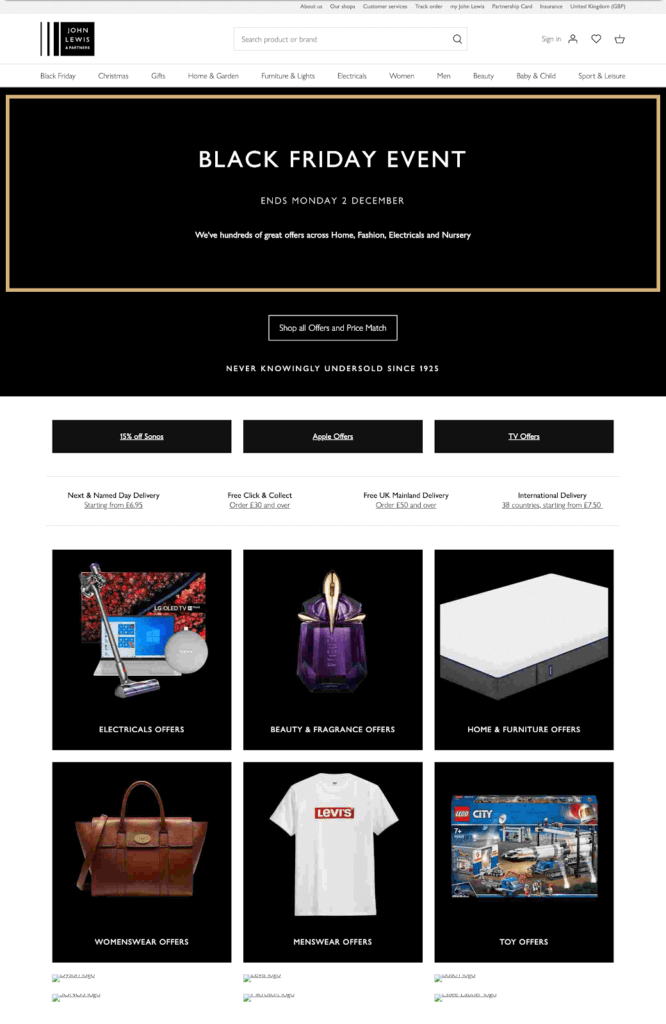
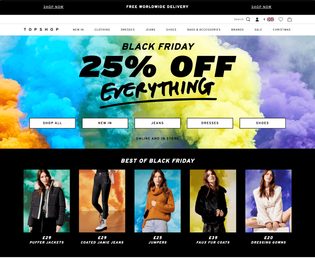
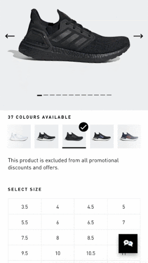
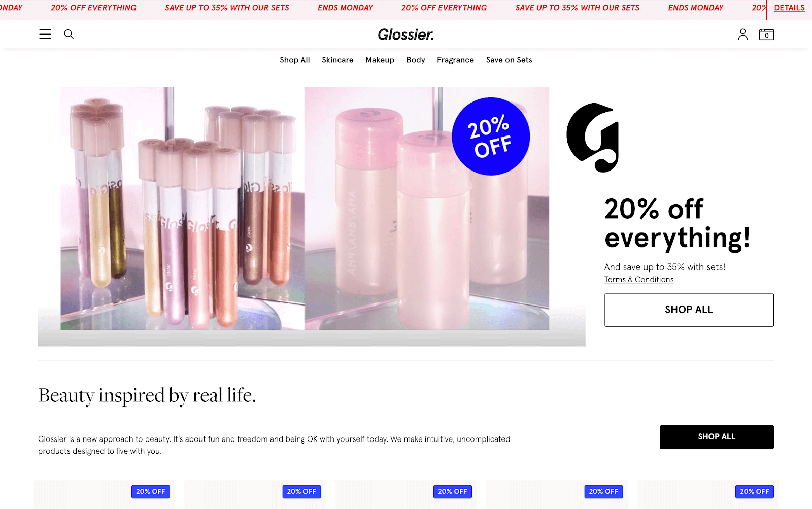
So ahead of the peak holiday shopping season, a time when UX optimization is more important than ever, here's how some of the best brands are handling deals, navigation and checkout. 

While I hope these holiday UX tips and examples will inspire you to test new content, just remember that your customers are the ones who should ultimately guide your development roadmap. Make sure you’re always collecting customer data, testing new content, and iterating on your designs to build a better digital experience for all of your visitors.

Here are three holiday UX tips to help your brand prepare for Black Friday, Cyber Monday, and beyond: 

3 Last-Minute Holiday UX Tips for 2020: 


1. Optimize your homepage with big, bold banners and CTAs

With Black Friday and similar shopping events, there’s always going to be a sense of urgency. Customers want to find the best deal possible and checkout fast. 

If your customers don’t find that on your website, then they’ll look elsewhere. 

Well-placed content blocks and easy-to-use navigation allow users to browse quickly and efficiently.

For users who are loyal to specific brands - how your homepage looks can have a big impact. For users who land on a PLP or PDP via Google, for example, you need to make sure these items are labeled correctly, with sticky navigation/filters to help users narrow down their search quickly. 

For big events like this, use bold colors and contrasts to allow content to stand out. Strip away irrelevant promotions and distractions to allow customers to focus on the deals. 

Here's how UK department store John Lewis updated their homepage last year. They opted for a simple black and white design, which helped their holiday offerings stand out. One simple CTA, ‘Shop all offers and price match’ placed above the fold grabbed shoppers' attention and launched their holiday shopping journey. 

Holiday UX tips: John Lewis' simple black and white 2019 Black Friday homepage

UK department store Jack Lewis's black and white 2019 Black Friday homepage design

On the other hand, female clothing brand Topshop opted for a more colorful approach, using exploding paint imagery to draw the user’s eye. Instead of John Lewis' more subtle approach, TopShop boldly listed their blanked discounts so shoppers could easily see the brand's promotions. This approach is impactful and entices the user to click/tap and begin their search. 

Holiday UX Tips: TopShop's eye-catching 2019 Black Friday homepage

TopShop's eye-catching 2019 Black Friday homepage

2. Bring more functionality to the PLP to aid browsing behavior

It’s important to remain transparent at all times throughout the user journey. 

Our next holiday UX tip is that subtle messaging such as ‘free delivery’, ‘in stock,’ and discount tags go a long way. By labeling or placing these elements correctly on-page, you’re constantly reassuring the customer. 

Try to keep color swatches and sizes open if possible, avoiding drop downs when possible. An item isn’t correctly labeled ‘out of stock’, or the user has to click into a dropdown to select a size, to then find out it’s not available... you might find them abandoning altogether. 

In this Adidas example, a user can select between different colors without having to scroll. They have visibility on the colors and sizes available.

Adidas website allows users to view different colors without having to scroll

Another holiday UX tip to consider - having relevant cross-sells close by, to help reduce potential disappointment. It might sound obvious but giving users options at all times, does ultimately help keep them inspired and perhaps one step closer to conversion.  

Last year, Glossier strategically placed discount tags on the main video and products below. Not only that, but they place emphasis on a rotating banner  [20% off everything - Save up to 30% with our sets - ends Monday]. This remains sticky throughout the user journey. 

Holiday UX tips with Glossier's sticky promotion banner and product discount tagsProduct discount tags and a sticky banner promote Glossier's site-wide 20% off deal

3. Speed up the purchase process with login and guest checkout

It’s essential that the checkout process is as smooth and frictionless as possible, not just for Black Friday but always (always!). Brands such as ASOS, Nike, and Amazon are hugely successful for a reason, and their checkout process is just one of many reasons why. It’s simple, intuitive, and easy to use. 

Quite often, websites opt for over-complicated (multiple steps and unnecessarily long forms) checkout processes (not usually on purpose). One of my biggest recommendations when working with checkout funnels is to try and keep it as simple as possible (sounds obvious but think of your user). A user wants to checkout as quickly as possible, and options such as using social accounts help.

Once happy with their cart, start giving users the option to log in, register, or ‘checkout as guest’. For existing customers, they’ll probably want to login as their details will be completed already. We don’t want existing customers to fill out all these details again! 

One of the best examples is Dune, which allows existing customers to login and new users to ‘Checkout as Guest’. By checking out as a guest, they’ll have the opportunity to create an account at the end of the journey. 

The guest checkout process on Dune's mobile experienceGuest checkout on Dune's mobile experience

Asos' simplified mobile checkout process

Try to keep them focused on the task at hand by guiding them step by step. Remove distractions (avoiding extra links that take them out of the funnel) and gray out incomplete steps until they’ve finished on their current step. 

What more?

Visit our Holiday Readiness Hub for more UX tips, brand success stories, workshops, & more.

Visit The Hub