
Creating a frictionless mobile experience is table stakes for companies that want to beat their competitors and stay ahead of the curve in 2023.
Today’s users expect slick, efficient in-app experiences, and failing to meet those expectations can have a disastrous impact on your mobile app performance. Here’s how disastrous: 70% of users abandon apps that take too long to load; 62% will uninstall an app if it crashes.
But how can you optimize your mobile app to ensure a great UX and happy users? And how can digital experience analytics help you in the process?
During a recent Contentsquare event, Renan Medeiros, Product Owner at Sykes Holiday Cottages, shared his insights into the company’s mobile app optimization process— and how they’re using Contentsquare’s CS Apps analytics to enhance their app user journey.
How do you optimize an app: first, why optimizing your mobile app is important?
Like many businesses, Sykes Holiday Cottages has made app optimization a central part of its 2023 product roadmaps. And no wonder—its consumer app is one of the business’s best performing channels.
“It’s a higher engagement platform than our mobile web and has a higher number of sessions per user,” said Renan. He also noted that customers who use the mobile app spend more on vouchers and have a higher lifetime value than those using their website.
“In our case, this means that customers in the app book properties that are more expensive, and they also book more often,” said Renan. On top of this, the conversion rate is also remarkably higher in-app, with “on average 25% higher conversion than we see in mobile web.”
Using digital experience analytics across the mobile app lifecycle
To ensure a seamless user experience, the product team at Sykes Holiday Cottages use Contentsquare throughout their app development and optimization process.
“Contentsquare is integrated into our process, and we use it at every stage—from discovery to ideation to post-implementation. After we release a new feature, we also look into how that feature is doing, how it’s being used and if there’s any usability issues that we should address.” — Renan Medeiros, Product Owner at Sykes Holiday Cottages
The team also combines Contentsquare insights with other data points (such as internal research, Google Analytics event data and experimentation) to make better data-driven decisions and decide product direction.
“Our app development process helps us identify customer pain points and build features that actually solve customer problems,” said Renan.
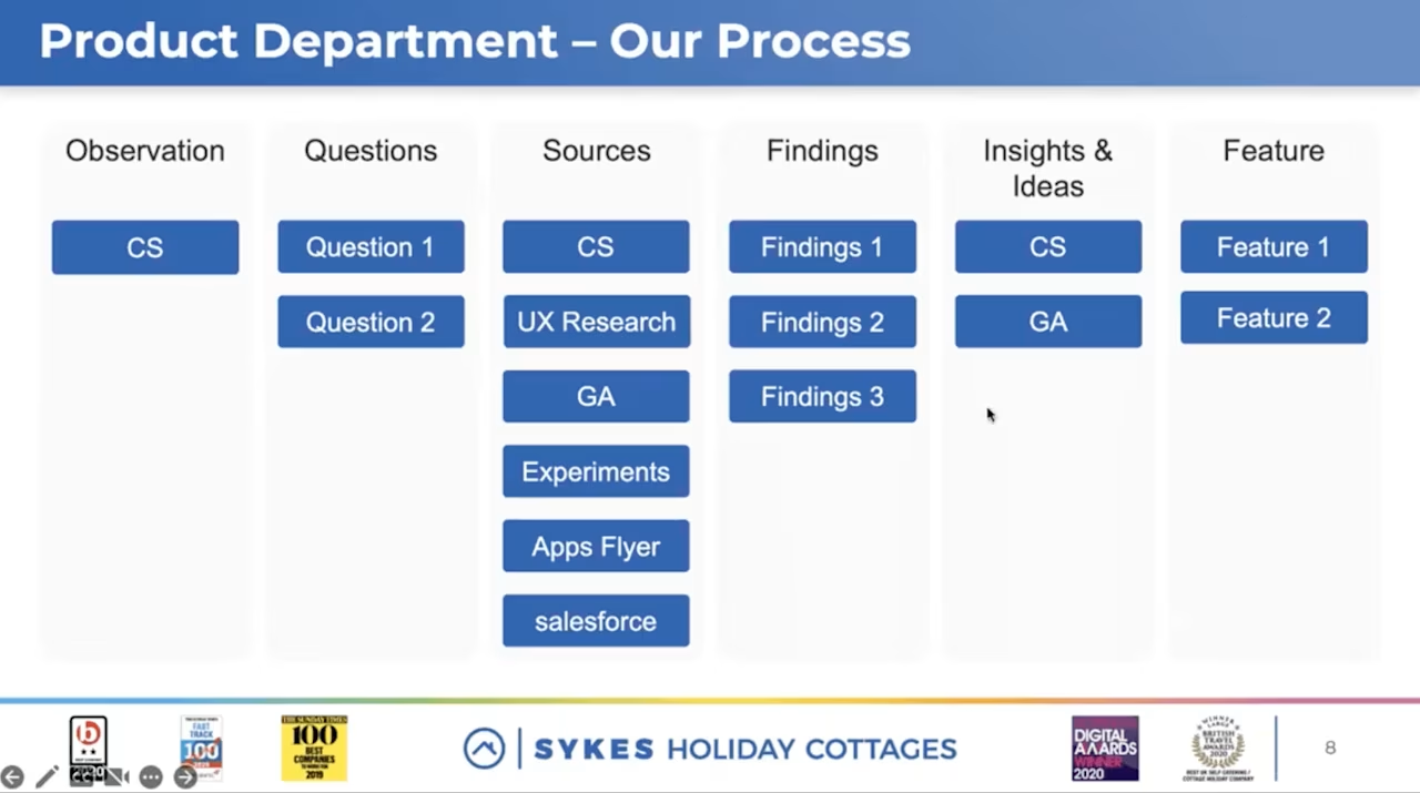
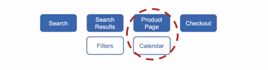
Three optimization examples throughout the mobile app user journey
During his talk, Renan shared three examples of how Sykes Holiday Cottages has used Contentsquare to optimize different parts of its mobile app user journey—from search all the way to checkout.
Example 1: how do you optimize an app with app search results experience
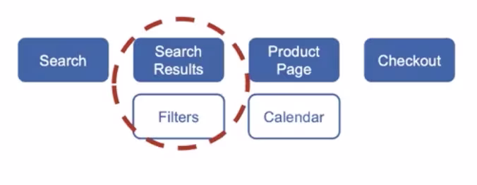
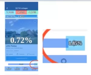
Renan and his team wanted to know how users were behaving on the app’s Search Results pages. Analysis courtesy of Contentsquare Zone-Based Heatmaps showed that only 1.85% of users were clicking on the second and third pages of the results.
Diving deeper into Customer Journey Analysis revealed that users were also displaying looping behaviors after landing on the Search Results page, moving from filters to search results and back several times.
Working from these insights, Renan and his team came up with two hypotheses:
That the looping behavior might indicate difficulty finding a property to book. It seemed likely that users were going back to filter several times in order to find a property that’s actually relevant to them.
That users were possibly only rarely getting to the second page of the property results because they preferred to filter again rather than go to the next page of the results.
This led the team to ideate around how to improve search filters and help users find properties they like faster. The team came up with two optimization experiments:
An exclusion test to remove the three least used filters. This would tidy up the page and allow the team to see what changes could be made to improve the search function.
A test to move the most relevant filter to the top, which in this case was the “Hot tub” filter present in 20% of user searches.
Both tests are still running, but partial results are already proving to impact both user experience and conversion positively.
Example 2: Removing friction from the app menu navigation
Next, Renan’s team analyzed their app navigation menu in Contentsquare’s Zone-based Heatmaps. They quickly noticed a high tap rate (1.97%) on a non-clickable mobile app search button.
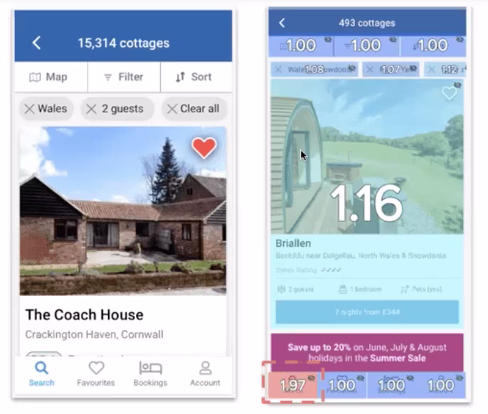
Further analysis of the customer journey showed that users who clicked on the search button tended to return to the homepage more than those who didn’t click. These insights suggested that users were trying to filter or refine their search when clicking the search button.
The team has now added app navigation optimization to their experimentation roadmap to test the clickable search button and filtering option within search result lists.
Example 3: how do you optimize an app with booking calendar
Finally, the team looked at improving the mobile app’s booking process.
Using Contentsquare’s Customer Journey Analysis, the team noticed that a big chunk (40%) of users that had previous transactions and interacted with the booking calendar were more likely to go straight into the checkout after. However, users with no transactions tended to return to the calendar several times, search results or even the homepage.
The team then used Zone-Based Heatmaps to compare behavior between the two user segments. This showed them that users with transactions tended to only interact with the calendar once, whereas users without transactions typically interacted with the calendar several times.
_
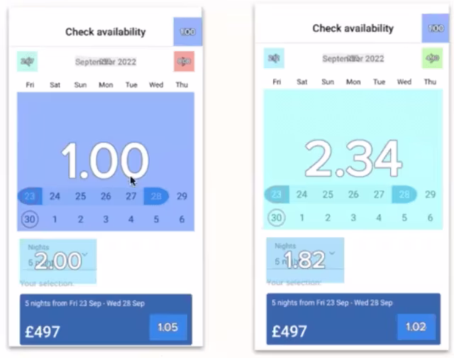
_
Click rate on calendar dates of users with transactions vs click rate on calendar dates of users without transactions
This data suggested that users with transactions are further along in their purchase journey and already have selected booking dates, whereas users without transactions are still researching and looking to compare prices by updating calendar dates.
Thanks to these insights, the team is now testing different ways to show prices in the calendar and enable users to make bookings faster.
Enabling all digital teams to optimize app user experiences
Successful and efficient mobile app optimization involves the entire digital team, from product to design. But aligning everyone around the same data requires easy-to-understand insights.
Renan highlighted how Contentsquare’s visual platform is helping make data accessible to all teams. “Everyone uses Contentsquare, not just product owners—our designers, researchers, analysts, and the marketing team all use it!”.
“Contentsquare is a very visual platform, so we often find new insights that we weren’t originally looking for. We can go down a completely different rabbit hole, which drives a lot of value for us.” — Renan Medeiros, Product Owner at Sykes Holiday Cottages
So if you’re looking for a tool to help you democratize data and better understand your in-app user behavior, book your personalized demo with our digital experience analytics experts!
![[Visual] Nea Bjorkqvist](http://images.ctfassets.net/gwbpo1m641r7/wtkAGoygaIfkRoTAbsygD/45c158c6ac863b68ba6c5cf48533a711/nea.jpeg?w=562&q=85&fit=scale&fm=avif)
Nea is the Global Content Lead at Contentsquare, based in London. With over ten years of experience in the SaaS industry, she’s passionate about creating engaging, compelling B2B content that drives traffic and conversions.