![[Stock] Analyse mobile](http://images.ctfassets.net/gwbpo1m641r7/7gmMbrNsaNsDLbLXdY98Kz/7be0c2c52fe689c4508a97f8321c8560/analyse-mobile-guide-complet.png?w=946&q=85&fit=scale&fm=avif)
Online reviews have become the most trusted form of social proof, shaping perceptions long before a shopper reaches checkout. Most shoppers read customer reviews before buying, and product pages that feature reviews convert better than those that don’t.
For ecommerce businesses, reviews act as a crucial trust signal—bridging the gap between brand promise and customer proof. Product reviews are also a core part of a seamless ecommerce experience that builds trust from the first click to conversion.
This chapter explores how reviews shape customer trust, influence conversions, and strengthen long-term loyalty. You’ll learn what makes an effective review section, how to encourage customers to share feedback, and which UX choices help those reviews work harder for your brand.
Key takeaways
Product reviews are a conversion engine: they build trust, boost engagement, and give shoppers the confidence to buy
Authenticity drives performance: verified purchases, balanced feedback, and real customer visuals make social proof credible and compelling
Good timing and UX amplify participation: personalized requests, seamless submission flows, and visible CTAs encourage more customers to leave reviews
Design matters: review sections with clear layouts, intuitive filters, and standout summaries help users find what’s relevant fast
Measure and optimize continuously: use analytics and experience intelligence to track how reviews influence behavior and refine your strategy
5 benefits of social proof on purchasing decisions
Product reviews are the digital equivalent of word-of-mouth marketing.
Reviews give shoppers the confidence and context they need to make informed decisions, reducing hesitation and uncertainty. When real customers share their opinions, photos, or use cases, it adds a layer of transparency that brand copy alone can’t achieve.
Understanding the benefits of product reviews helps ecommerce brands design experiences that convert browsers into loyal customers.
Let’s break down the key ways ecommerce product reviews create measurable impact.
1. Build trust and credibility
Reviews act as trusted, third-party endorsements that signal reliability and quality.
They give potential buyers the reassurance that real people have tried, tested, and approved the product.
Authenticity is key—’verified purchase’ labels, reviewer details, and user-generated photos all help reinforce confidence and demonstrate transparency.
![[Visual] Sephora-verified-reviews](http://images.ctfassets.net/gwbpo1m641r7/4OEjxCPwU9nG3xSoTwQlRq/e1728abd32cd4ac2d9bc96a9116163e2/Sephora-verified-reviews.png?w=965&q=85&fit=scale&fm=avif)
Sephora product reviews include a green ‘verified purchase’ label with each review
2. Drive sales and conversions
Higher review volume and quality consistently correlate with stronger conversion rates. In the context of CRO for ecommerce, reviews act as persuasive proof points that help guide users toward confident purchasing decisions.
The more authentic feedback customers can see, the more confident they feel in making a purchase. For ecommerce brands, showcasing both positive reviews and critical feedback builds credibility and trust—proof that you value transparency as much as praise.
Placing star ratings near the top of the product page helps reinforce confidence early in the journey and keeps shoppers engaged all the way to checkout.
![[Visual] Madewell-star-ratings](http://images.ctfassets.net/gwbpo1m641r7/3i39gPNngXL9dosCasxQAr/834086cf422a8757c588dfd264a02fac/Madewell-star-ratings.png?w=965&q=85&fit=scale&fm=avif)
Star ratings are shown near the top of each product page on Madewell’s website
3. Improve SEO
Reviews naturally generate a steady flow of fresh, keyword-rich content that keeps product pages active in search rankings.
Each new review adds unique phrasing and intent signals that help search engines better understand your products.
When implemented with structured data (schema markup), reviews can also appear as rich snippets—showing star ratings, review counts, or average scores directly in search results to boost visibility and click-through rates.
4. Gain valuable customer insights
Every review is a window into how customers experience your products.
Analyze feedback around key themes—like pricing, product quality, and usability—to uncover what resonates most with customers.
Use these insights to guide product development, ecommerce marketing campaigns, and merchandising decisions. Over time, this feedback loop strengthens your offering and your customer relationships.
5. Reduce returns
Detailed reviews and customer photos help set clear, realistic expectations—reducing returns and preventing cart abandonment by giving shoppers confidence to complete their purchase.
When buyers can see how a product looks, fits, or performs in real life, they’re less likely to be disappointed or surprised.
That clarity lowers return rates and improves overall satisfaction and trust in your brand.
Next, let’s look at how to build a review experience that encourages participation and makes every review count.
6 ways to optimize your ecommerce product review experience
Even satisfied customers often need a nudge to share their feedback—and once they do, a well-designed review section ensures that feedback has impact.
This section combines strategies to encourage reviews with UX best practices for displaying them, so you can build trust, boost conversions, and keep the customer experience seamless from start to finish.
1. Get the timing right
Ask for reviews when your product is still top of mind—typically a few days after delivery or once the customer has had time to use it.
Automate post-purchase review requests via email or SMS to ensure consistency without adding manual work.
For consumables or long-term products, schedule reminders a little later to capture more informed feedback.
2. Make the review experience personal and easy
Generic review requests often get ignored, but personalized ones stand out.
Tailor each message to the customer and product—“We’d love your thoughts on your new running shoes” feels more genuine than “Please leave a review.”
Keep the process simple. Use mobile-friendly, one-click forms and visible “Write a review” CTAs near star ratings and within the review section. Guiding microcopy like “How was your fit?” or “Share your experience” helps set the tone.
![[Visual] Madewell-review-copy](http://images.ctfassets.net/gwbpo1m641r7/7bhtu5esMiDfJPakF5ceQm/435771133d6c10628a19e298996dde24/Madewell-review-copy.png?w=965&q=85&fit=scale&fm=avif)
Madewell’s website encourages customers to write product reviews by asking, “Have something to say?”
3. Strategically incentivize reviews
When you offer incentives, frame them as appreciation for time and effort rather than rewards for positive sentiment. A thoughtful incentive can motivate customers to share feedback—but transparency is key.
Offer small rewards such as loyalty points, discounts, or giveaway entries as a thank-you for their time, not as payment for praise.
Automate incentive delivery to keep it consistent and low-effort for your team, and be upfront that incentives apply to all reviews, not just positive ones. Handled well, this approach boosts participation while keeping authenticity and trust at the center of your review strategy.
4. Showcase and respond to existing reviews
Showcasing existing feedback builds credibility and encourages new contributions. Feature a short, scannable set of positive reviews with a clear “See all” or “Load more” CTA to keep pages clean.
Include a review summary with visual breakdowns (average rating, % recommend) and customer photos for real-world context.
Respond to reviews—both positive and negative—to demonstrate active engagement. Thank customers publicly for praise and handle criticism transparently. Treat every response as an extension of customer support, reinforcing accountability and care.
![[Visual] Amazon-review-copy](http://images.ctfassets.net/gwbpo1m641r7/1RWwcrQYHIrOXx9lo8J4AY/f4bcdbad64d8e7ae25d80226acc94321/Amazon-review-copy.png?w=965&q=85&fit=scale&fm=avif)
Amazon reviews include images from real customers and a summary of how customers have rated each product, from 1 to 5 stars
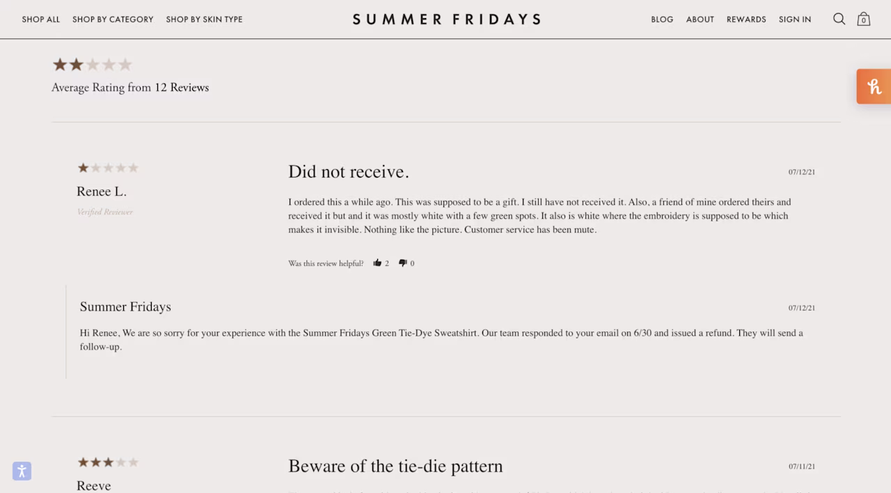
The Summer Fridays team responded to a 1-star review by addressing the customer’s specific problem, communicating what’s been done, and the steps they’ll take moving forward
5. Design for visibility and trust
Make reviews easy to find, read, and trust. Place star ratings and overall scores near the top of product pages, with quick-view dropdowns for review breakdowns.
Keep the section structured and concise—show around 6–15 reviews on desktop and no more than 10 on mobile, with “Load more” or carousel options to maintain flow.
Reinforce credibility with verified purchase badges and “helpful / not helpful” voting. These trust cues help readers assess authenticity and highlight the most valuable insights.

Clickable star ratings are near the top of product pages on ASOS’s website; clicking on the stars takes the customer to product reviews
6. Enable discovery and participation
Use intuitive filtering and sorting—by rating, date, helpfulness, and reviewer traits—to help shoppers find what matters most.
Add a Q&A section below reviews for common pre-purchase questions, along with “Ask a question” CTAs.
Encourage review sharing across email, SMS, in-app, and social media, and integrate UGC like Instagram photos or TikTok unboxings to connect product feedback with real-world experiences.
![[Visual] Target-mobile-review](http://images.ctfassets.net/gwbpo1m641r7/4yy41wM8pieagbugPScMtj/58b6837a988014be9d662722a870c39f/Target-mobile-review.png?w=965&q=85&fit=scale&fm=avif)
Target includes reviews and a product Q&A section on their mobile app, making it easy for shoppers to review before purchasing on the go
By combining smart review collection with thoughtful design, ecommerce brands can create review sections that attract participation, enhance trust, and drive long-term performance.
How to measure the impact of product reviews
Once your review strategy is in place, it’s time to track how it performs.
Tracking engagement and sentiment helps quantify how reviews shape the customer experience across your online store.
Monitor metrics like conversion rate lift, review volume, and customer satisfaction scores to evaluate the full impact of your review strategy.
Key review metrics to track
Track both quantitative and qualitative metrics to understand how reviews influence performance.
Focus on a mix of conversion, engagement, and sentiment indicators:
Average rating and review volume reveal overall satisfaction and credibility
Conversion rate lift for products with reviews measures the direct impact on sales
Engagement metrics like filter use, ‘helpful’ votes, and response rates show how actively users interact with the review section
Return rate reduction after reviews are added signals whether clearer expectations are leading to more confident purchases
Tools and analytics to measure review impact
Use analytics and experience intelligence platforms—like Google Analytics, Contentsquare, and ecommerce analytics tools—to track how reviews influence conversions, engagement, and on-page behavior.
Contentsquare capabilities like Heatmaps and Session Replay show you how users scroll, click, and interact with the review section. These insights reveal whether shoppers engage with social proof or skip past it, helping you refine placement, hierarchy, and calls to action.
Combine quantitative data with qualitative inputs through Contentsquare’s Voice of Customer tools to monitor and analyze sentiment over time. Identifying shifts in perception allows you to close the feedback loop, feeding insights directly into product design, marketing strategy, and UX improvements.
Maximizing your ecommerce product review strategy
Every ecommerce business benefits from a clear, optimized review experience that supports discovery, decision-making, and retention.
Product reviews and a thoughtful review strategy turn customer reviews into a key conversion driver for your ecommerce store. And strong UX ensures that ecommerce reviews are easy to access, filter, and contribute to, making them a seamless part of the shopping flow.
Audit your existing review experience, apply these best practices, and monitor results continuously to keep your strategy evolving with your customers.
To learn more about optimizing your reviews and overall customer experience, explore our ecommerce and ecommerce analytics guides.
FAQs about ecommerce product reviews
While there’s no magic number, most users start trusting a product after seeing at least 5–10 genuine reviews. Aim for consistency over volume—authentic, detailed feedback carries more weight than dozens of generic comments.
![[Visual] Contentsquare's Content Team](http://images.ctfassets.net/gwbpo1m641r7/3IVEUbRzFIoC9mf5EJ2qHY/f25ccd2131dfd63f5c63b5b92cc4ba20/Copy_of_Copy_of_BLOG-icp-8117438.jpeg?w=946&q=85&fit=scale&fm=avif)