Optimizing Mobile Experiences: Interview With Bobby Chucas of Babylon Health

- Summary
- Intro
- What’s your biggest challenge when it comes to optimizing your mobile experience?
- What can mobile commerce sites learn from Babylon, and vice versa?
- What’s the most surprising behaviour you’ve seen from mobile app visitors?
- What are the most important factors in an optimal mobile experience?
- What are the common mistakes most brands make when it comes to mobile strategy?
Summary
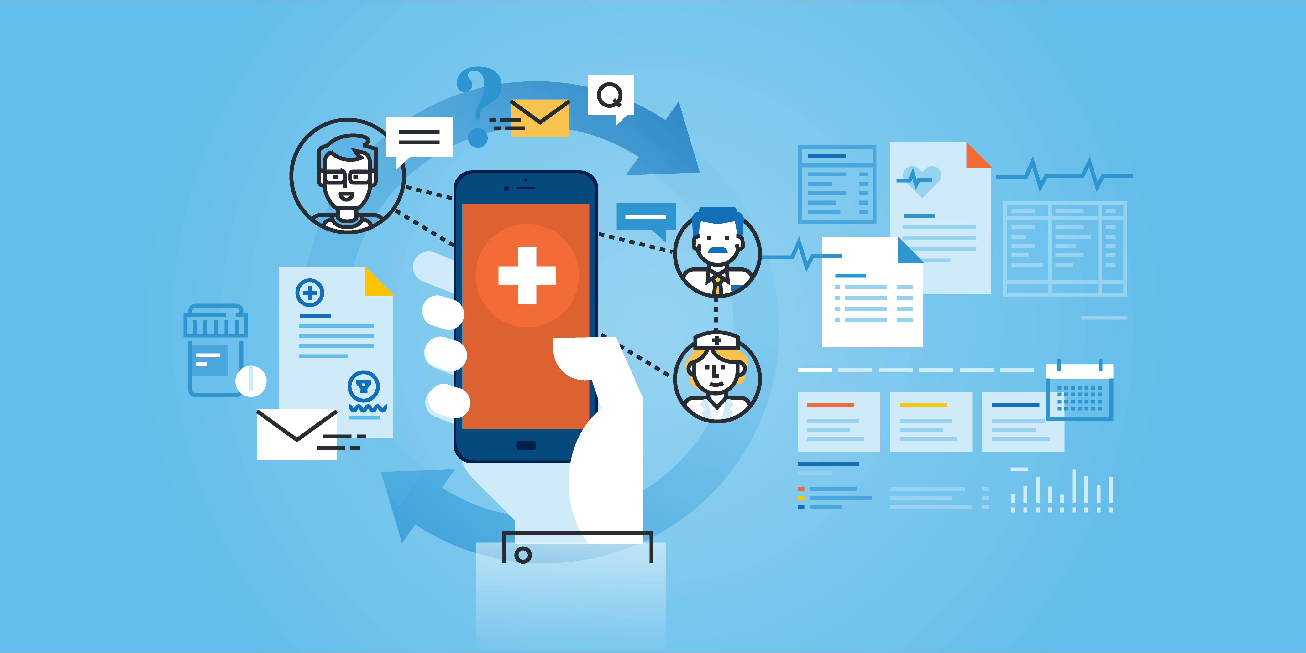
With over 2.5 million users, Babylon utilizes 21-century tech and a robust mobile strategy to fulfill their mission: to place an accessible and affordable health service in the hands of every person on the planet. From tackling challenges of form completion to designing a purposeful and compelling mobile platform, Babylon draws on behavioural insights to create a seamless experience. We sat down with Bobby Chucas, Senior Product Manager, to uncover how to optimise for a mobile-first world.
Intro
At the heart of every great mobile experience is a team that understands its users’ needs. Since 2013, Babylon has worked with partners like the English National Health Service, Samsung, and Tencent to revolutionize the GP experience. Named one of Europe’s hottest startups by Wired in 2016 and the Mobile App of the Year at the UK IT Industry Awards 2015, Babylon takes the mobile approach to democratizing healthcare.
A pioneer in health informatics, Babylon uses artificial intelligence to place accessible healthcare in the palm of your hand. However, it’s Babylon’s robust mobile strategy that places the user at the center of attention. From tackling challenges of form completion to designing a purposeful and compelling mobile platform, Babylon draws behavioral insights from its 2.5 million user base to create a seamless experience.
We sat down with Bobby Chucas, Senior Product Manager, to uncover how to optimise for a mobile-first world.
What’s your biggest challenge when it comes to optimizing your mobile experience?
You’d think mobile experience would be an easy thing to get right, given how much less space you’ve got to work with! However, mobile’s more complicated than being just about screen size, and is as much about understanding your users’ context and intent – given that mobile users could be literally anywhere when interacting with you – when they’re interacting with your product as it is about design. The biggest challenge we have is that what we’re offering requires focus and time: my product is a free, quick health assessment available through an app that gives you a detailed view of your risks of high profile diseases. This assessment is up to 15 minutes long, and many of the questions are quite specific, ranging from family history of certain diseases through to questions around sexual health and drug taking. We’d obviously love our users to get as much value out of the product as possible, so one of our biggest challenges is ensuring that users understand that the assessment takes time and focus, but that the payoff in terms of the insight you receive from the product is well worth the effort.
What can mobile commerce sites learn from Babylon, and vice versa?
Babylon isn’t really presented as a commerce app – while there are services users can pay for to get tests, insights, appointments etc., that’s not the focus, and that’s not what we’re trying to prioritise. Often our users come to us when they’re experiencing symptoms that they’re worried about, and of course our priority is to provide a seamless experience that gets them the information and support they need. By focusing on the needs of the user, we hope to build trust and reassure the user that Babylon is a service they can rely on. It’s difficult to translate this across to pure commerce, but focusing on the user’s immediate needs and priorities is hugely important for us.
That said, many commerce sites have very well structured conversion funnels, and I’m sure there are many insights we can take from those kinds of experiences to better convey what kind of offerings we provide to our users of our private service.

What’s the most surprising behaviour you’ve seen from mobile app visitors?
The most surprising behaviour we’ve seen is that we’re getting around 75% of our users to complete the assessment. Most equivalent assessments see conversion rates in the low single figures, so the fact we’re getting that rate is really valuable. We tested out a number of different ways of framing the assessment, in terms of conveying the value of the insights to users before they started, and we also experimented with the format – we provide a conversational chatbot experience rather than a standard form to fill in, which helps to engage users. It will be interesting to see how this evolves as we increase the range of diseases we provide, as they will be accompanied with more questions, and so we’ll need to decide whether users are still happy to take the assessment all in one go, or whether breaking it out more clearly would make sense.
What are the most important factors in an optimal mobile experience?
In general, people hate it when their screen gets too busy. The experience when you tap on a link to a site, which then fills the screen with multiple prompts for GDPR, cookie consent etc., is frankly awful. Whilst some of that is of course required by regulation, some sites can be tempted to grab the user’s attention by fitting as much information above the fold as possible, in the hope that one of the many items catches their eye. While in some situations this may work, most research shows that the far more compelling experience is a more sleek, refined, experience based around a single intent or purpose. Not only does that provide a clear purpose to the content you’re presenting, it also provides you with a clear metric of success that you can use to research and test how to add incremental value to your product.
What are the common mistakes most brands make when it comes to mobile strategy?
Criticising businesses for not being “mobile-first” has become a bit of a trope over the past few years, but it’s certainly true that it’s very difficult to get right. Often teams can evangelise enthusiastically about mobile, but when it comes to their development process they still build their desktop screens first, then essentially condense them for mobile. It’s not as simple as tweaking the design, and is much more dependent on research into understanding why the user’s interacting with you, and what they’re trying to do. By understanding that and ensuring that you’re expediting that as much as possible, you’ll keep their attention and stop them getting frustrated and resorting to searching elsewhere.
We’re potentially seeing a similar type of trend now with voice interaction – as smart home devices like Alexa and Google Home become more commonplace, more products will become available through the voice medium, and I’d happily bet that many of them will take the same approach and try to shoehorn their existing offering into a voice experience, rather than reconsider it from the bottom up. The first few products to get that experience right will create an incredible opportunity and reach for themselves.