Inspiration for enhancing your product experience pages

These editorial-style product experience pages need to showcase the main product, while remaining as easily shoppable as possible.
Here are some key tactics and concepts that can be used to create outstanding product page experiences.
Explore engaging layouts that encourage users to scroll
Unexpected layouts of imagery, media, and text can entice users to explore the page rather than dropping off, especially when they provide a different experience from the rest of the website.
Z-patterned layouts draw the eye from left to right (or reverse for countries that read in the opposite direction) and can help lead the user further down the page to learn more about the product.
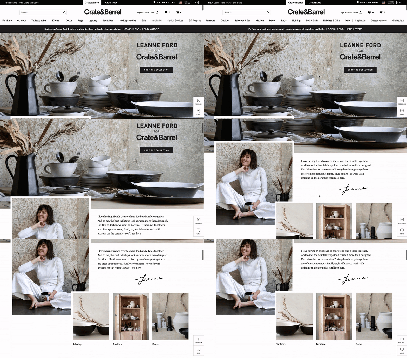
The creative is sized differently and placed in a z-pattern layout that naturally guides the eye from left to right.
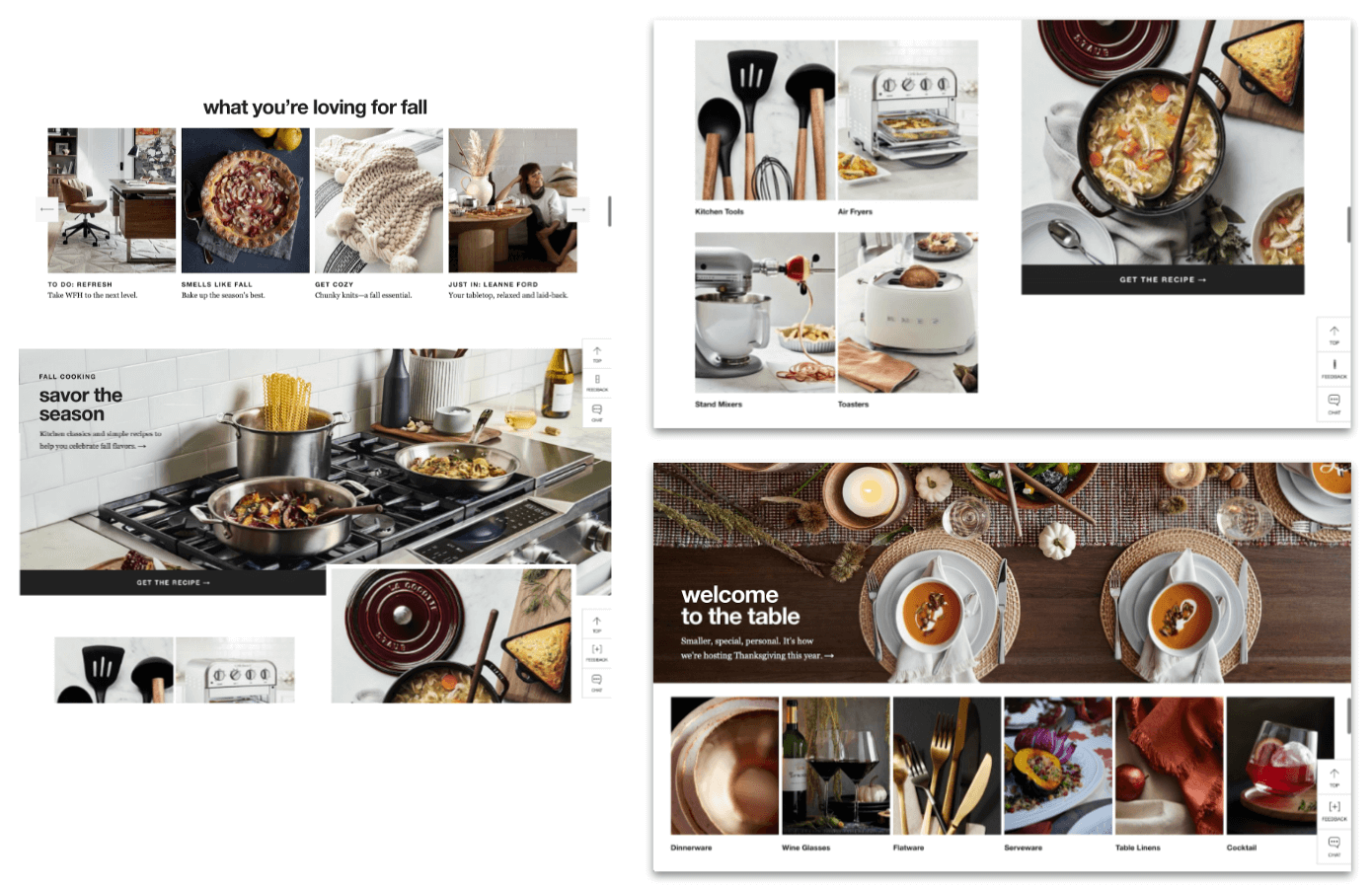
Each section uses a slightly different overlapping layout or image size to differentiate from the previous section.
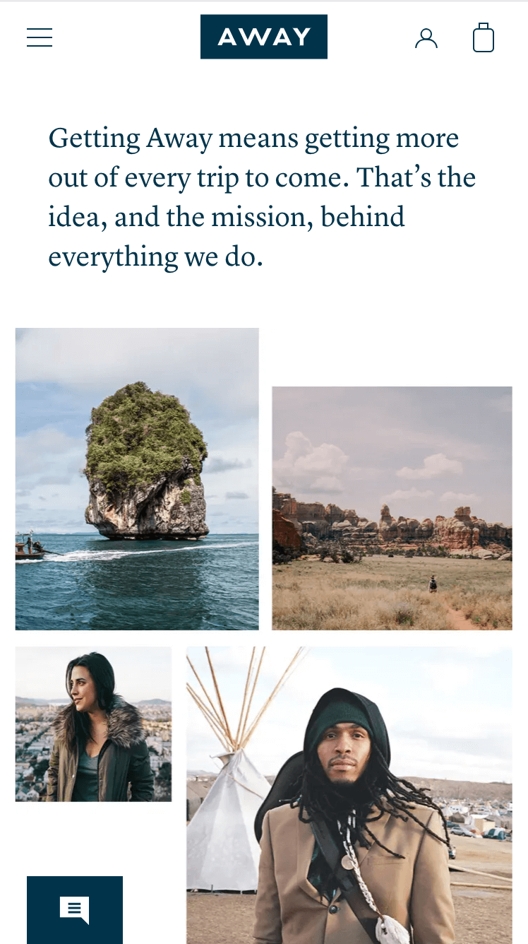
For mobile, the images are proportionally resized to maintain an interesting layout, rather than stacking large images that are difficult to see as a whole.
Highlight product features using rich media and interactive UI
While editorial and creative content is important for inspiring users, it needs to inform and educate them too.
Ensure that each piece of content provides important information or context about the product, such as how to use it, or information about its size and compatibility.
Take advantage of UI that suggests interactivity, and of horizontal formats for mobile to display more information at once. Short, looping video clips can help fill the gap between static images and in-store experiences where the user can see the product in action.
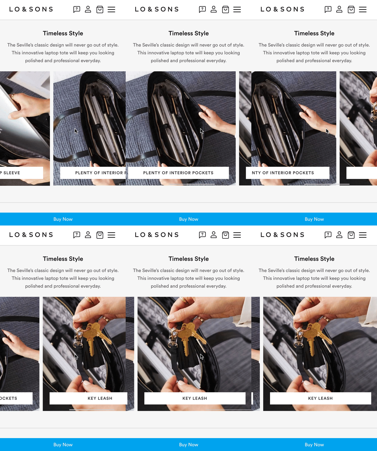
A simple carousel is used to easily highlight features, using short and straightforward phrases on each image to highlight a particular feature alongside a corresponding image.
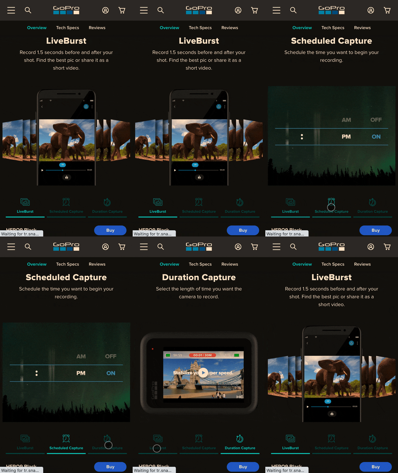
Tabs allow users to flip between highlighted features and corresponding images or media. This simple form of interaction is both highly engaging and informative within a small space on the screen.
Scroll triggers short video clips which show the product being used in a natural environment. Not only fun to watch, these video clips provide important context about how products work with each other, how to use the product, and a glimpse into optional accessories.
Intersperse shoppable functionality throughout content
While it’s important to inspire and inform users, ultimately the goal is for the user to convert from the page. Allowing users to shop the products is just as important as the immersive experience itself.
Interspering shoppable functionality throughout the page provides users multiple options to begin the conversion process. Content can be both informative and functional.
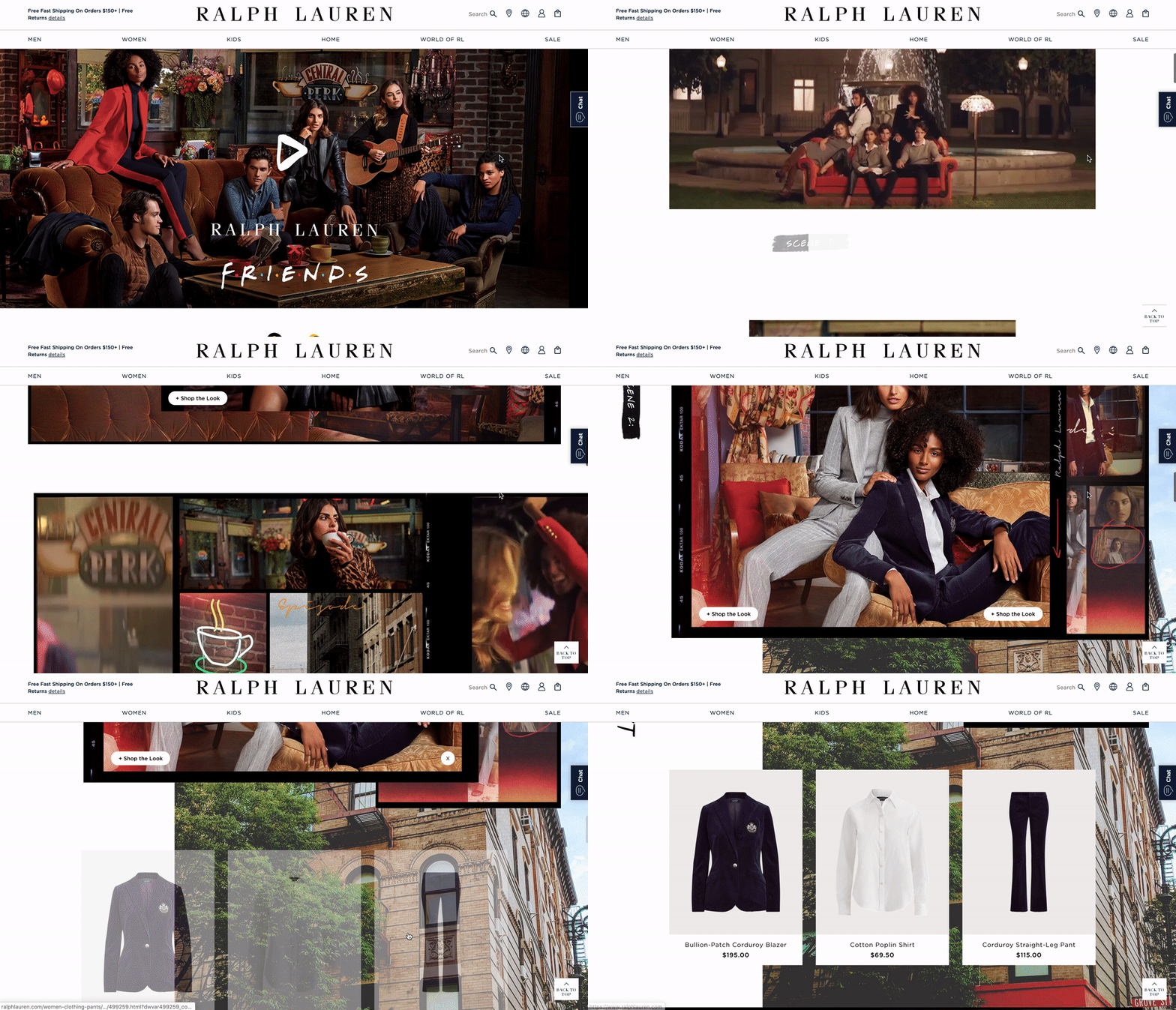
A fun and engaging collage-style layout (using both static and rich media) sets the tone and personality of the collection. The static images are shoppable; users can click on the white CTAs to reveal the products being worn in the image.
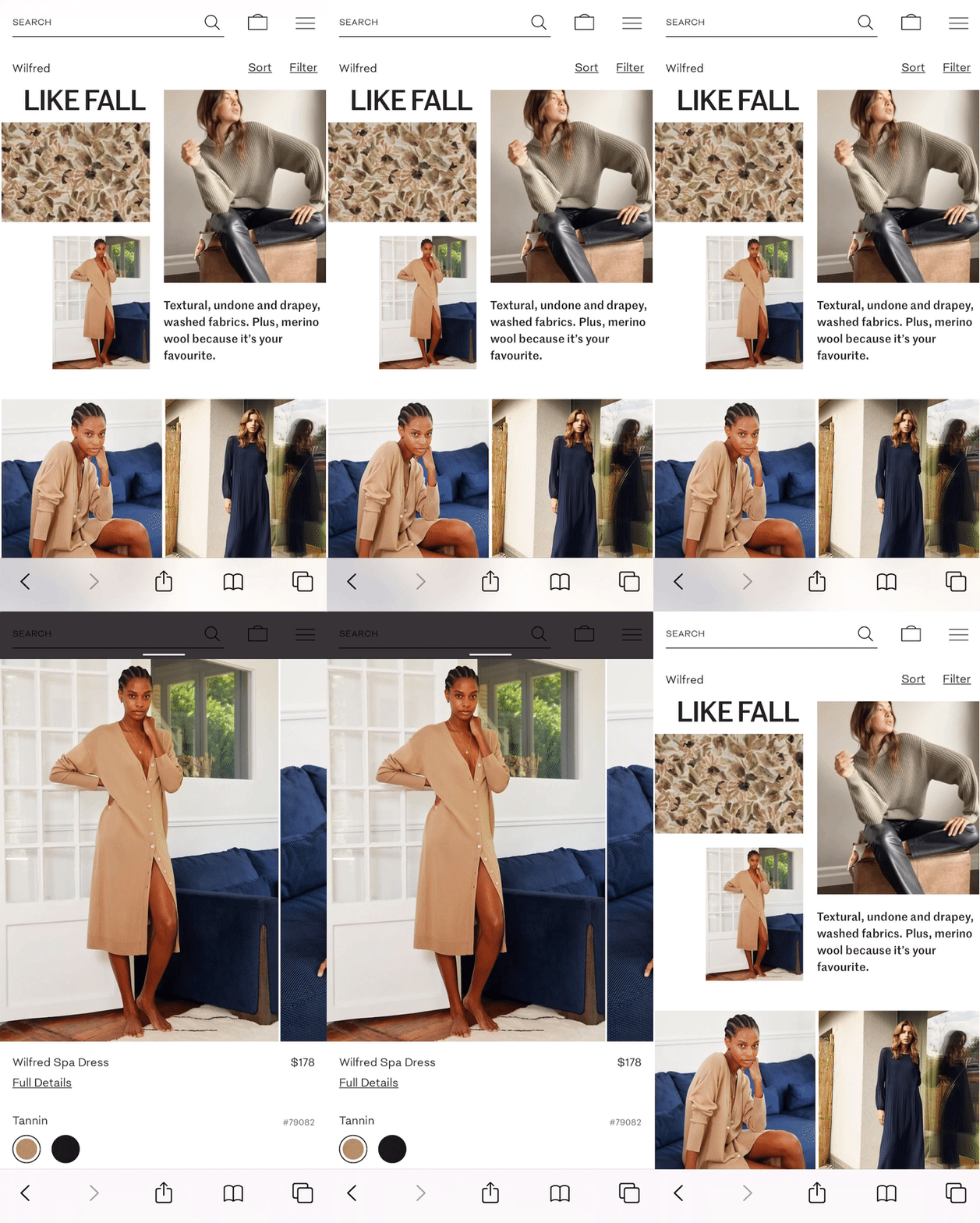
A variety of images in different sizes are placed in an interesting layout which draws the eye from left to right. Each image is clickable and surfaces a popover that allows the user to shop the image without disrupting the experience.
Whatever route you take to enhance the product experience on your site, make sure you adhere to the main principles of this experience: inspire, inform, and make it easily shoppable.
If you’ve created a cool product experience page and want to share it, send me a message at michelle.lee@contentsquare.com.
Remove customer friction with Contentsquare
Find out why your customers behave the way they do with our industry-leading customer experience analytics platform. Use Zoning to understand what elements have the highest likelihood of conversion, or discover your most profitable digital paths with in-depth Sunburst visualizations, covering data from 100% of your customer journeys.
Interested to learn more? Book a demo with us today.


