![[Visual] Stock photo of cell phone in hand](http://images.ctfassets.net/gwbpo1m641r7/1gQTSdTepVbdIMRGKJqZys/9be0bfee76919a80d525790e2fb40d09/AdobeStock_920265101.png?w=1280&q=85&fit=scale&fm=avif)
Most apps lost over 75% of their users within the first day last year. Want your app’s new users to stick around for longer than 24 hours? Then keep reading for actionable insights into teeing up an ultra-effective app onboarding process with the help of app analytics.
Onboarding is an essential but fiendishly tricky art for all app developers to master.
In this article, we’re going to help you master that art, covering:
Why getting onboarding right is vital to your app’s success
8 UX principles you can follow to improve your onboarding process (with best practice examples from Headspace, Duolingo, Revolut and Calm)
How an app analytics platform can help you take your onboarding from functional to exceptional
Why onboarding is the most important factor in retention
Retaining users is what separates successful apps from not-so-successful (or outright disastrous) apps, and the project of user retention starts from the moment your users start onboarding.
Not only is app onboarding crucial for keeping users hooked in the first seconds and minutes post download, but it also determines your chances of holding onto them through week one, two, three, four—and beyond.
According to Hubspot, there are three phases of customer retention:
Short-term retention: Week one, where your aim is to get users to use the product more than once
Mid-term retention: Week one to four, where you’re trying to get users to establish a pattern of regular usage
Long-term retention: After week four, your aim is to make your users see your app as an indispensable tool
While you might be forgiven for thinking that onboarding only helps with the short-term stage here, it’s actually the essential first step that makes short, mid and long term retention possible.
To explain why, let’s look at…
The critical functions of app onboarding
1. Get users registered
At its most functional level, an onboarding process should guide new users through your app’s registration and log-in process (if it has one).
Registering and logging in during a first session will save new users from having to log in every other time they open your app, but it will also enable you (with their consent) to start collecting their data and begin personalizing their experience through tailored notifications and recommendations.
This will help you start engaging them, which gives you a better chance of them establishing a pattern of usage and starting to feel connected and loyal to your app.
2. Teach users how to use your app—and the value of it
Onboarding should also educate users on how they can best use your app and why using the app is worthwhile, sharing important features and capabilities, tips and tricks, and benefits.
Communicating the value of your app is critical. If your users are able to immediately grasp why your app is beneficial to them, they’ll be much more likely to use it more than once, establish a pattern of usage and—ultimately—come to view your app as an indispensable tool.
Let’s say your app is a banking app that offers the following capabilities around budgeting:
Categorizes the user’s spending
Lists their active subscriptions
Enables them to set saving goals (and helps them achieve it)
This is all great stuff, and will certainly have a big impact on the user’s ability to manage their finances. Make that crystal clear at this stage by talking about the benefits, like so:
Understand exactly where your money is going each month with categorized spending
See all your subscriptions at a glance (including the ones you’re paying for but not using!)
Set yourself a savings goal and we’ll help you stick to it (and suggest extra ways to save yourself money!)
By including the benefit of these features, you’ll have helped your new user start painting a mental picture of how much better their life will be if they start using your app in earnest.
3. Make a great first impression
The onboarding experience is where you get to roll out the red carpet for new users, giving them a flavor of the sort of experience they can expect from your app once they start using it.
If that experience looks good and feels good, they’re going to go into their first experience of using your app in an excited, receptive mood—and that can make all the difference.
8 UX principles to improve your app onboarding process
In a world of shrinking attention spans, consumers are short on patience—particularly when using their smartphones, where on-screen notifications and off-screen events are constantly vying for their eyeballs.
This means that your app onboarding process has to be extremely engaging to hook users, and keep them hooked, so that they don’t skip important steps.
You also have to avoid frustrating new users in any way—by confusing them, for example, or simply by taking up too much of their time with tutorials.
Your onboarding can be off-putting (or just not engaging) in all sorts of ways, but here’s eight principles you can follow to help make yours as engaging and frustration-free as possible.
1. Keep it brief
Onboarding should be as simple, smooth and fast as possible. Otherwise, it quickly becomes less of an aid to users than an annoyance.
Time is of the essence. In one survey, almost three quarters (72%) of respondents said that completing all onboarding steps in less than a minute was important in their decision to keep using an app.
So clear the path to completion of anything that doesn’t need to be there. Your onboarding process shouldn’t contain too many steps, too much copy, too much explanation—and not enough progression.
2. Show progression
Speaking of progression, it’s important to give users a clear indication of how much progress they’ve made—particularly if your onboarding process is necessarily a little lengthier.
A progress bar will help them feel less impatient (and will help your developers laser-focus on keeping things as brief as possible).
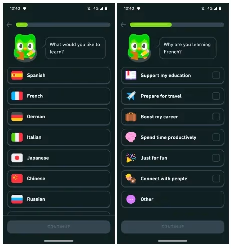
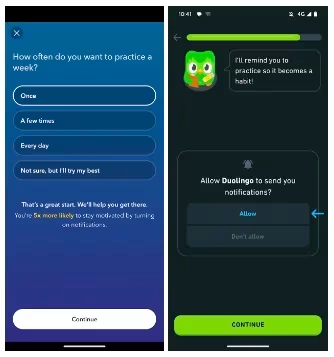
Duolingo’s wildly popular and beautifully designed app, for example, asks new users to answer a series of questions about their skill level and goals.
This is a necessary process for an app that offers personalized learning—but there’s a risk that users could feel frustrated if they don’t know how long the onboarding process will take.
Et voilà! (I’m learning French.) By adding a progress bar, Duolingo reassures the user this won’t take too long—and, incidentally, subtly makes them feel that they’re already making progress on their learning journey.
3. Sell your app’s benefits
Remember: Just because they’ve downloaded your app doesn’t mean they’re bought in.
Onboarding is your chance to make it crystal clear exactly why users should be using your app regularly—and how it will improve their lives.
Of course, explaining how to use your app’s key features is an essential part of a tutorial-type onboarding process. But if users can’t quickly (and we mean very quickly) see why they should use those features, then (newsflash!) they won’t use them.
Make sure the benefits that come with using your app are communicated loud and clear during your app onboarding process.
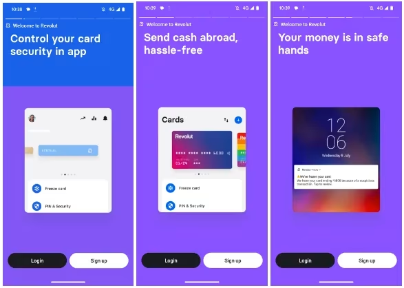
That’s what money management app Revolut does. Even before the user has logged in or signed up they get a quick, Instagram-story style tour of what they can do with the app, complete with animations demonstrating the functionality (and a progress bar!).
4. Make your app onboarding interactive
Ever heard of the principle: “Show, don’t tell”? It’s often applied to movies and TV shows, but it can be applied to lots of things, including software product demos—and app onboarding.
Telling your new user about the features and benefits of your app can work perfectly well, but showing them how things work by having them interact with your app—particularly if your app experience is highly interactive—can be even more powerful.
So ask them questions. Let them set their own goals. Have them try out features.
This serves a dual purpose. On the one hand, it engages the user straight away, instead of serving them a series of slides to passively consume (and possibly just skip through).
At the same time, it enables you to personalize the user’s subsequent experience and make it immediately more engaging.
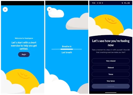
The meditation and mindfulness app Headspace provides a shining example of making onboarding interactive.
After asking some initial questions to establish the new user’s goals, the app launches into a (skippable) short exercise in which the new user takes a few protracted breaths, guided by an animated on-screen bar, and after which the user is asked how they’re feeling.
This is a fantastic little lesson in using interactivity to demonstrate how your app works and the benefits it can bring during onboarding. (We particularly like how Headspace uses haptic feedback to focus the attention of the new user.)
5. If you require information, explain why
Many users are justifiably wary of handing over personal information to yet another platform/app when registering.
Clearly, you need to reassure users that their data is safe with you, but this also offers you an opportunity to demonstrate that value we were just talking about.
Make it clear to users that sharing their data will help personalize and improve their experience so they get even more value out of your app.
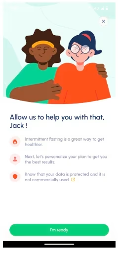
Intermittent fasting app Fastic does this in a subtle and effective way by leading with the benefit (“let’s personalize your plan to get you the best results”) and then reassuring users that their data is protected—with an icon linking to more information if users require it.
6. Use app onboarding to sell new users on push notifications
Push notifications can be an irritant to app users (and, if they’re not already a fan of your app, a reason to delete it)—but they’re also a powerful tool for securing user retention.
One study found that app users who received one or more notifications in their first 90 days had an average retention rate that was 3x higher than users who received no push notifications.
Because of the potential annoyance factor, you should always ask new users if they wish to receive notifications (Android 13 requires it of apps, in fact), and onboarding is the natural time to do this.
And, since you want them to allow you to send them push notifications, you should frame your request by explaining how notifications will benefit them—as in the examples from Calm and Duolingo below.
7. Enable registration through social and platform accounts
While entering a few registration details (like a name or an email address) might not seem like a hugely time-consuming process, to first time app users, it can be an irritant that overshadows their whole experience.
Popular apps now offer the option to register through Facebook, Google, Apple (etc.) with a few taps of the thumb. Remember: Whatever smooth onboarding or log in experiences are offered by the leading apps, app users tend to expect across all apps.
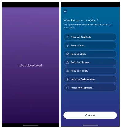
8. Be visual—but keep it simple
A picture can tell a thousand words, and a short animation a hundred thousand, so you’ll probably want to make use of eye-catching graphic elements when designing your onboarding process.
However, remember that new users are liable to be overwhelmed (and irritated) if you throw too many visuals at them at this stage—and may get the impression that your actual app experience is likely to be visually over-busy, too.
Few brands have a greater stake in not overwhelming new users than Calm—and their commitment to minimalist UX is immediately obvious when a user onboards for the first time.
The first screen new users of Calm see is maximally attention-grabbing because of its minimalism—and is followed by a very simple menu of usage-goals (that also functions as a list of benefits).
This is elegant design—highly engaging and not all overwhelming.
How app analytics can make onboarding outstanding
Apply the principles we’ve shared above to your app onboarding design process and you’re likely to see improvements in both your onboarding completion rate and overall user retention rate.
However, the next level of best practices for app onboarding—the practices that separate the apps people love from the apps they don’t use—only become an option when you measure your success and user experience with app analytics.
By monitoring your users’ behaviors in granular detail, both during and after the onboarding process, you can really understand how effective that process is, and how effective your subsequent optimization efforts are.
Without an app analytics platform like Contentsquare's Mobile Analytics and its Smart Capture (even for SwiftUI), you’ll be forced to track your onboarding process by building your own Google Analytics funnels and manually tagging screen elements—which, aside from being a highly laborious process, yields limited insights.
Knowing how many steps in the onboarding process users are taking on average isn’t going to tell you why they’ve mostly taken (or not taken) those steps—let alone helping you understand the effect that taking those steps has on their subsequent usage.
With the right app analytics platform, however, you can get real visibility into how users are experiencing your app onboarding, both throughout and after the process.
Here’s just a few examples of onboarding-related behavior you can track:
Completion rate
How many users made it through the whole onboarding process, how many skipped steps (or skipped the whole thing altogether), and what difference this made to users’ long term rate of retention, engagement and spending.
Time spent
How long it took users to complete the onboarding process—and how long they spent on specific screens and steps within the process.
This will enable you to identify ‘problem’ steps within the process which are taking up too much time, and also where users are potentially skipping important information.
On-screen actions (taps, scrolls, etc.)
By understanding where users tapped and scrolled on screens you can determine if screen elements are placed optimally and if there are UX problems which are leading to users getting stuck and/or abandoning.
Conversion rate for actions taken after app onboarding.
This will give you an idea of how effectively your onboarding process is communicating the value of using your app. Examples of actions you might track include:
Signing up for an account and logging in
Depositing money after onboarding (you can track if they did it in the same session)
Making an in-app purchase
Engagement rate with features in your app that are covered in your onboarding
Optimize app onboarding—and your entire app experience—with Contentsquare
You can track all of the above behaviors—and much, much more—with Mobile Analytics, Contentsquare’s comprehensive app analytics solution.
With Mobile Analytics, you can:
Capture every interaction, automatically, without a tagging plan.
Optimize every user journey from end-to-end with app analytics that goes beyond traditional touch and tap metrics to offer rich contextual behavioral insights
Use capabilities such as zone-based heatmaps, Journey Analysis and advanced, AI powered session replay to really understand how users are interacting with your app, what’s delighting and frustrating them about it, and how to improve the experience to drive retention and conversion
Use Error Analysis and crash analysis to detect and solve issues that are causing user frustration, uninstalls and bad reviews at speed—before they do too much damage
Quantify the impact of issues and opportunities to prioritize your workload and development roadmap and optimize your user experience on a continuous basis
![[Visual] Jack Law](http://images.ctfassets.net/gwbpo1m641r7/6K99ulcVqLqKGyNZUaPiF8/145af0b27131005d862c790ddcafb3c5/Jack_Law.jpg?w=1280&q=85&fit=scale&fm=avif)