
A/B testing seems simple: put 2 different product versions head-to-head to see which one works better for your users.
But in reality, A/B testing can get complicated quickly. Your website has so many different elements—buttons, inputs, copy, and navigational tools—and any one of them could be the culprit of poor conversion rates. You want to ensure you have the right tools and processes to solve the case.
That's why you need to analyze A/B testing examples—to see what kind of strategies and tools other companies used to successfully carry out their experiments.
This article looks at 6 A/B testing examples and case studies so you can see what works well for other businesses—and learn how to replicate those techniques on your own. You’ll walk away with new ways to test website improvements that boost the user experience (UX) and your conversion rates.
6 brilliant A/B testing case studies to learn from
Product and website design is not just an art; it’s also a science. To get the best results, you need to conduct A/B testing: a controlled process of testing 2 versions of your product or website to see which one produces better results.
A/B testing, also known as split testing, follows a predictable structure:
Find a problem
Create a hypothesis of how you could solve it
Create a new design or different copy based on your hypothesis
Test the new version against the old one
Analyze the results
But within this structure, you have many choices about the A/B testing tools you use, the types of data you collect, and how you collect that data. One of the best ways to learn and improve is to look at successful A/B testing examples
1. Bannersnack: landing page
Bannersnack, a company offering online ad design tools, knew they wanted to improve the user experience and increase conversions—in this case, sign-ups—on their landing page.
Unsure where to start, Bannersnack turned to Hotjar click heatmaps to investigate how users interacted with the page. With this tool, the company could visualize the areas with the most clicks and see spots website visitors ignored.
!

With A/B testing, Bannersnack discovered that a larger, higher-contrast call-to-action button made a huge difference. Check out the heat difference on these before-and-after click maps!
With this data, Bannersnack could hypothesize how to improve the experience and then create an alternate design, or variant, to test side-by-side with the original.
Bannersnack completed multiple rounds of testing, checking heatmaps each time and getting incrementally closer to their desired results. Ultimately, they realized they needed a larger call-to-action (CTA) button with a higher contrast ratio—and sign-ups increased by 25%.
💡Pro tip: optimize your landing page by breaking down drivers, barriers, and hooks.
Drivers are the reasons a lead came to the page
Barriers are the reasons they’re leaving
Hooks are the reasons they convert
2. Turum-burum: checkout flow
Digital UX design agency Turum-burum aimed to optimize conversions for their customer Intertop, an ecommerce shoe store based in Ukraine.
In the UX analysis phase, Turum-burum used surveys—specifically, an exit-intent pop-up—to gather user insights on Intertop’s checkout page. When a user clicked to leave the page, the survey asked, “Why would you like to stop placing the order?” Out of the 444 respondents, 48.6% said they couldn’t complete the checkout form.
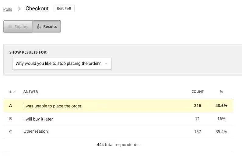
Contentsquare surveys reveal why users leave the checkout flow
The next step was to develop hypotheses and A/B test them. Turum-burum tested changes like reducing the number of form fields, splitting the webpage into blocks, and adding a time-saving autofill feature.
A/B testing plays a key role in Turum-burum’s conversion rate optimization (CRO) model, which they call Evolutionary Site Redesign (ESR)
Each time they tweaked a page, the company used session replay tools and heatmaps to see how users experienced the change. Heatmaps revealed trends in users’ click and scroll behavior, while replays helped the team spot points of friction, like rage clicks, users encountered during the checkout flow.
The final result? Intertop’s conversion rate increased by 54.68% in the test variant. When they officially rolled out the changes, the average revenue per user (ARPU) grew by 11.46%, and the checkout bounce rate decreased by 13.35%.
“We can optimize through our development roadmap, through our multivariate testing platform, and then the content changes we can make on a daily basis. And they’re all trackable through Contentsquare in a really immediate way.”
Jennifer North, Head of Digital Experience, Hobbycraft
3. Clarins: product copy
Serving customers with the right message at the right time doesn’t only help you satisfy them—it also signals to them that you understand them on a personal level. In retail, a picture can say a thousand words, but sometimes adding some words to those images can help spell things out for customers and inspire a decision.
That’s what Clarins discovered when they tested adding explanatory copy to images on their PDP pages. They saw an increase in engagement on those PDPs with added copy—and a big knock-on effect from this on basket page views which went up 2.41% and transactions, which went up by 0.37%.
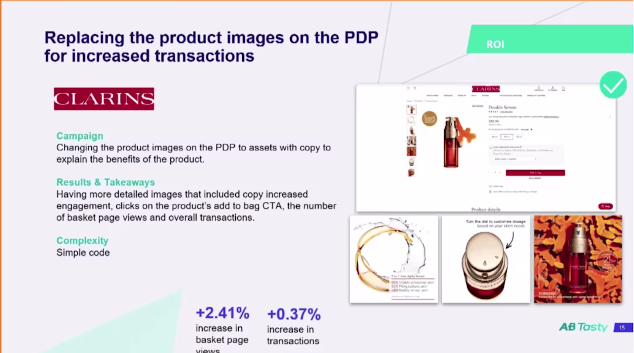
Clarins tested adding explanatory copy to images on their PDP pages
💡Pro tip: don’t be afraid of negative results when running A/B tests.
Johann Van Tonder, CEO at ecommerce CRO agency AWA digital, says, “A test with a strong negative result means you’ve identified a conversion lever. You’ve pulled it in the wrong direction, now just figure out how to pull it in the opposite direction.”
Johann says he often gets even more excited about negative results because they showcase how valuable A/B testing actually is.
“We tested a redesigned checkout flow for a famous car rental company,” he says. “It would’ve cost them £7m in annual revenue if they’d just made it live as is.”
Even though negative results are sometimes inevitable, there are some common A/B testing mistakes you need to be aware of, so you can get maximum results from your experiments. Check out the top A/B testing mistakes chapter of this guide to learn more.
4. The Good: mobile homepage
Ecommerce CRO experts The Good took on the task of achieving higher conversion rates on mobile for client Swiss Gear, a retailer of outdoor, travel, and camping supplies.
To uncover any existing issues or bottlenecks, The Good turned first to Google Analytics to determine where, when, and why visitors left the website.
With this quantitative data as a starting point, the company cued up heatmaps to highlight users’ click and scroll patterns. Then, they used session replays to determine the why behind user behavior—the qualitative data—and form their hypotheses about how to make improvements.
The Good tested their hypotheses, using heatmaps and recordings again after each test to see how changes impacted user behavior.

The Good used Hotjar Heatmaps to understand how users interacted with content filters, and used this data to redesign client Swiss Gear’s mobile menu to be more user-friendly.
The Good discovered that users were getting confused by the iconography and language on Swiss Gear's mobile site. The process led the team to design a simple, visually appealing menu-driven user interface (UI) for the mobile homepage.
This interface streamlined the browsing experience by promoting top filters—a move that led to big results: Swiss Gear’s mobile bounce rate dropped by 8% and time on site increased by 84%.
💡Pro tip: user interviews give you even more insights when optimizing your mobile site.
Contentsquare lets you source and interview real users about how they experience your site on their phones. Then, you can filter these interviews by type of phone, like Android or iPhone, to look for usability trends.
Recruit from Contentsquare’s pool of 200,000+ verified participants and automatically screen to make sure you’re speaking to the right people
5. Re:member: application form
Re:member, a Scandinavian credit card company, knew something was wrong with their funnel. Google Analytics showed that many qualified leads arrived from affiliate sites—and quickly left before they signed up for a credit card.
Using filters, re:member’s Senior Marketing Specialist, Steffen Quistgaard, pulled up session replays and click maps of sessions from affiliate sites only. While studying these sessions, Quistgaard noticed users scrolling up and down, clicking to the homepage, and hovering over—and attempting to click on—the benefits section.
Putting together these behavioral trends, Quistgaard hypothesized that leads were hesitant and needed more persuasive information on the form.
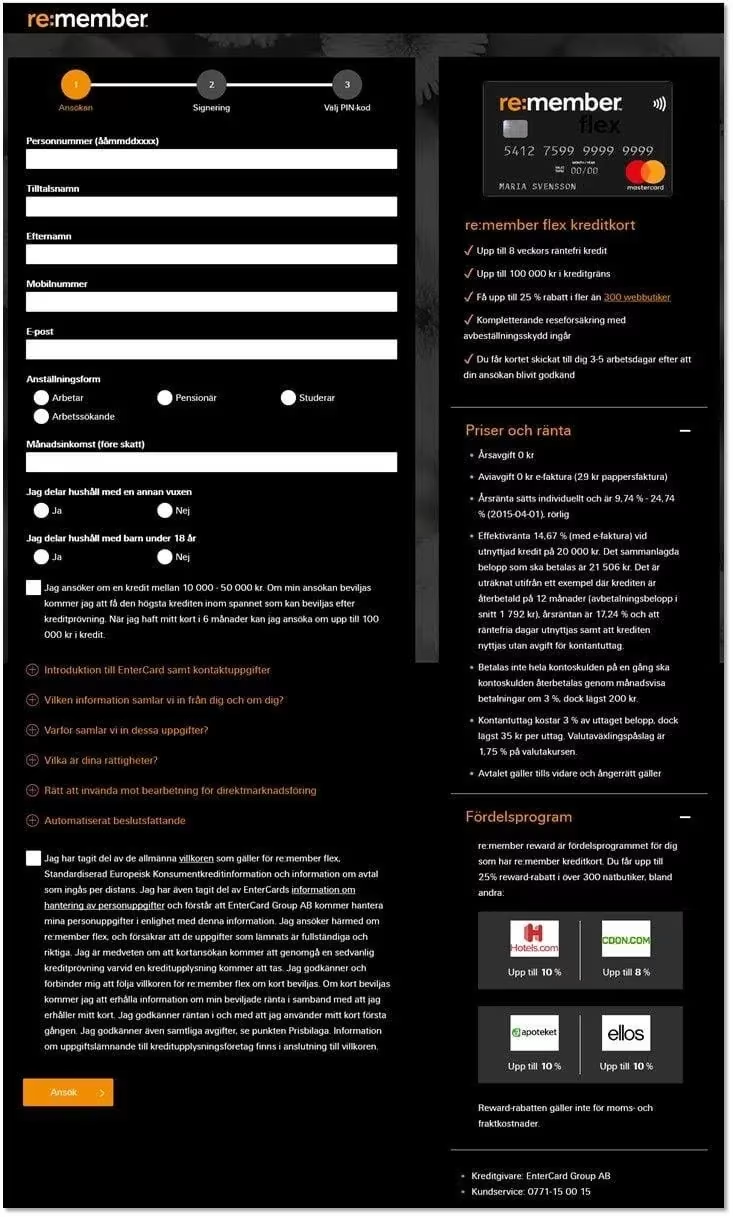
Re:member redesigned their credit card application form with more visual organization on the right side for users: three distinct content sections, checkmarks instead of bullet points, and icons in the rewards program section.
Re:member’s team redesigned the form, using visual and web design hierarchy cues to call attention to the credit card’s features and benefits. Then, they conducted split testing.
The result? Form conversions went up 43% among users from affiliate sites and 17% overall.
💡Pro tip: use Contentsquare to spend less time searching and more time analyzing session replays.
If your site experiences high traffic volume, you could rack up many session replays in a short time. To make the most of your time, you need to sort through them in the most efficient way.
Contentsquare’s session replay software includes segmentation, event tracking, error flagging, frustration signals, and find-and-fix notifications.
It has a module that summarizes key events within each recording, so you can quickly jump to relevant points.
Session Replay alerts you to spikes in errors and links each error to the relevant user session, so you can watch the errors occur in real-time and identify a fix.
With a few clicks, you can then quantify how many other users are seeing the same bugs, prioritize what to focus on, and expedite the needed fix.
Tying in Contentsquare’s alerting capabilities then makes sure that any errors that happen in the future are automatically flagged down, so you can deal with them immediately.
![[Visual] Session Replay](http://images.ctfassets.net/gwbpo1m641r7/ixsmocDmrb471y732GpId/a5d0b671a70df5f177bfe7262388623d/Screenshot_2024-11-04_at_19.22.27.png?w=1280&q=85&fit=scale&fm=avif)
Contentsquare’s session replays help you immediately detect undesirable behaviors, such as rage clicks
6. Every.org: donation flow
Dave Sharp, Senior Product Designer at charity donation site Every.org, was watching session replays when he noticed something interesting: a surge of rage clicks, or a series of repeated clicks in a short time, on their donation form.
After watching many sessions, Dave hypothesized that the form’s two CTAs were confusing and frustrating visitors.
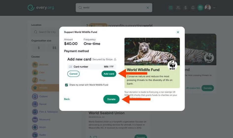
Every.org’s original donation form featured two CTAs, which confused visitors and increased the bounce rate
Every.org created a new version of the donation flow, splitting it into two pages, each with only one CTA button. Then they tested it against the original version.
By the end of the A/B testing process, conversions had increased by a whopping 26.5%.
💡Pro tip: combine session replays with other tools to get even deeper insight to optimize A/B tests.
Contentsquare’s Session Replay tool captures anonymous user sessions so you can see every interaction on your site during an A/B test—where users get stuck, what they click, and the path they take to convert.
Plus, our all-in-one experience intelligence platform helps you see the entire performance of your product and understand why users behave the way they do. Combine Session Replays with other tools like
Customer Journey Analysis to track how users navigate through your site, identifying key patterns and drop-offs
Heatmaps to visualize how users interact with each element, revealing insights on clicks, scrolls, and movements
Impact Quantification to link site errors with important KPIs, helping you prioritize the most critical fixes
Form Analysis to optimize form performance and boost conversions by identifying where users struggle
Voice of Customer to collect direct feedback from users through surveys and comments to understand their experience
Product Analytics to improve retention by analyzing how customers engage with your product's features
Contentsquare’s Session Replay helps you delight your users by getting a first-hand account of their experience
Get closer and closer to what users need
You can’t just rely on gut instinct when making changes to your website. To create a site visitors enjoy (and one that gets results), you need to collect real evidence and user insights.
By looking at A/B testing examples, you’ll have a clear roadmap of how to identify a problem, create a hypothesis, and test variants of your site. In time, you’ll have a site that delivers exactly what your target audience wants—and keeps them coming back for more.
FAQs about A/B testing examples
A/B testing is a controlled experiment in which you run two different product or website versions simultaneously and see which one performs better. For example, you might run your current sales page against a new version with a section that addresses objections. Then, you’d gather and analyze data to see which one resulted in more conversions.
![[Visual] Contentsquare's Content Team](http://images.ctfassets.net/gwbpo1m641r7/3IVEUbRzFIoC9mf5EJ2qHY/f25ccd2131dfd63f5c63b5b92cc4ba20/Copy_of_Copy_of_BLOG-icp-8117438.jpeg?w=946&q=85&fit=scale&fm=avif)
![[Author] Madalina Pandrea](http://images.ctfassets.net/gwbpo1m641r7/1CsEcp2v6jB6JAqrI9HDBa/76e37b242f67b2f063d657169afc559d/image.png?w=1274&q=85&fit=scale&fm=avif)