
Uncover trends for crucial digital KPIs
Access the 2024 Digital Experience Benchmarks Report and Interactive Explorer.


We go beyond technical issues and deep dive into metrics that reveal how your customers engage on your app and why they behave the way they do. From mobile UX metrics, like time spent and views per session, to conversion and revenue, we’ve got you covered! You’ll even get some key app benchmark data along the way…
Mobile app metrics help digital teams track whether their app is succeeding or failing. For marketing and UX, metrics are all about understanding user experience and quantifying engagement.
And it’s safe to say that monitoring app metrics is not just a nice to have, it’s fundamental to your success. Not only does it enable you to measure your overall app performance, but it can also help to identify potential issues, better understand user engagement, and optimize your app experience. By tracking key metrics, you can gain valuable insights into user behavior and make informed decisions on how to improve your app.
Uncover trends for crucial digital KPIs
Access the 2024 Digital Experience Benchmarks Report and Interactive Explorer.
But accurate tracking of app metrics requires the right tools. With comprehensive app analytics in place, your teams can go beyond just tracking clicks and sessions to understanding the entire user journey and behavior. In this very competitive environment, collecting behavioral data is instrumental to improving app performance, winning over new customers, and increasing retention and market share.
“It’s all well and good knowing what your users have done. But it’s also really, really important to know why they’ve done it. That’s one of the key areas within the app ecosystem that a lot of businesses are falling in – they get some data, but perhaps they’re not getting as much data as they should be. And then they’re acting on the data, without really knowing why those individuals have done it.”
Mick Rigby, CEO – at Yodel Mobile, App Growth Marketing Agency
So, let’s get started! We’re going back to basics by sharing some of the essential app metrics you should measure to optimize your mobile app experience.
This first one’s pretty simple: Active users are the people who are actively accessing your app on a daily, weekly, or monthly basis. This is a key app metric that indicates a positive sign of your app’s success, having a direct impact on your revenue. Here are three different Active User definitions:
Time spent is a great app metric for understanding which screens users are spending the most time on, and from there identifying if this was expected or not. By tracking this metric, you might find anomalies and unexpected user patterns—perhaps there’s a screen users are spending more time on than expected?
When looking at time spent, it’s worth considering the goal of the screen or the app. For checkout screens and booking flows, you want this to be low. However, when consuming content, you want it to be high.
According to our 2022 benchmark data, the average time spent per session is 2 minutes and 43 seconds.
How it’s calculated
| Average time spent on the screen – from screen view event to last event sent. |
Views per Session allows you to see how many times the average user is seeing the same screen during a single digital journey on your app. It’ll help you to see when and which screen users are viewing the most. For example, you could compare category screens to your product screens.
How it’s calculated
| The average number of times the screen was viewed during a session. |
Bounce rate is the app metric that tracks when a user only looks at one app screen during a session. So, a user can scroll, tap through images, and read content, but if they never see a second screen, it counts as a bounce.
Our benchmark data suggests that the average app bounce rate is 9%, which is low compared to other devices—our data shows that mobile bounce rate is 51%, desktop is 50%, and tablet is 49%. Considering that the user journey on apps is very different to other channels, this low bounce rate isn’t surprising.
How it’s calculated
| It’s the ratio between users that landed on a screen and left the app without seeing a second screen and the total number of users who landed on the screen. |
Exit rate on apps is quite different to other app metrics, as an exit can take place anywhere in the app user journey. Measuring exit rate can help identify problematic screens that might be causing app exit. For example, you’d expect an order confirmation screen to have a high exit rate but if it’s high on a specific product page, it could be indicating a problem.
How it’s calculated
| It’s the ratio between the number of users that ended their navigation on the screen and the total number of users. |
For digital teams, conversion remains a top priority, especially for those that aim to drive revenue from their app. And when it comes to user experience app metrics, conversion rate can be a tough one to define. This is because app CR is tied to the specific behavior depending on what you look at—it can range from views and taps to a simple check out.
App CR often also refers to the number of conversions in the app store. However, in this case, as we’re focusing on the user experience, we’re only referring to in-app conversion behavior.
How it’s calculated
| In Contentsquare, it’s the ratio between the number of users that viewed the screen and reached the objective during their navigation and the total number of users that viewed that screen. |
Now that we’ve gone through the essentials, let’s deep dive into some of the comprehensive app metrics you can get with Contentsquare.
CS Apps is unique in that it provides in-depth metrics around interactions allowing digital teams to discover issues and opportunities even when no technical errors found.
Here are some of the UX app metrics you can and should track using Contentsquare:
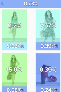
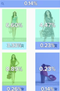 This is the percentage of users that tapped on the zone at least once. This metric allows you to rank zones according to their attractiveness. It’s useful when analyzing zones that can be tapped several times (like a carousel) because it doesn’t inflate the tap rate.
If during a screen view a user taps twice on a zone, the tap rate just considers it as one tap. So even if the zone is tapped hundreds of times by one user, and once by another user, the metric’s not inflated.
How it’s calculated
| Number of screen views where the zone was tapped |
| Total number of screen views |
 Tap Distribution is a Contentsquare app metric that allows you to identify the zones where users most frequently perform a tap. It helps you rank screen zones according to their shares of taps on the screen, and to evaluate their importance.
Tap distribution also helps to determine zones which receive the highest and lowest share of taps on the screen. It’s especially useful for merchandising to determine which zone is most tapped and is helpful when organizing the top navigation menu of your app.
How it’s calculated
| Number of taps on the zone |
| Sum of taps on all created zones |
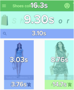 This mobile metric is the number of seconds between a screen view event being triggered and a first tap being triggered.
The metric identifies which elements were interacted with first. Time before the first tap is especially useful when looking at form field completion, by allowing you to see if forms are being filled out in the correct order.
It also shows you which areas of the screen are immediately attractive to users and where people are tapping first. If a visitor has a CTA in view, the time before the tap should be low, but if there is text on the screen, you can expect a longer time before the first tap
How it’s calculated
| It’s the average time from when the SDK sends a sum of taps on all created zones |
 This app metric is the average number of times an element was tapped when engaged with during a screen view. It measures user engagement and frustration.
Tap recurrence can help you identify if users are trying to engage with non-tappable elements. If users are repeatedly tapping on a banner with the exception to be brought somewhere but then are not, it is a negative experience.
A high tap recurrence could indicate a banner to be removed or a banner that should be linked to another screen.
How it’s calculated
| Total number of taps on the zone |
| Total number of screen views with at least one tap on the zone |
A swipe is a movement of the finger on the screen in one of 4 directions (up, down, left and right). It helps you to understand where users are swiping and in which direction. Contentsqaure has four different Swipe app metrics that you can track:
This is the percentage of users performing at least one fast swipe on a zone during a screen display. A high fast swipe rate on a rather short screen might indicate that users are looking for something and the content is not engaging. So, your users are just swiping fast to check the content of the screen, without actually reading it.
How it’s calculated
| Number of screen views where the zone was fast swiped |
| Total number of screen views |
This mobile app metric is the percentage of users performing at least one slow swipe on a zone during a screen display. Slow swipe rate might indicate better user engagement.
How it’s calculated
| Number of screen views where the zone was slow swiped |
| Total number of screen views |
This is the percentage of users performing at least one swipe on a zone during a screen display. The vertical swipes on the whole screen allow for analysis of overall consumption, while the horizontal swipes are relevant to analyzing the consumption of particular elements, such as carousels. It’s useful when analyzing zones that can be swiped several times (like a carousel) because it doesn’t inflate the swipe rate. If during a screen view a user swipes twice on a zone, the swipe rate just counts as one swipe. So even if the zone is swiped hundreds of times by one user, and once by another user, the metric’s not inflated.
How it’s calculated
| Number of screen views where the zone was swiped at least once, whatever the swipe speed, in the direction specified by Contentsquare user |
| Total number of screen views |
This is the average number of times an element was swiped when engaged during a screen view. It can help you spot when users are trying to engage with elements that can’t be swiped. If users are repeatedly swiping on a banner with the expectation to be led somewhere but aren’t, it can lead to a negative user experience.
High swipe recurrence can encourage you to consider updating the pagination of an image or carousel. It also allows you to see if users are repeatedly swiping on a zone that was designed for tapping. For example, a user could be trying to swipe through a carousel that’s designed for users to tap on arrows. High swipe rate can help you to better understand user intentions on different elements of the screen.
How it’s calculated
| Number of total swipes |
| Total number of screen views |
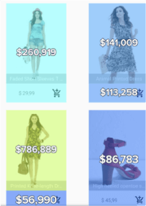 This is the total revenue generated by segmented users after they tapped on an element. The metric ranks elements based on their contribution to your revenue. When analyzing a screen, you can use revenue to see which areas of your mobile app are generating the most revenue.
How it’s calculated
| The total purchase amount of all sessions that tapped on the zone. |
Revenue per tap is generated by users after they tapped on an element and it ranks elements based on their contribution to your revenue. A zone with a high total revenue may just be caused by a high number of visitors tapping. Revenue per tap lets you see which areas or zones on your app are both attractive and have a high contribution to ROI.
How it’s calculated
| The total purchase amount of all sessions that tapped on the zone |
| The total sessions where the zone was tapped |
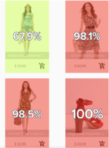
This metric allows you to decide whether taping on a zone impacts a user’s purchase or not. It allows you to quickly see which zones on a screen are contributing to conversions when they’re tapped on. This app metrics is useful for prioritizing a screen based on the tapped zones that led to conversions.
How it’s calculated
| Number of purchasers who tapped a zone |
| Number of users who tapped a zone |
 This app metric allows you to determine whether interaction (or tap) in a zone encourages or prevents visitors from converting. It allows you to quickly see which zones on a screen are contributing to conversions when they are tapped on, helping you prioritize a screen based on the tapped zones that led to conversions.
How it’s calculated
| Number of screen viewers who achieved the set goal |
| Number of screen viewers |
Now that you know all the essential app metrics you should be tracking, it’s time you get started. Provide your digital teams with the right tool for improving your app performance and UX by booking a demo with our experts. See how our analytics platform can help you take your app user experience to the next level! App metrics might include downloads, active users, session length, retention rate, daily active users (DAU), monthly active users (MAU), churn rate, and more. By tracking these numbers and understanding how they change over time, digital teams can make informed decisions about the app’s features and marketing strategies. Common metrics include active users, session length, app crashes, user retention, daily and monthly active users (DAU/MAU), and engagement by user segment. By tracking these metrics, teams can measure the performance of their app and determine which areas of the app need improvement. These metrics can include app downloads, user engagement, session length, average revenue per user (ARPU), customer lifetime value (LTV), user retention rate, and more. By tracking these metrics, teams can better understand their user base, identify areas of improvement, and optimize their app for better user experience.