![[visual] Striking the right balance between great aesthetics and strong functionality is tricky when creating web applications. Web apps need to be responsive and highly functional so that users can achieve their goals—but, at the same time, they also need to look good. This article will walk you through 6 examples of successful web app design to inspire you and help you create user delight with your own product. See how users experience your web app with Contentsquare Contentsquare pinpoints what works and what doesn’t in your design—so you can iterate, optimize, and roll out your web app successfully. Sign up now Get inspired with these 6 fantastic web app design examples Make sure your users have a frictionless experience interacting with features and content on your web application by understanding how these companies created brilliant web app designs. 1. Vimcar Vimcar is Germany’s top fleet management platform, and they’ve now expanded into both Austria and the United Kingdom, giving fleet managers, owners, and business leaders a 360 view of what’s going on at all times, letting them keep track of drivers, vehicles, and costs. Vimcar anticipates potential questions on its homepage and takes the first steps to guide users through their customer journey. They have a great section on how their software benefits businesses, as well as a handy graphic that shows how the Vimcar setup process works. By placing this graphic on their homepage, Vimcar shows users how easy and frictionless their set-up process is Vimcar’s design is based on satisfying user needs. They pinpointed their target audience’s concerns and understood their pain points by using tools like session recordings and heatmaps to identify blockers and where users were getting lost on their site. Contentsquare’s Heatmaps capability lets you jump to related session replays to see users navigating your web app in real time 💡 Pro tip: make sure potential leads feel informed and empowered after navigating through your homepage. Identify questions your ideal customer persona (ICP) has with Contentsquare’s onsite or offsite Surveys and answer them within your web app design. Here are some example questions your ICP might have: Can I trust the data and insights this app provides? How easy is it to set up and start using this product? What kind of support is available if I run into issues? Can this app integrate with my existing tools and workflows? 2. Vinted Vinted is an online marketplace where you can buy and sell secondhand and vintage clothing and accessories. Their web app design does a great job of accounting for both of these user objectives without things getting confusing. They’ve got a great CTA above-the-fold that prompts visitors to either start selling or learn more about how their platform works. Both buyers and sellers use Vinted, so it’s important that their homepage accounts for both of their objectives When you scroll down, Vinted shows a selection of currently-for-sale items to engage customers who want to shop, grouping pieces by item popularity, brand, and seller for a more intuitive browsing experience. Vinted organizes their listings with filters and search functions so it’s easy for users to browse 💡Pro tip: keep your users’ different motivations in mind throughout your design. If you’re creating a web app where users have multiple possible objectives—whether they have to decide between buying and selling or something else altogether—be sure they can easily figure out how to accomplish their tasks. Use Contentsquare Heatmaps to uncover where users are clicking and play around with placement, image links, and button size to see what yields the best results—then go deeper by adding a Survey or Feedback Collection widget to key pages. Invite your users to share their thoughts with a feedback button that’s always visible 3. Reed Reed.co.uk is one of the largest online career marketplaces in the UK, connecting people with professional opportunities and offering courses and career advice for both recruiters and job seekers. Reed.co.uk’s homepage sets users up for an intuitive browsing experience, allowing them to search for jobs according to industry, location, and whether they’re trending or not. Great web app design is especially important for online marketplace platforms like Reed because of the sheer amount of options they contain The Reed.co.uk search results page that pops up next also has a great, clear design that gives job seekers comprehensive information on available positions. They can filter their results by most recent or most relevant, save or hide listings, sign up for alerts, filter search distance, and apply for jobs in just a few clicks. Reed.co.uk’s job marketplace layout makes it easy for users to browse even though they’ve got over 1000 listings to make their way through 💡Pro tip: one of the most important web app design best practices is clarity. If you’ve got a web app like a marketplace, streaming service, or ecommerce store that’s got a lot of interactive content, make sure you prioritize navigation and filter functions in your design so users can easily move through tasks. 4. Zencastr Zencastr is an online podcasting software that allows creators to record and edit their podcasts within the platform itself. It features a free plan, studio-quality sound, HD video recording, automatic post-production, and secured cloud backup. Zencastr’s web app design is fantastic because of its user accessibility and intuitive navigation. It’s clear where users have to click to start recording, choose a recording type, chat with other participants, and ask for support. It also plainly shows users how to navigate back to the initial dashboard in case they get lost. Zencastr’s recording interface is simple enough for those without any production experience to navigate Great web apps are designed to feel intuitive for their users. It’s best to assume your users have minimal expertise, especially with technical functions like video recording or audio editing. Make it easy for users to get started with minimal onboarding, and use design elements like buttons and information panels to guide them through their customer journey. 💡Pro tip: to make sure your app stays usable and relevant over time, conduct qualitative and quantitative user research regularly. Contentsquare helps you do this by combining data like click maps (showing where users click most) with exit-intent surveys (asking users about their experience). For example, if a heatmap shows users aren’t clicking a call-to-action button, a quick survey can tell you if they find it confusing or hard to access. By blending real-time user behavior with their direct feedback, you can make smarter decisions to keep improving the user experience. Contentsquare’s exit-intent survey helps you go deeper into each user’s experience 5. The Plum Guide The Plum Guide is a luxury vacation rental platform that curates the best of the best listings. Their search engine lets customers browse and book award-winning homes all around the world, also allowing hosts to promote and rent out their properties. The Plum Guide provides guests with top-quality properties—so naturally, their web app design should reflect the same high standards The Plum Guide reflects its high-quality standards with a seamless, highly interactive web app design by Including a positive testimonial about their app Showcasing recognizable publications where they’ve been featured like Conde Nast Traveler, The New York Times, and Forbes Mentioning that their listed holiday homes are ‘award-winning’ and the ‘world’s best' Explaining their rigorous vetting process The Plum Guide uses design elements like the quote and partner icons above to establish credibility with their users. Their dynamic listings also help deliver a great user experience. As well as describing usual rental information like rules and check-in times, users can browse interactive sections about property highlights and nearby can’t-miss experiences. This listing from The Plum Guide shows highlights that are unique to the property, like taking a swim in the rooftop pool 💡Pro tip: build credibility with fast loading times, great usability, professional branding, and trust signals like testimonials and partner pages, ensuring they align with your branding. Contentsquare’s Session Replay capability helps you identify which credibility-building elements, like trust signals or customer reviews, capture the most attention. For example, if your replays show users engaging more with testimonials near the checkout page, you can optimize that placement for higher conversion rates. Analyzing session replays helps you notice the most popular credibility-building elements so you can optimize their placement 6. Skyscanner Skyscanner is an online travel agency where people can search for and book flights, reserve hotel stays, and find car rentals. The platform is known for helping travelers find great deals, and its user-friendly interface makes it easy to do so. Skyscanner’s web app design is simple for users to toggle back and forth between currency and languages; their top menu is clear and easy to navigate; and Skyscanner’s main search bar is front and center. Skyscanner is a fantastic example of great web app design because of the platform’s simple interface that lets users do exactly what they want The app’s interface also looks great on mobile—it’s been optimized for the smaller screen by removing the background image, adding white space, and moving the top menu. These changes make it easier for users to interact with the interface so they can access the features they want. Skyscanner’s web app design is perfectly optimized for mobile, which is great for on-the-go travelers 💡Pro tip: design your web app to look great and work well on devices of all sizes. In 2023, there were 313% more visits on mobile compared to desktop. Your web app needs to function just as well on mobile as it does on desktop or you’ll be missing out on a serious number of customers and conversions. What makes a strong web app design? There’s no one way to create a strong web application because user needs vary and are sometimes unpredictable, but implementing the following principles will help you shape the process: Your app should be easy for first-time users to navigate: most web apps that have steep learning curves or require too much teaching simply aren’t designed well. Many new users won’t have the patience to learn how to use them and move on to something else. Make your web app intuitive and accessible, and conduct user testing to validate your ideas. Your overarching visual design has to be strong: keep the principles of visual consistency, functional consistency, and external consistency in mind and make sure all the different elements work together to create an ideal customer experience. Make sure your web app is highly responsive: users interact with web apps on different screens like mobile devices, tablets, laptops, and desktop computers. Optimize across multiple devices to create a seamless navigation and interaction experience for your users, and monitor core vitals to ensure your application is responding quickly and smoothly. Guide users through the navigation experience: new users will need help scrolling and clicking their way through your web app, and you can provide that with great design. A clear top menu, cleverly placed buttons, and usability testing with product experience insights tools like Hotjar will help users quickly get acquainted with your web app. Be creative, but don’t go overboard: excellent web app designs strike the perfect balance between novelty and simplicity. Provide users with a product they haven’t seen before but feels familiar and manageable at the same time. “‘Creativity’ in app design needs to be applied in clever and subtle ways. Too many colored and moving parts on your screens, and users could get distracted and confused. Keep it simple, work on removing rather than adding, and ask yourself, ‘Is this information/content really useful at this point in this journey?’” Marco d’Emilia, Product Design Lead @Hotjar Create an effective web app design for your business While you can draw inspiration and get ideas from the successful examples of web application designs given above, you need to tailor your product to your unique business and user goals. Understanding your users’ needs and iterating until you get it right is key. With Contentsquare, you can make that process smarter, helping you fine-tune your design based on real user behavior—no guessing required! See how users experience your web app with Contentsquare Contentsquare pinpoints what works and what doesn’t in your design—so you can iterate, optimize, and roll out your web app successfully. Sign up now Frequently asked questions about web app design examples What is web app design? Web app design is the process of shaping how a web app appears, responds, flows, and operates so it meets its users’ needs. It encompasses how a web app’s interface looks, but also goes a step further and extends to everything from usability to accessibility and content placement to functionality. What makes a good web app design? There’s no single quality that makes web app design good, but brilliantly designed web apps certainly have a few elements in common. Here are the most important ones: Looks great and works great: an excellent web app is equal parts high-quality aesthetics and optimal functionality Beginner-friendly: your web app design should be easy for first-time users to navigate without much training A balance between creativity and simplicity: include unique design elements that are specific to your brand in your web app, but don’t go overboard Responsiveness: people access web apps from all kinds of different devices, so be sure that yours is optimized to work seamlessly and speedily from mobile, tablet, and desktop Guides users through the web app journey: design elements like a clear top menu and buttons can help users orient themselves on your site What are some examples of great web design? When you’re using some of your favorite web apps, consider what works about its design, what doesn’t, and how it could be improved. Some of our top examples of web app design include Vimcar: they anticipate questions on their homepage to make sure users feel confident and informed from the get-go Vinted: their design encompasses all the objectives their users have when navigating their app, like buying and selling Reed.co.uk: they’ve masterfully designed their search results pages so that it delivers comprehensive information while being easy to filter through and interact with Zencastr: they designed a user-friendly recording interface that’s easy enough for anyone to get the hang of, even without previous experience The Plum Guide: their web app design is consistent with their company branding and values and establishes credibility right away Skyscanner: their web app interface lets users seamlessly accomplish their goals whether they’re on a mobile, tablet, or desktop](http://images.ctfassets.net/gwbpo1m641r7/6IPxbA8OkcoJkfU1MqVJQH/298b889c244b2c765ac4eee2f01e6642/pexels-mikhail-nilov-8871854.jpg?w=1280&q=85&fit=scale&fm=avif)
Your users are already telling you what needs to change. The problem is that their feedback rarely arrives in a form your product team can act on immediately. One customer asks for a feature, another abandons onboarding, a support ticket points to a recurring problem, and hundreds of survey responses sit in a spreadsheet waiting to be read.
On their own, these signals are easy to misinterpret. The right product feedback tools bring them together, helping you collect feedback in context, connect what users say with what they actually do, and identify the issues worth fixing first.
We’ve compared 7 tools that take different approaches to the job, from conversational surveys and in-product research to feature request management and behavioral analysis, so you can find the one that fits how your team actually gathers and uses customer insight.
Key insights
The right product feedback tool depends on what you're trying to learn. Some tools excel at in-app surveys, others at feature request management or behavioral analysis—choose based on the feedback you need, not feature count alone.
Combining qualitative and quantitative feedback gives you the full picture. Tools that pair user comments with behavioral data (like session replays or heatmaps) help you understand not just what users say, but why they say it.
AI-powered analysis is now table stakes. Automated sentiment tagging, response summarization, and trend detection save hours of manual review and surface patterns you'd otherwise miss.
Integration matters as much as features. The best product feedback tool connects seamlessly to your existing workflows—whether that's Slack, Jira, or your analytics platform.
Product feedback tools comparison table
Tool | Best for | Key capabilities | Pricing |
|---|---|---|---|
Typeform | Conversational surveys | Custom forms, conditional logic, videoask | Free plan; paid plans available |
Contentsquare | Feedback + behavior context | Surveys, AI sentiment analysis, Session Replay, Heatmaps, Sense | Free plan; custom pricing |
Qualaroo | In-product nudge surveys | Nudge technology, sentiment analysis, branching logic | Free plan; paid from $19.99/mo |
Canny | Feature request management | Voting boards, roadmaps, changelogs, auto-close loops | Free plan; paid from $79/mo |
Sprig | In-product research | In-product surveys, AI analysis, session replays, heatmaps | Free plan; paid tiers available |
Pendo | Digital adoption + feedback | In-app surveys, feature analytics, in-app guides | Free plan; custom pricing |
Productboard | Feedback-driven prioritization | Centralized feedback, AI insights, roadmap planning | Paid plans available |
7 best product feedback tools to add to your tech stack
Product feedback tools give you a deeper understanding of what your users love about your product—and what they’d like you to improve. Tapping into quality insights will help you feel closer to customers and empathize with their frustrations and needs. Here are 7 of the best tools worth considering for your tech stack:
1. Typeform: best for conversational surveys
Typeform's feedback tool helps you create surveys, polls, and feedback forms that encourage user interaction. With its pre-designed templates and built-in photo and video libraries, Typeform makes creating surveys and soliciting user feedback an intuitive process.
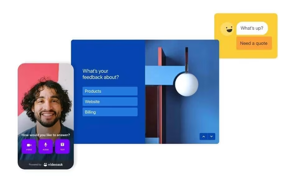
Its conditional logic feature lets you ask your customers questions based on their previous answers—which is ideal if you're trying to narrow down insights to a specific product feature.
In addition to its surveys and polls, Typeform's videoask tool helps you collect user insights through face-to-face interviews. It also integrates with a range of third-party tools, letting you connect feedback data to your existing workflows.
Other Typeform features let you:
Create more conversational product feedback surveys with single-page questions
Embed surveys on your website or share links in emails or on social media
Generate reports based on survey results
Connect and share data with other tools to analyze survey data in-depth
🎥 Real-world exampleAudience intelligence tool SparkToro uses Typeform to find and understand the right audience for its product. It sets up a form for people to sign up for its Beta launch, while also collecting information about its ideal customer profile (ICP). Typeform helped SparkToro identify users' struggles and develop its product to address common pain points better.
2. Contentsquare: best for pairing feedback with behavioral context
Contentsquare (that’s us 👋) is an all-in-one customer experience intelligence platform that helps you empathize with your users, understand their behavior, and bring the voice of the customer (VoC) into your decision-making.
![[Visual] Session replay - Triggered recording](http://images.ctfassets.net/gwbpo1m641r7/3x0k1KqlgQqa818JvI8mni/d323e94e4fcf5afeb2fd870577f06d15/Triggered_recording.png?w=1280&q=85&fit=scale&fm=avif)
Key capabilities:
Surveys: build one in seconds from 40+ templates or by telling the AI generator what you want to learn, trigger it on a specific page or action, and let AI tag responses by topic and sentiment instead of reading all of them
Session Replay: watch the session behind a piece of feedback. AI summaries compress one session, or up to 100, into key insights and friction points with time-coded links that jump straight to the moment
Heatmaps: check whether users ever saw the element they’re complaining about, and which parts of the page they scroll past
Frustration Score: automatically scores every session from 0 to 100 using signals like rage clicks, JavaScript errors, and form resubmissions, so you can jump straight to the sessions where users struggled most
Sense: ask in plain language why users are abandoning a flow, get the analysis back with the data behind it, then keep asking follow-ups
![[Visual] Sense-analyst](http://images.ctfassets.net/gwbpo1m641r7/14lhHZLJJzj23AMqlXZ2al/626a4c6f575706b0c7c9e943c2c08bd8/Sense-analyst.png?w=1280&q=85&fit=scale&fm=avif)
Contentsquare's Sense Analyst in action
🎥 Real-world example
Japanese golf ecommerce giant Golf Digest Online (GDO) couldn't work out why its new golf course reservation system was producing so few bookings. Contentsquare's Session Replay showed users hitting an error that said "the start time is sold out" no matter which timeslot they picked. Replays also caught people rereading the terms and conditions or backing out of the flow entirely after ticking the acceptance box. Fixing what the recordings surfaced contributed to a 2.6-point conversion uplift.

Watch the session behind an error to see what the user did before, during, and after it
3. Qualaroo: best for in-product nudge surveys
Qualaroo's product feedback software helps you collect in-product feedback and get insights the moment a user engages with your website or web app. In-product surveys have a much higher response rate and provide feedback responses that more accurately capture user sentiment.

The platform's Nudge technology lets you send survey questions based on user actions—like which pages they visit, how long they stay on the page, and how many times they visit a specific page.
Qualaroo also segments users by pricing tier, how long they've been a customer, and whether or not they're in a trial period, making it easy to specify your reach and send the right questions to the right audience.
Qualaroo's software also helps you:
Collect quantitative and qualitative feedback like user comments from Net Promoter Score® (NPS®), customer satisfaction (CSAT), and Customer Effort Score (CES) surveys
Conduct AI-powered user sentiment analysis based on keywords found in user feedback
Put surveys directly in product design templates and easily test out product changes and design prototypes
Utilize branching logic for surveys to ask users questions depending on the information that they already provided in previous responses
🎥 Real-world exampleOnline learning and teaching platform Udemy uses Qualaroo to gain insights from students and make product adjustments to better cater to their needs. For example, it asked students to rate the quality of machine-generated captions on their courses. Based on their responses, Udemy modified its caption-editing tool and made courses more accessible to students who speak different languages all around the world.
💡Pro tip: easily connect Contentsquare with thousands of tools, including Qualaroo, Optimizely, and Intercom. Other popular Contentsquare integrations include Slack, Jira, and Microsoft Teams.
![[Screenshot] Dynamic conditions](http://images.ctfassets.net/gwbpo1m641r7/1REE5aTWYacTQWSo7AbLG6/f1ebc43883bafd6f32666107c76cb746/Dynamic_conditions.avif?w=856&q=85&fit=scale&fm=avif)
Send information automatically between Contentsquare and Qualaroo
4. Canny: best for feature request management
Canny gives product teams a structured way to collect, organize, and prioritize feature requests—so you're building what your users actually want, not guessing.
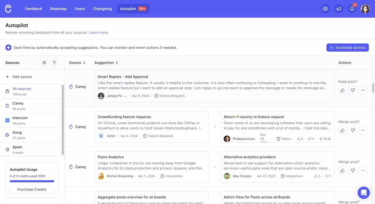
At its core, Canny provides public and private feature request boards where users can submit ideas and vote on the ones that matter most. This crowdsourced prioritization helps you see which requests have the strongest demand without manually sorting through support tickets and Slack messages.
Canny also offers built-in roadmap views, so you can share what's in progress, planned, or under review. When a requested feature ships, the platform automatically notifies users who voted for it through changelogs—closing the feedback loop without manual follow-up.
Other Canny features let you:
Categorize and tag feedback by product area, user segment, or business impact
Connect with tools like Jira, Intercom, Salesforce, and Slack to centralize feedback from multiple sources
Use AI-powered analysis to detect common themes across requests
Track feature request trends over time to inform your product roadmap
🎥 Real-world exampleProduct teams at companies like Ahrefs and CircleCI use Canny to centralize feature requests and let users vote on priorities—replacing scattered feedback across email, chat, and support tickets with a single system of record that connects user needs directly to the product roadmap.
5. Sprig: best for in-product research
Sprig helps product and UX teams run targeted research inside their product—capturing feedback at the exact moment users interact with a feature, flow, or page.
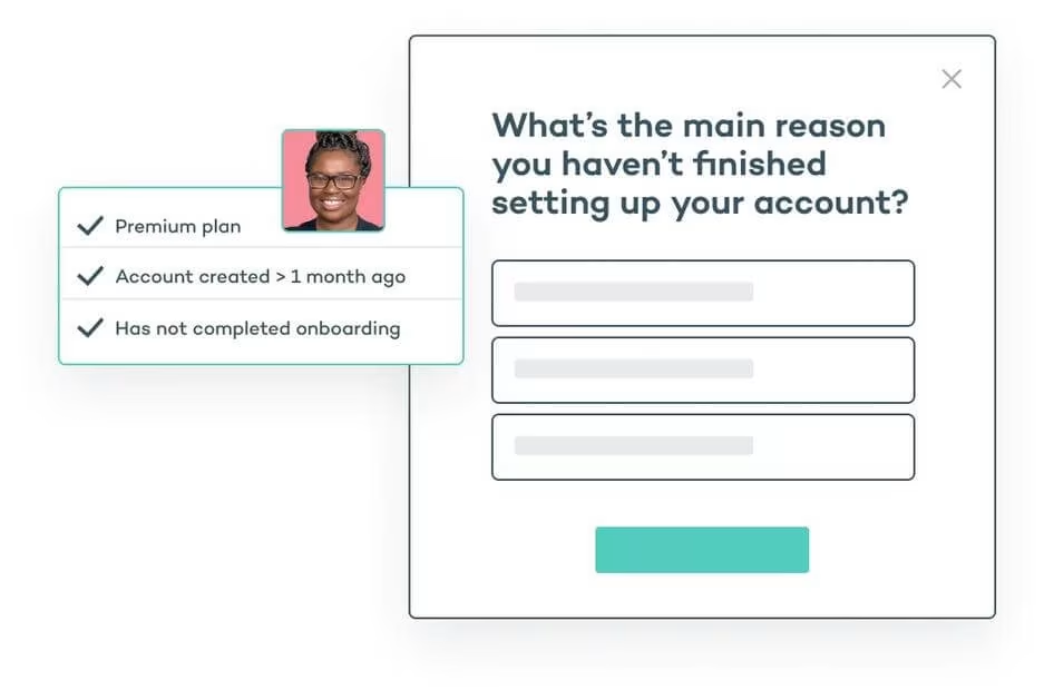
Sprig's in-product surveys trigger based on user actions (like completing onboarding, using a new feature, or encountering an error), so you collect feedback with full behavioral context rather than relying on recall. Its AI analysis engine automatically surfaces themes, sentiment patterns, and actionable recommendations from open-text responses—turning hundreds of survey answers into clear priorities in seconds.
Beyond surveys, Sprig includes session replays and heatmaps that let you see exactly how users interact with your product alongside their feedback—so you understand not just what users think, but what they were doing when they formed that opinion.
Other Sprig features let you:
Run concept tests and prototype feedback studies directly within your product
Segment respondents by user properties, actions, or cohorts
Integrate with tools like Segment, Amplitude, and Mixpanel for precise targeting
Use AI-generated reports to share findings across teams without manual analysis
🎥 Real-world exampleProduct teams use Sprig to run targeted in-context surveys at key product moments—like right after onboarding or when a user encounters a new feature. By pairing survey feedback with session recordings, teams pinpoint where experiences break down and prioritize fixes based on real user behavior rather than assumptions.
💡 Pro tip: targeted surveys only find the problems you already suspected. Contentsquare's feedback widget catches the rest: it sits at the edge of the page so users can rate their experience, leave a comment, and screenshot the exact element that tripped them up. Open the session replay behind any response, or push it straight to Jira, Asana, or Linear.
![[Visual] Feedback button - How would you rate your experience](http://images.ctfassets.net/gwbpo1m641r7/6zpie5F6Gwd4oyqXaxBfcN/b7e9b7f3bfcc6265f47b5294d8fec319/Feedback_button.png?w=1280&q=85&fit=scale&fm=avif)
Users can rate their experience and screenshot the page element they're reacting to
6. Pendo: best for digital adoption + feedback
Pendo helps you capture and prioritize in-app feature requests and quickly spot revenue-generating opportunities.
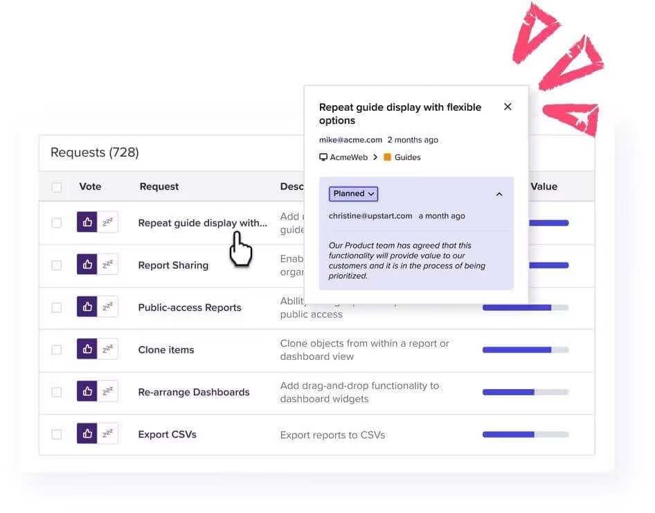
Pendo's in-app surveys let you segment users based on their activity, so you can solicit feedback for specific product features. This means that if users tried a newer version of a feature or one that you're trying to update, you can send them a survey to understand their experience while using that specific feature.
Use Pendo to quantify feature adoption and see which product features customers use the most. This data shows you where you need to improve awareness about certain features, change the user onboarding process, and make improvements to the overall user journey.
Here are some other ways to use Pendo:
Monitor user activity with product analytics and make data-informed decisions
Deliver in-app guides to spread awareness about lesser-known product features
Increase response rates with surveys targeted to specific user segments and product interactions
🎥 Real-world exampleCybersecurity leader Symantec uses Pendo to collect user insights and develop their cloud-based application. In its initial phases, Pendo's product team was able to fix and adjust the cloud platform based on problems that users were experiencing. Later, when many users needed to migrate from Symantec's on-premises solution to its cloud-based app, Symantec used Pendo's in-app guides to support customers during their transition.
7. Productboard: best for feedback-driven prioritization
Productboard's product management software helps you prioritize product updates based on user needs. The tool lets you build a roadmap based on customer feedback, and uses AI to transform feedback into actionable insights. By using this feature, you place customer needs at the center of your product strategy.
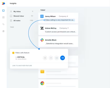
Productboard's Insights Automation tool lets you automatically filter and send relevant customer feedback information to the right teams. This tool gives your team visibility and makes product updates much more efficient, allowing you to specify whether product updates are "critical" or "nice to have."
Use Productboard to:
Consolidate product feedback from surveys, sales conversations, and support tickets in one place
Collect feedback about future product development ideas and source new ideas from customers
Share and celebrate new product updates with customers
🎥 Real-world example
Propeller Health uses Productboard to identify customer needs, despite having product feedback spread out across various channels. While onboarding with the tool, Propeller Health imported customer service tickets and past feedback from Slack onto Productboard. The company used Productboard to consolidate information and quickly recognize persistent problems, which helped it make product improvements based on feedback from customers.
How to choose the right product feedback tool
Keep in mind that there's no one-size-fits-all product feedback tool. When it comes to choosing the right software, you need to pick one (or more) tailored to your specific business and customer goals.
Consider these 5 key factors when choosing a product feedback tool:
The quality and kinds of product feedback you want to collect: for example, some tools work well to launch on-site user surveys but are not the best for collecting other forms of feedback, like social media mentions. Consider your goals when choosing a tool to collect product feedback.
How you'll compare quantitative and qualitative data: some tools help you collect data but have no way of displaying it in an analytics dashboard. Find a tool that lets you collect both qualitative and quantitative data to fully understand your customers' needs—and shape strategic product decisions.
Check integration compatibility. Your feedback tool should connect to the platforms your team already uses—whether that's Jira for engineering, Slack for communication, or Salesforce for customer data.
Look for AI-powered analysis. Manually reading through hundreds of open-text responses doesn't scale. Tools with automated sentiment analysis, theme detection, and AI summaries help you spot patterns faster and share findings across teams without hours of manual work.
Match scale to your team. A 5-person startup has different needs than a 500-person product org. Evaluate pricing, user limits, and the complexity of setup before committing.
FAQs about product feedback tools
Some of the best ways to get product feedback include: Surveys Feedback widgets Customer emails Focus groups Community forums and feature request boards


![[Visual] [Guide] Customer retention - Saas Stock image](http://images.ctfassets.net/gwbpo1m641r7/2Lmp9XhnD3Za2Q7fDglUJB/635404b1e617e2aa950703f719c0f0fa/Woman_with_Curly_Hair_Using_Tablet_on_Couch_Indoors.jpg?w=624&q=85&fit=scale&fm=avif)