Today, the biggest branch and storefront for a typical financial services (FinServ) company is its website. And what customers expect from digital, and from the digital banking customer journey, is convenience.
The last thing they want from a digital experience is friction. Unfortunately, our 2023 Financial Services Digital Experience Benchmark report shows that over one in four banking sessions last year frustrated users.
In this article, we’ll run through three ways your banking customer journey could be frustrating visitors.
We’ll also explain how our digital experience analytics (DXA) platform helps banks like yours to create frustration-free experiences that retain customers and drive conversions and growth.
Want to find out more about frustration (and consumption, and traffic trends, and much more) in FinServ experiences? You should read our Benchmark report ASAP.
1: Your customer journey is too slow
Our first obstacle: Slow loading pages, which our Financial Services Benchmark report pinpoints as the leading cause of user frustration in insurance and banking customer journeys last year.
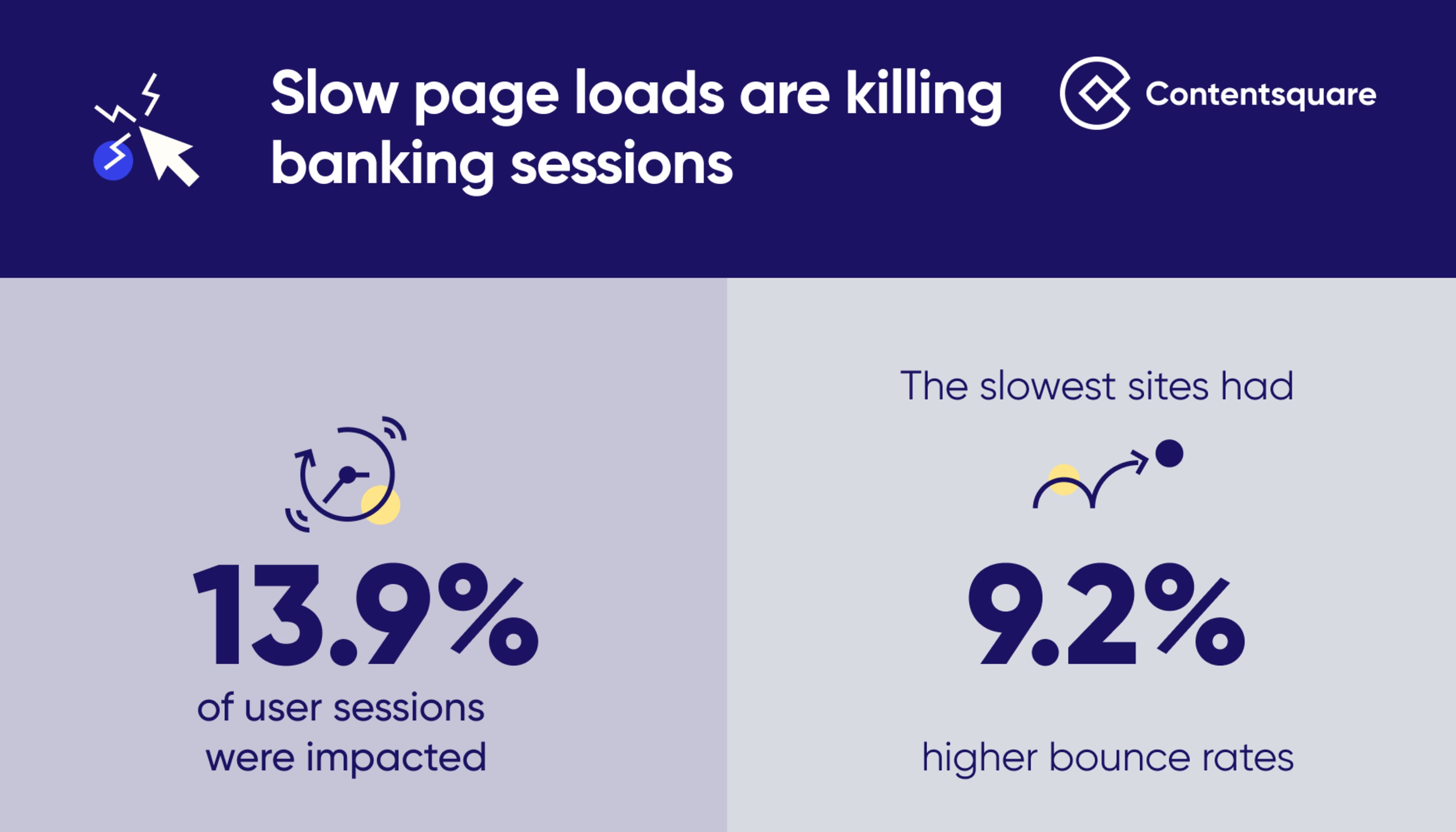
In 2022, slow page loads impacted 13.9% of financial services sessions—and sites with load times over two seconds have 9.2% higher bounce rates than those that load in under one second.

How slow page loads are negatively affecting the insurance and banking customer journey
Our research shows that FinServs are working on reducing site speed. Site load time decreased on financial service websites by -9.1% year-over-year in 2022.
This is excellent news for FinServ customers. But it puts further pressure on banks and insurance providers to ensure they’re meeting heightened expectations.
To ensure your site isn’t falling behind, you’ll need a sophisticated speed analysis tool—which (among many other things) Contentsquare provides.
2: Your customer journey features confusing or malfunctioning pages
Page design can frustrate visitors in all sorts of ways: Users don’t know where to click next, or miss out on crucial (or simply delightful) content because it’s placed too far down the page, or are overwhelmed by too many options or too much information.
Once again, a DXA platform can make all the difference here. Contentsquare customers can leverage technologies such as Zone-based Heatmaps to see where customers are (and aren’t) clicking and scrolling—and redesign their pages to optimize experiences.
For example, using our platform Natwest Group found that its Mortgage Calculator tool’s ‘compare’ functionality was only being used by 6% of customers. This led them to make changes to the page that drove an estimated £500k in additional revenue.
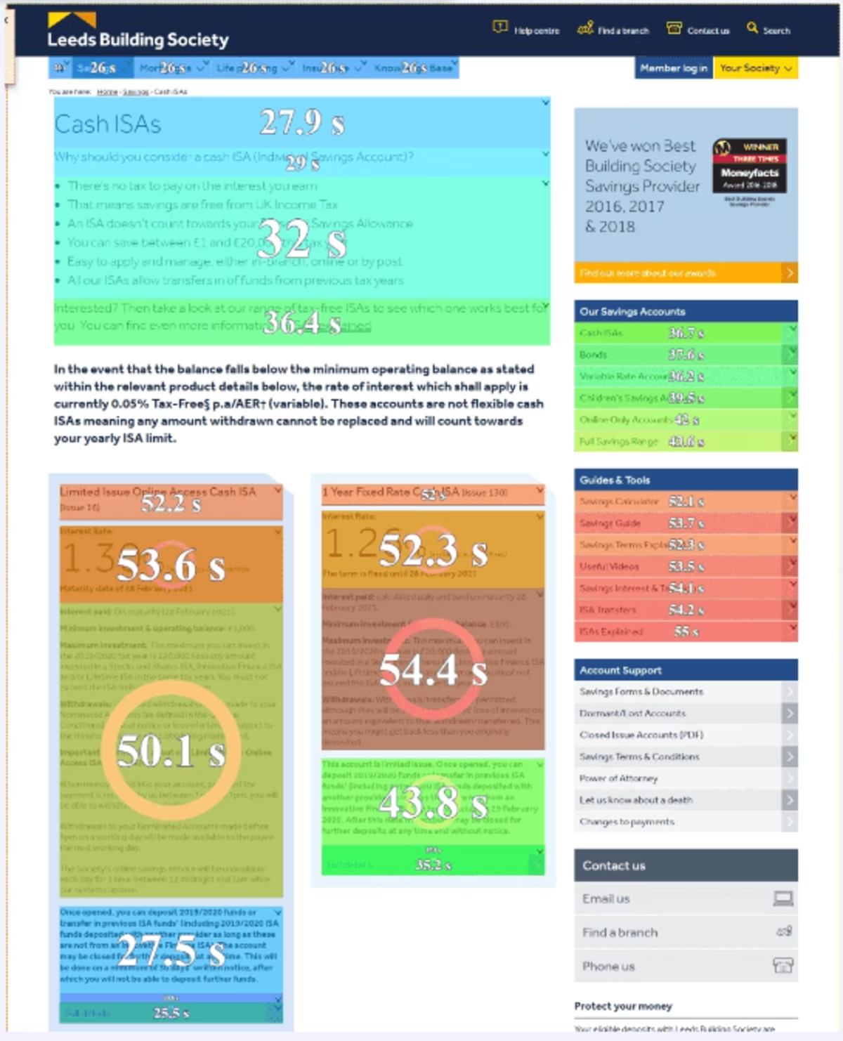
Here’s another example: In an effort to improve conversions by reducing distractions, Leeds Building Society used Zone-based Heatmaps to identify areas of its product pages that customers were spending too much time on. (See screenshot below.)

Exposure times on Leeds Building Society’s website as shown via Zone-Based Heatmaps
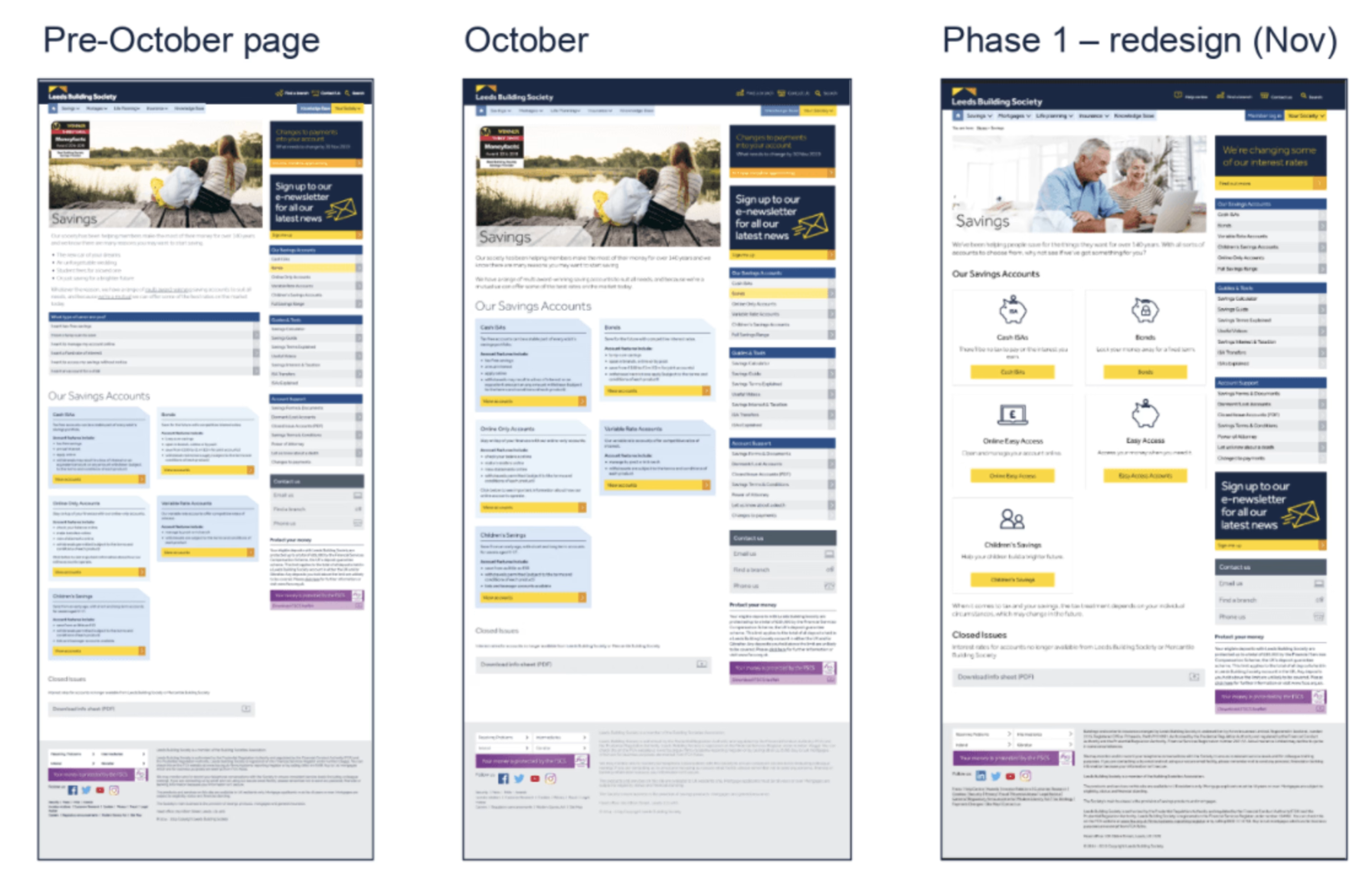
Their findings led them to simplify pages (see screenshot below), ultimately increasing average conversion rates by +40%—with some pages increasing conversion rate by +80%.

Simplifications to product pages made by Leeds Building Society as a result of Contentsquare analysis
Client-side technical errors are another big cause of frustration. When buttons don’t work and forms won’t fill, customers get frustrated fast.
Given the size and complexity of most websites, you’ll likely need an AI-driven tool like our own CS Insights to bring technical errors to your attention before they do too much damage. You’ll also need investigative tools like Session Replay to uncover the root cause of user frustration through a user’s-eye perspective.
3: Your customer journey falls short on in-page support
When users hit a snag in your experience, whether it’s a technical issue or a stage in a process they don’t understand, they need to be able to access in-page (or in-app) support ASAP.
The clock is ticking, and if you force customers to root through your website for an FAQ or wait in a queue for your contact center for an issue that could be resolved without a conversation, they’ll feel frustrated—and undervalued—fast.
Making these options available to your site users is up to your digital team, of course. But Contentsquare can help you identify precisely where in your journeys in-page support (whether that’s self-support or live chat) is most needed.
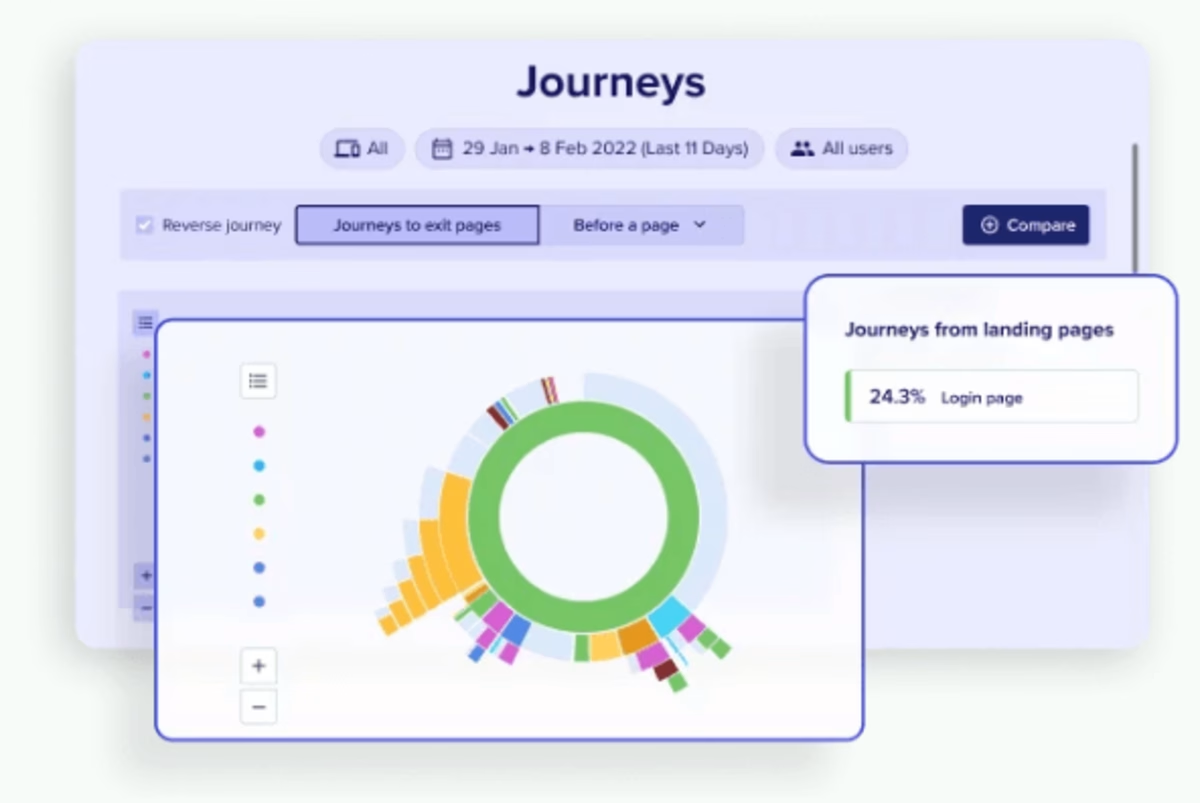
For example, our Customer Journey Analysis tool can help you detect and zero-in on bottlenecks and dead-ends in your banking customer journey where users are routinely getting stuck, or doubling back, or exiting altogether.

Discover where customers need support with Customer Journey Analysis
A frustration-free digital banking customer journey? It’s possible with Contentsquare.
Banks that eliminate frustration from their journeys identified in our benchmark report will lose less business (in the form of bounces) and generate more revenue (in the form of conversions).
Of course, that’s not all they need to do. You can learn what else should be on your to-do list by reading our benchmark report, or get a quick overview in our blog summarizing 5 reasons to read it.
But whether it’s removing frustration, monitoring and stimulating user activity, understanding session consumption or getting insights into your incoming traffic and user segments, Contentsquare has you covered.
Watch the six-minute demo below to see how you can start fixing frustration and dialing up the delight in your banking or insurance customer experience with Contentsquare this year.
Jack is Content Writer for Global Marketing at Contentsquare. He’s been creating and copywriting content on both agency and client-side for seven years and he’s ‘just getting warmed up’. When he’s not creating content, Jack enjoys climbing walls, reading books, playing video games, obsessing over music and drinking Guinness.
