![[CSQ for ecomm] [Visual] Heatmaps](http://images.ctfassets.net/gwbpo1m641r7/3A9M0wOiUPx80VHT66mZkN/070d10f4da5b1132e44c1705a1092afc/pexels-viktoria-slowikowska-5332244.jpg?w=3840&q=100&fit=fill&fm=avif)
You spend time and money bringing visitors to your ecommerce store. But once they’re there, how do you drive conversions and create a shopping experience they’ll love coming back to?
Enter: heatmaps—the quick, visual way to see what attracts attention and what visitors ignore, so you improve the customer experience and help drive revenue.
This guide will discuss what ecommerce heatmaps are and why using them is beneficial for ecommerce retailers. You’ll also discover 7 easy ways to use heatmaps to improve key ecommerce metrics—from improving the click-through rate on your call-to-action (CTA) buttons to reducing cart abandonment—with real-world examples.
What’s an ecommerce heatmap?
An ecommerce heatmap is an aggregated graphical representation of how visitors interact with any page on your online store. You can see where users click, scroll, and move their mouse across a page—areas that get the most attention appear as the “hottest” (or most brightly colored) parts.
There are 3 main types of heatmap you can set up on your ecommerce website:
Click maps, which show where people click (or tap on mobile)
Scroll maps, which show how far visitors scroll down the page
Move maps, which show all mouse movement across a page, even when nothing is being clicked
With Contentsquare’s Heatmaps capability, all heatmap types are captured automatically across your whole website. You can toggle between them with a single click:

Contentsquare’s Heatmaps capability lets you toggle between different map types
With Contentsquare, you can also capture Zone-based heatmaps, which divides your page elements into discrete segments, or ‘zones’. Filter these to see metrics tied to select business goals, such as:
Revenue
Conversion rate per click
Conversion rate per hover
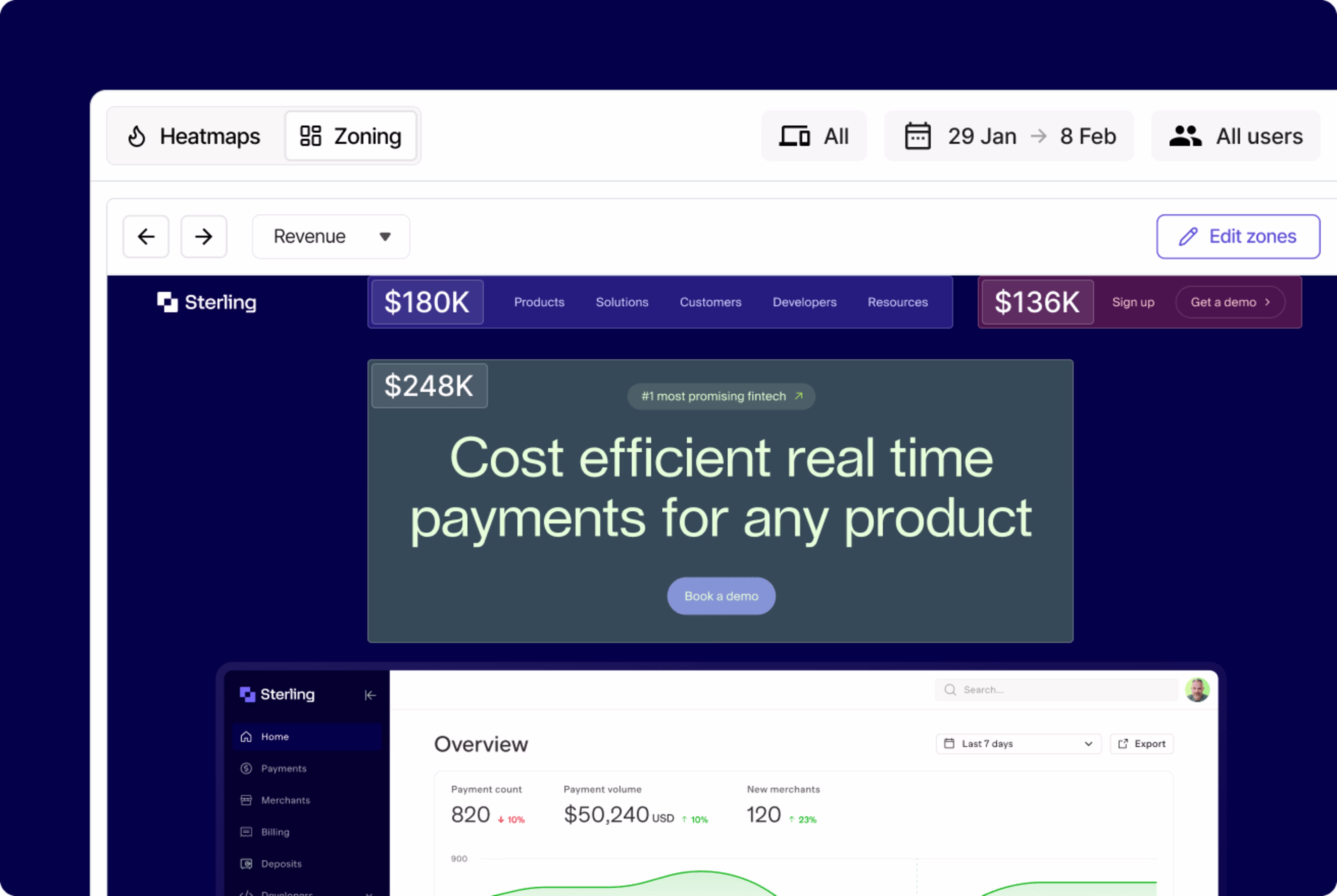
Zone-based heatmaps reveal the revenue associated with different areas of a page
This is particularly useful for ecommerce sites, showing which content blocks are contributing most to conversion and revenue.
Why use heatmaps on your ecommerce store?
Heatmaps give you a simple, visual overview of where you’re capturing (and losing) customer attention. They complement traditional analytics tools because
You don’t need technical knowledge to understand them. Anyone can set up a heatmap, and they’re a lot less complicated to analyze than rows of analytics data.
They’re easy to share. Share your analysis with digital teams and get buy-in from stakeholders (it’s hard to argue with the visual evidence a heatmap provides).
You can fix bugs and get quick wins. Spot easy-to-miss but simple-to-fix issues that have a big impact on visitor behavior.
💡 Pro tip: use Heatmaps to get fresh ideas for A/B tests and optimizations on elements that could be added, tweaked, or removed to improve customer experience and conversions.
7 easy ways to use heatmaps to grow your ecommerce store
Not sure exactly how to use heatmaps to optimize your ecommerce store? Here are 7 ideas to get you started, with real-world examples.
⭐ Caveat: even if you copy the methodologies below exactly, remember that you can’t expect the exact same end result—what works for one store may not work for yours.
1. Make sure important CTAs get clicked
Most pages on your ecommerce store will have a main CTA: a button, graphic, or link you want people to click on, in order to move to the next stage of the customer journey. Heatmaps can reveal whether users are seeing your CTAs or whether they’re missing them and getting distracted by other content.
🌐 Real-world example: outdoor activewear brand The North Face analyzed the CTAs on their ‘Gift Guide’ page using Contentsquare’s scroll heatmap. They realized their hero banner, which featured important CTAs, was sitting below the fold—and a large percentage of their customers weren’t scrolling down far enough to see it.
![[Visual] Contentsquare’s Heatmaps helped The North Face easily see how far customers made it through their Gift Guide](http://images.ctfassets.net/gwbpo1m641r7/7lfUYkYeBCADc9NfQbVZHe/dae81dc23850d59cb33b1f334dcbb622/desktop-mockup-northface-1024x660-1.avif?w=3840&q=100&fit=fill&fm=avif)
Contentsquare’s Heatmaps helped The North Face easily see how far customers made it through their Gift Guide
This pointed the way to an easy win. They redesigned the page so that more users would see their CTA, and instantly increased that CTA’s exposure rate by +50%.
2. Optimize for mobile conversions
Mobile ecommerce (stores accessed by customers on smartphones or tablets) represents around 68% of online spend globally. If visitors to your website can’t navigate your store on smaller screens, you’re likely missing a sizable chunk of revenue. Analyzing your mobile site with heatmaps helps you understand customer behavior on this essential channel.
💡Pro tip: use Contentsquare to check to see what percentage of your ecommerce site’s sessions are conducted on mobile compared to desktop.
Simply:
Head to Dashboards and click on the “Track key metrics to monitor and optimize your site” template
Find the line graph titled “Number of session / Conversion rate”
Click on the 3 dots in the top-right corner, this will open a new sidebar
Select “Edit” and then scroll down until you see “Line chart 1”. Click on this text and you’ll see which devices this line represents. Select “Desktop”, and deselect all other devices. Under “Metric”, select “Number of sessions”.
Scroll until you see “Line chart 2”. Click this text and then toggle this line to only count mobile sessions. Under “Metric”, ensure “Number of sessions” is selected.
Hit “Save”. You now have a widget that shows how many of your recent user sessions were on mobile and how many were on desktop.
![[Visual] Your finished widget should look something like this. Note the desktop and mobile icons that reveal which line of your graph corresponds to which device type.](http://images.ctfassets.net/gwbpo1m641r7/1yTOZKDRXlOPKlp7jYGNhe/cc528a699656262d83ce0bd85b57e955/Screenshot_2025-03-03_at_14.41.58.png?w=3840&q=100&fit=fill&fm=avif)
Your finished widget should look something like this. Note the desktop and mobile icons that reveal which line of your graph corresponds to which device type.
Once you’ve determined how important mobile users are to your store, view mobile heatmaps on your most important pages to see how visitors tap and scroll.
🌐 Real-world example: luxury jewelry business De Beers used Contentsquare’s experience intelligence platform to create scroll heatmaps for their mobile product detail pages (PDPs). Analyzing the data, they noticed a large percentage of customers were scrolling all the way to the bottom of these pages, even though the “Add to Bag” CTA was at the top of the page.
They realized there was a chance that mobile users were accidentally skipping past this CTA. They tested adding a sticky “Add to Bag” button to the page—and soon saw a +10% uptick in conversions.
![[Visual] The ‘Add to bag’ CTA on De Beer’s PDPs —before and after the redesign](http://images.ctfassets.net/gwbpo1m641r7/6HD9kU8LJZj1lvNlKQFgAK/6605e5cc01ed8674dc4156162e3c75b1/de-beers-1-3.avif?w=3840&q=100&fit=fill&fm=avif)
The ‘Add to bag’ CTA on De Beer’s PDPs —before and after the redesign
3. Spot and fix bugs and usability issues
Every time a visitor comes across a bug or issue, like a broken link or a pop-up that won’t close, they’re one step closer to navigating away and giving their business to one of your competitors.
A quick way to find areas of frustration is to filter your heatmaps to only show data from users who rage clicked—those who clicked or tapped repeatedly on the same spot.
![[Visual] Filter your users by rage click to reveal any UX issues](http://images.ctfassets.net/gwbpo1m641r7/3msGYWFcXypqJu7U6tMuHq/10325d40a1adcd32db776a7214428872/Rage_click_.png?w=3840&q=100&fit=fill&fm=avif)
Filter your users by rage click to reveal any UX issues
You’ll find exactly which elements users found confusing, like a non-linked asset they expect to take them somewhere, or a broken form field. With Contentsquare, you can follow up by viewing session replays of users who interacted with this element, to see what individual visitors did before and after rage clicking.
🌐 Real-world example: Australian ecommerce retailer MyDeal analyzed their checkout page using Contentsquare’s Heatmaps capability and noticed customers were often rage clicking on a credit card form field—indicating a UX issue.
![[Visual] Contentsquare’s Heatmaps capability revealed that user frustration on MyDeal’s checkout page had suddenly increased by 5x on a credit card form](http://images.ctfassets.net/gwbpo1m641r7/4Pw4jHKSbojA0JmJZ4fk0U/96a561a6292aa757acba3b854cc18b31/Group_26086412.avif?w=3840&q=100&fit=fill&fm=avif)
Contentsquare’s Heatmaps capability revealed that user frustration on MyDeal’s checkout page had suddenly increased by 5x on a credit card form
The team’s analysts and developers dug into the problem, found a solution, and quickly increased their conversion rate by 2%.
💡 Pro tip: for a new perspective on heatmaps, use Contentsquare’s Session Replay capability. Get more context behind why visitors click and scroll on certain elements and what they do next. You can skip to the moment a rage click happened, and leave comments on videos for your colleagues to jump to.
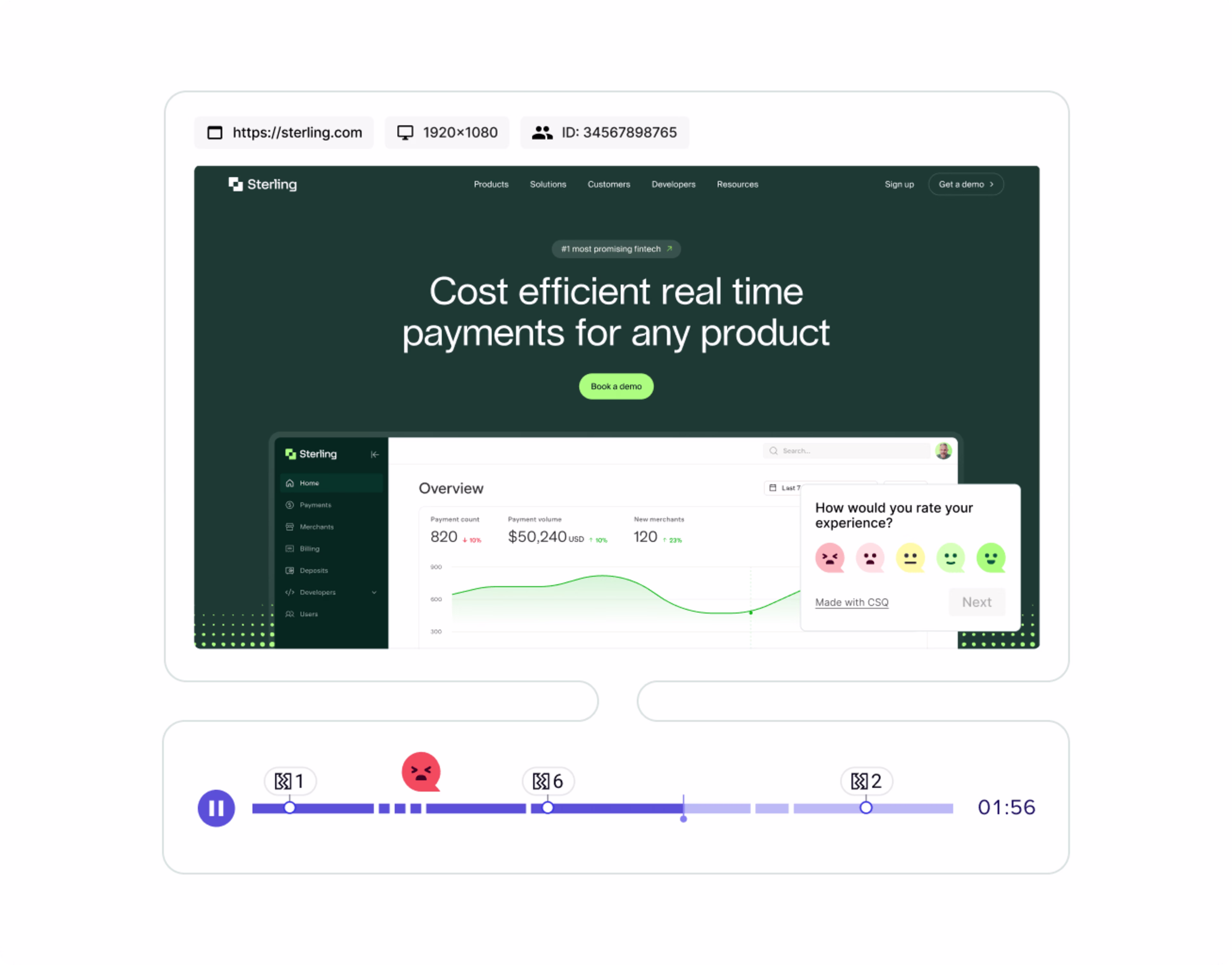
Contentsquare’s Session Replay capability gives you an over-the-shoulder view of what your users see when navigating your site
4. Nail your information hierarchy
Content design for ecommerce sites is all about giving customers what they want. With heatmaps, you can ensure that your best performing content blocks—the information your users respond to best—is the first information they’re shown.
🌐 Real-world example: lingerie retailer Etam analyzed the order of their product subcategories by creating a zone-based heatmap in Contentsquare, filtered by “Attractiveness”.
They saw their subcategories weren’t listed in order of attractiveness (from left-to-right). By simply swapping around the order, Etam achieved a +13% increase in conversion rate per click on one of their top categories.
![[Visual] Attactiveness of Etam’s top subcategories after optimization, ordered left-to-right, with the most attractive category on the left](http://images.ctfassets.net/gwbpo1m641r7/4dKberYT7itOfYDDMdoeBQ/15e6e91263d1e48a25394f3e03d717bc/Attractiveness-rate-of-Etams-Love-Prices-top-subcategories-after-optimization.avif?w=1920&q=100&fit=fill&fm=avif)
Attactiveness of Etam’s top subcategories after optimization, ordered left-to-right, with the most attractive category on the left
5. Design better landing pages
Landing pages can make or break the success of an ecommerce site. Customers often arrive to them cold—potentially via ads or affiliate links—and usually lack context about your brand. Landing pages need to give users the information they need, fast. Heatmaps can help ensure you’re doing this.
🌐 Real-world example: The U.K.'s leading mattress and bed retailer Dreams used Contentsquare’s Heatmaps to analyze their Black Friday mobile landing page.
They realized their “Shop by category” feature was the page’s most-clicked element—but it was at the very bottom of the page. Based on this insight, they moved it up to the top of the page, which resulted in a +150% increase in click rate on mobile devices.
![[Visual] Dream's Black Friday landing page before (left) and after (right) optimization](http://images.ctfassets.net/gwbpo1m641r7/2vaTOoz5UzhOY3gCIg2zoM/0d14056cd021e86b6a117942aec51ce6/dreams-shop-by-category.avif?w=3840&q=100&fit=fill&fm=avif)
Dream's Black Friday landing page before (left) and after (right) optimization
6. Reduce cart abandonment
Cart abandonment—when people bounce away from a website after adding items to their shopping cart—is the final hurdle stopping your visitors from becoming customers. Heatmaps help you reduce cart abandonment (and therefore increase sales) by giving you clues about what’s stopping people from making purchases.
🌐 Real-world example: footwear retailer Clarks used Contentsquare’s zone-based heatmaps to analyze their product description page, filtered by clicks. They realized more users were interacting with the “Size” and “Add to Cart” buttons than the “Width selector”—a required step to add a shoe to the checkout cart. Customers didn’t realize they had to select a width in order to check out, which increased their Frustration Score.
After seeing this behavior, the digital team decided to pre-select widths when only one width-fit was available. This removed friction and significantly increased the site's checkout rate. In fact, this one simple change drove $1.1M (£900K) in annual revenue.
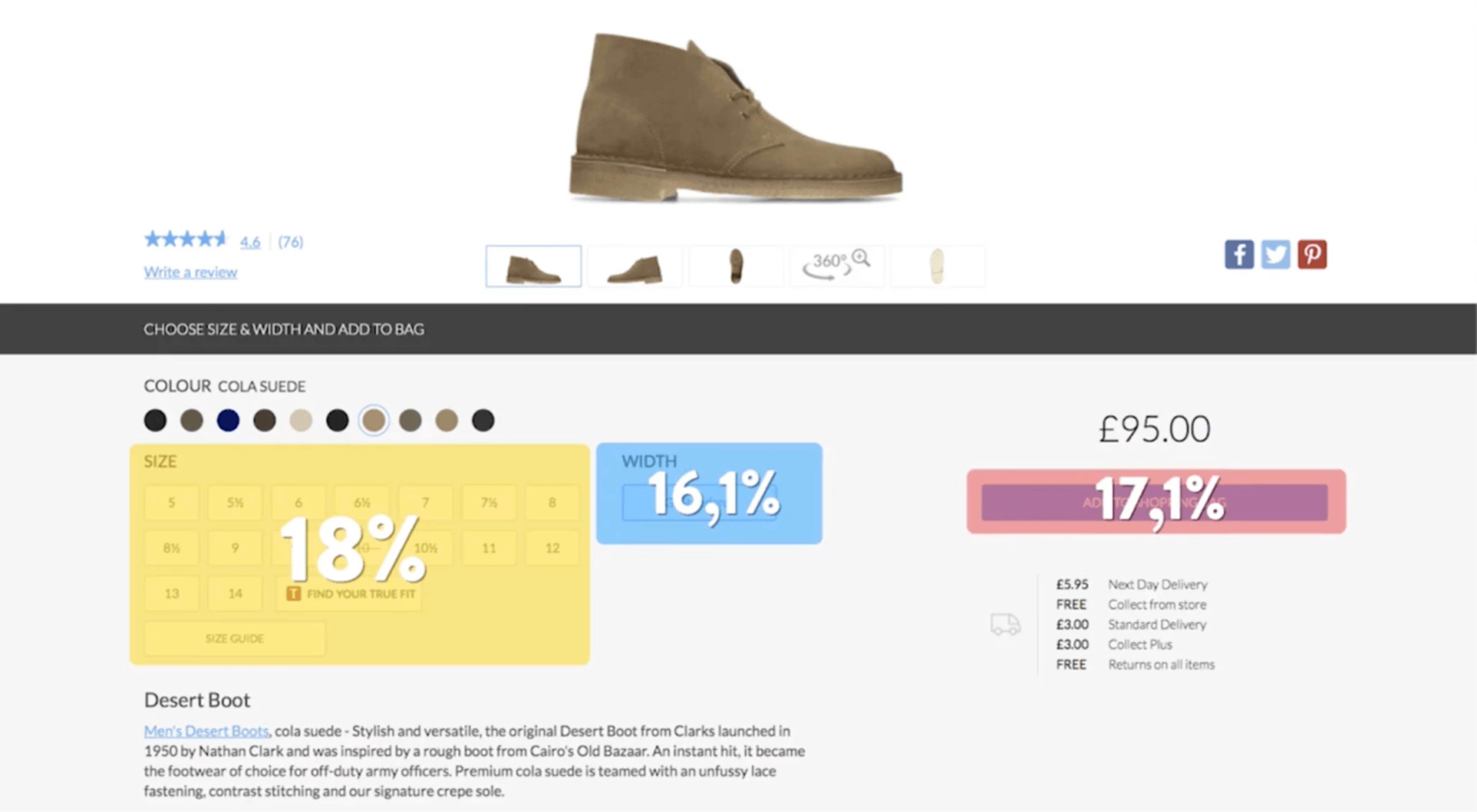
Contentsquare’s zone-based heatmaps helped Clarks reduce their cart abandonment rate
7. Understand your A/B test results
Using heatmaps on your ecommerce site can not only spark several conversion optimization ideas, they can also help you analyze the results of your A/B tests.
Integrate Contentsquare’s Heatmaps capability with A/B testing tools like AB Tasty, VWO, or Optimizely, and filter heatmaps by test variation. You’ll be able to see why the winning variation succeeded, helping you showcase results and make further improvements in your next test.
![[Blog ] Predictive personalization - Comparator IMAGE](http://images.ctfassets.net/gwbpo1m641r7/ANj20vBXBWxkCHWIvAE7w/9a33e43b8b285fdc49f14b7c4d11a979/Side-by-side_analysis.png?w=3840&q=100&fit=fill&fm=avif)
Use Contentsquare’s Heatmaps capability to dig deeper into your A/B testing results
With the Optimizely integration with Contentsquare, we're able to run a more effective CRO program because we can take a losing test and see why it lost—maybe there's points of friction or a minor tweak that could be made to change the outcome of the test. With Contentsquare we're able to build and iterate the losing test, instead of scrapping it and starting out a square one, turning a losing test into a winning experience. That has been a game changer for us.
Get more from heatmaps by combining them with qualitative insights
Ecommerce heatmaps give you a shareable, big-picture overview of what’s happening on your store’s site, helping you spot issues and get ideas for optimizations. But they have limitations, too: quantitative data can hide individual user experiences—you still have to make inferences about what users might be thinking as they browse.
To get even deeper insights about user behavior, use Contentsquare’s all-in-one experience intelligence platform to combine heatmaps with other in-platform capabilities like Session Replay and Surveys.
By bringing together quantitative and qualitative data, you can know exactly what’s happening on your ecommerce site to make data-driven, iterative improvements to sustainably grow conversions and revenue.
FAQs about ecommerce heatmaps
An ecommerce heatmap is a color-coded graphical representation of how visitors interact with any page on your site. You’ll see where users click, scroll, hover, and move across a page, with areas that receive the most attention appearing as the “hottest” parts.

![[visual] Whether you're starting an ecommerce business or want to increase your online sales, this comprehensive ecommerce guide will set you up for success.](http://images.ctfassets.net/gwbpo1m641r7/2oBR41ta2zGySqne7QEG0t/9e2a6804af71c5da0fe8f51e71f36e93/ecommerce.jpg?w=1920&q=100&fit=fill&fm=avif)
![[visual] Learn which events + metrics are useful for ecommerce sites, plus how to set them up in Google Analytics.](http://images.ctfassets.net/gwbpo1m641r7/s5r7ACMx6EPrRv6OUylfU/d2c12e65fb8374b9f281795160f692bd/5294329__1_.jpg?w=1920&q=100&fit=fill&fm=avif)