![Visual - [Call center analytics] Homepage](http://images.ctfassets.net/gwbpo1m641r7/1eEuGSYHh8241I2cdke28x/b444ba6150025b6c6d61b1f3768de388/5_ways_to_build_trust_with_your_remote_team_Image.png?w=946&q=85&fit=scale&fm=avif)
Most call center teams already have more data than they know what to do with. Average handle time, abandonment rates, first call resolution, agent performance scores, queue times, customer satisfaction metrics. The problem usually isn't a lack of reporting. It's that reports often become collections of numbers without enough context to explain what’s changing, why it’s happening, or what teams should do next.
A good call center analytics report should help different stakeholders answer different kinds of questions. Executives want to understand trends that affect cost, retention, and customer satisfaction. Operations managers need visibility into staffing issues, bottlenecks, and workflow inefficiencies. QA teams are looking for patterns in agent behavior, escalation risks, and recurring customer pain points. When all of those audiences get the same overloaded dashboard, the result is usually more noise than clarity.
This guide walks through a 9-step process for building call center analytics reports that are structured around decisions and key performance indicators, not just metrics. It covers how to choose the right KPIs, organize data for different stakeholders, visualize trends clearly, and turn raw operational data into reports teams can actually use to improve performance.
Key insights
Start with the decision the report must drive, not the data you have available. Your audience and the action they need to take should determine which metrics make the cut.
Call center analytics reports fail when they answer "what happened" but not "why." The diagnostic layer is what turns data into organizational action.
The KPIs that matter most vary by stakeholder. Executives need outcome metrics, operations teams need efficiency signals, and quality teams need conversation-level evidence.
Reporting cadence and format are as important as the metrics themselves. The right insight sent to the wrong person at the wrong time changes nothing.
Connecting contact center call drivers to what happened before the call on your digital properties is the fastest way to find root causes and justify fixes across teams.
A closed-loop review where you return to last cycle's findings and show what changed is what separates reporting that builds trust from reporting that gets ignored.
Call center analytics report steps: at a glance
Step | What it involves | Why it matters |
|---|---|---|
1. Set the reporting scope and time window | Define reporting period, comparison window, and stakeholder alignment | Scope changes mid-report are the most common cause of metric disputes |
2. Define the KPI set for this audience | Assign tiered metrics by stakeholder role | Presenting 20 metrics means none of them matter |
3. Gather and validate data from each source | Pull from CDRs, CRM, QA, WFM, and survey tools, then validate for consistency | Inconsistent definitions destroy stakeholder trust faster than any data gap |
4. Segment until a pattern appears | Break metrics down by channel, contact reason, agent cohort, and time | The difference between "volume increased" and "billing calls from new customers increased" |
5. Prove or reject the top 3 hypotheses | Test candidate explanations against corroborating data before writing findings | Unverified hypotheses presented as findings erode credibility |
6. Use a decision-first report template | Structure every report around findings, evidence, and recommended actions | Prevents reports from becoming data dumps no one acts on |
7. Match visuals to the question | Choose chart types based on the question each visual answers | Every chart should answer exactly one question |
8. Assign owners and deadlines | Attach a named owner, deadline, and success metric to every recommendation | Recommendations without owners become suggestions |
9. Run a closed-loop review | Return to prior cycle's action table before starting the next report | Transforms one-time reports into ongoing improvement cycles |
Call center analytics report: a step-by-step guide
The steps below aren't a checklist you run through once and file away. Each one builds on the previous, and the value compounds over reporting cycles when the process becomes consistent. Where most reporting breaks down isn't in the data, it's in what happens between the insight and the decision. Here are the 9 steps that bridge that gap:
Step 1: set the reporting scope and time window
Before you touch any data, define your reporting period. Daily, weekly, monthly, and quarterly reports serve fundamentally different purposes and should never be collapsed into one document.
Each reporting window answers different questions:
Daily/intraday: real-time staffing and queue management
Weekly: operational performance trends and coaching priorities
Monthly: KPI movement, contact driver shifts, and initiative impact
Quarterly: strategic review, benchmarking, and goal-setting
Your comparison window matters just as much. Confirm at this stage whether you're comparing week-over-week, month-over-week, or year-over-year so that all data pulled later remains consistent. A weekly operations report comparing to the same week last year tells a different story than one comparing to last week.
Agree on the scope with stakeholders before building anything. Scope changes mid-report are the most common cause of missed deadlines and metric disputes.
💡 Pro tip: use Contentsquare's Alerts to monitor the digital signals that precede call volume spikes between reporting cycles. Set manual thresholds on the metrics you already track, or let the AI alert mode, powered by Sense, detect unusual variations automatically, so you're not waiting until the next report to find out something moved.
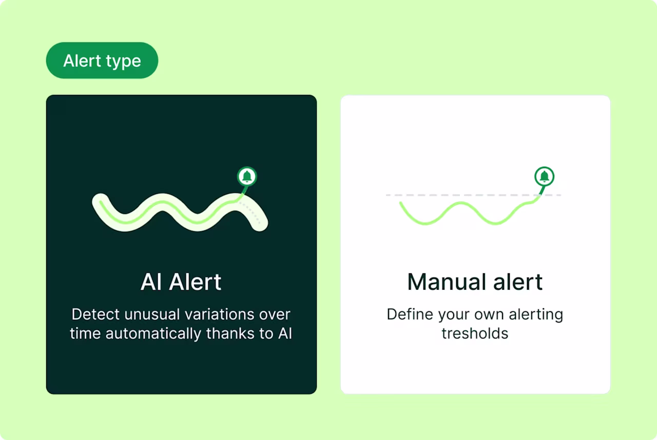
Contentsquare Alerts give you the choice between AI-detected anomalies and manually defined thresholds, so nothing significant happens between reporting cycles without you knowing
Step 2: define the KPI set for this audience
Not every metric belongs in every report. The concept of "KPI tiers" helps you avoid metric overload while ensuring each stakeholder gets the information they need to make decisions.
Different audiences require different metrics to drive their specific decisions:
Audience | Primary KPIs | Supporting KPIs |
|---|---|---|
Executive / leadership | CSAT, NPS, contact volume trend, cost per contact | FCR, abandonment rate |
Operations manager | Service level, AHT, abandonment rate, occupancy | Queue time, wait time, forecast accuracy |
QA / coaching lead | Call quality score, AHT by agent, sentiment drivers | FCR by issue type, repeat contact rate |
Product / CX team | Contact reasons, topic trends, sentiment by issue | Digital journey correlation |
Resist the temptation to include more than 6-8 metrics in a single stakeholder view. Additional metrics belong in an appendix or drill-down, not the headline report. When you present 20 metrics, none of them matter. When you present 6, each one demands attention.
KPI definitions must be agreed upon and documented before the first report is distributed. What counts as "resolved" in your customer relationship management (CRM) system might differ from your quality assurance (QA) platform's definition, and these discrepancies breed confusion and mistrust.
💡 Pro tip: use the Contentsquare Digital Experience Benchmark to validate what "good" looks like for the KPIs you're tracking. Before agreeing on targets with stakeholders, check where your industry sits on frustration rate, conversion rate, and bounce rate so your thresholds are grounded in real-world data, not internal assumptions.
![[visual] 2026 Digital experience benchmark](http://images.ctfassets.net/gwbpo1m641r7/2gMc41aGo0u0QPxxn8ACdP/3d71bcd1d340f38250aa34ba0ddee38a/2026_Digital_experience_benchmark.png?w=626&q=85&fit=scale&fm=avif)
The 2026 Digital Experience Benchmark, filterable by industry, so your call center KPI targets are set against real-world data rather than internal assumptions
Step 3: gather and validate data from each source
Call center reports typically draw from multiple data sources across your call center analytics software stack, each capturing a different aspect of the customer interaction. Understanding what each source provides and its limitations is essential for accurate reporting.
The most common data sources include:
Call detail records (CDRs): metadata for every call including duration, IVR routing, and termination reason
CRM or ticketing system: case type, resolution status, and customer history
Quality assurance (QA) platform: scored interactions, compliance flags, and coaching notes
Customer satisfaction surveys: post-interaction CSAT and Net Promoter Score®(NPS®) responses
Workforce management (WFM) system: schedule adherence, occupancy, and forecast vs. actual
Before analysis begins, run through a simple validation checklist:
Are date ranges consistent across all sources?
Are metric definitions aligned? Does "resolved" mean the same thing in your CRM as it does in your QA tool?
Are there known data gaps, like survey response rates below a reliable threshold?
Has bot or automated traffic been excluded from volume counts?
Inconsistent definitions are the most common source of stakeholder distrust in call center reports. When the operations team's average handle time (AHT) doesn't match the executive dashboard's AHT, credibility evaporates.
💡Pro tip: Contentsquare's Data Connect—a warehouse integration tool that syncs behavioral session data (records of how users navigate and interact with your website or app) directly to your data warehouse—makes it possible to join digital journey data with call center records. For example, you can correlate pages visited before a call with the contact reason logged in the CRM.
![[Visual] Data connect](http://images.ctfassets.net/gwbpo1m641r7/X4CmbptUDL2kLylidBMQ3/0512684e409a1412e9843ea82cf6ce68/Data-connect.png?w=1280&q=85&fit=scale&fm=avif)
Contentsquare's Data Connect syncs behavioral session data to your warehouse so you can join it with call center records and CRM data in one place
Step 4: segment until a pattern appears
Segmentation is breaking a metric down by a relevant attribute to find where the movement is concentrated. This means dividing your data by channel, queue, issue type, agent group, device, or time of day. It's the difference between knowing "call volume increased" and knowing "billing-related chat volume from new customers increased."
When a KPI moves unexpectedly, follow this segmentation order to isolate the cause:
1. Channel: is the movement concentrated in voice, chat, email, or one specific queue?
2. Contact reason / issue type: is one topic category driving the change?
3. Agent cohort or team: is the movement tied to a specific group of agents or a shift?
4. Customer segment: is the movement concentrated among new customers, a specific product line, or a geography?
5. Time of day or day of week: is this a staffing or routing issue disguised as a performance issue?
The goal isn't to find all 5 segments. It's to find the 1-2 that explain the majority of the movement. If billing calls from enterprise customers on Mondays account for most of your volume spike, you've found your story.
💡Pro tip: if a metric moves at the aggregate level but no single segment explains it, the cause is likely structural. Think policy change, system update, or new product launch rather than operational.
Understanding what customers did before contacting support often reveals the root cause of their customer journey friction. Contentsquare's Journey Analysis capability helps you investigate the digital side of your segmentation hypothesis. When a contact reason spikes, Journey Analysis shows you which pages users were navigating before dropping off or abandoning a flow, so you can check whether the call pattern has a digital origin worth investigating on the product or CX side.
![[Visual] Journey analysis - Exitanalysis 2](http://images.ctfassets.net/gwbpo1m641r7/3BQeOO8Q7TJ4wcfhWTB8jq/5eb3b4473b8a763b39ccc79c20e4ace1/Journey_analysis_-_Exitanalysis_2.png?w=1280&q=85&fit=scale&fm=avif)
Contentsquare's Journey Analysis surfaces the pages users moved through before dropping off, giving call center analysts a digital thread to pull when a contact reason spikes
Step 5: prove or reject the top 3 hypotheses
Once segmentation surfaces a candidate explanation, form a structured hypothesis and test it against available data before writing it into the report. This discipline separates credible analysis from educated guessing.
The 3-hypothesis framework works like this. Write down the 3 most plausible explanations for the metric movement. For each, identify what evidence would confirm or contradict it. This could be a correlated metric, a date-stamped event, or a comparison segment. Then eliminate hypotheses that lack corroborating evidence, keeping only what the data supports.
Here's how it works in practice. Say your average handle time (AHT) increased by 15% week-over-week:
Hypothesis 1: a new product feature launched and agents lack knowledge. Check: did contact reasons shift toward that feature? Did QA scores for product-related calls drop?
Hypothesis 2: a staffing change put newer agents on high-complexity queues. Check: does AHT increase concentrate in specific agent cohorts?
Hypothesis 3: a system outage caused longer hold times. Check: does the increase align with an incident window? Does hold time account for most of the AHT increase?
The report should only present the hypothesis that survives this test, not all 3. Presenting unverified hypotheses as findings erodes stakeholder trust faster than any data gap.
💡 Pro tip: use Contentsquare's Error Analysis to prove the technical hypothesis before it goes into the report. When a contact spike points to a broken flow, Error Analysis tells you the revenue impact, what the error actually is, and the exact steps to reproduce it, so you're not presenting a theory to stakeholders, you're presenting confirmed evidence with a fix already scoped.
![Error Analysis - Features - Error Reporting [Fall Launch Update]](http://images.ctfassets.net/gwbpo1m641r7/5gRt3ajZ5OtGqgeJR9ZARh/4a169edcc964c064c96f434748fbe876/Error_Analysis_-_Features_-_Error_Reporting.png?w=1280&q=85&fit=scale&fm=avif)
Contentsquare's Error Analysis surfaces the revenue cost, issue context, and reproduction steps for each error in one view, so the hypothesis and the handoff happen at the same time
Step 6: use a decision-first report template
A repeatable report template ensures consistency while keeping the focus on decisions rather than data dumps. This structure works for weekly ops reports, monthly reviews, and quarterly business review (QBR) packs alike.
Section | What it contains | Length |
|---|---|---|
Headline finding | The single most important change this period and its business implication | 2-3 sentences |
KPI scorecard | Current period vs. prior period for agreed KPIs, with directional indicators | Table |
What changed and why | The 1-2 metric movements that matter most, with the confirmed hypothesis | 1-2 short paragraphs |
Supporting evidence | Segmentation data, trend charts, or customer verbatims that back the finding | Visuals + 1 sentence each |
Recommended actions | Specific next steps with an owner and a deadline | Bulleted list |
Open questions | What you still don't know and how you plan to find out | 2-3 bullets |
3 structural rules prevent reports from becoming data dumps:
Lead with the finding, not the methodology: the reader should know the "so what" by the end of the first paragraph
One recommendation per finding: resist the urge to list every possible action and prioritize the one with the highest impact
Separate the scorecard from the narrative: give readers the option to skim the numbers and read the story, don't force them to do both at once
For executive audiences, the headline finding and recommended actions should fit on a single slide or page. The supporting detail belongs in an appendix where those who want depth can find it without cluttering the main message.
💡 Pro tip: use Sense to draft the "what changed and why" section of your report automatically. Ask Sense Analyst a plain-language question about the metric movement you're investigating and it pulls the behavioral patterns, journey data, and frustration signals together, giving you a narrative ready to drop into the report rather than building it from scratch.
Sense Analyst turns a plain-language question into a structured quarterly analysis, with before-and-after comparisons ready to drop into your report
Step 7: match visuals to the question
Every chart in a call center analytics report should answer exactly one question. If you can't state the question in a single sentence, the chart doesn't belong.
Different questions require different visual formats for clarity:
Question | Best visual | Avoid |
|---|---|---|
Is this metric trending up or down over time? | Line chart | Bar chart (hides trend direction) |
Which contact reason drives the most volume? | Horizontal bar chart | Pie chart (hard to rank) |
How does this period compare to last period? | Side-by-side bar chart or delta table | Line chart (too much noise) |
What proportion of contacts fall into each category? | Stacked bar or donut chart | Table alone |
Where are agents performing above or below average? | Scatter plot or ranked table | Aggregate average only |
3 common visualization mistakes undermine even the best analysis:
Showing absolute numbers without context: a raw call volume of 10,000 means nothing without a comparison period or a target
Using color to decorate rather than communicate: reserve red/amber/green for genuine threshold signals like service level agreement (SLA) breaches, not aesthetic variety
Overloading a single chart: if a chart needs a legend with more than 4 items, split it into 2 charts
💡 Pro tip: use Contentsquare Surveys, powered by Sense's insights, to add a qualitative signal to your report without manually reading through every response. Sense tags every open-ended answer by sentiment automatically and flags when the balance shifts, so you know when customer perception is moving before it shows up in your CSAT score.
![[Visual] Capabilities - Surveys - Features - Quantify - Survey responses with sentiment analysis](http://images.ctfassets.net/gwbpo1m641r7/2LAUWojNqxgONNnwgpvhIF/665597ac1a5f2d02205bb0dfca8b6d1c/Quantify_issues.svg?w=655&q=85&fit=scale)
Contentsquare Surveys with Sense detects a sentiment shift in purchase experience feedback before you think to check
Step 8: assign owners and deadlines in the report
Every recommended action in the report needs 3 things: a named owner, a deadline, and a success metric. Without these, recommendations become suggestions. Suggestions rarely get acted on in complex organizations where multiple teams share accountability for contact center performance.
Use a simple action table at the end of every report:
Finding | Recommended action | Owner | Deadline | Success metric |
|---|---|---|---|---|
Billing call AHT 30% above average | Audit billing knowledge base and update 3 most-accessed articles | \[Name\] | \[Date\] | AHT for billing calls returns to baseline within 4 weeks |
Account access contact reason up 40% WoW | Investigate recent changes to login/authentication flow | \[Name\] | \[Date\] | Contact reason volume returns to prior-period level |
The success metric in this table becomes the leading indicator you check at the start of the next report cycle. This creates the closed loop that transforms one-time reports into ongoing improvement cycles.
When a recommendation requires cross-functional input, name a point of contact on both sides. Say a product team needs to investigate a digital journey issue. Agree on a response timeline before the report is distributed to prevent finger-pointing and ensure accountability.
💡 Pro tip: Contentsquare's Session Replay tool lets you create Jira tickets directly from the session where an issue occurred. It pre-fills the ticket with the error type, a replay link, and an AI summary, so the owner your report names gets everything they need to reproduce and fix the issue without a single back-and-forth to gather context.
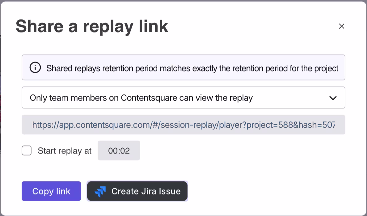
Contentsquare's Session Replay creates a Jira issue and shares the exact replay link in the same step, so whoever owns the fix has the evidence before they even open the ticket
Step 9: run a closed-loop review
The closed-loop review happens in the first 5-10 minutes of every reporting meeting. You return to the action table from the previous cycle and ask what happened.
Structure the review around 3 questions for each prior action:
1. Was the action completed by the deadline?
2. Did the success metric move in the expected direction?
3. If not, what's the revised hypothesis and new action?
This review serves 2 critical purposes. It holds owners accountable, creating the social incentive to act on findings. And it validates or challenges the diagnostic work done in the previous cycle, building analytical credibility over time.
Over time, the closed-loop review becomes the most valuable part of the reporting process. It's where you learn whether your hypotheses about root cause were correct. It's the evidence base for making the case that call center improvements have measurable business impact.
💡 Pro tip: use Contentsquare's Impact Quantification to close the loop with revenue evidence, not just directional improvement. It compares conversion rates between users who experienced a UX issue and those who didn't, calculates the missed revenue from that gap, and gives stakeholders the measurable upside of fixing issues identified through the reporting process, so recommendations come with a business case already built in.
![[visual] Prioritize by impact, not guesswork with Contentsquare](http://images.ctfassets.net/gwbpo1m641r7/7whhoI4ffa7LK62tDUBfW8/298f0324037eb90445c38735b424fbd8/Smartlook-alternative-for-ROI.png?w=593&q=85&fit=scale&fm=avif)
Contentsquare's Impact Quantification translates a conversion rate gap into missed revenue and projected upside, so the fix comes with a number attached to it
Build reports that drive decisions, not just documentation
Good reporting doesn't end when the report is distributed. It ends when something changes because of it.
The 9 steps in this guide are designed to close that gap, from defining the right scope and KPIs upfront, to segmenting for root cause, to making sure every finding has an owner and a deadline attached to it. Each step builds on the previous one, and the closed-loop review in step 9 is what ties the whole process together over time.
The teams that get the most out of call center analytics aren't the ones with the most data. They're the ones that treat reporting as a decision-making system rather than a documentation exercise. When every report answers a specific question, reaches the right stakeholder, and feeds back into the next cycle, the data starts doing what it was always supposed to do: help you run a better operation.
FAQs about call center analytics reporting
Call center analytics is the process of collecting, measuring, and interpreting data from customer interactions to improve service performance, staffing, and the customer experience. It covers operational metrics like average handle time and abandonment rate, quality metrics like call scores and sentiment, and strategic metrics like first contact resolution and cost per contact. The goal is to turn raw contact center data into decisions that reduce friction, improve efficiency, and help teams understand why customers are reaching out in the first place.