
As both website users and user experience experts, we can all relate to the situation of searching for a specific product or string of words on a company’s website and getting the simple dead-end response: “No Results Found.”
Sometimes they might switch things up with a “0 Results Found,” but most of the time, the effect remains the same. As a user, we feel lost and stranded, without any guide or next steps to follow. This is the first critical mistake of any “no results” page.
We see the effect time and again in Contensquare user session replays: users typically reach an empty “no results” page and then pause to “look around” with their mouse, scrolling up and down. They then attempt to either re-enter a search, hit the back button, or abandon the website entirely.
We can’t help but wonder how many potential customers fall through the cracks after a failed search and abandon their shopping experience altogether. From content to eCommerce sites, the “no results” page is the opportune place conversion optimizations and start flipping those “failed searches” into successful conversion stories. Let’s start with the easiest “no results” page recommendations to implement and move our way up:
1. Stop No Results Pages Before They Happen
This is somewhat of a no-brainer, but it’s so important that it’s worth mentioning. Prevention is always better than treatment. To improve your site’s search engine results, make sure all of your product pages are up-to-date and build out your own controlled vocabulary. Do what it takes to ensure that none of your users sees the “no results” page, and you will reap huge benefits.
2. Implement Autocomplete with a Twist
Auto-complete search represents one of the best ways to prevent the no results page from appearing altogether. Presenting autocomplete suggestions accompanied by product thumbnails, like Shoe Me Gorgeous does below, is a smart and user-friendly way to gain a competitive edge. Plus, adding images to on-page autocomplete search results can increase your overall conversions, average order value, and per visit value.
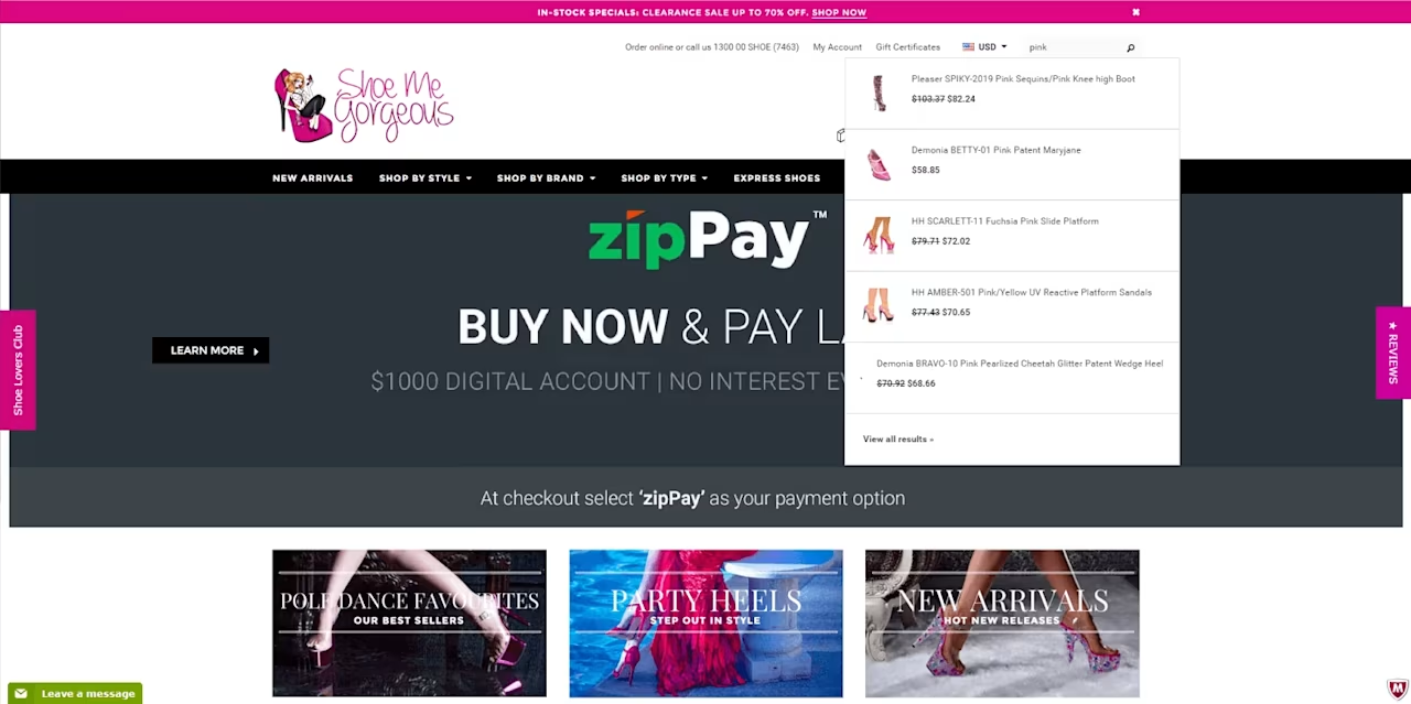
Show Me Gorgeous’ search bar includes autocomplete search suggestions with product thumbnails to prevent users from hitting a no results page
3. Include Automatic Spell Check
Google has dramatically shaped users’ expectations for the search experience. Users now expect internal site searches to auto-correct our spelling mistakes or offer a polite, “Did You Mean ___?”
Yet, surprisingly, this functionality is still not yet standard across many sites. Without it, though, potential customers might not recognize their mistake and assume you don’t have the product or service they’re looking for when they hit your “no results” page. Instead of double-checking the spelling of their inquiry, odds are they’ll go somewhere else to find what they need, costing you the sale.
While you should try to implement an automatic spell-check feature on your site search, there are a few alternatives to help you improve the search experience if that’s not a possibility. You can still take advantage of the “no results found” page to make it clear that while there are no matching results to their query, your users should try the following to see more promising search results:
Check their spelling
Try using more general words
Avoid using brand names
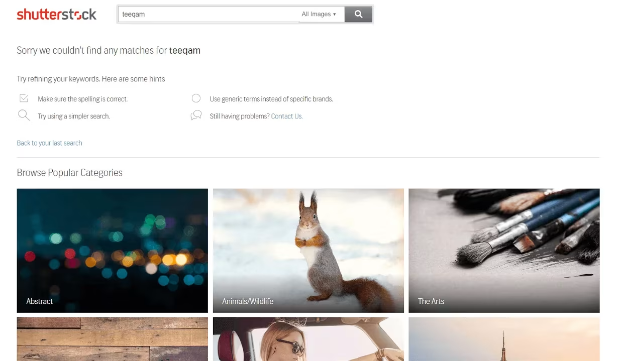
An example of an alternative display for “0 results found”
Shutterstock is a good example of what a website can do if a search query pulls up zero results. Its first reminder is that the user should check their spelling. If that does not help, it suggests that users edit their search query term – and then offers further recommendations.
4. Always Offer Another Way Forward
Contentsquare’s zone-based heatmaps confirm that most visitors will abandon a site within 2 minutes if they can’t find what they are looking for. When users are confronted with 0 results and no additional guidance, we see a more scattered distribution of mouse moves and clicks around the page, with the majority of the mouse interactions centering around the search bar or top of the page – either near the back button or the browser bar – indicating users are abandoning both their search and the website.

Mouse Move Heatmap of a “0 results” page, showing excessive mouse movement around the page.
The solution is simple: Don’t leave potential customers stranded without any direction on your no results page! Remember, they are only one click away from exiting your website.
Besides offering spelling suggestions and tips on how to better approach or refine the user’s search, you can:
Offer a search box with the original query still there for the user to easily edit.
Always provide relevant alternatives whenever possible. ‘No results’ may also be an indication that the product out of stock. If that’s the case, use this as an opportunity to offer up other similar or related items.
Similarly, provide links to other popular choices or categories on the website. Users are depending on your next response, so use this space wisely to provide them with something of value!
5. Optimize for Mobile Search
It goes without saying that mobile users should enjoy the same (or better) experiences as desktop users. Your mobile “no results” page will likely get more hits than the desktop equivalent due to a higher occurrence of misspellings. You need to ensure mobile users have all the same navigation options and suggestions available to desktop users.
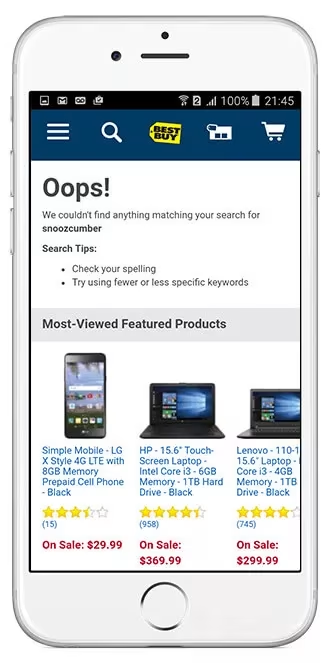
Best Buy’s “0 results” page pushes searchers to their most-viewed featured products as a potential next step
Mobile users have less patience than those on desktop. Plus, they can also be more easily distracted from the task at hand. That’s why it’s important to provide a quick and easy way for them to find what they need. There isn’t too much room for error here – users expect an easy ride on mobile and if they don’t get it, they’ll go elsewhere.
6. Add a Personal Touch
Your search bar is designed to help your customers find what they need quickly and easily. That said, it’s also a great opportunity to showcase your brand voice. “0 results found” is frustrating, in part, because it’s cold and impersonal. On the other hand, it’s hard to dislike: “We’re sorry we can’t seem to find anything that matches {query}. How about we try again?” A little empathy can go a long way and help your brand stand out in a positive way!
Don’t overlook the importance of the “no results found” page. These six “no result” pages best practices will greatly improve the user experience on your site. With a little planning, you can easily turn the many missed opportunities from failed searches into additional conversion winners.
Learn more about how to increase conversions with Contentsquare.
![[Logo] CSQ - Favicon Circle](http://images.ctfassets.net/gwbpo1m641r7/3TtXqFCibupR1BU1WliUMk/ec866c9a074e71cb5f6401be7b220bdd/CSQ_-_Favicon_Circle.png?w=100&q=85&fit=scale&fm=avif)
Contentsquare has been in business for 14 years since its founding in Paris in 2012. We offer a complete understanding of customer experiences across all touchpoints, our platform is designed to help businesses understand how users interact with their websites and mobile applications.