When you acquire two companies in quick succession, you don't just inherit their products. You inherit their communities, their visual languages, and their customers' loyalty. Here's how Contentsquare unified three distinct brands into one—what we learned, what we'd do differently, and what no generic rebranding guide will tell you.
After acquiring Hotjar and Heap, we had three distinct products, three customer communities with their own identities and expectations, and a leadership directive to become the go-to platform for understanding people. The question wasn't whether to rebrand. It was: how do you build a masterbrand that feels like home to a Hotjar user who loves simplicity, a Heap user who lives in data, and an enterprise Contentsquare customer who needs depth and scale—without losing any of them?
Here's what we actually did.
The trigger wasn't a logo refresh. It was a strategic necessity.
We didn't rebrand because we felt like it. We rebranded because we had to.
Post-acquisition, the challenge was real. Three platforms. Three visual identities. Three sets of brand promises. And an ambitious goal to unify them into a single, cohesive experience analytics platform.
Leaving them as three separate brands would have created confusion, fragmented our go-to-market motion, and sent a mixed signal to the market about what Contentsquare actually is. This wasn't a marketing project. It was a business-critical decision.
That matters because the trigger shapes everything that comes after it. If you're rebranding post-acquisition, post-merger, or after a significant pivot, the process looks fundamentally different from a refresh driven by aesthetics or competitive pressure. The stakes are higher. More people are watching. And there's less room to get it wrong—because you have existing customers on multiple platforms who are paying close attention.
Before anything else, get clear on the trigger. Everything follows from that.
We needed more than a design agency. We needed strategic partners.
To tackle the complexity of this rebrand, we partnered with Saffron Brand Consultants. And that partnership taught us something important early on.
Brand strategy and visual design are inseparable. You can't outsource one and keep the other in-house. The thinking has to be integrated—because every visual decision is actually a strategic decision in disguise.
Saffron helped us do something that sounds simple but is genuinely hard: articulate what Contentsquare is now that it contains multitudes. The platform delivers actionable insights into people's behaviour through effortless analytics. And it needed to work for a global automotive giant using Contentsquare's enterprise features and for a local e-commerce shop that just discovered session replay for the first time.
That dual audience requirement shaped every element of the identity that followed.
💡 If your rebrand is complex—post-acquisition, international, or spanning multiple product lines—invest in strategic brand partners, not just executional ones.
The hardest part wasn't the design. It was the positioning.
Before we touched a colour palette or a typeface, we had to answer the hardest question in any rebrand: what do we stand for now that we couldn't stand for before?
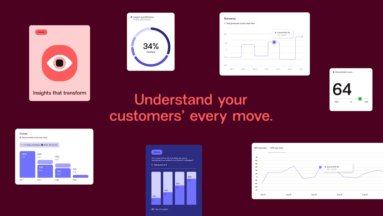
For Contentsquare, the answer came from our leadership team's ambition: to be the go-to platform for understanding people. Not just clicks and scrolls. People—their intent, their frustration, their delight, their journeys across every digital touchpoint.
That became the north star for everything. Insights that transform. Three words that needed to hold the weight of an entire platform evolution. Positioning comes before identity. Do the hard thinking first. Then design.
Moving away from blue was a strategic decision, not an aesthetic one.
Here's a detail that outsiders often miss about the Contentsquare rebrand: we deliberately moved away from the blue-heavy palette that dominates tech.
Blue says: "We are a technology company. We are safe. We are like the others." For a platform that had just declared its ambition to become the go-to platform for understanding people, "like the others" was exactly the wrong signal. The new identity leans into a warm, sophisticated colour palette—one that sets Contentsquare apart in a category where everyone looks the same.
The graphic language was built around three principles that mirror what the platform actually delivers: Space for Clarity, Customer Journeys, and Human Understanding. These aren't decorating ideas. They're conceptual anchors. Every visual element earns its place by communicating something true about the product.
The typographic system pairs New Edge Rounded—a modern grotesque that conveys ease and approachability—with Inter for versatility across everything from long-form content to product UI. Even the adaptable 'Q' in the wordmark was designed to carry a sense of connection throughout the identity system.
Every decision was made in service of the positioning, not ahead of it. Treat visual choices as brand strategy choices, because that's what they are.
Flexibility wasn't a nice-to-have. It was a core design requirement.
One of the most underestimated challenges of a post-acquisition rebrand is the range of contexts the new identity has to survive in.
Contentsquare's customer base runs from global automotive manufacturers to independent online retailers just getting started with analytics. The new identity needed to work across a conference stage in Paris, a product UI seen by a developer in Singapore, a social post targeting a VP of CX in New York, and a tote bag at a marketing meetup in London.
That's not a stretch goal. That's the actual requirement.
Saffron built the identity with flexibility as a core design constraint, not an afterthought. The result is an identity that—as they put it—is "subtle and sophisticated, implicitly expressing ease rather than overtly declaring it." It scales down to a favicon and up to a billboard without losing its meaning.
This is harder to achieve than it sounds, and it's why we invested in a proper identity system rather than a logo refresh. A logo is a single asset. An identity system is a set of principles that generates consistent outputs across every possible touchpoint—including ones you haven't imagined yet.
Define your identity's range of application before you start designing it. If your brand needs to work across enterprise sales decks and consumer social in the same week, that requirement needs to be in the brief from day one.
With our reimagined identity, Contentsquare embodies a commitment to delivering solutions that are powerful and data-driven, but also approachable and intuitive, with human understanding at their core. We are now better positioned to empower businesses with smarter insights and a seamless experience, allowing them to thrive in a competitive digital landscape.
Measuring whether it worked: qualitative and quantitative, together.
A rebrand without a measurement plan is a brand decision made on faith.
Post-launch, we tracked quantitative signals: traffic patterns, engagement metrics on redesigned pages, interaction rates on updated user flows, conversion shifts across the funnel. But quantitative data tells you what happened, not why.
That's where qualitative measurement becomes essential. Voice of Customer studies with customers, partners, and prospects give you the feedback loop that numbers alone can't provide. Did the new identity resonate? Did the positioning shift change how people describe Contentsquare? Did it feel like an evolution or a disruption?
And—because we use our own platform—we had one more advantage: the ability to see, at a granular level, how users actually interacted with the redesigned site. Where did they scroll? Where did they hesitate? What did they click? What did they ignore? Using Contentsquare to measure Contentsquare's own rebrand was one of the most instructive things we did.
Build your measurement framework before launch, not after. Decide what success looks like in quantitative and qualitative terms. Then keep evolving—don't just declare victory.
The one thing every rebranding guide gets wrong
Most guides treat the rebrand as an endpoint. A project with a launch date, a reveal moment, and a set of brand guidelines that get filed on a shared drive.
The rebrand isn't the endpoint. It's the beginning.
Contentsquare's identity was designed to flex and evolve as the product grows, the customer base diversifies, and the market shifts. Our identity system was built to generate new outputs consistently—not to constrain creative work to a fixed set of approved executions.
That's what separates a great rebrand from a great logo. And it's what most post-acquisition brand projects get wrong: they launch a new visual identity and assume the work is done.
The work has just started.

Valeria is a seasoned content marketing, web and creative expert with experience in developing and executing content strategies to drive business growth. As the leader of the Global Web and Content team at Contentsquare, she oversees a diverse group dedicated to delivering audience-centric content across multiple regions, formats, and languages.
![[Visual] platform-overview-dashboard](http://images.ctfassets.net/gwbpo1m641r7/2LTkt1YATVIWCvRyN5bS1I/c7a6221f286ae35996f05df19f74781c/platform-overview-dashboard.svg?w=624&q=85&fit=scale)
![[Visual] e-commerce home page - stock image](http://images.ctfassets.net/gwbpo1m641r7/48LwhhIBbtyQTIlfcYjn1a/dd9430036a248ce594ef151965365a7f/AdobeStock_846417258.png?w=624&q=85&fit=scale&fm=avif)