With an estimated 6.9 billion smartphone users worldwide (that’s 86% of the world’s population), there’s clearly plenty of value in providing an excellent mobile customer experience.
A hefty chunk of that opportunity is represented by mobile browser traffic—which our Digital Experience Benchmark report found accounted for nearly two-thirds (64.7%) of all traffic to websites last year.
And then there’s mobile apps—arguably an even bigger opportunity.
How big? Well, last year 255 billion new apps were downloaded globally (up +11% from 2021) and app store spend reached $167 billion. This year, ad spend is predicted to hit $362B.
In short: The mobile market is a pie that you really want a piece of. But to secure yourself a slice, your mobile customer experience needs to be top-notch.
So let’s dive into some strategies for delivering more smartly-designed experiences for smartphone users, and to find out how our platform—and mobile-focused features—helps you execute on all five.
Meet your go-to guide to driving growth through the mobile customer experience
‘How to optimize mobile experiences to drive growth’ is our guide to optimizing experiences for smartphone users to drive revenue, customer satisfaction, customer retention and (yes) growth.
Inside you’ll find 25+ strategies for making your mobile experiences less frustrating, more delightful and ultimately more valuable for your business.
Our tips are backed up with examples of best practice from leading brands (with killer apps) like Evernote, Duolingo and Gucci.
We also explain how you can maximize the payoff (and minimize the workload) of these strategies by using digital experience analytics to understand your site and/or app’s user behavior and the impact on that behavior of your digital team’s decisions.
Here’s a sneak preview of the sort of insights and strategies you’ll get from reading the guide.
Optimize your mobile app onboarding process
According to Statista, the average retention rate (after 30 days) for apps is under 5% in most industries—and while a great onboarding experience isn’t going to make up for a shoddy mobile app customer experience, a sub-part onboarding experience can be a big cause of churn.
You never get a second chance to make a first impression. A confusing onboarding experience could signal to new users that the app will also be confusing to use—and therefore not worth using.
Secondly, if you fail to train new users in how to use your app, they may struggle to navigate their way through it (and blame their struggles on bad app design), and miss out on highly engaging features that should have been signposted during onboarding.
Our guide contains a list of five UX tips for improving app onboarding, complete with examples of how onboarding should be done from Duolingo and Evernote.
But how can you accurately assess how effective your app onboarding process design is, both before and after implementing these tips?
The answer is to use a Experience Analytics and Product Analytics, which enable mobile analytics insights. This will enable you to analyze the behavior of your new app users both during and immediately after onboarding.
And that’s not all. By enabling you to monitor all the most important app metrics from onboarding onwards—and, crucially, the ‘why’ behind those metrics—DXA enables every other conceivable aspect of mobile app optimization.
Make sure there’s no place like your homepage
The cost of acquiring visitors has shot up in the last decade, with one study estimating that it’s risen by 60% in the last six years. If you want to maximize the ROI of your investments, it’s imperative that you make the most of those acquisitions.
Your site or app’s homepage is the first thing new users will see (not to mention the page app users will revisit most). So it’s got to be engaging.
Behavioral analytics will massively help you out here, giving you an instant view of what elements of your homepage visitors are engaging with—and not engaging with—where they’re heading next, and much, much more.
And of course, there are certain UX tips you can follow so the most essential, relevant and high-performing homepage elements are on show—and distractions are kept to a minimum. (You can find those in our guide, too.)
Give your MVPs (most valuable pages) the VIP treatment
According to our Benchmark report, product pages (referred to in some industries as ‘category’ or ‘solution’ pages) took up an average of 30.7% of the buyer’s journey on mobile in 2022.
This confirms that product pages are a, if not the, crucial stage in your mobile customer journeys—especially as they’re increasingly being used as landing pages, particularly by retailers.
A customer who reaches a product page is almost always primed to purchase, and simply needs to be persuaded to tap “Add to basket”.
While the entirety of the customer journey is important, you should be particularly careful to ensure your product and category pages (which took up 20.1% of buyer’s journeys on mobile) are optimized for the mobile customer experience.
Our guide features not only five UX tips for getting more engagement on your product and category pages (with examples from Gucci and Lulus), but also five UX tips to boost product detail page (PDP) micro-conversions.
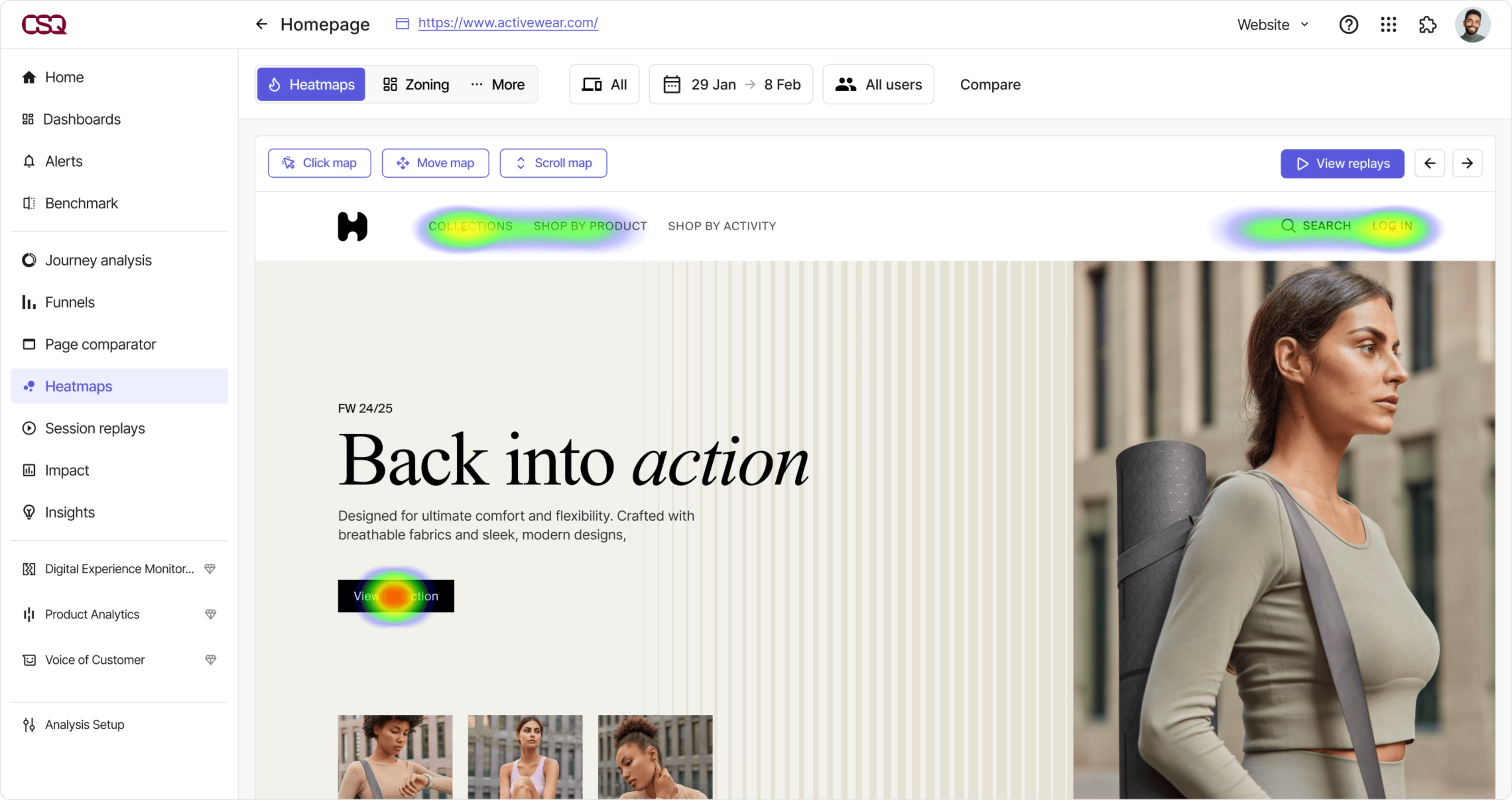
Digital experience analytics platforms, which feature tools like zone-based heatmaps, will help you monitor and optimize every page on your website and every screen on your app, from the most to the less important.

Screenshot of Contentsquare’s zone-based heatmaps
Fix friction to smooth the path to conversion
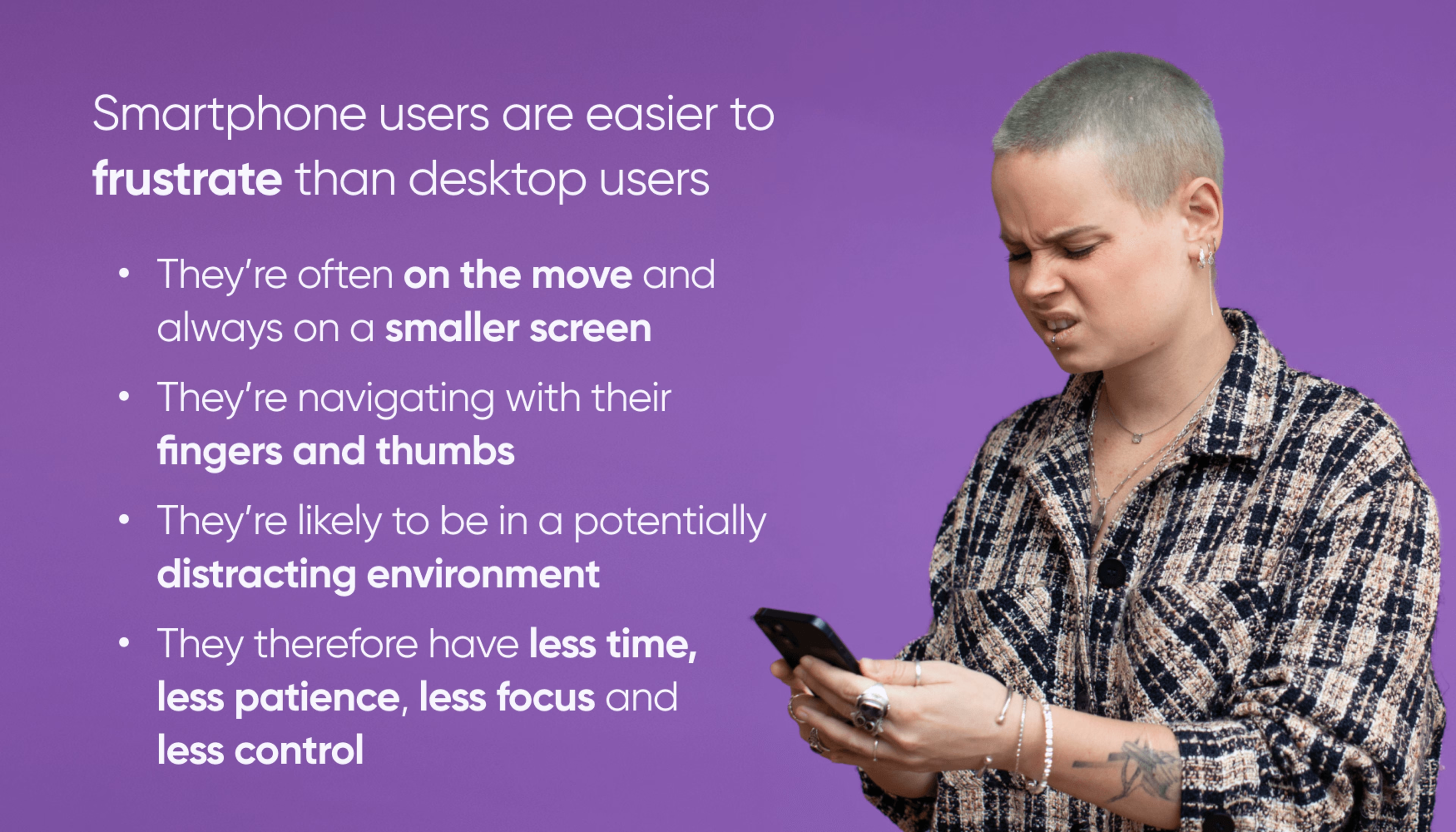
Friction is commonplace in user journeys on both mobile and desktop—and it’s seriously damaging to customer satisfaction, retention and conversion rates.
Our Benchmark report found that more than one in three of user sessions last year were marred by some form of frustration, and that slow page loads (the leading cause of frustration) led to higher bounce rates and less pages viewed per session.

Users have high (and rising) expectations around the mobile customer experience, have limited patience for dealing with friction—and aren’t short on options if they decide to leave your site or delete your app.
And if you frustrate them at a crucial point in the journey—such as the checkout, they might abandon your site, app and brand at the drop of a hat.
On that note, our guide features six UX tips for making sure your checkout isn’t where customers are compelled to drop off.
But how do you fix friction throughout your entire journey?
Generally speaking, there are two sources of frustration for mobile web visitors and app users:
Technical issues (whether this means a button isn’t working, your app keeps crashing or your website/app isn’t loading fast enough)
Sub-par page/screen design (a page or screen element is confusing, overwhelming or otherwise alienating customers)
As our Benchmark report findings suggest, these issues are common; there may be many to deal with at any given time. But they’re not always obvious. Your team might not even be aware of them until they’ve already done their fair share of damage to your KPIs and app store rating.
To deal with these issues in a timely fashion that doesn’t eat up your resources, you need a leg up from digital experience monitoring (DEM).
Experience monitoring tools like Error analysis leverage machine learning to detect errors and pain-points in your journeys, quantify their level of impact, bring them to your immediate attention and empower you to investigate the root cause.
![[Visual] Error analysis](http://images.ctfassets.net/gwbpo1m641r7/6ELBPV051gA5ePLDZOiFEG/8352c504a71e140b84d4b0587b2c446c/eyJwYXRoIjoiY29udGVudHNxdWFyZVwvZmlsZVwvZHVGZlF4bWVzMjU0WGhkNXExOXcucG5nIn0_contentsquare_-5dJe5Xqp6vEwH1Gl8wqmZQXmHHT4auNG_.png?w=3840&q=100&fit=fill&fm=avif)
Analyze every aspect of your user journeys (not just the outcomes)
This strategy is arguably implied by the first four we’ve run through. But it bears repeating.
Too many businesses are monitoring incoming traffic and outcomes (be that conversions, bounces or uninstalls) but neglecting the all-important middle of the user journey—which is a massive mistake.
Only by understanding what’s happening between the moment a user arrives on your site or opens your app and the moment they bounce, convert or exit can you take truly informed action to optimize your journeys and drive more positive outcomes.
But that’s no mean feat. Even taken in isolation, user journeys are often complex, rarely linear, sometimes involving multiple devices and channels. Every user is unique, coming from a particular traffic source, with a particular intention, on a particular device.
This complexity could make the task of understanding where in all those possible user journeys your site or app is delighting or frustrating your users seem extremely daunting.
As our guide explains in more depth, though, with digital experience analytics, your user journeys become transparent, and the task of optimizing your mobile customer experience from end-to-end becomes as manageable as it is valuable.
Here, a key feature of our platform is Journey Analysis , which allows your teams to see at-a-glance how users in different segments of your audience make their way through your site or app.
Every team can easily understand the clear, color-coded ‘sunburst’ visualizations of journeys —and make rapid, data-driven decisions that will improve your site and app journeys, satisfy more customers and drive more revenue.
Your mobile customer experience upgrade starts here
Whatever aspect of the mobile customer experience you want to perfect, Contentsquare’s digital experience analytics cloud has you covered.
If you’re looking to improve your mobile (and desktop!) customer experience, request a demo:
![[Stock] Analyse mobile](http://images.ctfassets.net/gwbpo1m641r7/7gmMbrNsaNsDLbLXdY98Kz/7be0c2c52fe689c4508a97f8321c8560/analyse-mobile-guide-complet.png?w=3840&q=100&fit=fill&fm=avif)
![[Visual] Jack Law](http://images.ctfassets.net/gwbpo1m641r7/6K99ulcVqLqKGyNZUaPiF8/145af0b27131005d862c790ddcafb3c5/Jack_Law.jpg?w=3840&q=100&fit=fill&fm=avif)