Want to grow your app’s user base—and get better reviews? Keep reading for tips on engaging app users and to find out the best way to measure the success of your mobile app engagement strategy.
In an exponentially growing global app market where customer acquisition costs are spiraling, user retention is what separates the app pack leaders from the rest.
To retain users, you’ve got to engage users. But that isn’t easy—particularly when even non-social apps are competing for attention with the likes of Instagram and TikTok.
We’re here to make it easier. Keep reading to find out:
Why mobile app engagement matters so much
5 in-app design tips to increase engagement on your app (with best practice examples from Duolingo, Strava and MoneyCoach)
How to use app analytics to measure and optimize engagement
Why engaging app users matters
Users who consistently and purposefully interact with your app are considered ‘engaged’.
Engaged users use your app on a regular basis, and tend to interact with it to achieve a particular goal—whether that’s finding some entertaining content, buying a new pair of sneakers or making a bank transfer. And they’re more likely to:
Spend with you (through in-app purchases, subscriptions and/or exposure to advertising)
Spread the good word about you
Leave a glowing review for you on the app store
Unengaged users, by contrast, will either:
Forget your app exists (only to uninstall it without a second thought when they need to free up some smartphone space)
Decide your app isn’t worth using and uninstall it immediately
Uninstall it immediately and leave you a poor review
Engaged users are valuable users, and growing your app engagement rate will grow your user base and grow the loyalty and lifetime value (LTV) of the users who make up that base.
5 tips for maximizing mobile app engagement
1. Optimize your onboarding process
Your app should be engaging users as soon as they open it for the first time.
Here’s a quick three-point checklist on how to make your onboarding experience as engaging as possible:
Keep it brief: New users want to start using your app as soon as they can. If your onboarding gets in the way of that, they’ll quickly feel unengaged—or worse.
Sell your app’s benefits: Take first-time users on a product tour during onboarding to show them what they’ll get out of your app if they use it correctly. Echoing again on brevity, keep it concise: 3-5 panels should be enough to get the value across.
Make it interactive: Get new users to answer questions, set their own goals and try out features during onboarding. This will get them using your app straight away, make them feel invested in the experience, and provide you with data that will help you craft a more engaging app experience.
2. Engage through education
Educating your users shouldn’t stop with onboarding. After all, many users will skip onboarding, while those who didn’t skip it might still forget what you showed them in it. Plus, any new features you add to your app will require highlighting and future explanation.
Remember, educating users doesn’t just make them better users—it makes them more invested in using (and not deleting) your app.
Here’s a few ideas about how to go about that:
Product tours: As onboarding, 3-5 panels can be deployed to draw attention to new features, especially after users have updated your app
Tooltips: Hints, tips and descriptions that pop up over key features before they’re used for the first time. (Careful with these: A smartphone screen can get overcrowded, fast.)
Messaging/notification section: to deliver news to users, or to prompt them to try or learn something new.
3. Gamify wherever possible
As anybody who’s ever stayed up until the early hours playing Call of Duty until their fingers and eyes hurt (just me?) can attest, tech doesn’t get much more engaging than video games.
App gamification seeks to harness that addictive power by borrowing principles and mechanics from game design and applying it to app design.
Fundamentally, this boils down to incentivizing engagement by rewarding app users for taking actions—encouraging them to repeat actions they’ve taken before, and/or take new actions to get different or better rewards.
What gamification will look like differs for different apps:
Shopping and food ordering apps could give users points for purchases that can eventually be exchanged for a complimentary item. That’s what Starbucks does with its “star” system, in which app users get stars for using the app to spend, and can exchange 150 stars for a drink of their choice.
Finserv apps are increasingly giving out points/badges that recognize users’ achievements, such as saving a certain sum of money.
Health and Fitness apps often set targets for users to reach (e.g. reach 10,000 steps in a day)—and reward them with achievement badges that can be shared both within the app and through social media
As you can see, rewards don’t have to be financial. As video games have demonstrated, you can incentivize people with virtual rewards that have no tangible ‘real world’ value. The important thing is they have a personal value for users in representing their own achievements.
Take the language learning app Duolingo, for example. Duolingo is great at making users feel rewarded for completing lessons with virtual rewards like XP points, gems and streaks.
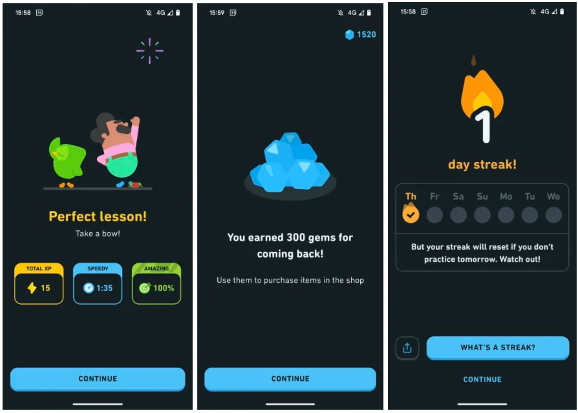
These gems and points may just be pixels on a screen, but they have real value for Duolingo users, who will keep coming back to collect more of them.
This benefits Duolingo, of course, but it also benefits the app’s users, making learning their language of choice a daily habit.
4. Make your app sociable
People want to connect with other people, and if you can design your app to tap into this desire you can drive engagement through the roof. (Just ask Facebook.)
A simple way to get started is to place social buttons on your app, enabling your users to share their in-app activity on other platforms.
But for really engaging results, your app should include social elements of its own.
Here’s why: If you make your users feel part of an app-based community, they’ll be less likely to leave that community (and uninstall your app).
Make your app a point of connection between your users and their real-life friends and you’re on the way to making it an indispensable part of their lives.
The fitness tracking app Strava serves as an exemplary model of the power of adding social elements to an app that isn’t primarily a social app.
You and your Strava-equipped friends can follow each other (and other members), give each other “kudos” for workouts, leave comments and add each other to activities when you’re working out together.
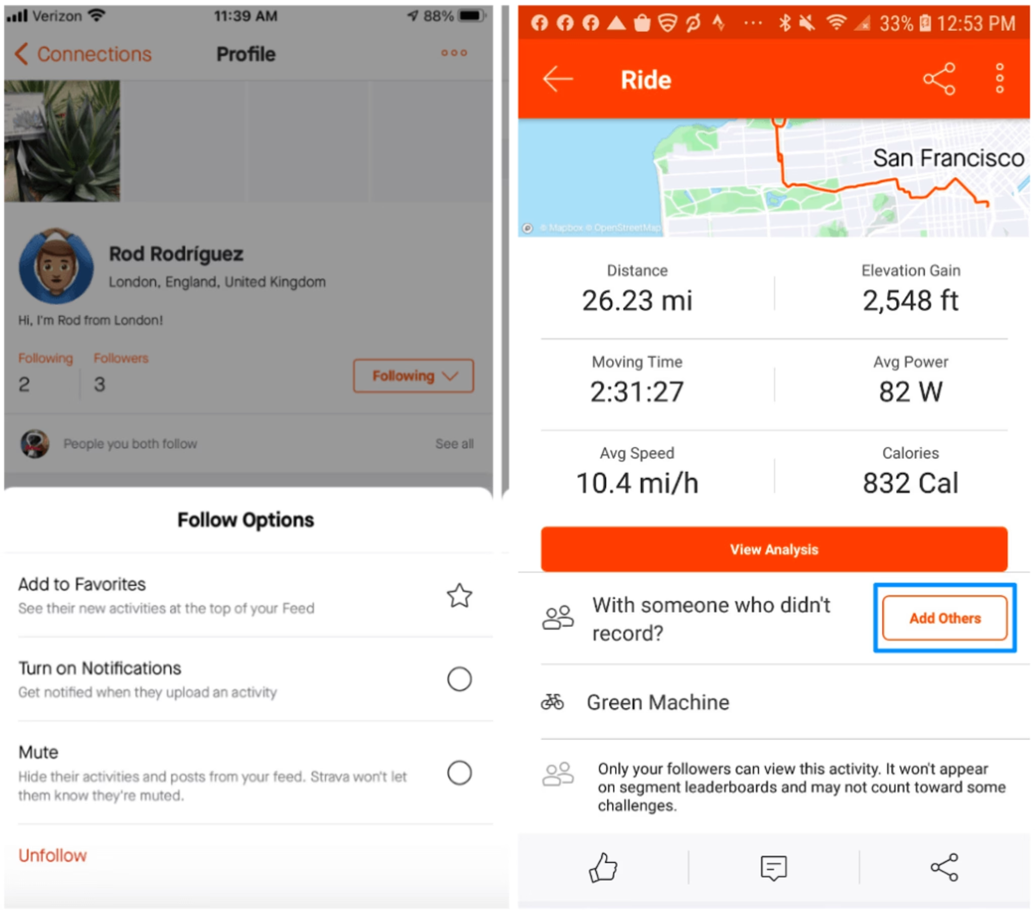
Users can also set up group challenges and create and/or join public and private clubs and compete to head up leaderboards.
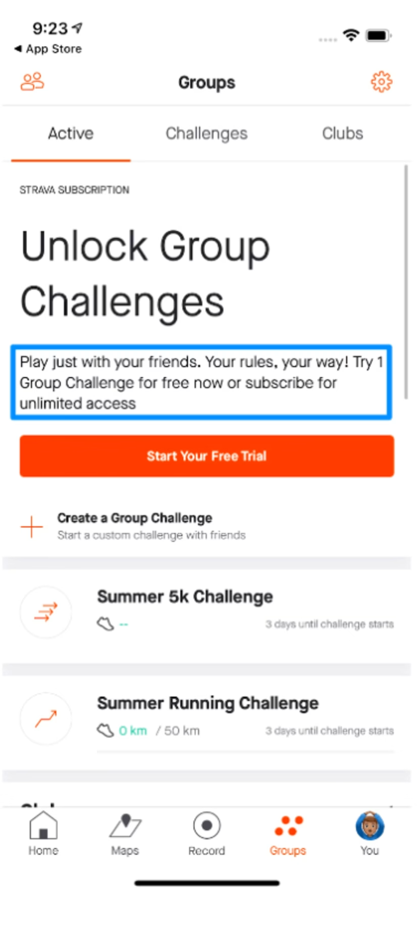
Here, social media tactics meet gamification—and the result is next-level engagement.
5: Personalize your app experience
Providing your app users with connections to their friends is one way of driving engagement. Being a friend to your users is another. And that’s where personalization comes in.
While being careful not to come across as intrusive, your team should be drawing on the data users have consented to share with you to tailor their experiences for optimal engagement.
The goal here is not only to give them a better experience—it’s to make them feel like your app ‘knows’ what they need from it, cares that they get it and is giving them it.
And the best time to start this process is…? Immediately.
That’s what budgeting app MoneyCoach does. Early in the app’s onboarding process, users are assured that their experience will be personalized.
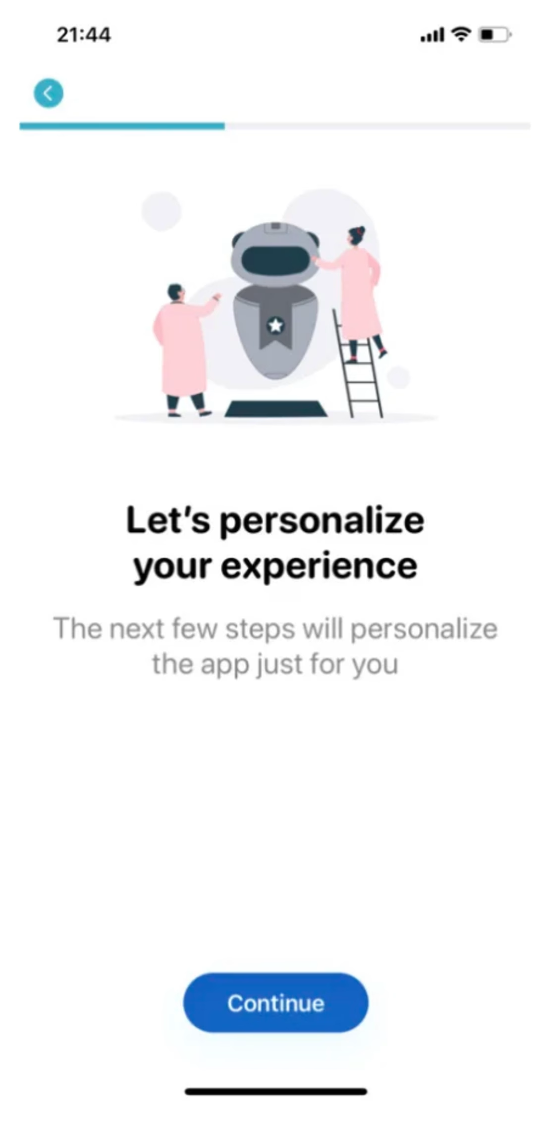
They’re then asked to submit information about their financial income and outgoings and to specify what they hope to achieve by using the app.
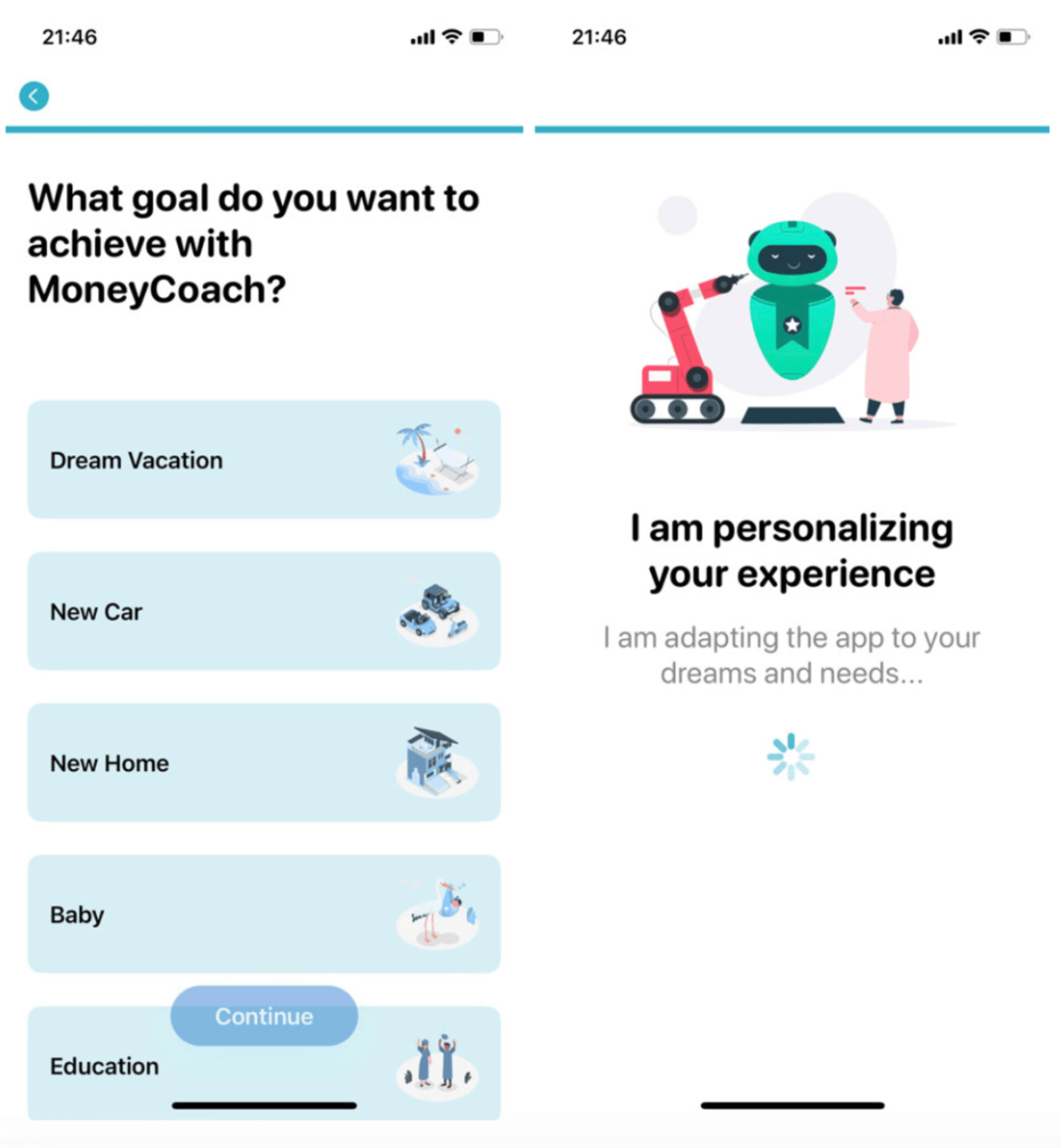
Henceforth, every piece of advice the app gives each user will be based upon this initial personalization—and crucially, they know it.
They’ll also be reminded how valuable MoneyCoach has been in helping them to save money.
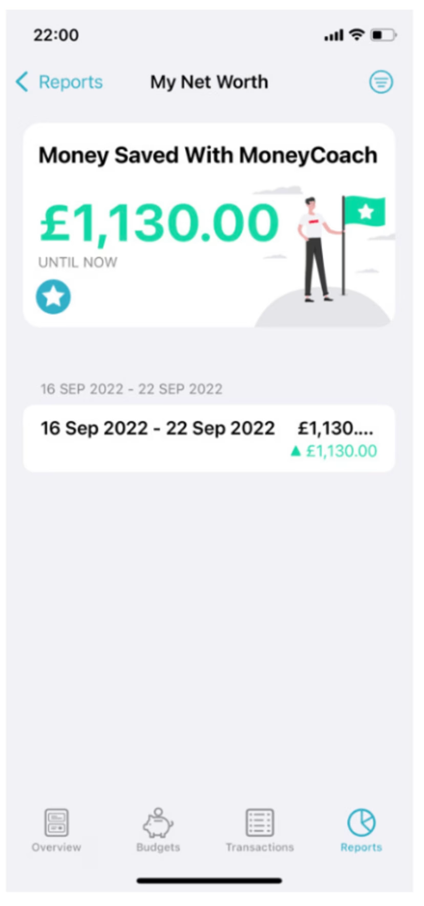
The message is clear: MoneyCoach knows them, and knows how to get them what they want, so long as they keep engaging with the app. This is a valuable relationship—and that’s a hard thing to break up.
Bonus tip: In-app notifications
Hey, we know we said 5 tips. But we couldn’t write a blog about mobile app engagement without at least mentioning in-app notifications.
In-app notifications can be used to remind users of all sorts of things—incomplete tasks, items requiring their attention, new products or promotions they might find interesting, etc.
They’re also proven tools for engagement: Sending in-app messages that are specifically tailored to their profile and/or behavior on your app has been shown to improve user retention rates.
A word of caution, though: There are few things more annoying than an app that goes overboard with notifications, particularly if they’ve got nothing to do with our preferences and in-app behavior.
So be smart with the notifications you send. They should be concise, laser-focused and above all necessary. Remember: just because you’ve got something to say doesn’t mean it needs to be said in a notification.
How to measure mobile app engagement
Many articles on the topic of measuring mobile app engagement will feature something like the following equation:
Monthly (or weekly, or daily) active users / Total users x 100 = Engagement rate
In fact, your app’s level of engagement can’t be boiled down to a single metric.
To understand how engaging your app experience is, you need to build the most comprehensive and nuanced picture of that experience possible by measuring relevant engagement metrics at every level of the experience.
What constitutes “relevant” here will depend on what your app is and what your goals are. Shopping apps will want to measure cart addition and purchase conversion; news and content apps will monitor daily usage, time on site/page, articles read per session, and so on.
Whatever metrics you’re measuring, though, you’ll want to measure them at three levels:
App-level: To give you an overall picture of your app’s engagement level and understand how effective your overall strategy is.
Examples: Bounce rate, conversions, conversion rate, screen-view average, revenue, session time average and number of sessions.
Screen-level: To give you an understanding of the engagement level of particular screens, helping you ‘zoom in’ to resolve issues.
Examples: Bounce rate, conversion rate, activity rate, screen height, fold height, time spent/interaction time, landing rate, and load time.
Zone-level: Zone-based analysis shows you exactly how users are interacting with on-screen elements, which elements are and aren’t working—and how this ties into conversion and revenue.
Examples: Tap rate, tap recurrence, conversion rate per tap, revenue per tap, swipe rate, and time before first tap
Measure, analyze and optimize mobile app engagement with Contentsquare
Mobile Analytics enables you to track your users’ behavior at every level of the app experience.
And what’s more, it gives you tools such as Journey Analysis and Session Replay, with which you can investigate the ‘why’ behind that behavior.
Let’s say you notice app users aren’t tapping on a particular CTA button (and it’s impacting your app’s conversion rate).
By rewatching an affected session on Session Replay, you may realize that users are tapping on a non-button element instead, suggesting this element is misleadingly designed.
That’s just one of countless examples of how CS Apps can help you understand your users and your mobile app experience so it can be optimized for better outcomes.
And if you’d like to book a demo today, we’d be happy to show you some more of what CS Apps can do.
![[Visual][mobile analytics] tools](http://images.ctfassets.net/gwbpo1m641r7/6JeWRjpArxxVpvvdWONAo/06ce3d8e131969492d187187cc996a96/mobile-analytics-tools.jpeg?w=3840&q=100&fit=fill&fm=avif)
![[Visual] Jack Law](http://images.ctfassets.net/gwbpo1m641r7/6K99ulcVqLqKGyNZUaPiF8/145af0b27131005d862c790ddcafb3c5/Jack_Law.jpg?w=3840&q=100&fit=fill&fm=avif)