![[Visual] Digital Analytics Reporting: Everything You Need to Succeed](http://images.ctfassets.net/gwbpo1m641r7/3Jkw9AAZJ7NuLHu11bte2l/70b6e153246a99f2919429c8c5915023/pexels-artempodrez-8519097.jpg?w=3840&q=100&fit=fill&fm=avif)
You've spent weeks setting up dashboards, tracking metrics, and analyzing data trends. Your digital analytics strategy is moving nicely—but now comes the hard part: explaining what all those numbers mean to your boss, your team, and stakeholders, all who just want to know if your efforts are working.
Raw data doesn't tell a story on its own—that's where effective digital analytics reporting comes in. With the right approach and tools, you can transform complex datasets into reports that showcase your wins and guide strategic decisions across your organization.
In this guide, you learn what digital analytics reporting actually is, what to include in a report that resonates, and which types of reports matter most—so you can deliver valuable insights that drive action, faster.
Key insights
Great digital analytics reports don’t just inform—they persuade. Go beyond the what and show the why, so stakeholders clearly see the impact of your insights on real business outcomes.
Speed up and scale your reporting with artificial intelligence. AI analytics helps you uncover insights faster—so your team spends less time wrangling data and more time driving strategy.
Let visuals do the heavy lifting. Digital analytics tools like Contentsquare’s Funnel Analysis, Journey Analysis, and Heatmaps make complex data easier to understand at a glance—and easier to share across teams.
Don’t report in a vacuum. Use reporting as a chance to connect the dots across sessions, teams, and tools. When your reports reflect the full user experience, they unlock smarter strategies and stronger results.
What is digital analytics reporting—and why does it matter?
Digital analytics reporting is the process of turning user behavior data into clear, actionable insights. It helps you measure how your digital experience is performing—and explain that performance to others. Reports take many forms, depending on your audience and goals. For example, you might create a slide deck for presentations to the C-suite, a written PDF for cross-functional updates, or even a quick Loom video walkthrough to provide context.
The format you choose matters. It shapes how clearly your insights come across and how easily others can act on them.
With the right reporting approach, you can
Show how digital efforts contribute to business goals
Uncover trends and patterns in customer behavior
Align teams around the same performance story
Spot what’s working—and what needs to improve
It’s not just about numbers. It’s about making your work visible, valuable, and easier to act on.
📊 Quick note: dashboards and reports are commonly confused, but they’re actually two different things. Dashboards help you monitor key metrics in real time—they’re like your control center. Reports, on the other hand, tell a story about something specific: they explain performance, show what’s working (or not), and suggest next steps.
Use graphs and charts from one of your Contentsquare dashboards in your digital analytics reports
How to create a digital analytics report
Whether you’re reporting monthly performance or digging into a specific campaign, you need to create reports tailored to the right audience that communicate what’s working (and what still needs work).
Here’s how to create an easy-to-understand digital analytics report that makes an impact.
1. Identify your purpose and audience
Before you pull a dataset, start with a simple question: who is this report for, and what do they need to know?
Your audience shapes everything—from the data you include to the way you present it. A leadership team might want high-level key performance indicators (KPIs) tied to revenue, while a product manager might need a deeper dive into user flows or drop-off points.
Think about:
The goal of the report. For example, are you showing a campaign’s impact or highlighting a problem?
Your audience’s priorities. What digital analytics metrics matter most to them? How familiar are they with digital analytics?
The level of detail needed. Does this report need a full breakdown or just a quick snapshot?
Once you pin down the who and why behind your report, the rest of the steps become much easier!
2. Collect your data
Now it’s time to gather the data that supports your story.
Start with the platforms where your key metrics live—this could include web analytics, customer relationship management (CRM) tools, campaign platforms, product analytics, or user experience (UX) tools. The goal here isn’t to pull everything, but to choose data sources that reflect the KPIs and behaviors your audience cares about.
Depending on your goals, you might collect
Website traffic and engagement data (think visits, bounce rates, scroll depth, click-through rates)
Conversion metrics (such as sign-ups, purchases, and form completions)
User journey flows and drop-off points
Behavioral signals like clicks, hesitations, or rage clicks
Technical issues impacting UX, like errors or slowdowns
Customer feedback from surveys or interviews
With Contentsquare, this data lives in one place—no manual tagging required. Capture complete user journeys across your website and mobile apps, and then surface the insights that matter most with the help of our AI analytics tools.
💡 Pro tip: even with an all-in-one platform like Contentsquare, your team may still rely on additional systems—like a CRM or ad platforms—to round out your reports.
Use Contentsquare’s Data Connect to export user behavior data straight into your data warehouse (like Snowflake or BigQuery), combine it with other sources, and build holistic reports that align teams and drive faster decisions. (No custom APIs needed!)
3. Analyze your data
After data collection, the next step is to extract meaning from the numbers. This is where you connect the dots between what happened and why it happened—so your report tells a clear, compelling story.
Start by looking for patterns and trends relating to your goals, like
Increases or drops in key KPIs over time
Changes in page views or traffic patterns across marketing campaigns
Drop-offs in funnels or product flows
Customer engagement with specific content or features
UX friction, such as hesitations, rage clicks, or technical errors
Analyzing this data manually could take hours, but Contentsquare makes it faster and smarter. Instead of piecing insights together on your own, AI surfaces what matters most: which content drives results, where users struggle, and what changes could have the biggest impact.
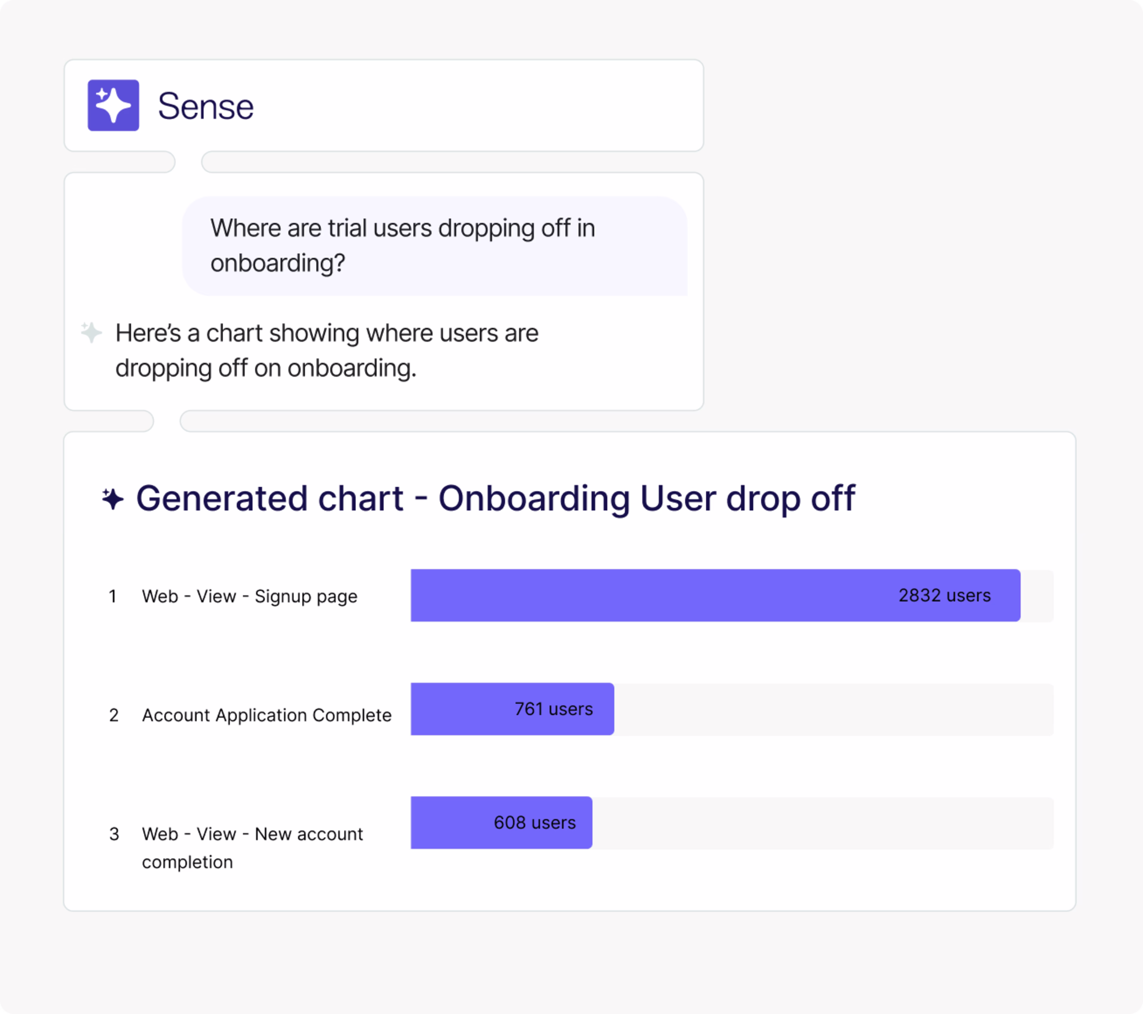
For example, ask questions in plain language—like ‘Which product pages convert best?’—and our AI agent Chat with Sense will show you the relevant analysis. Or, if you want to understand how users behaved before and after an error, go to Error Analysis to get an AI-generated summary report of issues like slow page loads or payment processing issues. Then, view Session Replay Summaries to get an overview of how these errors affected the users’ experience.
![[Visual] Session-summaries-AI](http://images.ctfassets.net/gwbpo1m641r7/3E9ARXCivOtg1MUf0gH3lx/4c6757264bed19488ccfa934a313ce76/Session-summaries-AI.png?w=3840&q=100&fit=fill&fm=avif)
Session replay summaries give you insights about up to 10 session recordings
4. Choose your visualizations
Once you’ve identified your key insights, choose visualizations that match the story you’re telling. A clear chart or heatmap makes complex metrics instantly understandable—especially for busy stakeholders who don’t live in dashboards.
Depending on your audience and report type, you might use
Line graphs to show trends over time
Bar charts to compare performance across segments or pages
Sentiment analysis charts to bring in the voice of the customer
Funnels to visualize conversion paths and drop-offs
Heatmaps to highlight engagement and scroll behavior
Error analysis to visualize how sessions with errors increased over time
![[Visual] Error analysis](http://images.ctfassets.net/gwbpo1m641r7/5Ph333vaFL4uazhLiLonMi/5366582c00731b7f4a3a819a9fd3230d/Screenshot_2024-11-05_at_17.09.50.png?w=3840&q=100&fit=fill&fm=avif)
Find visualizations for your reports in Contentsquare’s Error Analysis
Not sure how best to visualize your findings? Just ask Chat with Sense. Our AI assistant will automatically choose the right chart, filters, and segments based on your goals, so your insights come together faster.
Ask Chat with Sense to analyze your data and create charts and graphs for you.
5. Build your report
Now it’s time to bring everything together. Your report should clearly communicate what’s happening, why it matters, and what to do next. It should be easy to skim, but rich enough to support decision-making.
No matter who you’re reporting to, most digital analytics reports should include
Goals and KPIs: a quick recap of what you’re tracking and why
Context: what’s changed recently? New campaigns, product launches, experiments?
Key insights: highlight your most important takeaways
Visualizations: use charts, heatmaps, and replays to make your insights stick
Recommendations: explain what should happen next based on what you found
Prioritize your insights based on your audience. For example, if you’re reporting to leadership, start with the bottom line—and then let them dig into supporting visuals if they want more.
4 types of digital analytics reports (and how to optimize them!)
Not all reports are created equal, and not every audience needs the same level of detail. Tailoring your reports to specific goals and stakeholders ensures your insights land with impact.
Here are 4 essential types of digital analytics reports you might create regularly. Each one serves a different purpose—and with the right tools, they’re faster and easier to build than ever.
1. Executive performance summary
This high-level report gives leadership a clear view of how your digital efforts contribute to business outcomes. Whether you’re reporting on a single campaign or quarterly progress, this type of report is all about connecting marketing performance to revenue, conversion, and ROI.
Focus on the metrics that matter most to senior stakeholders, such as
Website or app traffic trends
Conversion rates and revenue impact
Campaign highlights and digital marketing performance overviews
Channel attribution and ROI
Top wins, risks, and recommendations
💡Pro tip: use Contentsquare’s Impact Quantification capability to identify which elements on your site actually influence conversions.
With just one click, it lets you measure how specific behaviors—like interacting with a call to action (CTA), engaging with a hero banner, or encountering a slowdown—affect conversion, revenue, or subscription rates.
This makes it easy to tie recommendations in your executive report directly to ROI, so stakeholders see not just what’s happening, but why it matters to the business.
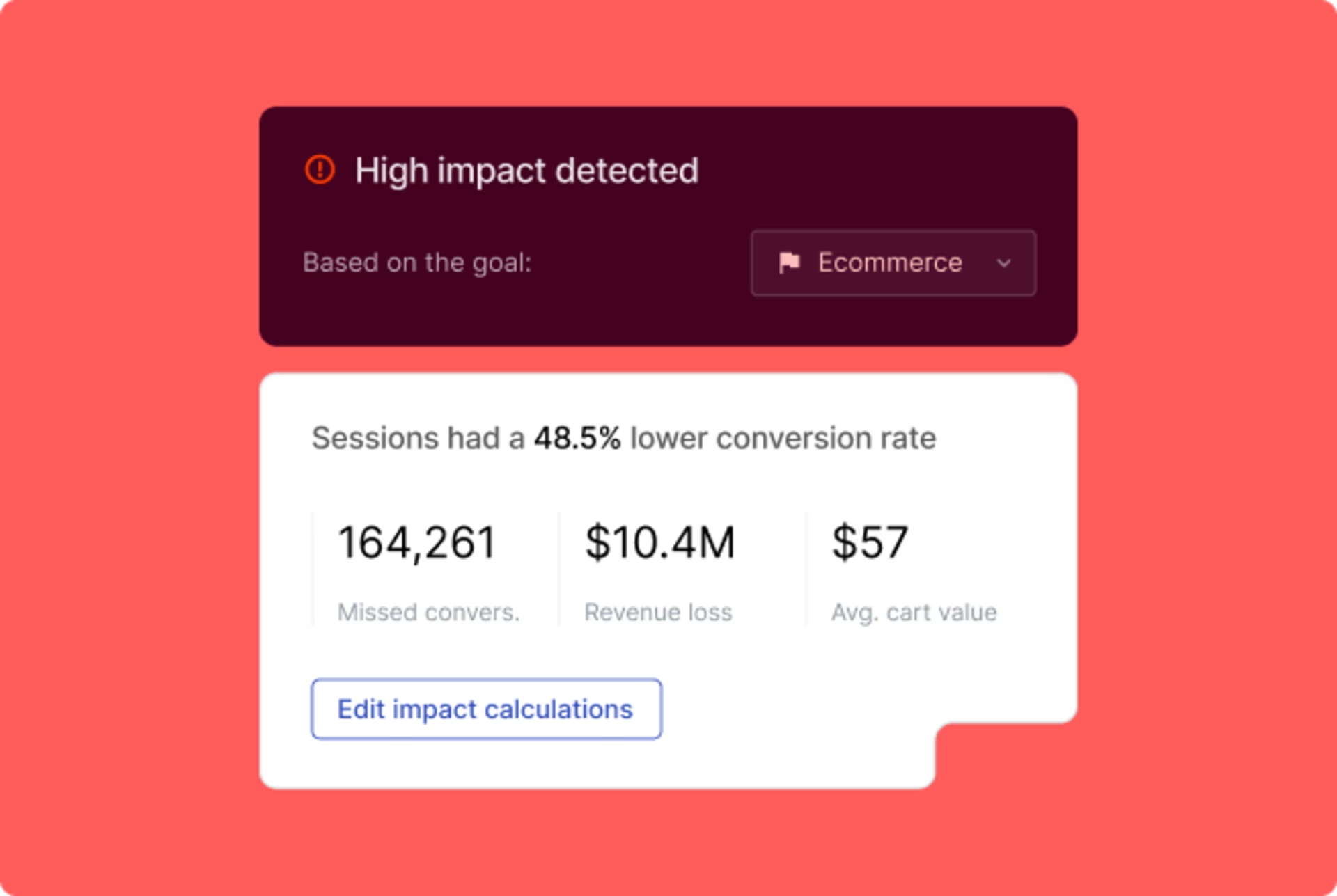
Use Impact Quantification to connect user behavior to revenue—and highlight these numbers in your report
2. Conversion funnel report
This report helps you understand how users move through critical paths on your site or app—like account signup, checkout, or booking flows—and where they’re falling off.
Mapping the entire journey from entry to goal completion lets you identify drop-off points, friction zones, and optimization opportunities.
A conversion funnel report should highlight
Funnel completion and abandonment rates
Top-performing entry and exit pages
Bounce rates at each step
Behavioral patterns linked to high or low conversion rates
Recommendations for UX, content, or flow improvements
This report helps growth and UX teams looking to reduce friction, improve user flow, and drive measurable gains in conversion. It bridges the gap between ‘what’s happening’ and ‘what to fix.’
💡Pro tip: build and visualize funnels for your report with Contentsquare’s Funnel Analysis. See where users get stuck or sidetracked and how long it takes them to move through each stage.
![[visual] Contentsquare Funnel setup](http://images.ctfassets.net/gwbpo1m641r7/5EX1R2zY8dxcIJvHEYEe8m/b31846b2b709fad619d81fe04bcadbd4/funnels.png?w=3840&q=100&fit=fill&fm=avif)
Download or export funnel visualizations from Contentsquare to enhance your reports
3. UX and behavior report
While conversion numbers tell you what is happening, a UX and behavior report reveals why it’s happening. This report uncovers how users interact with your site or app—what they click, where they hesitate, and what causes frustration—so you can find and fix UX issues that impact performance.
UX and behavior reports are especially valuable for product, design, and user experience teams. They help you turn subjective feedback (like ‘this feels clunky’) into objective, prioritized insights you can act on—and prove their impact with data.
A UX and behavior report should include
Heatmaps showing top areas of engagement
Session replay clips
Scroll depth, hover, and click data
Frustration signals (rage clicks, repeated taps, hesitations)
Behavioral trends on key pages
Recommendations for improving the user experience
Contentsquare makes this kind of reporting faster and smarter. Use Zone-Based Heatmaps to break down individual pages into clickable zones and see which areas drive action (and which don’t). Or, check out Frustration Scoring to find and prioritize the problems that make users leave—and add these visualizations to your report.
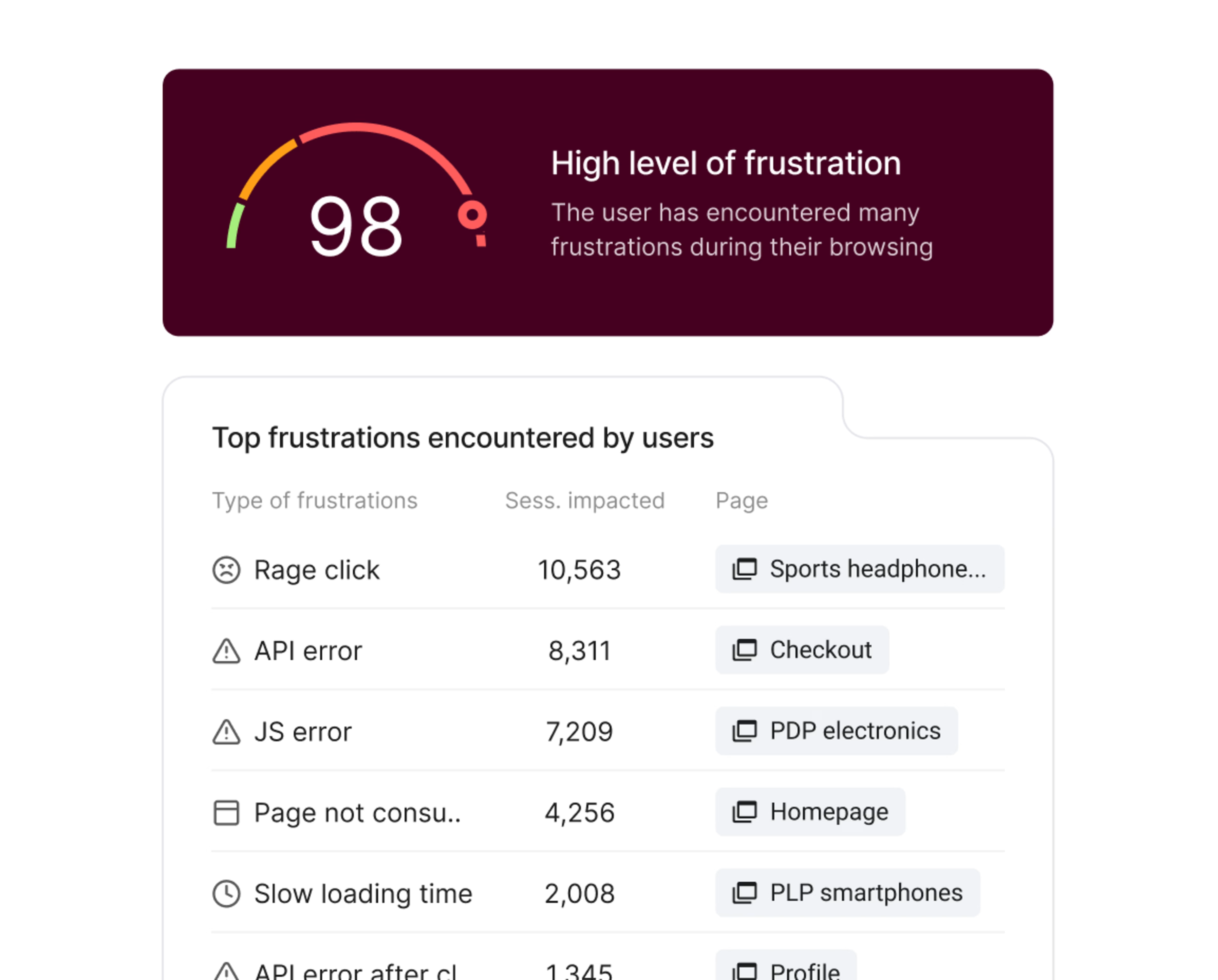
Find and report on the product or web issues that frustrate users the most
4. Campaign report
Campaign reports track how your paid, organic, email, and social campaigns perform—not just in terms of traffic, but user behavior and conversions. These reports help you explain which efforts are working, which need adjusting, and why.
Your campaign report should include
Traffic and engagement by campaign and channel
Conversion rates and drop-off points
Behavioral differences across audiences
Insights and next-step recommendations
For digital marketers, this type of report helps prove ROI and plan future campaigns. With the right visuals and behavioral context, it’s easier to make your case for an increased budget—and refine your digital analytics strategy with confidence.
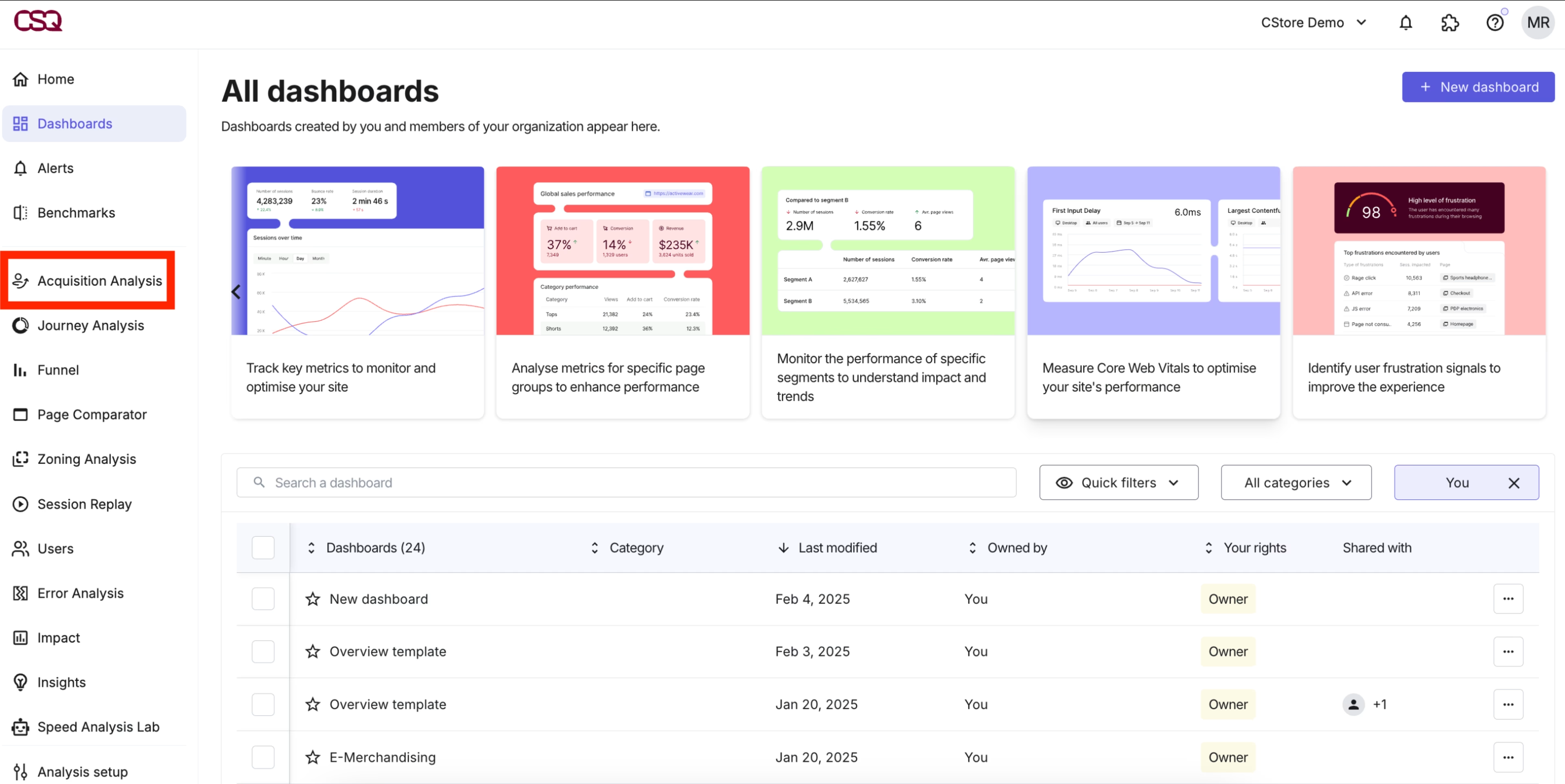
💡 Pro tip: use Contentsquare’s User Lifecycle Extension—specifically the Acquisition Analysis feature—to go beyond first-click performance reporting. See which campaigns bring in users who explore, engage, and come back. Then, prioritize the traffic sources that drive long-term value and boost retention—so your reports help you scale what works.
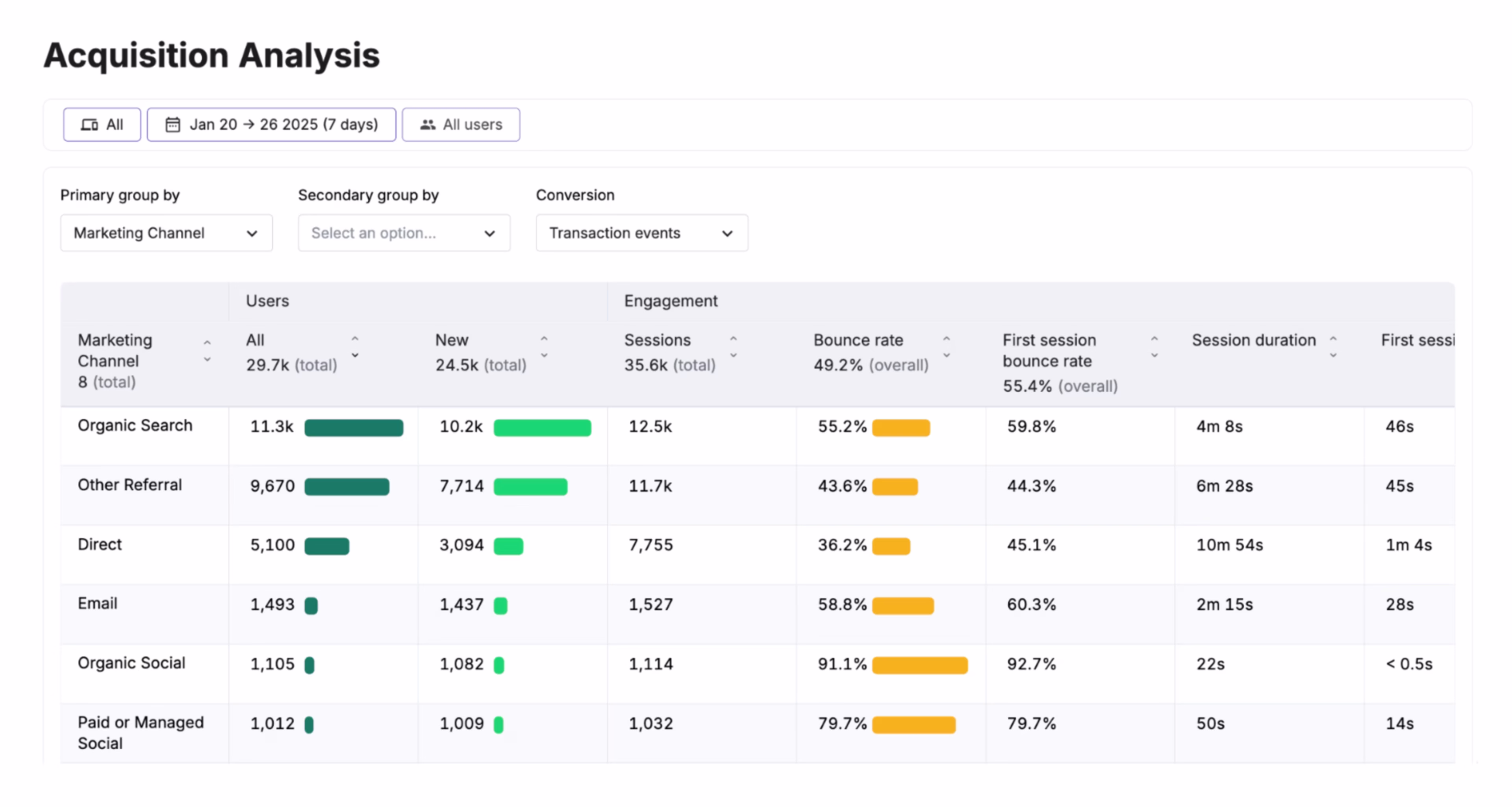
See which campaign sources drive your most valuable users with Acquisition Analysis
Getting started with digital analytics reporting
Digital analytics reporting isn’t just about sharing numbers—it’s about turning real-time data into clarity, momentum, and results. From surfacing friction to celebrating wins, better reporting empowers every team to make smarter decisions, faster. And when everyone can see what’s working (and what’s not), it’s easier to align efforts, scale what matters, and deliver better experiences across the board. 🙌
FAQs about digital analytics reporting
Digital analytics reporting is the process of turning raw user data into clear, actionable insights to share with stakeholders and team members. A great report highlights what’s working, what needs improvement, and what drives real results across your digital experiences. With automated tools that surface actionable insights for you, creating these digital reports is easier than ever.
![[Visual] Contentsquare's Content Team](http://images.ctfassets.net/gwbpo1m641r7/3IVEUbRzFIoC9mf5EJ2qHY/f25ccd2131dfd63f5c63b5b92cc4ba20/Copy_of_Copy_of_BLOG-icp-8117438.jpeg?w=1920&q=100&fit=fill&fm=avif)
![[Visual] AI analytics home - stock](http://images.ctfassets.net/gwbpo1m641r7/64i3HakmQ9aHWYWEEqpFUM/f1d5d2a41b5c7d7a523a34b58bd50ece/AdobeStock_634961399.png?w=1920&q=100&fit=fill&fm=avif)
![How to Improve CX With Surveys [Steps, Examples, & Strategy] — Cover Image](http://images.ctfassets.net/gwbpo1m641r7/3IQ0IahJEOnhmLEFZKLXf4/d46b6ce27b48ba33b4a256e13d2aa05b/Customer-Segmentation-Analysis.jpg?w=1920&q=100&fit=fill&fm=avif)