![[Visual] [Guide] [Digital Analytics] dashboard](http://images.ctfassets.net/gwbpo1m641r7/78PEBztPwE30MT9a3bIWia/e3dffa81717df72671254feb6d41d6bc/pexels-diva-plavalaguna-6147360.jpg?w=3840&q=100&fit=fill&fm=avif)
Imagine you're staring at 3 different browser tabs: Google Analytics 4 showing a 15% traffic drop, your email platform claiming campaign success, and a Slack notification about conversion rate concerns. Meanwhile, your CEO is asking why acquisition costs are up 40%, and you're manually pulling data from 5 different sources just to answer one simple question.
This is the reality for most digital teams: disconnected data sources, time-consuming manual reporting, and the constant pressure to prove return on investment (ROI)—all while fielding a steady stream of requests from every direction.
It’s inefficient and making you reactive instead of strategic. While you're generating reports about last week's performance, opportunities and problems are happening in real time.
A properly built digital analytics dashboard eliminates this chaos.
This guide shows you exactly how to build a digital analytics dashboard that answers questions before they're asked and gives your team the confidence to move fast on optimization opportunities.
Key insights
The best digital analytics dashboards combine multiple data sources in one centralized, easy-to-interpret view that democratizes insights across teams
AI-powered anomaly detection catches issues before they become expensive problems—like spotting a 20% mobile conversion drop as it happens instead of discovering it in Monday's weekly report
Successful dashboards focus on business outcomes instead of vanity metrics, tracking key performance indicators (KPIs) that directly link to revenue, retention, and customer satisfaction
Template-based setup gets you live data in hours, not weeks, but customization for your specific audience segments and campaign goals is what drives real results
What is a digital analytics dashboard?
A digital analytics dashboard is a centralized interface that brings together your most important metrics and KPIs in one place, pulling data from multiple sources to give you a complete picture of your digital performance.
Unlike static reports that show you historical data, a well-designed dashboard provides
Live data updates that help you spot trends as they happen
Visual representations that make complex data instantly understandable
Drill-down capabilities to investigate specific metrics
Customizable views for different team roles and responsibilities
Contentsquare gives you a high-level overview of your most important metrics in one place
The real difference a digital analytics dashboard makes
The right digital analytics dashboard turns overwhelming data into clear, actionable insights that help your team make confident decisions and drive measurable business results.
Here’s a side-by-side look at the difference it makes in your day-to-day.
What happens | Without a dashboard | With a dashboard |
Faster issue detection | Manual check triggered by a marketing manager's question | Automated alert detects anomaly within hours of launch |
Less time spent on reporting | Spend 45 minutes pulling data from 3 different sources | Instant notification via Slack |
Fewer wasted resources | Discover conversion is 30% worse after an A/B test, but only after 2 weeks of wasted budget | Team switches back to control version quickly, minimizing budget loss |
3 dashboard examples that bring clarity to everyday decisions
The most powerful dashboards help teams focus instead of drowning them in metrics. They’re specific, adaptable, and built around action. Every metric should serve a purpose: if it doesn’t lead to a specific decision or next step, it’s likely just noise.
The examples below show how to design role-specific dashboards that drive real business outcomes.
Each one provides the right level of context and drill-down capabilities to help teams catch issues early and take advantage of opportunities as they arise.
1. Marketing performance dashboard: focus on what drives revenue
Who uses it: marketing managers, campaign specialists, growth teams.
How often: daily monitoring, with regular checks during active campaigns.
How it helps
This dashboard helps marketing teams cut through surface-level engagement stats and focus on what truly matters—business impact.
Instead of measuring success by clicks or impressions alone, this type of data analytics report connects marketing efforts to revenue, retention, and long-term customer value.
By tracking performance across the full funnel, you can identify which channels bring in high-quality customers, optimize spend, and make faster data-driven decisions mid-campaign.
![[Visual] Marketing Acquisition Channels](http://images.ctfassets.net/gwbpo1m641r7/4J6qDzB2Ed3vip3FLVS0Qb/3d4ee58cf35d8995605cff17f9fe93e7/Digital-analytics-dashboard-marketing-attribution.png?w=3840&q=100&fit=fill&fm=avif)
Build a custom dashboard in Contentsquare to collect all your acquisition channel data—from organic traffic to paid ads—in one easy-to-access place
Essential metrics
Customer acquisition cost by channel: paired with customer lifetime value (LTV) to assess the true ROI of each channel
Full-journey attribution: shows how different touchpoints influence conversions across time and devices, not just the last click
Revenue per user by traffic source: highlights which channels drive the most valuable, high-converting traffic
Cohort retention rates by campaign: tracks how well each campaign retains customers over time, not just at conversion
Time from first touch to purchase: reveals bottlenecks and opportunities to shorten the conversion path
💡 Pro tip: make data collection and exploration easy and intuitive.
If you’re using Contentsquare, set up drill-down capabilities that connect campaign performance to actual user behavior and easily explore what’s happening beyond the metrics. So when a campaign performs well, your team can quickly
Watch session replays of users who converted
Analyze their journey paths to see how they moved through your site
Identify the messaging, layout, or targeting elements that likely drove their decision
![[Visual] Session replays AI summaries](http://images.ctfassets.net/gwbpo1m641r7/513RGRBy7acZFtxrrMg1cE/7f6851e3d8f3c4ca804c3e8cde0f847a/Session_replays_summaries.png?w=3840&q=100&fit=fill&fm=avif)
With this context directly in your digital marketing dashboard, you can replicate wins across other campaigns rather than just celebrating nice graphs and good numbers.
Contentsquare’s Session Replay Summaries feature helps your team understand campaign impact without sifting through hours of footage
2. CRO dashboard: connect behavior to business impact
Who uses it: product managers, UX designers, CRO teams.
How often: continuous monitoring, with weekly team reviews.
How it helps
This dashboard zeros in on where users struggle and why they drop off, then connects those struggles to what they actually cost the business.
Instead of guessing that "the form might be too long" or "maybe users are confused here," you’ll see CRO metrics that help you understand exactly where users struggle—whether it’s a spike in rage clicks on a mobile checkout page or a drop-off between product view and cart.
With this kind of clarity, it’s easier for you to prioritize optimizations, justify A/B tests, and focus on changes that will actually improve your conversion rate.
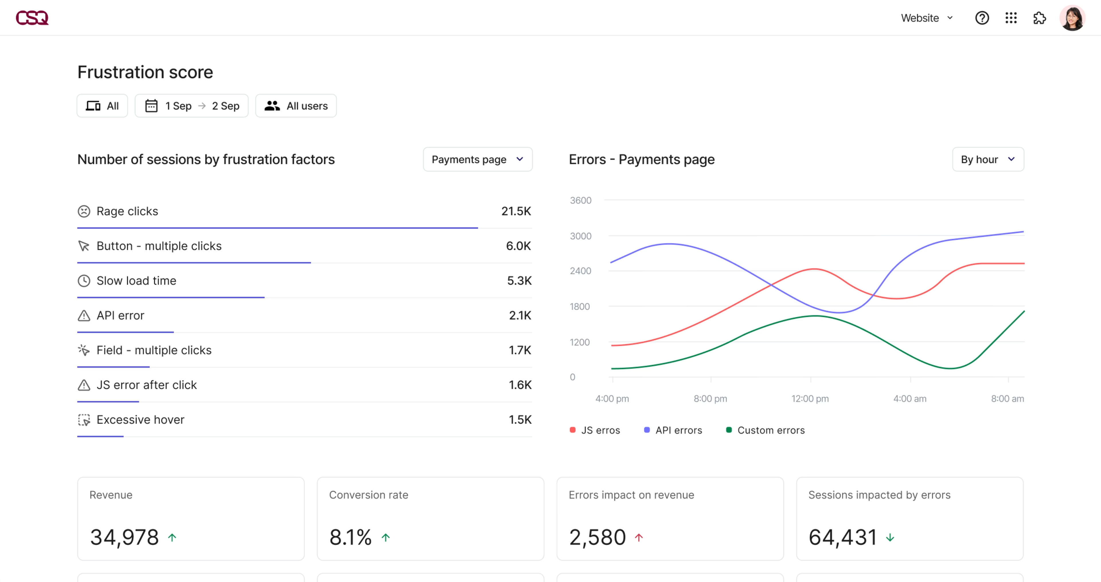
A dashboard that tracks user frustration helps shift conversations from "this feels broken" to "this is costing us $X"
Essential metrics
User frustration scores by page: tracks signals like rage clicks, failed form attempts, or repeated reloads that indicate something’s not working the way people expect
Revenue loss from drop-offs at each funnel stage: see where people are dropping off and what it’s costing you, so you know which fixes will have the biggest impact
Conversion rate by user segment and device: surfaces underperforming combinations so teams can target UX improvements more precisely
A/B test results with statistical significance: avoid overreacting to noise and build confidence in what’s working
Error rates correlated with purchase abandonment: catch technical issues that quietly kill conversions—like buttons that don’t work or forms that break on certain browsers
💡 Pro tip: give your numbers context before you act on them.
A 3% drop in conversions might be bad—or totally normal. For instance, our Digital Experience Benchmarks report data shows that in 2025,
Traffic dropped 3.3% overall
Organic traffic from unpaid channels fell 5.7%
The cost of a visit rose 9% due to higher ad spend and lower free traffic
New visitors viewed 1.8% fewer pages
So before you rush to redesign a page or rewrite calls-to-action (CTAs), ask: is this a real issue, or part of a wider trend?
That’s why a CRO dashboard helps you cut through the noise. Include comparisons to previous periods and use benchmark trends like these to understand whether a dip is a red flag or just part of a broader shift. Then act where it counts.
3. Executive dashboard: predict business outcomes and make decisions faster
Who uses it: C-suite, department heads.
How often: daily check-ins for pulse checks, with deeper reviews weekly.
How it helps
Executives don’t need the full picture—they need the right picture.
This dashboard highlights key outcomes that reflect business health, giving you just enough context to make decisions quickly and confidently. And when something looks off, you can drill down to see what’s driving it—whether that’s a technical issue, a drop in conversion, or a shift in customer behavior.
Take journey analysis, for example. A dashboard that connects outcome metrics with journey data gives executives a way to connect high-level trends to what users are actually doing on the site.
Take the example below: revenue is down, but journey data reveals the experience behind the outcome—a high number of users are exiting at the checkout and cart stages. By explaining the ‘why’ behind the drop, leaders can act quickly to delegate and improve the experience.
When combined with the right performance metrics, journey insights turn a static report into a decision-making tool that helps move the company forward.

Contentsquare’s Journey analysis capability helps executives identify the most valuable user paths at a glance
Essential metrics
Monthly recurring revenue growth and attribution: tracks topline performance and shows which channels or products are driving momentum
Average customer value trends: uses average revenue per customer (ARPC) or per user (ARPU) over time to reveal how customer quality—not just quantity—is evolving
Digital channel ROI with acquisition costs: helps prioritize investments across paid, owned, and earned media
Conversion rate trends with context: includes factors like seasonality, promotions, or known technical issues for accurate interpretation
Revenue at risk from technical problems: flags urgent issues that could affect short-term targets or customer satisfaction
💡 Pro tip: use the elevator pitch test for every executive metric.
Executives should be able to summarize what a number means—and why it matters—in one sentence:
Instead of: "Sessions increased 25%"
Your dashboard should say: "Customer acquisition cost dropped 15% while revenue per customer grew 8%, indicating improved targeting efficiency worth €120K in additional profit this quarter."
That’s the kind of insight a CEO can take straight into a board meeting. And when they’re asked about digital performance reporting, they can give confident, business-focused answers, without needing a translator.
How to set up your dashboard in one afternoon
Most teams put off building dashboards because they think it requires weeks of planning and technical setup.
But you can go from scattered data to actionable insights in under 2 hours—especially if you use analytics platforms like Contentsquare that surface behavioral insights, performance trends, and business impact out of the box.
Here’s how to get it done, fast.
Step 1: start with the questions your team asks most
Time estimate: 5 minutes.
Before picking customer experience metrics, start with the questions your team asks again and again. For example,
"Why did conversions drop this week?"
"Which marketing channels bring the best customers?"
"What's causing users to abandon checkout?"
"How is the new feature performing?"
Write down 2–3 of these. They will shape your dashboard's focus, and ensure your team members actually use it.
Step 2: identify the KPIs and segments that answer them
Time estimate: 15 minutes.
Next, work backward from those questions and identify the data you need to answer them.
The goal isn’t to pull everything into a dashboard. It’s to prioritize key metrics that tie to outcomes—like conversion rates, drop-offs, or engagement with a key feature. You want to show where users struggle, where they succeed, and how that affects revenue.
Take stock of your existing data sources. Which ones actually help you answer your core questions?
Source | Examples | Use it if... |
Web analytics | Google Analytics, Adobe Analytics | You want to see website traffic patterns, bounce rates, or high-exit pages |
CRM data | HubSpot, Salesforce | You need to connect onsite behavior to purchases or lead stages |
Marketing platforms | Google Ads, Facebook Ads, email marketing tools | You're measuring campaign ROI or acquisition cost |
Product analytics | You're tracking feature adoption or in-app behavior | |
Customer support | Zendesk, Intercom | You want to tie friction or bugs to support volume and user sentiment |
Start by focusing on 2–3 core data sources you trust. You can always add more later, but trying to include everything from the start leads to analysis paralysis.
💡 Pro tip: use Contentsquare’s Data Connect to supercharge your dashboard by combining data from different tools.
Most dashboards fall short because they only show one slice of the story. Contentsquare’s Data Connect lets you automatically sync behavior analytics metrics, performance insights, and error data to your warehouse, and blend it with your customer relationship management (CRM), marketing, and support tools.
It lets you sync all of this into a single source of truth.
That means you can finally answer questions like:
Did this frustration spike lead to a support ticket?
Are high-value segments seeing more errors?
Which behaviors predict churn before it happens?
Data Connect lets you automatically export behavioral data straight to your warehouse of choice
Step 3: use a template, then customize it for your KPIs
Time estimate: 30 minutes.
Now that you’ve selected your key questions and data sources, it’s time to bring them to life. You’re not choosing what to track anymore, but how to present it in a way that’s immediately usable.
Dashboard templates help you skip the blank page and structure your insights in a way that actually drives informed decisions.
Start with a Contentsquare dashboard template that’s closest to your use case:
Ecommerce dashboard: understand how the user experience affects your bottom line by tracking the revenue impact of drop-offs, friction, or failed checkouts
SaaS dashboard: spot where users lose momentum or disengage by tracking feature engagement, activation, and retention
Content marketing dashboard: measure how well your content resonates by tracking scroll depth and return visits
From there, tweak it: replace metrics, adjust filters, and rearrange widgets. You’ll have live, meaningful data in under an hour.
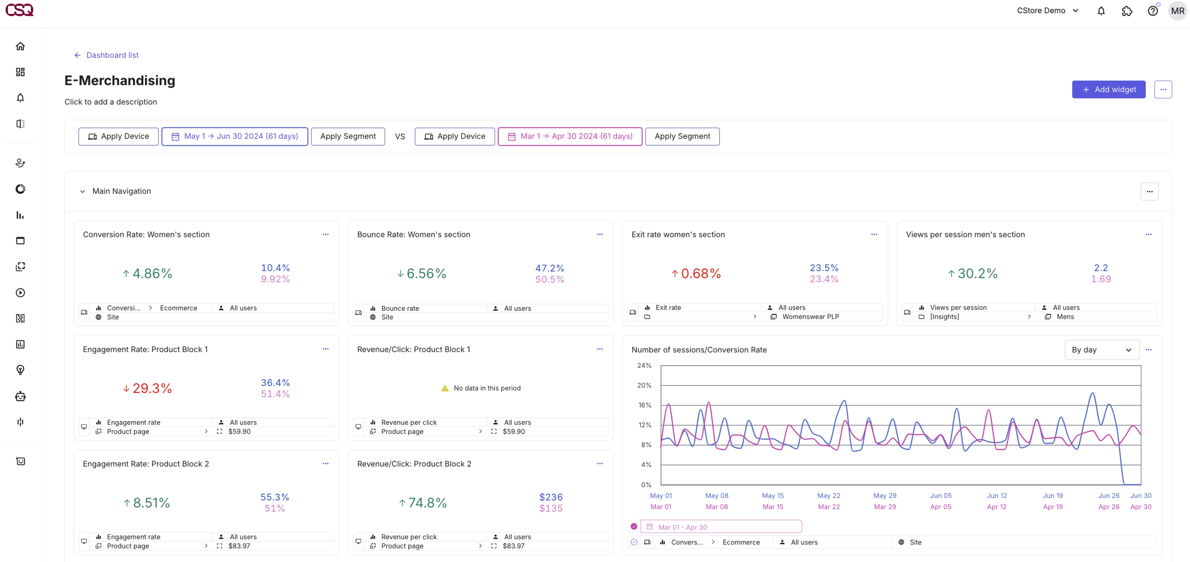
If you regularly follow product and product page performance, Contentsquare’s E-Merchandising dashboard saves you some serious time
Step 4: automate monitoring with smart alerts and clear goals
Time estimate: 20 minutes.
Once your dashboard is live, the next step is to make it work for you—even when you're not looking at it.
Rather than manually checking your digital experience monitoring metrics every day, set alerts that flag meaningful, sustained changes, like
Revenue impact: conversion rate drops for mobile or desktop
Technical issues: page load time exceeds your threshold on key pages
Campaign problems: bounce rate increases for visitors from paid search
If your business is especially seasonal or volatile, use AI-powered anomaly detection to eliminate noise. For example, Contentsquare uses machine learning to automatically adjust thresholds based on historical patterns, reducing false positives and alert fatigue.
Contentsquare’s alerts allow you to get automatically notified to relevant and impactful changes in your metrics
💡 Pro tip: use smart alerting to reveal real issues, without overwhelming your team.
Most dashboards alert you to everything under the sun, which means you ignore them all. Smart alerting focuses on business impact, not data fluctuations.
Set up these 5 critical alerts:
Conversion rate drops >15% for more than 2 hours
Mobile page load time exceeds 4 seconds
Error rate spikes affecting >100 users
Revenue attribution changes >20% week-over-week
User frustration score increases on key pages
Contentsquare offers alerts that include context (changes, timeframe, or impact), so you can act immediately and outline clear next steps. You can even route alerts via Slack or email so the right teams see them instantly and jump into action.
![[Visual] Contentsquare for Slack](http://images.ctfassets.net/gwbpo1m641r7/113iKQLXi5H7Usy4ADamHj/e6e4bdb7b64b5dda9d92d82c02d522a0/Screenshot_2025-01-10_at_16.42.29.png?w=1920&q=100&fit=fill&fm=avif)
Turn Slack into your real-time dashboard by setting up alerts for your most important metrics
Step 5: share with your team and review weekly
Time estimate: 15 minutes.
A dashboard is only powerful if people use it. Once it’s live and alerting you to the right behaviors, it’s time to bring your team into the loop.
Create role-based views so everyone sees what matters:
Team | What they need |
Marketing | Campaign performance, attribution breakdowns, traffic trends |
Product | Feature usage, behavior flows, drop-offs post-release |
CRO | Funnel completion, frustration signals, A/B test outcomes |
Executives | Revenue trends, key KPIs, risk or opportunity alerts |
You don’t need different dashboards for each team—just custom views or filters that align with their responsibilities.
💡 Pro tip: use AI to make dashboards more helpful (and less manual).
Sense, Contentsquare AI agent, brings a layer of intelligence that helps non-analysts get analyst-level answers:
Natural language queries: ask things like, "Why did conversions dip last week?" and get clear, instant explanations
Automated pattern detection: Sense surfaces hidden trends and correlates behavior changes to performance shifts
Smart alerts: AI learns your baselines and flags only meaningful changes—no more chasing false alarms
Predictive insights: Sense can identify signals that indicate potential churn or success before they show up in the KPIs
![[Customer Story] IDM Sudtirol - Chat With Sense image](http://images.ctfassets.net/gwbpo1m641r7/3QHCvM15opgWHA1L1Mow6A/2d2901a69186b2a6f2fcee2191abe3a4/chatwithsenseimage.webp?w=3840&q=100&fit=fill&fm=avif)
With Sense, understanding your customers’ digital experience is as simple as asking a question
Next steps: build your digital analytics strategy
Setting up an effective dashboard is a huge win, but it’s just the beginning.
To become truly data-driven, you need a digital analytics strategy that connects daily performance tracking to quarterly goals, team priorities, and a clear process for fixing what’s not working.
Your dashboard is your pulse check. Your analytics strategy is the brain that makes sense of it all. Together, they drive smarter decisions, faster results, and a more confident, aligned team.
With Contentsquare, you don’t need to jump between 5 tools to get that overview. Our all-in-one experience intelligence platform connects dashboard monitoring with session replays, journey analysis, and testing tools, all in one place.
Faster, easier, and intuitive—so you can move from question to insight to action without slowing down.
FAQs about digital analytics dashboards
Most dashboards show data. Digital analytics dashboards focus on how users actually experience your site or product: where they click, where they struggle, where they convert (or don’t).
They go beyond basic traffic stats and show you the ‘why’ behind performance trends, combining behavior, friction, and revenue impact into one view.
![[Visual] Contentsquare's Content Team](http://images.ctfassets.net/gwbpo1m641r7/3IVEUbRzFIoC9mf5EJ2qHY/f25ccd2131dfd63f5c63b5b92cc4ba20/Copy_of_Copy_of_BLOG-icp-8117438.jpeg?w=1920&q=100&fit=fill&fm=avif)
![[Visual][guide] sentiment analysis home page](http://images.ctfassets.net/gwbpo1m641r7/5Ambj2K5EYDaS0tiOWyuZz/e923f90fb57af8a30a7d8f5e626ff9ea/sentiment-analysis-team-work.jpeg?w=1920&q=100&fit=fill&fm=avif)