Everything You Need to Know About Microinteractions in Website Design

What are microinteractions?
A microinteraction is a product interaction that allows the user to accomplish a single task. Microinteractions can be small events within a product, such as a button or a scroll bar on the page, or be an entire product, such as a calculator app, which has a simple task of crunching numbers. It can even be a kitchen appliance, such as a toaster, which performs a single task of toasting bread.
Microinteractions are present everywhere: on your phones and laptops, home appliances, and environments. Although they are often overlooked, they play a crucial role in guiding you through a product and helping to build a great user experience.
The four steps of microinteractions
Each microinteraction follows four steps: a trigger, rule, feedback, and loops and modes.
- Trigger: a trigger is what initiates the feedback. This can either be a manual trigger, which is initiated by the human (think clicking, hovering, scrolling, etc.) or an automatic trigger, which is initiated by the system when conditions are met (think meeting a time condition, receiving an email, getting a phone call, etc.). Without a distinct trigger, an element cannot be a microinteraction.
- Rule: A rule determines what happens when the feedback is triggered. If, for example, a user sets a time for an alarm, the rule is that the alarm will go off when the time condition is met.
- Feedback: Feedback can be in the form of visual, auditory, or haptic feedback, or anything that the user can see, hear, or feel after microinteractions are initiated. Setting off a phone alarm, for example, can result in an alarm alert screen (visual feedback), a ringing alarm (auditory feedback), or maybe even vibrations (haptic feedback) if you’ve set your phone to silent.
- Loops & Modes: Loops determine the length of microinteractions. Going back to the example with the phone alarm, how long would the microinteraction last? Will the alarm keep ringing, or will it stop after a single instance? Modes control the form of feedback that is sent to the user. If the user sets their phone to silent mode, the alarm would not ring with a sound, but would ring silently or with vibrations. It is important to note that not all microinteractions have modes, and if they do, should be clearly differentiated from its normal functionality.
Why are microinteractions important?
Microinteractions are important because they play a huge role in the user experience. More specifically, they improve the usability of a product, grow its user involvement, and empower users by communicating what’s happening.
Ultimately, this can all create a delightful experience among your users. This is why it’s not only crucial to implement microinteractions, but to implement good microinteractions, which can bring delight and joy to your users.
A good microinteraction can set a product apart from others.
What do microinteractions do?
The main functionalities of microinteractions are to:
- Increase user engagement
- Help construct habits
- Display system status
- Prevent mistakes
- Share about the brand
Let’s take a look at some of these in more detail…
Microinteractions increase user involvement
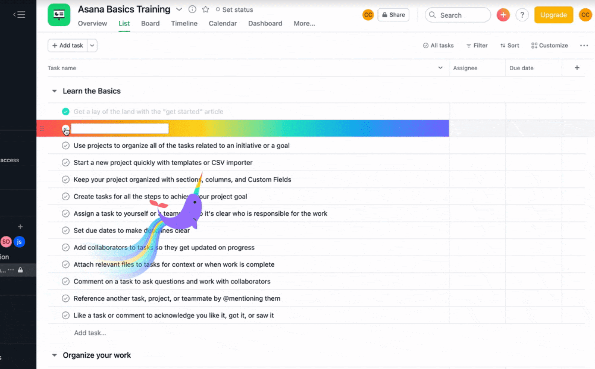
Microinteractions can help provide positive reinforcement to the user, such as Asana’s narwhal (pictured below) which helps to reinforce desired behavior from users.
When the user checks off an item on their list, the task lights up in color and a wonderful narwhal flies by – two small microinteractions that help make the user feel good.

Checking off a task on Asana’s desktop site.
Help construct habits
Microinteractions can help construct user habits, too. Any quick action that is intuitive to carry out or brings joy to users will make them do it more often, which helps to set up habits in your users.
For example, push notifications are microinteractions. We instinctively check our phones when we see them light up or hear them ring – proof that microinteractions can help change user behavior, almost instinctively.

Viewing push notifications on an iPhone lock screen (Image from support.apple.com)
How about Instagram stories? Have you ever caught yourself swiping through mindlessly? The quickness and simpleness of this microinteraction help build this habit.

Swiping through stories on Instagram.
Microinteractions display system status
Displaying status is another functionality of microinteractions.
A progress indicator on LinkedIn, for example, tells the user what’s going on when they refresh the page. After the user pulls down the page, the system immediately provides visual feedback, showing a spinning progress wheel on the page before the page refreshes.
It also encourages the user to stay engaged with the product, even while they are waiting for something to happen.

Refreshing recommended jobs on LinkedIn.
Another example is showing the system on standby. When you say “Hey Siri,” an orb pops up, then waits for further instruction from the user, encouraging the user to continue interacting with the product.

Siri on standby.
Microinteractions help to anticipate mistakes
Microinteractions can help prevent mistakes or errors. When you try to exit out of creating an Instagram story, you get a confirmation modal that asks you to confirm your decision.This microinteraction is forgiving of human error, allowing the user to undo any accidents and create a better user experience.

Asking confirmation to discard a story on Instagram.
Using microinteractions to communicate your brand message
Microinteractions are great at communicating your brand’s personality and message.
For example, when someone types on Snapchat, their Bitmoji and a chat bubble are shown on the bottom left of the screen. This is a microinteraction. Snapchat uses its fun, signature, Bitmoji feature to keep users engaged with the app, even as they are waiting for the user to reply.

Waiting for a reply on Snapchat.
Another example is with the popular voice and video chatting platform, Discord. Discord uses microinteractions that are very distinctive to the brand. When a user talks in a voice channel, their avatar and server name light up, providing visual response that the user is talking.
![]()
User is in Discord’s voice channel but does not speak.
![]()
User speaks on Discord’s voice channel.
Microinteractions play a huge role in UX. They improve usability, encourage users to engage with your brand and use your products effectively. They can also bring joy and delight, increase engagement, build user habits, communicate system status, prevent human errors, and communicate your brand.
They are a hugely important part of building incredible user experiences, and when done correctly can have a huge impact on brand loyalty and customer satisfaction. Why not take a look at your brand’s own microinteractions and see where you can improve the experience for your customers?


