![[Visual] Wesbite usability and B2B - stock image](http://images.ctfassets.net/gwbpo1m641r7/6f58ikhwJpzoO9Eyd16Mnf/558dc3756f3ef9a0fdbaea70d94280d2/AdobeStock_664400008.jpeg?w=1280&q=85&fit=scale&fm=avif)
Key insights
Most app UX friction is silent. Users abandon without reporting errors, submitting feedback, or explaining why, which means drop-off data alone can't tell you what went wrong. Understanding these silent UX pain points requires reading behavioral clues.
Behavioral signals like rage taps, looping paths, and long hesitation before a tap reveal friction that no survey will capture.
Mobile app flows have unique friction patterns. Small touch targets, keyboard overlays, permission prompts, and connectivity drops create obstacles that don't exist on desktop.
Fixing the most visible drop-off point isn't always the highest-impact move. Tracing friction to its root cause before prioritizing fixes is what separates guesswork from results.
Where do users struggle in mobile app flows?
Friction in mobile app flows is any point where the experience creates enough resistance that users slow down, get confused, or abandon entirely. This happens during onboarding, search, checkout, upgrade flows, or any sequence of screens a user moves through to complete a goal.
A mobile app flow means a sequence of screens or steps, not just a single page. The distinction matters because mobile app friction is fundamentally different from desktop friction.
Mobile app experiences face unique challenges. Smaller screens force compromises in what you can show at once. Touch-based input lacks the precision of a mouse, making mis-taps common. Variable connectivity creates unpredictable performance issues. Context switching from notifications or calls means users often return to flows disoriented about where they left off.
Most critically, users who hit friction don't complain. They just leave. You won't get a support ticket explaining why they abandoned at checkout or a survey response detailing the confusing button label. This makes passive behavioral signals your primary evidence for understanding what went wrong.
Which friction signals reveal hidden struggle in mobile app flows?
Behavioral signals are the language users speak when they won't or can't tell you something is wrong. These 9 specific signals each point to a different type of friction.
What do rage taps and repeat taps reveal?
Rage taps are rapid, repeated taps on the same element in quick succession. This means 3 or more taps within 2 seconds on the same spot. You're witnessing a user's mounting frustration in real time.
Repeat taps on a call-to-action (CTA) that appears functional signal several issues. A slow response makes users doubt their first tap registered. A broken interaction fails silently. A confusing affordance makes the element look different from other tappable items. Users tap again because they don't receive immediate feedback like a color change, loading indicator, or screen transition.
On desktop, users can hover to check if something is interactive before clicking. Mobile offers no such preview. Users must commit to a tap to discover if an element works, making rage taps particularly common on mobile interfaces.
When you need to understand what's causing rage taps, Contentsquare's Session Replay records real user sessions including all gesture events, allowing teams to watch the exact moment frustration occurs. You can see the element's state at that point and determine whether the issue stems from a broken interaction or a design problem. Session Replay's AI-powered session summaries help surface the most relevant moments of user struggle, so you don't have to watch hours of recordings to find the problem.
![[Asset] Session replay summaries](http://images.ctfassets.net/gwbpo1m641r7/37Slb23dAdFsAgNItuUNPc/5ad533ecdc801e082aeef8bfaca324ce/sessionreplaysummary.webp?w=1280&q=85&fit=scale&fm=avif)
What do dead taps reveal about your UI?
Dead taps are taps on elements that look interactive but have no action attached. This includes non-linked images, static text styled like a button, or decorative elements that resemble CTAs.
On desktop, a cursor change signals "not clickable" before users commit to a click. Mobile offers no equivalent pre-tap feedback. Users discover non-interactive elements only after tapping them, which creates a trust issue.
High dead-tap rates on a specific element tell you users expect it to do something it doesn't. Common examples include:
Product images that look like they should enlarge but don't
Heading text styled with brand colors that match button styling elsewhere
Icons that appear actionable but serve only as decoration
Contentsquare's click heatmaps visualize where users tap across a screen, making clusters of dead taps immediately visible. When you see concentrated tap activity on non-interactive elements, you're seeing user expectations laid bare.
![[Visual] Click map](http://images.ctfassets.net/gwbpo1m641r7/1oAZUOxd5cXHEGZRB70Fyc/2b3fabe6ac4202c782fd656040e78315/Mobile_maps.png?w=1280&q=85&fit=scale&fm=avif)
What do repeat submissions reveal in mobile app forms?
Repeat submissions happen when a user submits the same form more than once or re-enters data after a failed attempt. This behavior signals one of 3 core problems.
First, validation errors the user doesn't understand. Generic messages like "Please check your input" leave users guessing which field has the problem. Second, slow response times make users think the submission didn't go through. Without a loading indicator or disabled submit button, users naturally try again. Third, error messages aren't actionable enough, telling users something is wrong without explaining how to fix it.
Mobile app forms face a specific vulnerability. Keyboard overlays can obscure error messages that appear at the bottom of forms. Users see no error, assume a technical glitch, and resubmit.
Contentsquare's Error Analysis (part of Experience Monitoring) tracks JavaScript and API errors linked to user interactions, including form submissions. This helps you correlate repeat submissions with specific technical failures, distinguishing between UX copy problems and actual system errors.
What does looping behavior reveal about mobile app navigation?
Looping behavior is when users visit the same screen or step more than once within a single flow. This means backtracking instead of progressing forward.
Loops typically signal 2 issues. Either users are lost because navigation labels are ambiguous or the flow structure is unclear. Or they're hunting for information they expected to find at an earlier step, like shipping costs, return policies, or account requirements they need to make a decision.
A single loop is common and often harmless. Users check something they missed. But repeated loops across many users on the same step signal a structural problem with your flow. Say 30% of users loop between your product page and cart. Something critical is missing from one of those screens.
Contentsquare's Journey Analysis visualizes how users move through sequences of screens step by step, including where they backtrack or exit. The tool tracks up to 7 navigational steps and includes a Reverse Journey view, making it possible to spot looping patterns at scale rather than discovering this pattern one session at a time.
![[Visual] Journey-analysis-sense](http://images.ctfassets.net/gwbpo1m641r7/3YF1vgtNFaqqWjjaxSZbgl/b37170520a1dc52508425883c909ace1/Journey-analysis-sense.png?w=1280&q=85&fit=scale&fm=avif)
What does hesitation time reveal about decision friction?
Hesitation time is the gap between a user arriving at a screen and their first meaningful interaction. This means that long pause before tapping a CTA or advancing to the next step.
Hesitation signals uncertainty. Users have reached a decision point but something stops them from proceeding. This could be unclear copy that doesn't explain what happens next, unexpected information like a surprise price reveal, trust concerns about security or privacy, or a form that looks more complex than they're prepared to complete.
Hesitation is not the same as engagement. A user who scrolls and reads is engaged, actively consuming content. A user who sits still on a CTA screen without scrolling or interacting is hesitating, frozen by indecision.
Contentsquare's Experience Analytics captures time-based interaction data at the element level, allowing teams to identify screens where users consistently pause before acting. This surfaces decision friction that wouldn't appear in a standard funnel drop-off report. You might see 70% completion at a step, which looks healthy, but miss that users are hesitating for 15 seconds before proceeding.
What does slow performance reveal about mobile app abandonment?
Performance friction is abandonment caused by slow screen loads, laggy transitions, or delayed responses to tap interactions. This is distinct from UX or copy friction.
Mobile app users are more sensitive to performance delays than desktop users for 3 reasons. Mobile connections are inherently variable, swinging from 5G to Edge networks as users move. Users are often in low-patience contexts like commuting, standing in line, or grabbing a moment between tasks. Mobile devices themselves vary wildly in processing power, from flagship phones to budget devices that struggle with modern web apps.
Performance friction is silent in a specific way. Users don't know whether a slow screen is a bug or just slow. They just leave. In your analytics, this abandonment looks identical to a user who didn't like your price or wasn't interested.
Contentsquare's Speed Analysis (part of Experience Monitoring) identifies performance bottlenecks at the page and interaction level and correlates slow load times with user abandonment. When you see that users on 3G connections abandon at 3x the rate of WiFi users at the same step, you've identified a performance problem, not a design problem.
Which errors create silent friction in mobile flows?
Silent errors are technical failures that block users from completing a step but produce no visible error message. This includes JavaScript errors, API failures, and app crashes that either show nothing or produce messages too vague to act on.
These errors create the most damaging type of friction because users blame themselves. When a silent error occurs, users assume they did something wrong. They retry once or twice, then abandon. The error is never reported because users don't know it was a system failure.
Error spikes during specific flow steps signal technical friction sources, not design problems. Say 20% of users drop at payment, but only on Android devices. You're looking at a technical issue, not a trust problem.
Contentsquare's Error Analysis monitors multiple error types including JavaScript errors, API errors, and app crashes, and surfaces errors that are linked to specific user interactions using the "Error After Click" feature. Instead of seeing "high drop-off at checkout," you see "API timeout on payment validation causing checkout abandonment."
![[Visual] error analysis](http://images.ctfassets.net/gwbpo1m641r7/2RHGIcGhjdzYE7tMVVWzzg/2bc7b35d22f6b8a0806a09a23f6f7c71/error_analysis.avif?w=1280&q=85&fit=scale&fm=avif)
Which permission prompts create trust friction?
Permission friction is the resistance users feel when a mobile app requests access to device features. This includes camera, location, push notifications, contacts, and biometrics at a moment that feels premature or unexplained.
iOS and Android both require explicit user consent for sensitive permissions. A declined permission can make a flow impossible to complete. Decline camera access during ID verification, and the user literally cannot proceed. Decline location access for a delivery app, and the core value proposition fails.
Timing is everything. A permission prompt that appears before users understand why it's needed creates more friction than the same prompt shown at the moment it's clearly relevant. Ask for push notifications immediately after app install, and users reflexively decline. Ask after they've completed their first order with a clear value proposition like "Get delivery updates," and acceptance rates soar.
Which touch interactions create mobile app friction?
Touch target friction is difficulty tapping the intended element because it's too small, too close to adjacent elements, or positioned in a hard-to-reach area of the screen. The top corners on large phones are particularly problematic for one-handed use.
Touch targets that work perfectly on a design mockup can fail catastrophically in real use. Fingers are imprecise. The average fingertip covers about 45 pixels on a typical screen. Screens vary dramatically in size and pixel density. Users interact one-handed more often than designers assume, especially while walking, carrying items, or holding onto public transport.
Touch target friction produces 2 clear signals. Dead taps when users hit the space between elements. Mis-taps on adjacent elements when they aim for one thing but hit another.
Contentsquare's click heatmaps visualize where users actually tap on a screen versus where the interactive elements are positioned, making it straightforward to identify touch target sizing or spacing issues at scale.
How do you trace friction to a root cause you can fix?
Spotting a signal like a drop-off or rage tap cluster is only the starting point. It tells you where something is wrong, not why. Root-cause diagnosis requires triangulating across multiple data types: quantitative flow data, behavioral recordings, and qualitative user feedback.
Without this triangulation, teams risk fixing the symptom rather than the cause. You might redesign a button when the real problem is an API error that made the button unresponsive.
What are the steps to diagnose friction in mobile flows?
Following a systematic diagnostic workflow ensures you identify true root causes rather than making educated guesses. Here are the 4 steps:
Step 1: Identify the drop-off. Use funnel analysis to find which step in the flow has the highest exit rate. Treat this as your starting hypothesis, not your conclusion. The step with the highest drop-off isn't always the step with the problem.
Step 2: Segment by device, OS, and connection. Check whether the drop-off concentrates in a specific device type, operating system version, or network condition. A friction pattern that only appears on iOS 14 devices or 3G connections is almost certainly a technical issue, not a design one.
Step 3: Watch what users actually do. Review recordings of sessions from users who dropped at that step. Look for the behavioral signals covered earlier like rage taps, loops, hesitation, and errors to identify the specific interaction that failed. Contentsquare's Session Replay can be filtered by specific flow steps, device type, and frustration signals, helping you go directly to the most relevant sessions rather than watching randomly.
Step 4: Corroborate with user feedback. Cross-reference behavioral evidence with any open-text survey responses, support tickets, or in-app feedback from users who completed or abandoned that flow. Contentsquare's Voice of Customer (VoC) surveys can be triggered at specific flow steps to capture the "why" from users in the moment, connecting behavioral data with stated frustration. The platform's AI-powered surveys and sentiment analysis help surface patterns across hundreds of responses.
![[Guide] Surveys AI sentiment analysis](http://images.ctfassets.net/gwbpo1m641r7/36jQmowoqQcZwulSdW26qj/17a48e2b87a9b324d3bda705c2d790ed/Surveys-AI-sentiment-analysis.png?w=655&q=85&fit=scale&fm=avif)
Understanding the difference between symptoms and root causes is critical:
Symptom (What You See) | Root Cause (What Actually Happened) |
|---|---|
High drop-off at payment step | API error on card validation returning no user-facing message |
Rage taps on submit button | 3-second delay before loading indicator appears |
Looping between cart and product page | Shipping cost not visible until checkout |
45-second hesitation on account creation | Password requirements only shown after first submission attempt |
Which fixes reduce friction in mobile app flows?
Fixes fall into 3 categories: interaction fixes, flow structure fixes, and performance fixes. The right fix type depends on the root cause identified in your diagnosis. Each fix ties directly to specific friction signals, so you can connect diagnosis to action.
Interaction fixes address rage taps, dead taps, and touch target problems:
Resize touch targets to meet minimum tap area guidelines (48x48 pixels minimum)
Remove or restyle non-interactive elements that look clickable
Add visible loading states so users know a tap registered
Form and error fixes solve repeat submissions and validation loops:
Surface inline validation errors above the keyboard overlay so they're visible on mobile
Replace generic error messages with specific, actionable instructions
Add a loading indicator after form submission so users don't re-submit
Navigation and flow fixes eliminate looping behavior and hesitation:
Simplify step labels so users know exactly where they are in the flow
Move critical information like price, commitment level, and required permissions to earlier steps so users aren't surprised mid-flow
Add progress indicators showing how many steps remain
Performance fixes reduce slow-screen abandonment:
Prioritize rendering of interactive elements users need first
Reduce API calls on high-exit screens
Test on mid-range devices and variable network conditions, not just the latest hardware on fast WiFi
Permission and trust fixes minimize permission prompt friction:
Delay permission requests until the moment they're contextually necessary
Add a brief explanation of why the permission is needed before the system prompt appears
Provide fallback options when permissions are declined
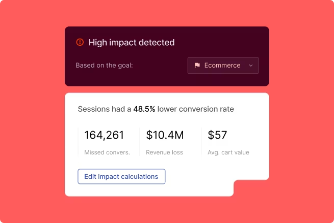
Contentsquare's Impact Quantification helps teams rank potential fixes by their estimated effect on conversion or revenue, so decisions about which fix to build first are based on business impact rather than team opinion or design preference.
Which mobile friction should you fix first?
Not all friction is equal. A rage tap on a secondary help link has a different business impact than a rage tap on the checkout CTA.
Prioritization should be driven by 3 factors:
Frequency: how many users encounter this friction point in a given time period
Position in the flow: friction closer to the conversion point like checkout, sign-up completion, or payment has higher revenue impact than friction at earlier, lower-commitment steps
Severity: does the friction cause a slowdown, a retry, or a full abandonment?
Plot friction issues on 2 axes. Frequency (how many users are affected) versus severity (does it cause abandonment?). Fix high-frequency, high-severity issues first. This simple matrix keeps prioritization practical and actionable.
Contentsquare's Impact Quantification automatically scores friction issues by their estimated business impact, removing the need to build manual prioritization matrices. When everyone can see that fixing the payment API error is worth more than redesigning the help section, prioritization conversations become much simpler.
How do you prove a friction fix worked?
Validating a fix has 2 goals: confirming the friction signal decreased (behavioral proof) and confirming the business outcome improved (conversion or retention proof). Without both, it's easy to "fix" a rage tap cluster by removing the element, which eliminates the signal but may not improve the outcome.
3 validation approaches ensure your fixes deliver real value:
Before/after funnel comparison: measure the completion rate for the affected flow step in the period before and after the fix. Control for traffic volume and campaign changes that could skew results.
Behavioral signal check: confirm that the specific signal like rage taps, repeat submissions, or loop rate decreased at the fixed step. If it didn't, the root cause may not have been fully addressed.
Regression monitoring: watch for friction signals appearing at adjacent steps after a fix. Removing friction at one point sometimes shifts the problem downstream.
Contentsquare's Experience Monitoring includes alerting capabilities that notify teams when error rates or performance metrics change, making it possible to catch regressions automatically. You don't have to wait for a drop in conversion to surface the problem. Journey Analysis and Funnel Analysis provide before/after path comparison, helping you validate that users are progressing through flows more smoothly after your fix.
Frequently asked questions on app UX friction
Not all friction has equal business impact, so prioritization should be driven by three factors: frequency (how many users are affected), position in the flow (friction closer to conversion like checkout or sign-up has higher revenue impact), and severity (does it cause a slowdown, a retry, or a full abandonment?). A simple approach is to plot issues on two axes: frequency versus severity, and tackle high-frequency, high-severity issues first. To validate a fix worked, combine a before/after funnel comparison with a behavioral signal check (confirming rage taps, loops, or repeat submissions actually decreased) to make sure you addressed the root cause and not just the symptom.
![[Visual] Contentsquare's Content Team](http://images.ctfassets.net/gwbpo1m641r7/3IVEUbRzFIoC9mf5EJ2qHY/f25ccd2131dfd63f5c63b5b92cc4ba20/Copy_of_Copy_of_BLOG-icp-8117438.jpeg?w=946&q=85&fit=scale&fm=avif)
We’re an international team of content experts and writers with a passion for all things customer experience (CX). From best practices to the hottest trends in digital, we’ve got it covered. Explore our guides to learn everything you need to know to create experiences that your customers will love. Happy reading!
![[visual] Lady on her phone](http://images.ctfassets.net/gwbpo1m641r7/26Yoxc2SKYV3DvWOeoEYCi/4a94b9c4fdc847313de47dfa5db5a190/AdobeStock_607077602.png?w=624&q=85&fit=scale&fm=avif)
![[Visual] What is Contentsquare - header](http://images.ctfassets.net/gwbpo1m641r7/520cmRL5dDNOrfb9OOPCSW/a770ce55ac2daeb24d9f221d5817abd6/What_is_Contentsquare_header.png?w=624&q=85&fit=scale&fm=avif)