Tracking whether users actually adopt a feature—not just click on it once—is one of the most important things a product team can do, and one of the most commonly done wrong. This guide walks you through how to define adoption in a way that reflects real value, build a measurement framework that reveals where and why users drop off, and connect adoption data to the business outcomes that matter to your stakeholders.
Key insights
A feature being used and a feature being adopted are not the same thing. Adoption requires repeated, value-driven behavior, not just a first click.
The denominator you choose (all users vs. eligible users) changes your adoption rate more than almost any other decision you'll make.
A single adoption rate number can't tell you why adoption is low. You need a funnel to isolate where users drop off.
Behavioral data (what users actually do before, during, and after encountering a feature) is what turns a metric into a diagnosis.
Segmenting adoption by user role, lifecycle stage, or access level reveals patterns that aggregate numbers hide.
Connecting adoption to retention and conversion is what turns a product metric into a business case.
Set your feature adoption definition and eligible users
Before you instrument a single event, you need to agree on what "adopted" means for this specific feature. Without a shared definition, every adoption number your team reports will mean something different—leading to misaligned priorities, wasted engineering effort on the wrong fixes, and inability to prove ROI to stakeholders.
Three decisions must be made upfront: what action counts as adoption, who is eligible to take that action, and over what time window you'll measure it.
Pick the adoption event that signals real value
A usage event and an adoption event are fundamentally different measurements. Usage events track surface-level interactions like opening a screen, clicking a button, or viewing a page. Adoption events capture the moment a user completes the action that delivers the feature's intended value.
The adoption event should map to the moment a user gets the outcome the feature was built for. Consider this contrast:
Usage event: user opens the reporting dashboard
Adoption event: user exports or shares a completed report
The first tells you someone looked. The second tells you someone found value. When teams mistake usage for adoption, they celebrate vanity metrics while missing the real story.
Set the denominator to avoid misleading adoption rates
The eligible user is the subset of your user base who actually has access to the feature based on their plan, role, permissions, or device type. Dividing by all active users inflates the denominator and makes adoption look artificially low.
The formula is simple, but the denominator changes everything:
Feature adoption rate = (users who completed the adoption event ÷ eligible users) × 100
Say you launch a premium analytics feature that 500 users adopt in the first month. If you divide by your total 10,000 active users, you get a 5% adoption rate. But if only 1,000 users have premium accounts with access to the feature, your actual adoption rate is 50%. That's a completely different story that leads to completely different decisions.
Set the timeframe and cohorts you'll compare
The right time window for measuring adoption depends entirely on the feature's natural use frequency. A daily workflow feature needs a 7-day measurement window to capture regular usage patterns. A quarterly reporting feature needs a 90-day window to account for its expected cadence.
Cohort comparison is the method for tracking whether adoption improves over time. Compare users who were exposed to the feature in week 1 versus week 4 of a rollout to see if your iterations are working. But here's the critical rule: never mix cohorts from different rollout phases in the same analysis. Comparing early-access users with general-release users produces misleading trends.
Map the feature adoption funnel in your app
A single adoption rate number tells you how many users adopted, but it can't tell you why adoption is low or where to focus your efforts. Adoption doesn't happen in a single step. It breaks down across a sequence of stages, and each stage can fail independently.
The 4-stage feature adoption funnel consists of: exposed (user sees the feature), activated (user takes first action), used (user completes the workflow), and used again (user returns). This funnel structure reveals whether your problem is discoverability (users never see the feature), activation friction (users see but don't try), value delivery (users try but don't complete), or retention (users complete but don't return).
Understanding how users move through your app helps you see whether users are even getting close to the entry point or taking completely different routes. Contentsquare's Journey Analysis visualizes the paths users take through your app, showing the most common navigation patterns and alternative routes users follow before reaching a feature.
![[Visual] Journey-analysis-sense](http://images.ctfassets.net/gwbpo1m641r7/3YF1vgtNFaqqWjjaxSZbgl/b37170520a1dc52508425883c909ace1/Journey-analysis-sense.png?w=1280&q=85&fit=scale&fm=avif)
Define exposed and activated events for your feature
The distinction between exposure and activation is where most adoption measurement goes wrong. These two events mark fundamentally different moments:
Exposed: the user encountered the feature's entry point (saw the button, received the prompt, landed on the screen)
Activated: the user took the first meaningful action inside the feature (not just a tap or scroll, but an action that moves them toward the value moment)
"Exposed but not activated" is a discoverability or friction problem, not a value problem. If 90% of users see your new feature but only 10% activate it, you don't need to rebuild the feature. You need to fix how it's presented.
Teams can validate whether users are actually seeing the feature entry point by using Contentsquare's heatmaps—visual overlays that show where users tap, scroll, and focus their attention on each screen, making it possible to confirm whether a feature's UI element is getting visibility or being ignored entirely.
![[Visual] Heatmaps types](http://images.ctfassets.net/gwbpo1m641r7/44qPX6Nyu2v2i9pGM8JdIE/e1ccfd573959295483bb4b867ca7e57f/Heatmaps___Engagements__3_.png?w=1002&q=85&fit=scale&fm=avif)
Define repeat-use rules that match the workflow
"Used once" and "adopted" are not the same thing. Adoption requires the behavior to become part of a user's regular workflow. The distinction matters because curiosity drives first use, but value drives repeat use.
Setting a repeat-use threshold requires understanding the feature's expected frequency. A feature designed for daily use needs a 7-day return window. A feature used monthly needs a 30-day window to capture its natural rhythm. Using the wrong window either overcounts adoption (calling one-time users "adopted") or undercounts it (missing legitimate but infrequent users).
Duration of adoption (how long a user continues using a feature after first activation) separates habit from curiosity. A user who uses a feature daily for a week then stops was curious. A user who uses it weekly for 3 months has adopted it into their workflow.
Measure feature adoption metrics that pinpoint the cause
No single metric tells the full story of feature adoption. You need a small stack of complementary metrics, each of which diagnoses a different failure mode across the 4 stages of the adoption funnel: exposed, activated, used, and used again. Five core metrics work together to reveal not just whether adoption is happening, but why it's succeeding or failing at each stage.
With Contentsquare's Smart Capture—which automatically records user interactions without requiring manual event tagging for each action—you don't need manual event tagging for every new feature. This means teams can define adoption events retroactively and still analyze historical patterns.
Measure feature adoption rate without vanity metrics
The feature adoption rate formula (users who completed the adoption event divided by eligible users) tells you what percentage of potential users are getting value. But interpreting this number requires understanding what it reveals and what it hides.
A flat or declining adoption rate tells you something is wrong but not what. It could mean poor discoverability, high friction, weak value proposition, or wrong audience. This is why you need the companion metric: breadth of adoption, which measures the percentage of your eligible user base that has adopted the feature at least once.
Metric | What it measures | What low means |
|---|---|---|
Feature adoption rate | % of eligible users who completed the adoption event | Too few users are reaching value |
Breadth of adoption | % of eligible user base that has adopted at least once | Adoption is narrow (concentrated in a small segment) |
Measure breadth and depth of adoption
Breadth tells you how many users adopted. Depth tells you how much of the feature's capability they're actually using. This distinction matters for features with multiple steps, settings, or sub-functions.
A feature with high breadth but low depth suggests users are adopting the entry point but not progressing to the full value. For example, many users might create a saved filter, but almost none use it to power a dashboard view. This pattern reveals that users understand the feature's basic value but haven't discovered its full potential.
Measure time to adopt and time to first action
Time to adopt measures the elapsed time between a user's first exposure to a feature and their completion of the adoption event. Long time-to-adopt signals friction in the path, not necessarily lack of interest.
Time to first action is the narrower version: how long it takes a user to take any action inside the feature after exposure. This metric catches hesitation at the entry point. If users stare at a feature for 30 seconds before clicking anything, something about the UI is causing uncertainty.
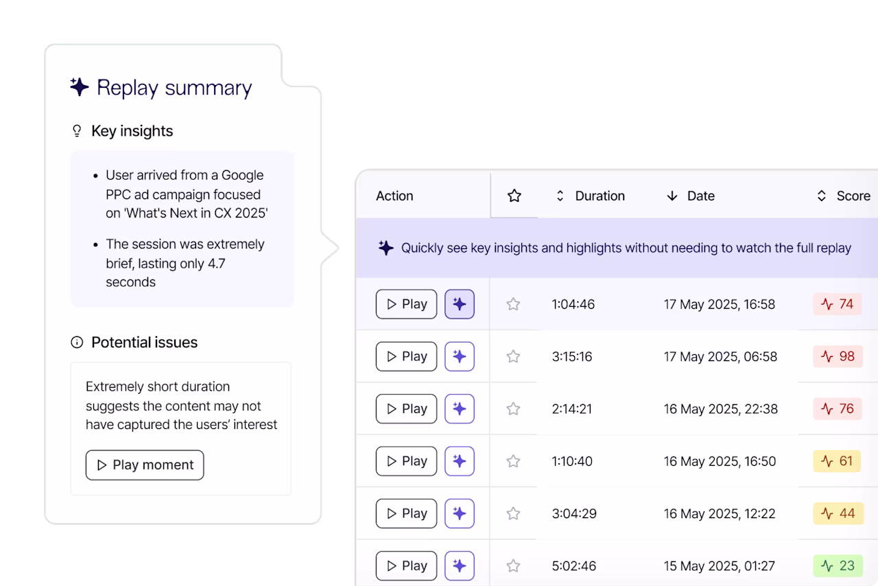
Both metrics are leading indicators. They tell you adoption is at risk before it shows up as a low rate. Contentsquare's Session Replay records real user sessions, allowing you to watch exactly what users do in your app. It turns "time to adopt is long" from a number into a visible story. You can watch exactly where users pause, hesitate, or navigate away before completing the first action.
Measure feature usage frequency and stickiness
Feature stickiness is the ratio of users who use a feature daily versus monthly. It measures whether the feature has become a habit or remains occasional. Low stickiness on a feature designed for daily use signals that users aren't getting enough value to return.
Usage frequency complements stickiness by measuring how many times per session or per week the average adopter uses the feature. Together, these metrics reveal usage patterns:
High frequency, high stickiness: feature is embedded in the user's core workflow
Low frequency, low stickiness: feature is tried but not integrated (churn risk)
Measure workflow conversion rate and drop-off rate
Workflow conversion rate measures the percentage of users who complete a multi-step feature workflow from start to finish. This differs from adoption rate because it captures within-feature abandonment, not just whether a user ever adopted.
Drop-off rate is the inverse: the percentage of users who start the workflow but exit before completing it, and at which step they exit. Knowing where in the workflow users drop off is more useful than knowing the overall completion rate.
When investigating drop-off points, Contentsquare's Session Replay shows whether it's a confusing UI element, an error message, or a dead tap that sends users searching for another path.
Instrument feature adoption tracking for app workflows
Most teams discover their adoption data is unreliable only after they've made decisions based on it. Clean measurement starts with clean instrumentation. Most adoption data problems are caused upstream, at the event-design stage, not in the dashboard—leading to false conclusions about what's working and wasted effort fixing the wrong problems.
Two foundational principles guide proper instrumentation: track complete workflows (not isolated interactions), and avoid the instrumentation mistakes that silently distort your numbers.
Track start-to-finish workflows for each feature
A single "feature used" event tells you nothing about whether the user completed the workflow that delivers value. Workflow tracking requires a different approach: define a start event (user enters the feature) and an end event (user completes the adoption action), then track everything in between as a funnel.
This gives you a workflow conversion rate and reveals exactly which step loses users. Here's a simple 3-step workflow event map:
Step 1: user opens the feature entry point (start event)
Step 2: user completes a required configuration or input
Step 3: user triggers the output or result (adoption event / end event)
Contentsquare's Funnel Analysis lets teams define the exact sequence of steps in a feature workflow and see where users drop off at each stage. With Smart Capture recording interactions automatically, teams can define funnels retroactively and still get complete data.
Avoid the 6 mistakes that distort feature adoption rate
Product teams consistently make the same instrumentation errors that corrupt their adoption data. Here are the 6 most common mistakes:
Using all users as the denominator: includes users who never had access to the feature
Counting page views or screen loads as adoption events: records exposure, not value delivery
Ignoring internal users and test accounts: inflates or deflates adoption depending on how frequently your team uses the feature
Mixing rollout cohorts: comparing early-access users with general-release users produces misleading trends
Tracking feature clicks instead of workflow completion: misses users who start but don't finish
Using a fixed time window for all features: a 7-day window is wrong for a feature designed for monthly use
Use a diagnosis playbook for low feature adoption
When adoption is low, the instinct is to jump to a solution. But the right fix depends entirely on where in the funnel adoption is breaking down. This diagnostic playbook matches failure patterns to failure modes, then guides you to gather behavioral evidence before acting.
If exposure is high and adoption is low, run these checks
When users are seeing the feature but not activating, the problem is almost always one of 3 things. Each requires a different diagnostic approach and solution:
Check discoverability quality: is the feature entry point visible and understood, or just technically present?
Check first-step friction: is there a configuration, permission, or input required before users can experience value?
Check audience fit: are the users being exposed to the feature the ones who actually need it?
Contentsquare's heatmaps help validate whether the feature entry point is receiving user attention or being scrolled past entirely. These visual overlays show where users' focus goes on a screen, revealing whether your feature's UI element sits in a low-attention zone.
If activation is high and repeat use is low, look for value gaps
When users activate but don't return, the feature delivered enough value to try but not enough to keep. This is a value gap, not a discoverability problem. Three signals point to a value gap:
Users complete the workflow once but never repeat it
Time between first and second use is long and inconsistent
Users who do return are concentrated in a specific segment (suggesting value is real, but narrow)
Contentsquare's AI-powered surveys can be targeted to users who activated but didn't return, letting teams ask directly what was missing or what prevented them from using the feature again. This closes the gap between behavioral data (they didn't return) and the reason why.
![[Visual] [Survey Goal AI]](http://images.ctfassets.net/gwbpo1m641r7/30i7uF6gKnbjEYq8uJaYPL/ecc49f753c6e217305bf91426765eca8/Screenshot_2025-02-23_003543.png?w=918&q=85&fit=scale&fm=avif)
Separate friction from value failure with behavioral evidence
Friction and value failure look similar in the numbers. Both produce low repeat use, but they require completely different responses. Friction means the workflow is harder than it needs to be. Value failure means the outcome isn't worth the effort even when the workflow works.
Here's how to tell them apart:
Friction signal: users start the workflow repeatedly but abandon at the same step. Rage taps or repeated back-navigation cluster at a specific interaction.
Value failure signal: users complete the workflow cleanly but don't return. No clustering of errors or hesitation.
Contentsquare's Error Analysis surfaces JavaScript errors and API failures that may be causing silent friction (broken interactions that don't show a visible error to the user but prevent workflow completion). This rules out technical issues as a cause before attributing abandonment to value failure.
![[Visual] error analysis](http://images.ctfassets.net/gwbpo1m641r7/2RHGIcGhjdzYE7tMVVWzzg/2bc7b35d22f6b8a0806a09a23f6f7c71/error_analysis.avif?w=1280&q=85&fit=scale&fm=avif)
Prove feature adoption impact on retention and conversion
Adoption metrics tell you whether users are using a feature. But business stakeholders need to know whether that usage matters. The gap between "users adopt this feature" and "this feature drives business value" is where many product teams lose executive support.
Validate lift with pre-post cohorts and holdouts
The pre-post cohort method compares the behavior of users who adopted the feature against users who were eligible but didn't adopt, across the same time window. This comparison (not a raw adoption rate) shows whether the feature is driving better outcomes.
For example, if users who adopt your new collaboration feature have 85% 30-day retention while non-adopters have 70% retention, you can claim a 15 percentage point retention lift. But here's the critical rule: cohorts must be matched on eligibility and lifecycle stage, not just time period.
Holdout groups provide even more rigorous validation. By intentionally not exposing a small percentage of eligible users to the feature, you create a control group for measuring true lift.
Link adoption changes to business outcomes users care about
The metrics stakeholders care about (retention rate, conversion rate, support contact rate) need to be mapped to feature adoption events to make the case for investment. Three linkages consistently resonate with leadership:
Adoption to retention: users who adopt a core feature within their first 30 days have higher 90-day retention
Adoption to conversion: users who complete a feature workflow convert at a higher rate than those who don't
Adoption to support deflection: features with high adoption reduce support contacts related to the problem they solve
Contentsquare's Impact Quantification connects behavioral signals like completing a feature workflow to conversion and revenue outcomes. This turns "adoption went up" into "adoption going up is worth $2.3M in additional annual revenue."
Frequently asked questions about feature adoption in apps
Feature usage tracks surface-level interactions like clicking a button or opening a screen. Feature adoption measures whether a user completed the action that delivers the feature's intended value and repeats that behavior over time. A user who opens a dashboard has used it; a user who exports a report has adopted it.
![[Visual] Contentsquare's Content Team](http://images.ctfassets.net/gwbpo1m641r7/3IVEUbRzFIoC9mf5EJ2qHY/f25ccd2131dfd63f5c63b5b92cc4ba20/Copy_of_Copy_of_BLOG-icp-8117438.jpeg?w=946&q=85&fit=scale&fm=avif)
We’re an international team of content experts and writers with a passion for all things customer experience (CX). From best practices to the hottest trends in digital, we’ve got it covered. Explore our guides to learn everything you need to know to create experiences that your customers will love. Happy reading!
![[Blog] [Visual] Contentsquare Free Plan](http://images.ctfassets.net/gwbpo1m641r7/6v2PGzIn2q7Wfgru62QZS5/b17b908b43885c841ba46089cd6653d5/AdobeStock_950001038.jpeg?w=624&q=85&fit=scale&fm=avif)