![[Visual] Man at computer - stock](http://images.ctfassets.net/gwbpo1m641r7/7GloM7xPXUs1M75nfaIWtr/6566092d4d853e43c29d9df2bf791fd1/AdobeStock_540624504__1_.png?w=3840&q=100&fit=fill&fm=avif)
Redesigning a website is exciting. It’s a chance to modernize, fix clunky UX, and finally align your site with what customers need. But it can also be risky. Too many teams dive straight into a redesign with good intentions and zero research—only to find out too late that they’ve broken what was already working and missed what really needed fixing.
Think of it like remodeling a house: you wouldn’t start by swinging a sledgehammer without knowing which walls are load-bearing. The same goes for your website. Before you start making changes, you need to understand what’s holding your experience together, where it’s weak, and how real users are actually interacting with it. Otherwise, you risk wasting time, money, and trust.
This guide is here to help you avoid that. We walk you through how to research your website before a redesign—so every change you make is backed by insight, not assumptions.
How to research for your website redesign
Before you dive into sketches and layout ideas, there are a few key things you need to understand about how your current site is working (or not working). Start by answering these questions:
Which pages do your customers usually land and convert on?
What’s already driving users there?
Why are they converting (or why are they not)?
What’s acting as a barrier?
What can be improved? vs. what’s already performing well?
Below is a 2-part research framework to help you get started finding all the data you need to carry out a successful redesign. We wrote this with an ecommerce website in mind, but most of it applies to non-ecommerce sites as well:
Part 1: how to identify and categorize your top paths
Part 2: how to identify your customers’ drivers, barriers, and hooks
Part 1: how to identify and categorize your top paths
A handful of URLs on your website likely contribute to a large percentage of conversions: any untested or careless changes to those pages could potentially break the experience and tank revenue as a result. However, other landing pages may not receive many visitors or may yield an irrelevant number of conversions. The 2 types of pages are clearly not created equal—you need to be way more cautious in the first case than in the second.
You can use this framework to categorize your pages into 4 main groups:
![[Visual] Traffic/Conversions graph](http://images.ctfassets.net/gwbpo1m641r7/6EtZvKoDGty8JqMlSO8PTn/86859e9b54d13ceaafaf5bac30b90c00/website-redesign-categories__3_.jpeg?w=1920&q=100&fit=fill&fm=avif)
Pages you need to redesign with extreme care (in red) → these pages have high traffic and conversions, which makes them extremely important for the health of your business. Anything you break here will have far-reaching consequences.
Pages you need to redesign with care (in yellow) → these pages have high conversions but low traffic, so anything that breaks here will affect a smaller amount of visitors than the previous case—but they still need to be handled with care, so as not to cost your business in the long term.
Pages you need to improve (in green) → pages with high traffic but low conversion offer many opportunities for improvement, seeing as they receive a lot of traffic but there is nothing crucial conversion-wise you might break.
Pages you can redesign without worrying (in grey) → changes you make here are probably not particularly noticeable anyway, because of the low traffic. Redesign away: these are some of the most risk-free pages on the site.
Here are the 3 steps you need to take to identify and categorize your top paths with Google Analytics:
Step 1: collect data in Google Analytics
Step 2: organize and categorize the data in Google Sheets or an Excel spreadsheet
Step 3: segment your traffic further in Google Analytics
Step 1: collect data in Google Analytics
Head to your Google Analytics account. To get started, you need a sufficient amount of data to account for seasonality and random blips. In this example, we’re going to use 3+ months:
![[Visual] GA Landing pages](http://images.ctfassets.net/gwbpo1m641r7/5TOCFtaawS2OokBIu3jDid/d7f1602aee1d378a954d37687dd6012c/1-select-time__1_.png?w=1920&q=100&fit=fill&fm=avif)
Go to Behavior > Site Content > Landing Pages. This gives us a good idea of where people land on and start their journey across your website:
![[Visual] GA exit pages](http://images.ctfassets.net/gwbpo1m641r7/69BxReT5G5UPDJBr8EqLX9/33871725569bf1e2f5576d9f9bae4316/19-exit-pages__1_.png?w=1920&q=100&fit=fill&fm=avif)
We’re now going to identify the paths that bring 80% of the traffic and 80% of the conversions. Use the selector to show 50 of your top pages:
![[Visual] GA top 50 pages](http://images.ctfassets.net/gwbpo1m641r7/2sf9ILn0URR3RZ7dK9VClO/843fc95d4fa54578d717ab307b07d287/unnamed_-_2025-11-12T145723.143.png?w=1080&q=100&fit=fill&fm=avif)
Export the data and import it into Google Sheets (or Excel, or any other spreadsheet format you might want to use):
![[Visual] GA Import data](http://images.ctfassets.net/gwbpo1m641r7/7xqagplFhSUGjYhLhvk833/b3803887057b0b5db50e587627f73065/4-import__1_.png?w=1920&q=100&fit=fill&fm=avif)
Step 2: organize and categorize the data in Google Sheets or Excel
Simplify your spreadsheet by taking out unnecessary columns. Leave Sessions (so you can check the traffic) and Transactions, Revenue, Ecommerce CR (so you can check for conversions and value) only.
![[Visual] GA delete unnecessary columns](http://images.ctfassets.net/gwbpo1m641r7/5GBJZeRMF6SMmIVWAZsOB/1eec799e54665b579f5d5802bb09f231/5-delete__1_.png?w=1920&q=100&fit=fill&fm=avif)
Create a column to the left of the Sessions one, give it a descriptive name such as % Total Traffic, and use it to calculate the percentage of traffic to each page as part of the total:
![[Visual] PXL percentage](http://images.ctfassets.net/gwbpo1m641r7/5WSOcnM0GqlicmMndAR16U/014bb319408985a8e35d11a88aa2ed0a/6-percentage__1_.png?w=1920&q=100&fit=fill&fm=avif)
Select enough pages to reach 80% of the traffic. Highlight them: these are your high traffic pages.
![[Visual] PXL highlight](http://images.ctfassets.net/gwbpo1m641r7/6zmdNsfSNph4Dg0D7iGogB/fcbdf1fa3bbe6d336feffe7de5401298/unnamed_-_2025-11-12T150026.479.png?w=1080&q=100&fit=fill&fm=avif)
Select enough pages to reach 80% of the traffic. Highlight them: these are your high traffic pages.
![[Visual] Total traffic pages](http://images.ctfassets.net/gwbpo1m641r7/4pAHS8LYtJrIPnMaF3E4T3/1530f5e3c9dfd4619247c09638a1abdc/8-top-traffic-pages__1_.png?w=1920&q=100&fit=fill&fm=avif)
Repeat the previous steps for the Revenue column (depending on how you evaluate ‘conversions’, you may want to do this with the Transaction column instead)
You should now highlight the pages that bring you the top traffic or are responsible for the most revenue or transactions on your site.
![[Visual] Top pages 2](http://images.ctfassets.net/gwbpo1m641r7/6fRyZWTp9UTqUlyJdQ7bKg/172b774514b46e4f1c18bf667cabd49f/9-top-pages-b__1_.png?w=1920&q=100&fit=fill&fm=avif)
Remove everything you have not highlighted (everything that is neither top traffic nor top conversion) to make the spreadsheet even more straightforward:
![[Visual] Top pages b](http://images.ctfassets.net/gwbpo1m641r7/4HeMBzJccwbgOmuBPQYFU2/c101ba11defdb454ea3a33e3341768a1/9-top-pages__1_.png?w=1920&q=100&fit=fill&fm=avif)
Look at the relationship between traffic, conversion rate, and revenue, and tag the pages accordingly based on the 4 available categories.
🔥 A word of advice: the process we followed so far looks at landing pages, but in an ecommerce setting, you will also need to evaluate pages that form part of the overall customer journey and lead to purchase, such as account sign-in, basket, checkout steps, etc. In our example, the basket and sign-in pages both qualify as a ‘redesign with care’ because of their high conversion, low landing traffic status—but since they both will be seen by a lot of people throughout their journey, you can move them to the ‘redesign with 10x care’ category:
![[Visual] tagged pages](http://images.ctfassets.net/gwbpo1m641r7/3sDL9CoNzR3EYmDcvTB5hN/f6cbe04e638dd833302bfe0b9dab64d9/10-tagged-pages__1___1_.png?w=1920&q=100&fit=fill&fm=avif)
💡 Pro tip: use Contentsquare’s Journeys tool to spot high-impact pages that might not be top landing spots but play a critical role in conversions—like basket, sign-in, or checkout. These aren’t just stops along the way—they’re make-or-break moments. If they show up frequently in key paths, treat them as sensitive zones during your redesign.
![[visual] Journey Analysis - Segments break down by behavoir or browser](http://images.ctfassets.net/gwbpo1m641r7/5Muy4j91VHoE05F9aR8zRE/a49f9b2919b7e0fdbcfcd9f7b9a73c09/eyJwYXRoIjoiY29udGVudHNxdWFyZVwvZmlsZVwvVWlVb3V1SmtzdFNxeDRHZlFIVDguc3ZnIn0_contentsquare_uVIAMsfg-SoMfrK7iC5NKgnOIw9_DomMb3.svg?w=3840&q=100&fit=fill)
Contentsquare’s Journeys tool in action
Step 3: segment your traffic further in Google Analytics
Once you have your top paths, it’s time to dig a bit deeper into each page—because it’s not just the URLs themselves you’ll need to focus on, it’s also (and mostly) the people visiting them. Let’s use /home as an example:
Start by applying a secondary dimension such as Device Category and look for differences in behavior. For example, in this case, mobile devices bring less traffic but a much higher conversion rate and overall revenue than desktop:
![[Visual] Devices](http://images.ctfassets.net/gwbpo1m641r7/KIRHYL7RvNitUoKdHy8PY/6396db46a02e5e65f65e79dd67fe7c0b/10b-devices__1_.png?w=1920&q=100&fit=fill&fm=avif)
Take note of this in your spreadsheet. In this case, it’s worth splitting the /home row into 2 separate desktop and mobile rows, and treating the two slightly differently—mobile clearly needs to be handled with more care than desktop:
![[Visual] Mobile devices 2b](http://images.ctfassets.net/gwbpo1m641r7/3IAHzRLkgsEBCChphW1TYY/aefb38dbfaf5077bc2f794885677c2d4/11-mobile-devices__1_.png?w=1920&q=100&fit=fill&fm=avif)
Apply other secondary dimensions such as Country, especially if you’re selling across multiple countries, and look for interesting patterns. For example, you’d probably need to treat US traffic particularly carefully as it accounts for almost half of the traffic and over 93% of the revenue, but India accounts for almost 8% of the traffic, yet there are no conversions and that’s something that could be investigated:
![[Visual] Countries](http://images.ctfassets.net/gwbpo1m641r7/2KpYkwVUL5CRoaGvtwH8OH/cc398fed4e8224d26185475d79bfe93f/12-countries__1_.png?w=1920&q=100&fit=fill&fm=avif)
Keep making notes in your spreadsheet. If it looks like a bizarre rainbow at this point, you’re probably doing it right 😉
![[Visual] Devices 3](http://images.ctfassets.net/gwbpo1m641r7/KTlnJcOzAYlC5EXcawwl5/73933be5990b343de4f20d4b9c5dc746/unnamed_-_2025-11-12T151206.034.png?w=1080&q=100&fit=fill&fm=avif)
You can then move to ecommerce specific reports from Conversions > Ecommerce > Shopping Behavior or Conversions > Ecommerce > Checkout, and look for anomalies or interesting data points from the segments you’ve identified this far. For example, we’ve already found that people from India don’t convert, but this report shows that 2% of them do actually add things to the basket—they just never complete their purchase. The question to keep in mind for future steps would be: why?
![[Visual] Ecommerce report](http://images.ctfassets.net/gwbpo1m641r7/4ASppABVhEVB3A9DeZVxw6/7310a83803a21b3aa60890955d029ade/14-ecommerce-report__1_.png?w=1920&q=100&fit=fill&fm=avif)
💡 Pro tip: Contentsquare’s Funnel Analysis lets you zoom in on drop-off points across key ecommerce steps—like basket adds that don’t lead to purchases. If a segment’s getting stuck mid-funnel, like users who add items but never check out, Funnel Analysis helps you spot exactly where and start asking the right questions: what’s stopping them, and how can you smooth the path to conversion?
Contentsquare’s Funnel Analysis tool lets you spot drop-offs in your checkout funnel
You might not find anything groundbreaking in this data, but the point is to keep investigating and digging. At the end of this process, you should get to a table that looks like this and have a fairly clear idea of how to behave with each page or set of pages:
Part 2: how to identify your customers’ drivers, barriers, and hooks
Once you’ve identified your top conversion paths, you’ll have a good idea of how much care to apply when redesigning each individual page (or set of pages) people land on and browse through. Now it’s time to dig deeper into who these people are, why they got to your website in the first place, and what is stopping them or moving them forward.
You cannot do this in Google Analytics, so your next move is to combine data from GA4 with insight from an experience intelligence software like Contentsquare. In the next few sections, we’ll show you how to do it using a simple research framework one-pager (see photo below) that you can consult for inspiration and create a similar one to use throughout the next part of the process.
![[Visual] Redesign research plan](http://images.ctfassets.net/gwbpo1m641r7/dT8VgbShpOoteF555fq7z/ea2815082fbd0b8b1c4c0deb759ea18c/Screenshot_2025-07-08_001213.png?w=1920&q=100&fit=fill&fm=avif)
In this section, you’re going to learn how to:
A. Identify your top personas and what drives them to your site
B. Identify where and why people are exiting your website
C. Identify what persuades your customers to convert
A. Identify your top personas and what drives them to your site
Visitors and potential customers come to your website for different reasons:
To know and learn something specific about your products
To get in touch with you directly (like to find a customer service number or a store address they can go to)
To learn how to do something (a task, an action) with one of your products
To buy something from your site
If you treat all visitors the same or make assumptions about why they’re coming to your site without validating it with real data, you won’t be able to tailor the redesign experience or prioritize the right messages for the customer segments that are most important to your business. The first thing to do is define your top personas and their drivers.
⚠️ Why this is important: user personas are realistic representations of your visitors and customers; they help you get a clearer sense of who your ideal customers are, why they’re reaching your website, and what helps them in their path to conversion.
How to do it → set up a survey using Contentsquare’s Surveys tool. In the Questions section, add 3 open-ended questions in this order:
A question to identify the demographic that matters most to you: How would you describe yourself in one sentence?
A question that helps you uncover what is driving visitors to your website (their ‘driver’): What’s the main reason for your visit today?
A question to identify what may be stopping them from an action (their ‘barrier’): What, if anything, is stopping you from [action] today?
![[Visual] Surveys screenshot](http://images.ctfassets.net/gwbpo1m641r7/7IWBNPN4yjn57YgaL5HipU/472e9dc8c95b3aefafa7428fc0cf6bfb/unnamed_-_2025-11-12T152034.577.png?w=1080&q=100&fit=fill&fm=avif)
Use the Targeting option in Contentsquare to set the survey to appear for specific devices on your top landing pages (the ones you identified in the previous steps).
![[Visual] Surveys targeting](http://images.ctfassets.net/gwbpo1m641r7/6giZnCfz5uSRCNExqM4AgP/e0ed2a920cb034edbeabab3cf54669e2/Screenshot_2025-07-07_015017.png?w=1920&q=100&fit=fill&fm=avif)
After collecting several answers representative of your website traffic (for example, if you get thousands of visitors a day, don’t stop after collecting 10 or 15 answers!), follow the steps from this article to identify your user personas and organize your answers into a list of the main ‘drivers’ that people want to fulfill on your site.
✅ Next: fill in the redesign research plan with your top 3 drivers and personas
B. Identify where and why people are exiting your website
While many people may arrive at your website, only some of them complete the journey to conversion (if you’re in ecommerce, the average conversion rate you can expect hovers between 2% and 4%). People who came without a desire to convert are unlikely to be swayed, but some of your visitors may be actively trying to complete an action, and something on your website is stopping them from doing so. That’s why the next step in your redesign process is investigating what, if anything, is currently not working on your existing pages.
⚠️ Why this is important: you want your redesign to help even more people who visit your high-traffic, high-conversion pages convert, so you need to figure out why some currently don’t.
How to do it → you need to dig deeper and answer these 2 questions: 1. Where are people leaving the site? 2. What could be causing them to leave?
1. Find where people are leaving your site
Head back to your Google Analytics account and reach Behavior > Site Content > Exit Pages. Make a note of the pages with a high exit rate:
![[Visual] Exit rates 2](http://images.ctfassets.net/gwbpo1m641r7/bYQszOzIKzlfd10QIwIE5/6aa8cff16e2d4a08a1f45ff789a5df54/unnamed_-_2025-11-12T152319.804.png?w=1080&q=100&fit=fill&fm=avif)
Bear in mind that some pages should have high exit rates (thank-you pages, for example, are a prime candidate: customers got what they came for and now they’re naturally ready to leave). But pages like your contact form, pricing page, or shopping carts are common culprits for drop-offs, and you can use the Conversions > Ecommerce > Checkout Behavior report to find where people exit their session on their way toward a purchase.
In our example, most drop-offs happen on the billing and shipping page:
![[Visual] Drop-off](http://images.ctfassets.net/gwbpo1m641r7/5cTUXoBzPZXmnlTq0h5bsh/4a25d623b8cea8aca0046ff68a737d60/20-checkout-behavior__1_.png?w=1920&q=100&fit=fill&fm=avif)
This answers the ‘where are people dropping off’ question—and now, you need to investigate the why.
2. Find the most problematic section(s) of the drop-off pages
Once you know that people leave on a specific page or set of pages, you want to investigate what is making them leave at that point in their journey. Start by setting up a Contentsquare heatmap:
![[Visual] CSQ analyze page or page group](http://images.ctfassets.net/gwbpo1m641r7/3xZPXUWJUwFMMYNvv28KPY/d85811c5cc77ff0c46ad6e8d93ef2089/Screenshot_2025-07-07_013423.png?w=1920&q=100&fit=fill&fm=avif)
Contentsquare’s Heatmaps tool records your visitors’ actions on the page (including mouse scrolling, clicking, finger tapping, or swiping on mobile) and renders them in the form of scroll maps, click maps, and move maps to help you see which parts of the page people are interacting with, skipping past, or ignoring.
![[Visual] Heatmaps and Session Replay](http://images.ctfassets.net/gwbpo1m641r7/6YDY4oo6gLAtcf6l94Ve4i/4b3d5fbd30fadffffca11937179dde5d/image__8___2_.png?w=2048&q=100&fit=fill&fm=avif)
Leverage Contentsquare’s Heatmaps and Session Replay tools to research before your upcoming website redesign
In addition to Heatmaps, use Session Replay to see how people interact with the page as part of their wider journey. Use the filter function to find sessions that end on your drop-off pages:
![[Visual] Clicked element filter](http://images.ctfassets.net/gwbpo1m641r7/6NKT9qUNgIxhT3SqZU0AqX/46447b1e4d7b6d2b1f92a331def1d65d/Screenshot_2025-04-07_015033.png?w=3840&q=100&fit=fill&fm=avif)
Contentsquare’s Session Replay lets you filter sessions by various conditions such as ‘clicked element’ or ‘zone clicked’
As you watch the selected replays, make a note of whether your visitors:
Hesitate when performing an action
Frequently click in frustration or U-turn back to the pages they’d just come from
Can see all the content as you intended it to be seen
Can interact with buttons, links, or clickable elements
Encounter bugs or broken elements
Combining insights from heatmaps and replays will give you a much better sense of how to proceed with your website redesign: which page elements to preserve, which to remove or edit, and what changes to make to the overall site flow to allow people to find what they currently cannot.
✅ Next: fill in the redesign research plan with the top 3 barriers or obstacles you have identified.
📖 Extra reading: if you are new to heatmaps, check out this multi-chapter guide that will help you get started. If you need an efficient method for not drowning in mountains of data, you can also peruse our guide on session replays.
3. Collect feedback on what’s ruining the experience
Contentsquare’s Heatmaps and Session Replay capabilities help you make sense of your customers’ journey across your website and on specific pages, and you can even come up with a pretty solid list of what’s working and isn’t based on observation alone—but you still need to hear directly from your customer so they can confirm your hypothesis and tell you exactly why something needs fixing.
Start by setting up Contentsquare’s feedback widget on your pages, and wait for people to leave their comments:
![[Visual] Feedback-Button rate your experience](http://images.ctfassets.net/gwbpo1m641r7/1jtKOa90vakvficfgrrXTz/81dc0f40dff6d9257d91872c4efed9cb/Feedback_button__1_.png?w=3840&q=100&fit=fill&fm=avif)
In addition to rating their experience, your visitors will be able to take screenshots of specific page portions they want to comment on. Use our AI capability to screen by the sentiment behind the feedback or filter the results for the high-exit pages you found in the previous steps, and start reviewing your results by making a note of all the negative comments (but also take note of the positive feedback, so you don’t remove what people already like!).
![[Visual] Survey responses sentiment](http://images.ctfassets.net/gwbpo1m641r7/1NT5uBwxGGWyG5n70sWxcL/860ac6a16d65246d8e60306ecc66e5dd/Screenshot_2025-07-07_012746.png?w=3840&q=100&fit=fill&fm=avif)
As an additional step, go back to using on-site surveys to prompt direct answers from your visitors. Set up a one-question survey and ask one of these questions:
If you decided not to [action] today, what stopped you?
What is missing on this page?
What, if anything, is stopping you from [action] today?
![[Visual] Open-ended questions](http://images.ctfassets.net/gwbpo1m641r7/1vx0lkLPUZlxOedzlxNTji/2ac1f0cd8c44cc5b0d6add49c320b301/unnamed_-_2025-11-12T154304.389.png?w=1080&q=100&fit=fill&fm=avif)
Analyze your open-ended questions based on the results you collect. At this point, you see some barriers that might stop visitors from completing specific actions on these pages: your redesign should investigate whether you can resolve them with design, clearer copy, a different page architecture, or other on-page changes.
✅ Next: fill in the redesign research plan with the top 3 reasons why customers leave your website—in their own words.
📖 Extra reading: read more about setting up and using surveys on your site to collect customer feedback.
C. Identify what persuades your customers to convert
At this point, you’re almost there: your final step is identifying the nudges or ‘hooks’ that push people to convert. And for that, you need to talk to people who have already converted—and get to the bottom of what almost stopped them, and what ultimately propelled them forward.
⚠️ Why this is important: without asking people who have converted about their experience, you will not be able to identify conversion-boosting insights or ‘hooks’ that you can amplify for all other visitors; similarly, you will not be able to understand the fears and concerns that almost stopped these people on their conversion journey, so you can address the same obstacles for everybody else.
How to do it → set up a post-purchase survey on your thank-you page (or send a survey via email to your new customers soon after they convert) and use it to ask these 3 questions:
How would you rate your overall experience?
a) If the answer to question 1 is positive, ask: What did you love the most about the experience? b) If the answer to question 1 is negative, ask: What can we do to improve the experience?
What almost stopped you from completing your purchase?
![[Visual] Rate your experience - Surveys](http://images.ctfassets.net/gwbpo1m641r7/qTKpmRVDOhk06RV0Iubq6/1ecd9657612bd3bb09a9056f5dc8a505/Screenshot_2025-07-07_014913.png?w=3840&q=100&fit=fill&fm=avif)
At this point, you can also review data from your feedback widget (which we discussed in point B) and filter by ‘love’ to see if there are any on-page elements that your customers and users particularly appreciate.
![[Visual] Survey reactions](http://images.ctfassets.net/gwbpo1m641r7/4oUAhYpmde73HnKeMNxMJ6/1976b1ab97b181cf4bd787d3d591aafe/unnamed_-_2025-11-12T154610.620.png?w=1080&q=100&fit=fill&fm=avif)
💡Pro tip: a website redesign deserves an in-depth customer investigation. In addition to placing surveys on your pages, interviewing existing customers about their pain points is a valuable source of information. Use Contentsquare’s Interviews tool to recruit 5-10 users (those who fit your user persona and have purchased multiple times) and ask them a few questions about their order, in person or via phone call. You might need to offer an incentive for this, such as monetary compensation, for people to agree—but we guarantee it will be money very well spent.
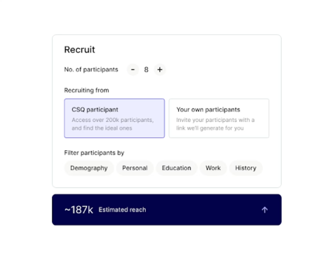
Contentsquare’s Interviews tool lets you recruit participants from your network or a diverse pool of over 200,000 users
You can also go back to Session Replay, and compare replays of people who visited your pricing page (and may have therefore converted) with those of users who never made it there:
![[Visual] Session replay filters](http://images.ctfassets.net/gwbpo1m641r7/6dedDHcxJzg8IO7G4T08IE/092738a40676a67336e45c21a27c6470/unnamed_-_2025-11-12T154843.658.png?w=1080&q=100&fit=fill&fm=avif)
Then, spend a few hours diving into your replays, asking yourself:
Are people seeing important content?
Are people clicking on key page elements (links, buttons, and CTAs)?
Are people confused by non-clickable elements?
Are people getting distracted?
Are people experiencing issues across devices?
You might find that people who do convert click key buttons like a CTA, but those who exit without purchasing don’t. Similarly, you might find that non-converters spend a long time hovering over your navigation bar, something that customers don’t do. What you’re looking for is not just how people navigate through the site from page to page, but also how they behave within a page: where did they stop at, what's sticky, what attracts attention.
✅ Next: determine the top 3 hooks and top 3 fears and concerns people experience when converting on your website.
Your next steps
As you follow the steps above, you will see existing issues and potential opportunities start coming into sharper focus. Something we recommend at this point is to summarize the data you’ve gathered so far and present it to your teammates, colleagues, and stakeholders.
You can then open up a discussion, collect more and different insights from other team members (for example, sales and success teams that are in regular touch with your customers), and find a collective way forward for your website redesign.

![[Stock] Unlocking the power of customer journey visualization – Step by step — Cover Image](http://images.ctfassets.net/gwbpo1m641r7/1E3yKJe4En4Jq36yjJl4vW/f7befc254b7ce2102e5ebe1e4586814b/customer-journey-visualization-people-draw-1.jpg?w=1920&q=100&fit=fill&fm=avif)
![[Visual] Stock Website Conversions Blog](http://images.ctfassets.net/gwbpo1m641r7/2rVeNuG0ooadj9K0aBdjXD/d3d14906ef74dcdef8140c73605b46eb/AdobeStock_673731153.png?w=1920&q=100&fit=fill&fm=avif)