![[Visual] Website audit stock photo](http://images.ctfassets.net/gwbpo1m641r7/4XPc1coFszyXSEHRlsYDdF/2036b199e569a7116d83825d9c3876e4/6240756.jpg?w=3840&q=100&fit=fill&fm=avif)
The word ‘audit’ strikes fear in many of us. We picture working through mountains of paperwork as time ticks by and uncertainty creeps in—and wonder if anything good can come of the process.
But a web design audit is different: if you have an effective framework to follow and know which tools to use, conducting an audit becomes a smooth, stress-free task.
In this guide, we help you understand what a web design audit is, why it’s important, and how to conduct one on your own site. You’ll walk away knowing exactly what steps to take to find ways to improve your website design and create a delightful user experience (UX).
6 steps to conduct an effective website design audit
A strong website design ticks all the boxes: it reflects your company’s brand identity, meets customer expectations, and provides an effortless user experience.
But company goals, user needs, and web design trends change frequently, so even the best websites need periodic reviews or audits.
A web design audit is a check-up that assesses your website’s visual elements and functionality using both quantitative and qualitative data. (Quantitative data tells you what’s happening, while qualitative data reflects user opinions, behaviors, and ideas to show you why.)
Your company might opt for a website audit before a major redesign or rebrand—or when you’ve noticed a gradual decline in website conversions or performance.
Download our free web design audit checklist here to guide you through our 6-step process, so you can increase conversions and provide a consistent, enjoyable experience for users.
1. Understand your user
Here’s the thing: your website won’t work for you if it doesn’t work for your user.
By grounding your web design audit in an understanding of your target audience, you’ll approach the rest of the process with empathy and create a brilliant site that helps your users achieve their goals.
Start by creating (or revisiting) your user persona—a description of your ideal customer persona (ICP)—and your customer journey map, which outlines all of the touchpoints your ideal customer has with your brand. If you have a jobs-to-be-done (JTBD) framework that explores what users want to achieve or accomplish with your product, that’s a great resource, too.
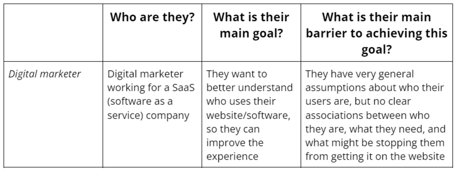
An example of a simple user persona
To get to know your user, consider the following questions:
Who is your target audience?
What goals do they have?
What pain points or struggles do they have?
What touchpoints do they have with your site?
Remember: the answers to these questions may have changed since you designed your current site. Now’s a great time to launch an on-site survey to gain new insights and update existing user information.
💡 Pro tip: use Surveys in Contentsquare to gather valuable insights. Choose from our 40+ survey templates, create your own, or let the AI assistant generate one based on your research goal (like learning about your ideal user, the obstacles or barriers they face, and how they use your product or service). This information helps you remain customer-centric throughout the web design audit as you decide what works and what doesn’t.
![[Visual] Meet up event feedback survey](http://images.ctfassets.net/gwbpo1m641r7/6JaKIovRKhnH2TcMdHER3Q/9cf8574d490138596540de8eb9da59d8/Group_1948760392__1_.png?w=3840&q=100&fit=fill&fm=avif)
Use surveys to learn more about your target user
2. Review metrics to narrow your focus
Once you have a clear understanding of your user and their needs, it’s time to turn to your data to assess how well your site design currently meets their expectations.
We recommend you get a ‘lay of the land’ first by looking at key performance indicators (KPIs) and web analytics data to spot high-level trends and narrow your focus.
For example, if you see that your direct-to-consumer (DTC) coffee company’s product pages have declining conversion rates, you know you’ll need to focus most of your web audit energy there.
As you review key metrics, consider the following questions:
How many visitors does your site get?
How long do visitors spend on your site?
Which pages get the most traffic?
What’s your bounce rate—the number of people who leave after visiting a single page—and how’s it trending?
💡 Pro tip: check your dashboards in Contentsquare to get a balcony view of your site. Dashboards show you key metrics—like views per session and bounce rate—at a glance, so you walk away with a high-level overview of how users experience your site and know what pages or issues you need to investigate in more depth.
![[Visual] CSQ-dashboard](http://images.ctfassets.net/gwbpo1m641r7/5UayXXx5uCUiTTCdOQwhrV/de037fc0ec041b16e088987de88be039/CSQ-dashboard.png?w=3840&q=100&fit=fill&fm=avif)
Dashboards let you view key metrics all in one place
3. Assess your site’s usability
When people hear ‘web design’, they typically think of flashy logos and fun graphics. But a well-designed site is more than just visually appealing; it also meets users’ needs with a clear structure and seamless navigation.
In this stage of your web design audit, assess user experience (UX) design—how interactions with your site make the user feel.
This is where usability testing comes in. Two popular usability testing tools include
User tests, which lets you recruit testers, record them as they use your website to perform a task, and collect feedback
Session replays (also known as session recordings), which let you see users’ mouse movements, clicks, and scrolling on your site
![[Visual] User tests dashboard](http://images.ctfassets.net/gwbpo1m641r7/sqwAOl693ETZdIkhDvSVo/83e366a323fa2b5c160a2f87f5516626/01-Masthead__1_.png?w=3840&q=100&fit=fill&fm=avif)
Run unmoderated user tests with Contentsquare to get perform usability testing at scale and across time zones
As you assess your site’s usability, consider the following questions:
How well can users find key pages?
Does navigation remain consistent between pages?
Do all login, checkout, and registration forms work?
Can users find and use buttons quickly and easily?
💡 Pro tip: filter session replays to find quick answers to your most pressing usability testing questions. Try filtering by
Rage clicks to see sessions where users quickly clicked a button repeatedly out of frustration
Device to see how user experience varies on desktop, mobile, and tablet
Page or page group to see how users interacted with your site’s most important touchpoints, such as checkout or registration pages
4. Analyze your visual design
Once you’ve tested your website’s usability, turn your attention to its visual design—the layout, colors, typography, images, logo, icons, formatting, and input boxes.
Getting your site’s visual design just right is no easy feat. It should reflect your brand identity, but it also needs to appeal to users and make their experience easier.
For example, the typography on your homepage might reflect the relaxed, beachy vibe users love about your sunscreen brand—while helping users notice important headers and making it easy to read the body paragraphs.
A great way to evaluate your visual design is by collecting user feedback. Place a feedback widget on any page on your site, so users can tell you more about their experience, and highlight the elements they like and dislike.
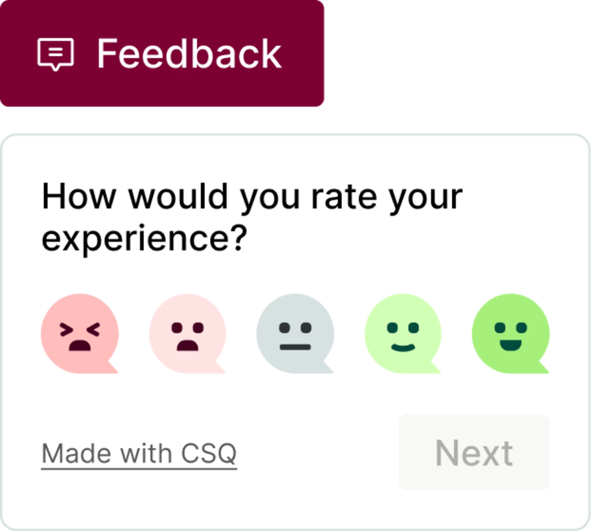
A feedback widget lets users weigh in on your site design
As you analyze your web design’s visual design, consider the following questions:
Do your site’s visual elements align with your brand identity?
Do they reflect the message or tone you want to convey?
Are they consistent (across your site) and cohesive (with each other)?
Is the visual design appealing to your audience?
💡Pro tip: use Contentsquare’s Zone-Based Heatmaps to see which visual elements—like images and carousels—users engage with most.
This heatmap type takes into account all of your available click, move, and scroll data, laying a grid of hot spots over your heatmap. The darker the red on the map, the more users interacted with that area.
With the help of heatmaps during your web design audit, you might spot an ‘About Us’ section that doesn’t get clicks but still captures visitors’ attention or an image carousel that users largely ignore.
![[Visual] Heatmaps types](http://images.ctfassets.net/gwbpo1m641r7/44qPX6Nyu2v2i9pGM8JdIE/e1ccfd573959295483bb4b867ca7e57f/Heatmaps___Engagements__3_.png?w=2048&q=100&fit=fill&fm=avif)
Heatmaps help you spot areas of high engagement in your web design
5. Check for accessibility, responsiveness, and performance
At this point in your web design audit, you’ve confirmed your design functions well and visually wows users. Now it’s time to ensure your design is accessible, responsive on tablet and mobile devices, and quick to load, which not only improves UX but also your search engine optimization (SEO) rankings.
Getting your technical ‘ducks in a row’ is as essential as the other steps in this process. Without it, your font might be too hard to read, your pricing table might be cut off, and your page might take too long to load—causing your user to bounce from your otherwise impeccably designed site.
As you evaluate your website’s performance, consider the following questions:
Does your design meet web accessibility standards?
How fast does each page load? (Use Speed Analysis to find out.)
Are there any display problems on mobile or other devices?
💡Pro tip: check scroll heatmaps when optimizing a responsive website—one that automatically resizes a page to fit a specific device. Scroll heatmaps show where most of your users stop scrolling, so you can tell if they see key elements like call-to-action (CTA) buttons.
For example, NatWest used Contentsquare to find issues with their previous web design that were affecting conversions. When Journey Analysis revealed a high exit rate on a key page, they investigated further and realized that some users weren’t even reaching the ‘Apply now’ button.
![[Visual] Journey Analysis visualization of NatWest’s Youth Savings page, showing a high exit rate](http://images.ctfassets.net/gwbpo1m641r7/6dcARUJSzSYGLP5lIUDDDi/92e959056b80beb07e6c19c127f1a287/Journey_Analysis_visualization_of_NatWestâ__s_Youth_Savings_page__showing_a_high_exit_rate.png?w=3840&q=100&fit=fill&fm=avif)
“This is the CTA we really wanted people to click on, and yet on some devices, you couldn’t even see it until you scrolled below the fold, so we were really missing a trick there,” says Ollie Mitchell, CRO Manager at NatWest.
The team ran an A/B test and used the results to make optimizations, resulting in an uplift in visitor-to-application completion rate and reducing drop-offs.
6. Review results and take action
Now’s the time to pull your data together and decide on your next steps. Based on all the information you’ve gathered and analyzed, decide as a team which design elements to keep, cut, or revise.
For example, you may opt to keep an eye-catching graphic in a high engagement zone and re-design a pricing page chart that many users report as ‘confusing’ via your feedback widget.
As you review the results and create next steps, consider the following questions:
Which design changes are most important to your users?
What changes will have the biggest impact on conversions?
What design tasks should you prioritize?
Use what you learn to create a new design plan, dividing up responsibilities and creating deadlines. Then take action—web design is a constant cycle of testing and iteration. Create a new prototype based on user feedback, and then run concept testing to see if users approve, or A/B testing to see which version actually performs better (sometimes, users say one thing and do another).
Put user needs first with a design audit
Sometimes teams put off web design audits because they think they take a lot of time and everything seems to be working ‘well enough’. But running a web design audit helps you build empathy for your customers and put their needs first.
By listening carefully to users and evaluating your site through their eyes with heatmaps, recordings, surveys, and feedback widgets, you figure out exactly how to improve their experience. This shows your users you care, creating customer delight and building long-lasting loyalty.
FAQs about web design audits
A web design audit evaluates how well your current website design meets users’ expectations and needs. It takes into account the visual appeal and overall usability of the site.