![[Visual] computer stock](http://images.ctfassets.net/gwbpo1m641r7/3ZKnZsUEB6rdrDK1fCeLYl/1bab216d3b61b8e3fb37444688f02b25/BLOG-cart-abandonment-stats-7191168.jpeg?w=3840&q=100&fit=fill&fm=avif)
With competition only a click away, what truly sets brands apart is the quality of their user experience (UX). And as more businesses tap into user insights, those with smarter UX analytics stand out from the rest.
UX analysis is all about understanding how people actually experience your site or product—what they love, where they get stuck, and why they leave. With the right tools in your corner, you can stop guessing and start making decisions that truly move the needle.
This guide highlights the top UX analytics tools to help you unlock real user insights, optimize your product, and create experiences people genuinely enjoy.
One tool can’t do it all, but the right combination of tools should easily tick all your boxes. Here’s a shortlist of the best UX analytics software to help you deliver optimal experiences.
1. Google Analytics
Why add this to your toolkit: Google Analytics 4 (GA4) points UX design teams to potential issues based on quantitative data—and it’s a tool most of us already know and love.
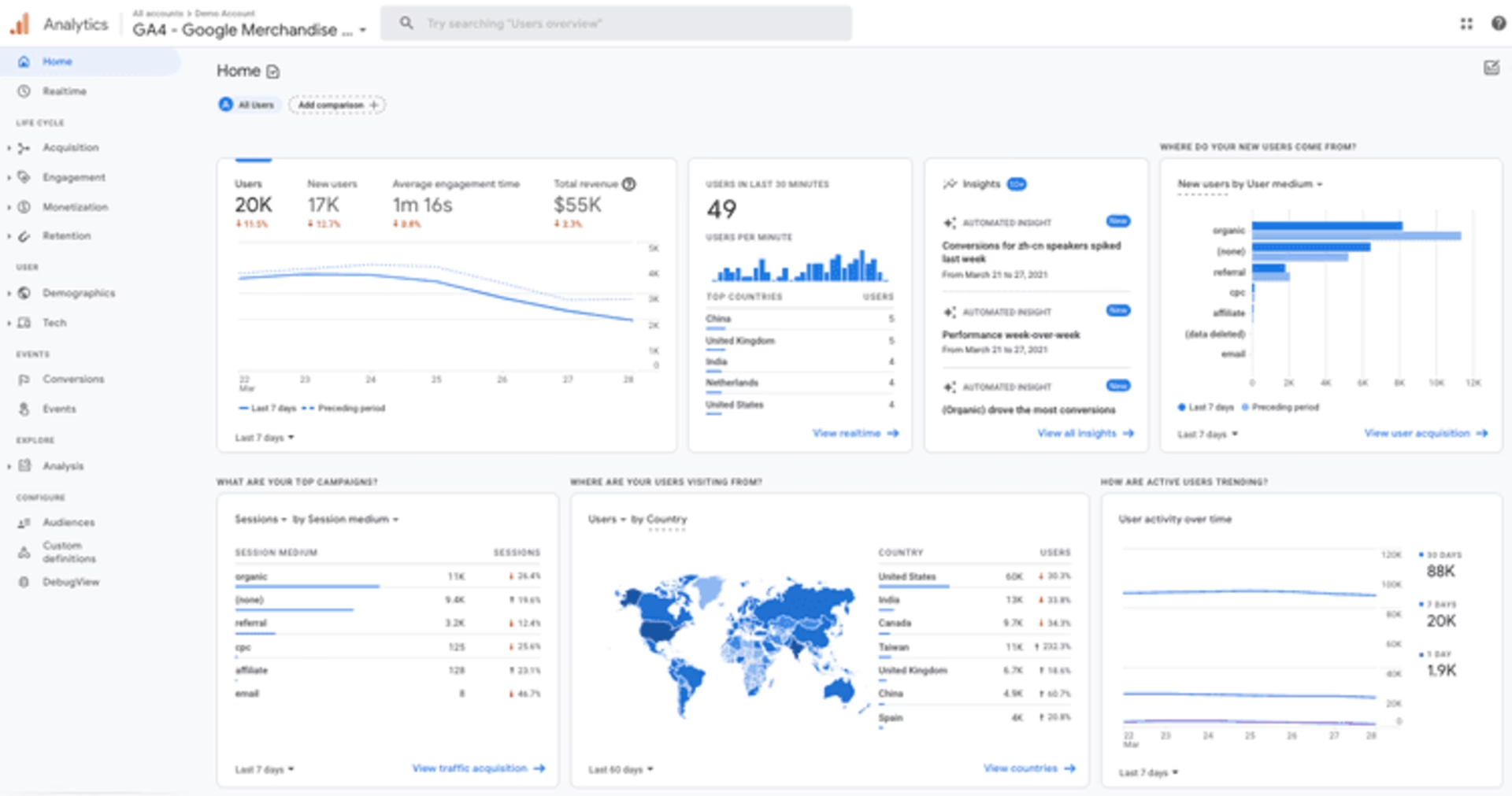
Example of a site’s Google Analytics dashboard
As a traditional analytics solution, GA4 is great at telling you what’s happening on your site. Many online businesses rely on it to track site-performance metrics like pageviews, sessions, and bounce rates.
GA lets you go beyond pageviews to track specific user actions or events, such as clicking a button, submitting a form, or completing a purchase.
🔎 Get the full story with one platform
Despite GA's abundance of metrics and statistics, the platform doesn’t tell you why something happens on your site. This is where Contentsquare’s all-in-one experience intelligence platform shines.
It combines traditional analytics and digital experience insights to give you a robust mix of:
Quantitative data: numerical and measurable metrics, such as success rate, error rate, Customer Satisfaction (CSAT), Net Promoter Score® (NPS®), and Customer Effort Score (CES)
Qualitative data: subjective and non-numerical metrics, including user behavior and feedback
For instance, GA tells you which pages people visit and which ones they skip—but that’s only half the story. Want the full picture? Start by checking your performance metrics in your custom Contentsquare dashboard. Then zoom in with session replays and heatmaps to see exactly how users experience those key pages—where they get stuck, what they miss, and why they leave. An all-in-one platform, no tab-switching required.
2. Contentsquare
Why add this to your toolkit: Contentsquare offers valuable insights into how users interact with your product or website, helping you establish a deeper connection with them.
Delve into the qualitative insights you need with Contentsquare Surveys, and uncover hidden gems in your quantitative data with tools such as Session Replay and Heatmaps.
Surveys
Let users tell you—in their own words—what they think, feel, or experience when navigating your product or site. Launch surveys at critical moments in their customer journey, such as before they exit a page or when they abandon their cart. This is your best bet for identifying and addressing pain points.
![[Visual] NPS example](http://images.ctfassets.net/gwbpo1m641r7/3XOoUidmkg53gC8ufv817q/818f1324b1fb5a866cf9795cb9c9222e/Screenshot_2025-02-23_005204.png?w=1920&q=100&fit=fill&fm=avif)
Contentsquare’s NPS® survey lets you ask users how likely they are to recommend your product
💡Pro tip: to glean actionable insights, ask a mix of open-ended and closed-ended questions. Open-ended questions reveal more detailed and nuanced responses, while closed-ended questions yield specific answers (think yes/no or multiple-choice).
Session replays
Observe how individual users work their way through your website and uncover roadblocks in your UX via session replays. For example, if Google Analytics shows people leaving your site at checkout, pull up relevant replays to investigate the cause.
Seeing patterns like users rage-clicking (repeatedly clicking or tapping) on a link or call-to-action (CTA) button is a possible sign of frustration and that one of those elements is broken.
![[Visual] Experience Analytics - AB Test Session Replay](http://images.ctfassets.net/gwbpo1m641r7/6B0G5JrPHs7GYx3UTU4sm9/dd0a6aa32cad72ad6a6b087dcd21e816/Experience_Analytics_-_AB_Test.png?w=1920&q=100&fit=fill&fm=avif)
Heatmaps
Contentsquare’s Heatmaps capability is a powerful visual tool that uses color to help you analyze user behavior. It shows where visitors click, how far they scroll, and which areas they pay attention to or ignore.
Study heatmaps to spot opportunities: what and where you can improve on your most important pages. Elements you could change include the page copy, layout, messaging, and CTA placement.
![[Visual] ab test heatmaps](http://images.ctfassets.net/gwbpo1m641r7/71Feljv3nwR0ng3PEiPGEG/c5c4f991ef679e660e08970edb2a894a/ab_test_heatmaps.png?w=3840&q=100&fit=fill&fm=avif)
Combining A/B testing with Contentsquare Heatmaps enables you to visualize how users interact with each variation of your product, and identify which elements are most effective
🔥 Which heatmap do you need?
Different types of heatmaps offer unique perspectives on website performance and user behavior:
Scroll heatmaps: these display the percentage of users who scroll down to different points on the page. See if users reach the area where you placed valuable content and CTAs—and change accordingly.
Click heatmaps: know where and how often users interact with page elements (clicks on desktop and taps on mobile devices). Analyzing this data helps you optimize button placement and reduce clicks on non-clickable elements.
Move heatmaps: learn where users move their mouse while navigating a web page on a desktop. This visualization shows whether they spend time on sections you want them to reach.
Zoning heatmaps: see all your users’ clicks, scrolls, and mouse moves—brought together for each zone of your page. Instead of just highlighting hot pixels, Zoning heatmaps show you which page elements and sections get the most engagement.
3. Mixpanel
Why add this to your toolkit: follow user journeys, including their path to purchase, with an events tracking tool like Mixpanel.
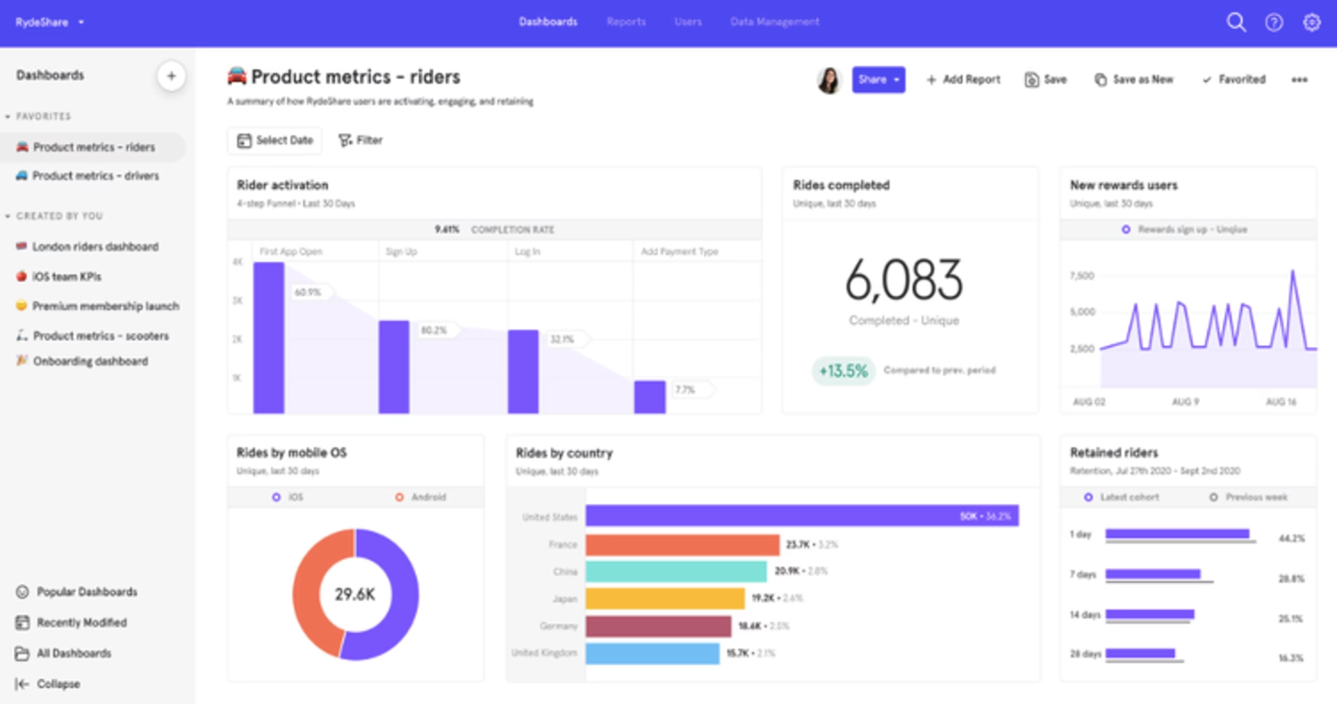
A screenshot of the Mixpanel dashboard
Events are specific tasks or actions users perform on your site or product. Mixpanel tracks a range of different events, such as completed purchases or signups, allowing you to measure every step leading to engagement and conversion.
Get reports on events across user journeys, from users creating an account, logging in, and engaging with content about your product, to adding the product to cart and completing a purchase.
Enrich your UX analysis by blending qualitative and quantitative insights through the Contentsquare-Mixpanel integration. For instance, you can create replays, heatmaps, and surveys based on Mixpanel events:
Filter replays (and heatmaps) by Mixpanel events to get straight to the moments that matter most. No more guessing—see exactly what led up to a key action and make confident decisions based on what really happened. Just look for events prefixed with “MP_” (like MP_Purchase-Complete) to quickly surface relevant sessions and watch what users did before, during, and after.
Trigger surveys when users do something important—like clicking a button, finishing a purchase, or hitting a milestone tracked in Mixpanel. Get feedback right at the moment it counts, so you can uncover pain points, needs, and new ideas.
Segment your users in Contentsquare by Mixpanel events for a crystal-clear view of how different actions shape the user journey across your site or app
💡 Pro tip: you can send all your Mixpanel events to Contentsquare in a single click—no code needed. Just toggle on ‘Automatically send events’ and start turning your data into powerful, actionable insights.
4. Optimizely
Why add this to your toolkit: Optimizely lets you blend A/B testing and personalization seamlessly to update your site’s or product’s UX design.
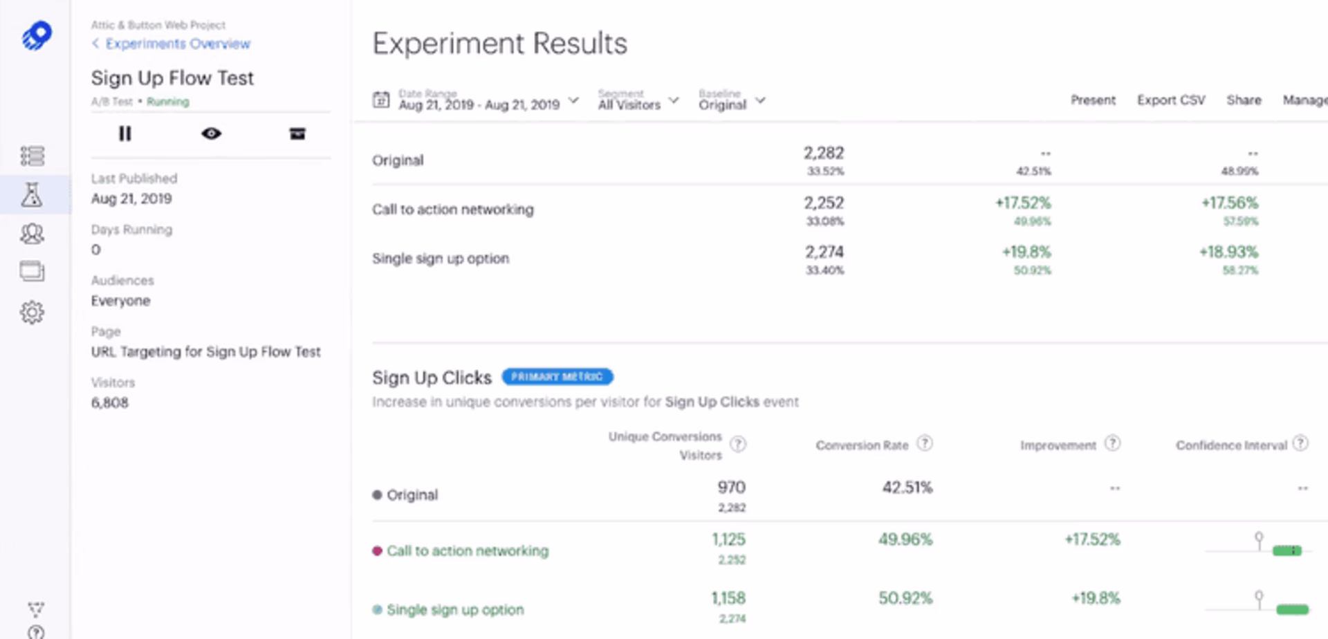
An example of A/B testing result data in Optimizely
Optimizely is another platform that supports A/B testing, split testing, and multivariate testing. But it also draws designers' and developers' attention with its website personalization feature.
Running personalization tests lets you tailor 2 or more versions of your entire website (vs. just a page or element in A/B testing) based on your users' contexts and interests. These include crafting separate landing pages for different audiences.
💡Pro tip: deepen your insights by viewing replays and heatmaps or triggering surveys for your Optimizely experiments when you integrate Optimizely with Contentsquare.
Make data-driven decisions on improvements, such as a homepage redesign, before rolling them out to a broader audience. This saves valuable time, resources, and effort while ensuring your changes are effective and resonate with your users.
5. Omniconvert
Why add this to your toolkit: tap into Omniconvert to gather user behavior insights and focus on building user-led solutions—resulting in increased conversions and higher revenue.
With features such as A/B testing, personalization, surveys, segmentation, and behavioral targeting, Omniconvert is an excellent option for CRO. It also checks every item on the list of must-haves: intuitive, reliable, and compatible with other tools (Contentsquare included!).
Learn how your visitors interact with your website by testing various designs, copy, and CTA on different devices. To add a layer of detail, segment your Omniconvert testing based on factors like geolocation, traffic source, behavior, UTM parameters, and custom parameters.
📝 Note: product and ecommerce teams stand to benefit from Omniconvert the most when using it to improve customer experience, boost loyalty, and increase conversion rates.
💡Pro tip: Contentsquare saves your Omniconvert session replays as events and uses them to trigger session capture, display feedback widgets or surveys, and filter collected data. Check out this guide to get started with the Omniconvert-Contentsquare integration.
![[Visual] Omniconvert <> Contentsquare](http://images.ctfassets.net/gwbpo1m641r7/s2BiGXBTF8vEoII83AKTS/00c31057ba2399fcd2eec7a0cc0a234e/mceclip0.png?w=1920&q=100&fit=fill&fm=avif)
Using Contentsquare and Omniconvert together provides even deeper A/B testing insights
6. Adobe Analytics
Why add this to your toolkit: identify opportunities to elevate the user experience through Adobe Analytics’s ability to predict future trends and events.
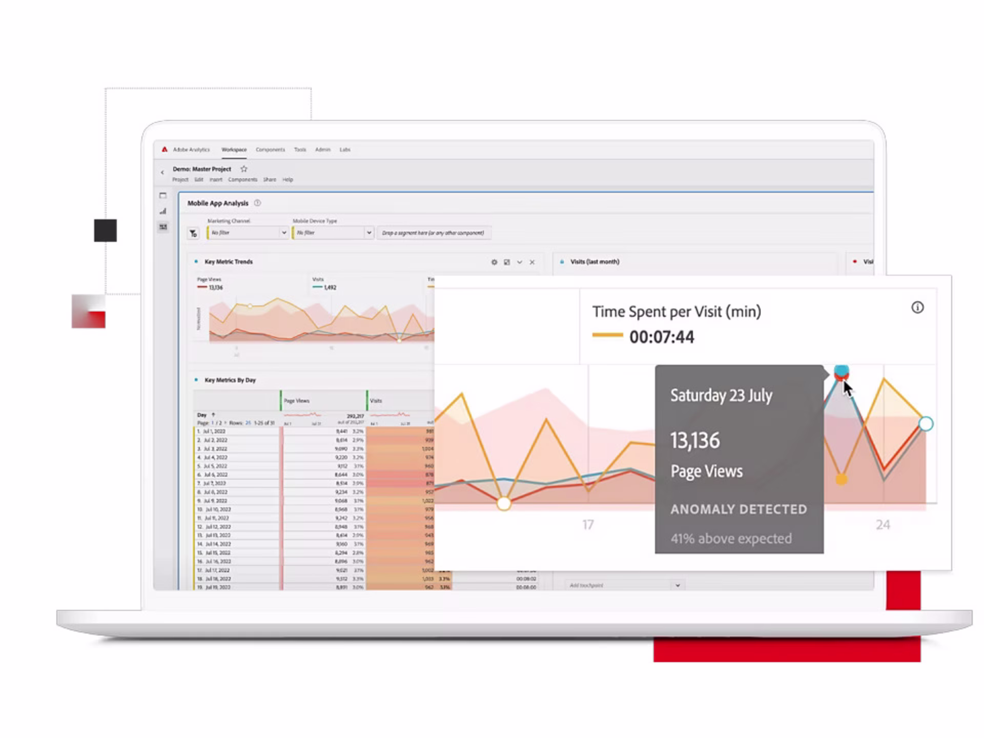
Adobe Analytics in action
Adobe Analytics employs multi-channel analysis, data visualization, machine learning, and artificial intelligence (AI) to analyze UX. It works best for product managers and UX designers who require quantitative data collection and predictive analytics.
Get more granular in your analysis of user behavior to identify crucial patterns and trends. This includes determining the most popular pages or features, locating where users drop off, and tracking actions that drive or block conversions.
For example, pinpoint areas on your website or digital product where users drop off, such as during checkout or when filling out a form. Then, use this information to make targeted improvements to those areas, aiming to reduce drop-offs and increase conversion rates.
🏆 What makes a winning UX analytics tool?
Building and maintaining a product isn’t easy for the stakeholders involved. So choose software and tools that make analysis a delight for everyone in your team: UX researchers, designers, product managers, and marketers.
Consider these 3 characteristics when selecting UX analytics tools for your team:
Reliable and easy to use: provides clear and concise reporting, data visualization, and actionable insights in a user-friendly and intuitive way
Practical and cost-effective: accurately captures real users’ actions on your site or product while requiring less time and fewer resources to set up
Complementary and compatible: integrates well with other tools in your tech stack, such as collaboration, testing, and marketing platforms
Powering UX design decisions with data
You can’t go wrong in prioritizing the delivery of exceptional user experiences. And the right UX analytics tools can be the game-changers you need to dominate the competition.
If you’re keen to look into the ones we shared, keep in mind you can mix and match them—blending qualitative and quantitative data sources is the key to a more accurate and in-depth analysis.
Now, there’s one more thing left to do: add your preferred tools to your tech stack, and get started creating unrivaled, unforgettable experiences for your users.
FAQs about UX analytics tools
These are used to gather, assess, and structure data about users’ interactions with your app or website. They help you understand your users and their experience with your product better. Further, they enable you to make decisions based on solid insights and create solutions that meet users’ actual needs.


![[Visual] Man at computer - stock](http://images.ctfassets.net/gwbpo1m641r7/7GloM7xPXUs1M75nfaIWtr/6566092d4d853e43c29d9df2bf791fd1/AdobeStock_540624504__1_.png?w=1920&q=100&fit=fill&fm=avif)