![[Visual] Stock group in office](http://images.ctfassets.net/gwbpo1m641r7/4qn7ZZ3yGGwvON1mesdH3s/c4d1c9d121d8d67b184011b4bcd2b6bd/Untitled_design__3_.jpg?w=3840&q=100&fit=fill&fm=avif)
If you’re running an online marketing campaign, you probably want the same thing everybody else does: better performance.
One of the most useful tools in the campaign performance improvement toolbox is landing page optimization (LPO) tests, where you design two different versions of the same page and test them against one another to see which performs best.
But how do you know what to test?
Today, we’ll help you identify what to test to enhance your landing pages, along with real-life examples of businesses that have successfully optimized theirs.
What are landing page optimization tests?
Landing page optimization tests (LPO tests) are tests that you run on a landing page, where you ‘split’ inbound visitors between the original page (control) and a variation to which you’ve applied specific changes.
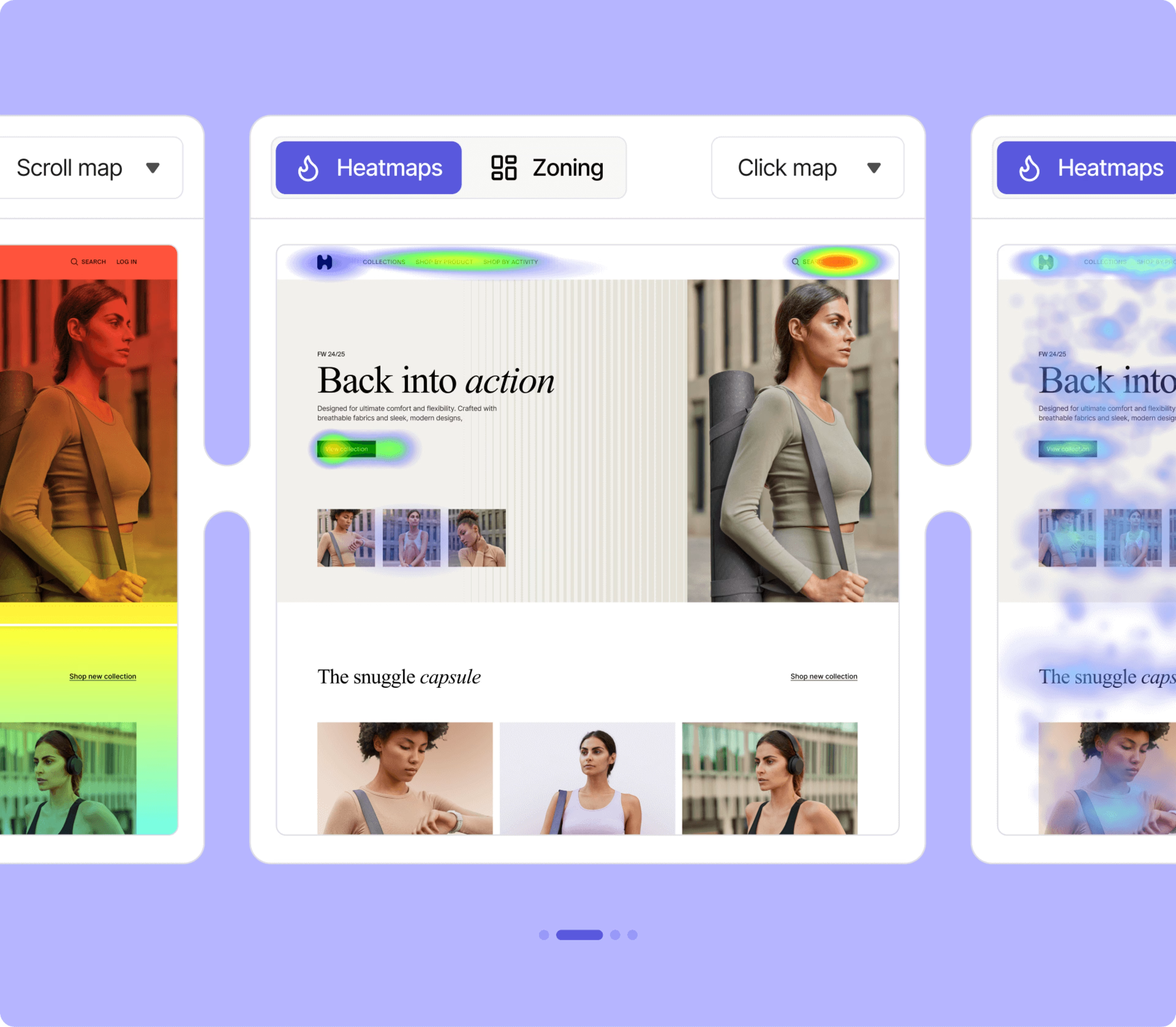
![[Visual] ab test heatmaps](http://images.ctfassets.net/gwbpo1m641r7/71Feljv3nwR0ng3PEiPGEG/c5c4f991ef679e660e08970edb2a894a/ab_test_heatmaps.png?w=3840&q=100&fit=fill&fm=avif)
An example of a split test using heatmaps to see how users interact with a slightly different page
If the changed version drives more conversions, you can roll out that change for all visitors. From there, you can continue testing other elements to further boost conversions.
How to form LPO test hypotheses
The strongest LPO hypotheses are based on data, rather than hunches or guesswork.
Here’s how you can incorporate data into your hypotheses:
Data-driven CRO and split tests usually start with a metric-based observation, such as the average time visitors spend on your page, bounce rate, or number of partial form completions
Advanced techniques and CRO tools go more in-depth by integrating on-site tracking. This is where you can use tools that collect quantitative and qualitative data, like heatmaps and recorded visitor sessions, as the basis for your hypotheses. You can use this data to refine your user experience, tweak button placements, adjust headline copy, and make plenty of other changes to improve your conversion rate.
Heatmaps show you information like scroll depth and where users focus their attention
Example #1: using heatmaps to inform LPO hypotheses and tests
Sometimes, even small changes to your landing page design can make a big difference in how users engage with your content.
Ocado is one of the UK’s leading online grocers. Its approach to improving the Christmas promotional page, ‘Christmas Wondermarket,’ provides a great example of using data-driven insights to make impactful changes.
Step 1: analyze user behavior with heatmaps
Heatmaps are a powerful tool for identifying where users are clicking, scrolling, or exiting on your page.
In Ocado’s case, a zone-based heatmap analysis showed that
0.76% of desktop users and 1.24% of mobile users were clicking on the large, unclickable hero image on the page
Mobile users were particularly frustrated, with many exiting the page without scrolling further
Scroll depth was low across all devices, indicating that users weren’t engaging with the content below the fold
![[Visual] Heatmap mobile vs desktop click rate](http://images.ctfassets.net/gwbpo1m641r7/446cEOR0MIsBHgIuJdC0YE/cb7152acd154790e033fcc1dfff77a85/heatmap-mobile-desktop.png?w=3840&q=100&fit=fill&fm=avif)
Heatmaps for Ocado’s desktop and mobile users
This analysis revealed that the hero image was a potential obstacle to user engagement, especially for mobile visitors.
Step 2: hypothesize changes to test
Based on these insights, the team hypothesized that removing the hero image would
Bring product tiles above the fold, making them more accessible to users, and
Reduce user frustration and improve overall page engagement
Step 3: test your hypothesis with split testing
To validate this hypothesis, the team ran a test with a variation of the page that removed the large hero banner.
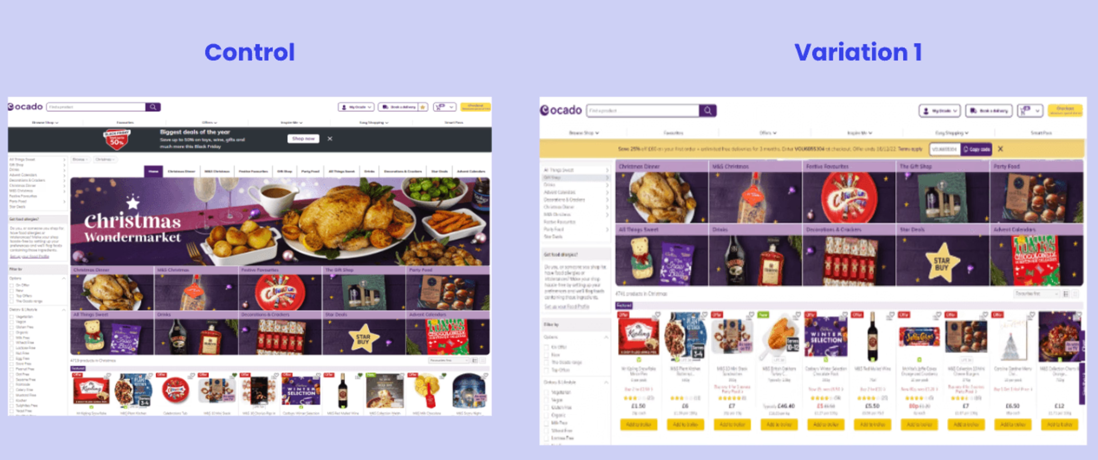
Ocado’s test pages with and without a hero image
The results showed that removing the hero image had no negative impact on order conversion rates. Additionally, secondary metrics, such as engagement with product tiles, improved significantly.
Step 4: implement and iterate
With the test results confirming the hypothesis, Ocado simplified the page by replacing the large hero image with a smaller one and removing category tiles to focus on product tiles.
These changes improved product visibility and helped users quickly find what they were looking for, leading to a better user experience and higher engagement.
Example #2: analyzing the user journey to inform hypotheses and LPO tests
Clarins, a leading luxury skincare and cosmetics brand, demonstrates how understanding the customer journey can help you optimize landing pages for better engagement and conversions.
Step 1: identify friction points in the user journey
When Clarins launched a new product line of Multi-Active day and night moisturizers, the product page wasn’t converting as expected.
Using Contentsquare’s Journey Analysis tool, the team identified a critical friction point: users frequently navigated between the product listing pages (PLPs) and product detail pages (PDPs).
![[Customer Story] [Clarins] Journey Analysis](http://images.ctfassets.net/gwbpo1m641r7/4nozxbnvlcRqDnxYjbPNnm/707c4b2a2c0c36077eb336538bb1098c/Complex.svg?w=1920&q=100&fit=fill)
Example of Contentsquare’s Journey Analysis tool
The hypothesized reason why?
The product imagery for the day and night moisturizers looked too similar, and users were struggling to distinguish between each product. This difficulty made users bounce before making a purchase.
Step 2: hypothesize changes to test
To resolve this issue, the team hypothesized that clearer visual cues could help users differentiate the products.
Step 3: test your hypothesis with split testing
Clarins tested adding ‘sun’ and ‘moon’ icons to the product tiles to visually indicate which cream was for day and which was for night.
![[Customer Story] [Clarins] Sun and moon](http://images.ctfassets.net/gwbpo1m641r7/4V1oUYL2dSzPk7DhUnkoaJ/c807e64ee1173a2ea47d4cbff5810a49/Clarinssunmoon.png?w=3840&q=100&fit=fill&fm=avif)
The team hypothesized that different icons would help users distinguish between the two products
Step 4: implement and iterate
After implementing the changes, Clarins saw a noticeable increase in conversions on the Moisturizers PLP.
This small but impactful change helped users make faster decisions and improved the shopping experience.
Confirm your hypotheses with surveys
If your hypothesis is based on tracking data, you’ll have to infer a ‘best guess’ no matter how accurate and intuitive your landing page tracking data is.
But if you crowdsource your hypotheses and pair it with tracking data, you’re likely to get insights that will lead to more impactful tests right away.
Adding surveys to your LPO toolkit gives you a stronger foundation because your hypotheses come directly from users and customers.
![[visual] Post-purchase survey (activewear)](http://images.ctfassets.net/gwbpo1m641r7/22Ax873Kqdr4ahX9D8BdtI/3513924949f08cfc161600d3da0ba91c/Reduce_churn_and_abandonment.svg?w=1920&q=100&fit=fill)
Contentsquare Surveys let you hear directly from your users so you can base your split tests on concrete data rather than guesswork
Plus, the request for customer feedback might help your users stay engaged and feel appreciated.
Run successful LPO tests with quantitative and qualitative data
Collecting both qualitative and quantitative data is key to running successful LPO tests:
Use Session Replay to watch renderings of users interacting with your landing pages
Use Heatmaps to see where users click and scroll and what they ignore
Use Journey Analysis to identify pages with high drop-off rates
Use Surveys and other voice of customer tools to gather direct feedback from users
Then, use the data to inform your hypothesis and run successful split tests.
FAQs on LPO tests
To test landing page performance, start by analyzing key metrics such as conversion rates and bounce rates. Next, develop hypotheses about which changes could improve these metrics. Finally, conduct split tests to experiment with different elements on your landing pages, identifying the variations that drive better results and improve overall performance.