Upselling and cross-selling can be a challenge to implement in any industry.
A poorly-time distraction can frustrate users, or worse, cause them to leave your site. At the same, cross-selling, when done right, can prove to be an effective way to increase revenue and sales.
In fact, product recommendations drive 10-30% of eCommerce site revenue, according to Forrester research analyst Sucharita Kodali. But, you can’t push just any product at any point in the buyer’s journey. In order to really drive value for your customers, you need to be mindful about what you suggest and about your upsell UX.
There’s no doubt that companies should take advantage of upsell and cross-sell opportunities to surface relevant, popular products to customers and drive sales. After all, pushing a product at the right time can help increase the average order value at checkout. The tricky part, however, is executing these recommendations in a seamless, unobtrusive way.
To help you perfect your eCommerce upsell UX and cross-sell strategy, we’ve put together some best-in-class examples that show how you can incorporate upsells and cross-sells within your existing site design.
1. Present recommendations in the cart preview or add-to-bag confirmation modal
Placing product recommendations within the cart or add to bag confirmation allows users to make quick decisions about adding products they may have missed during their browsing session, while catching their attention before the end of their purchase journey
Recommendations should stand out from the cart in their own container and design. This helps users quickly distinguish between areas of the cart page, while still capturing their attention.
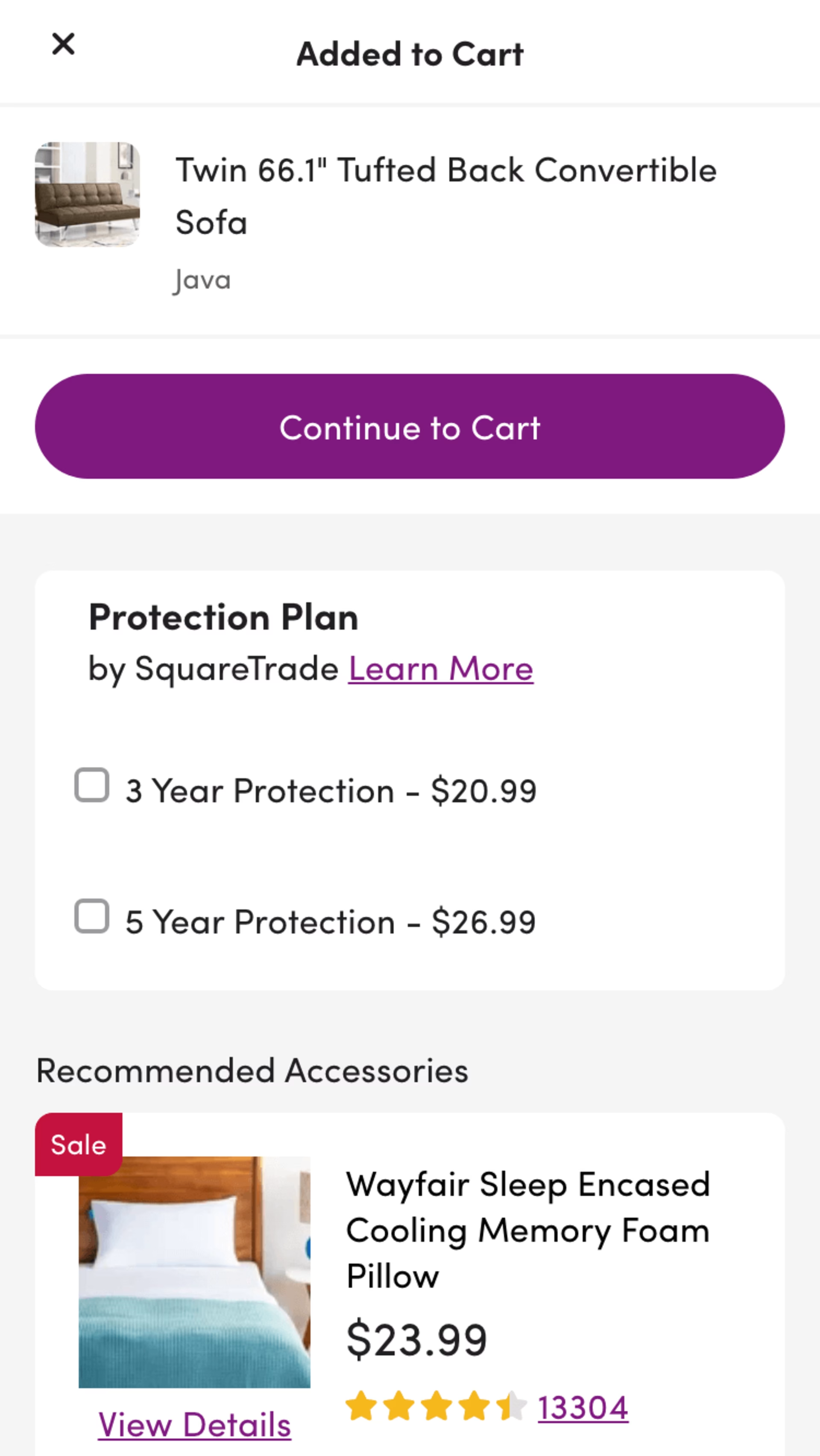
Once a user adds an item to their bag on home goods company Wayfair’s site, they receive recommendations within the same modal for relevant warranties and accessories. Users can choose to add items, continue to the cart, or exit out of the modal to return to their browsing experience.
2. Surface recommendations to the shopping cart
Adding cross-sell recommendations directly to the cart without having to navigate away from the browsing experience allows for a hassle-free experience. Make sure to have just enough key details to empower your users to make an informed decision, such as the product title, an image thumbnail (if applicable), and the price. Have the cart update seamlessly and automatically if a user decides to add one or more of these items to their cart, and check for long page reloads when users use this feature to minimize frustration.
When creating your upsell UX, consider providing a tooltip or a quickview for users that require more information about the product before adding.
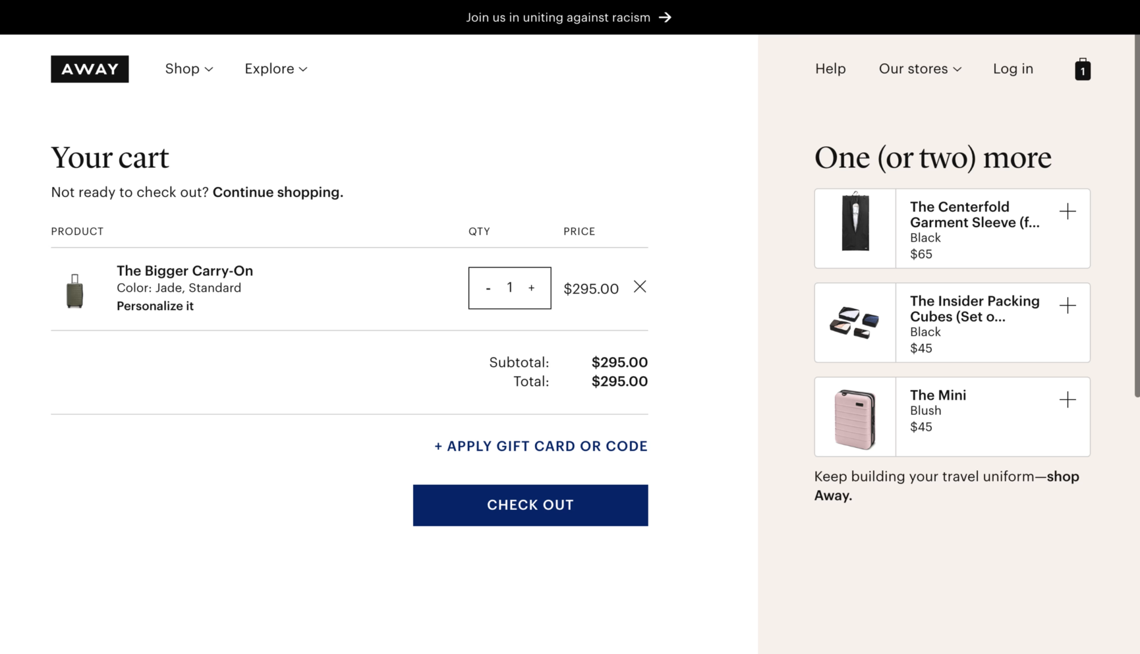
On luggage and travel accessories company Away’s site, add-ons are displayed on the right-hand side of a users cart using a panel with a different background color to help set it apart from the rest of the cart. Users can click on the plus icon to add these items directly to their cart.
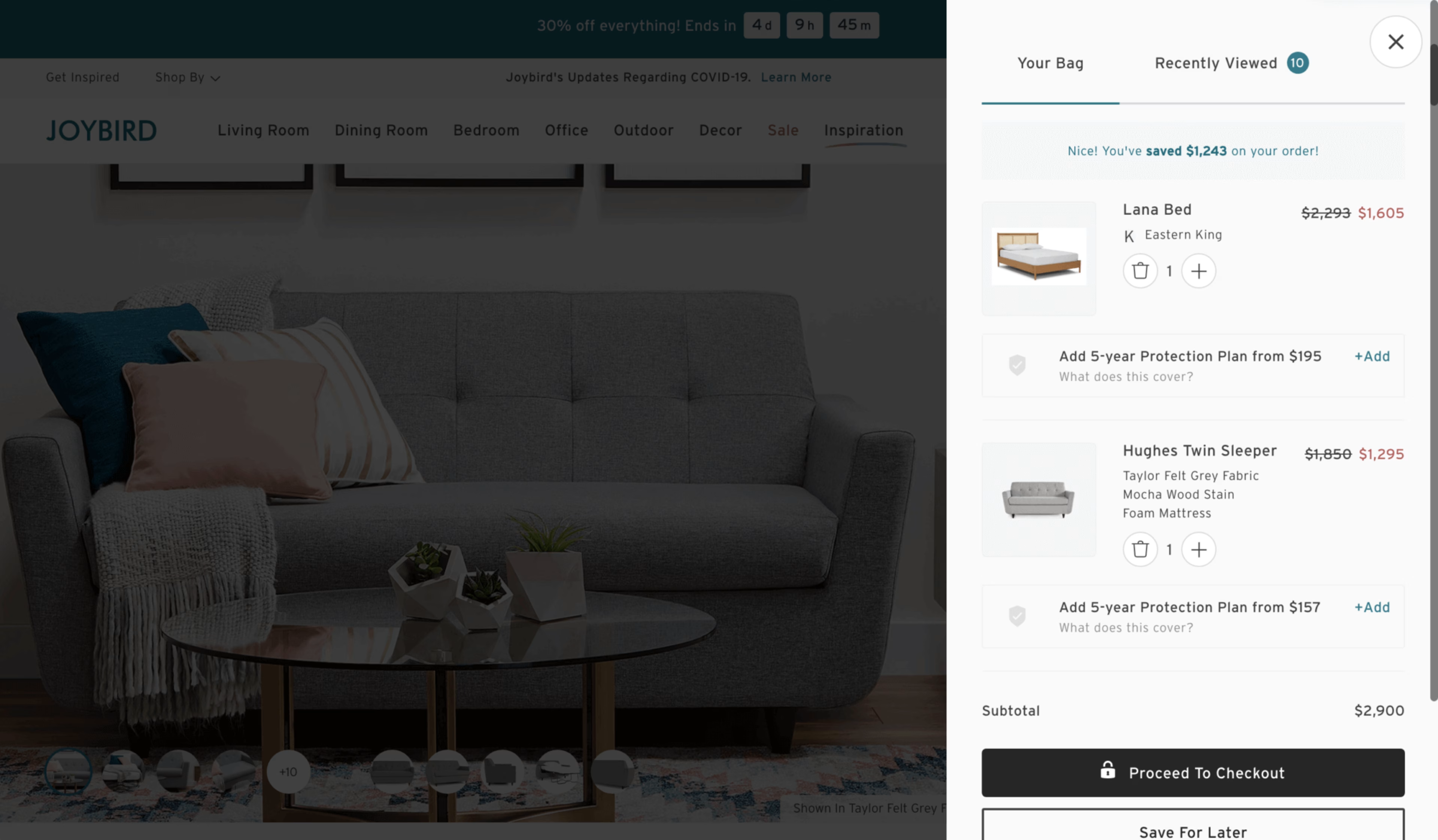
On furniture retailer Joybird’s site, the company’s upsell UX offers users optional add-ons for eligible products wIthin the cart preview. From this view, users can directly add these warranties and protection plans to their cart.
3. Personalize your recommendations
Your recommendations should be straightforward and fairly intuitive to your users. You don’t want to surface a product that seems completely unrelated to their interests or needs. Items should be of lower cart value, or at least a necessary addition to the item that was added. That way, your users can quickly perceive the value of these additional items, decide whether the item is right for, and seamlessly add it to their cart.
Any item you recommend should fit into one of these three categories:
It’s directly related to the product
It’s complementary to the product
It’s personalized for the user
So, how can you ensure the value and convenience of these items are communicated clearly to your customers? The secret lies in optimizing both your user interface (UI) and using easy-to-understand copy. Here’s how to improve your upsell UX using these two factors:
Recommendations should make sense to the user based on their relation to other items in the cart. For example, are they normally bought together out of necessity? Or, are you surfacing this recommendation because most users bought these items together? Indenting cross-sell recommendations within the same listing and using the right language can be a subtle, but effective way to indicate direct relation to the cart item.
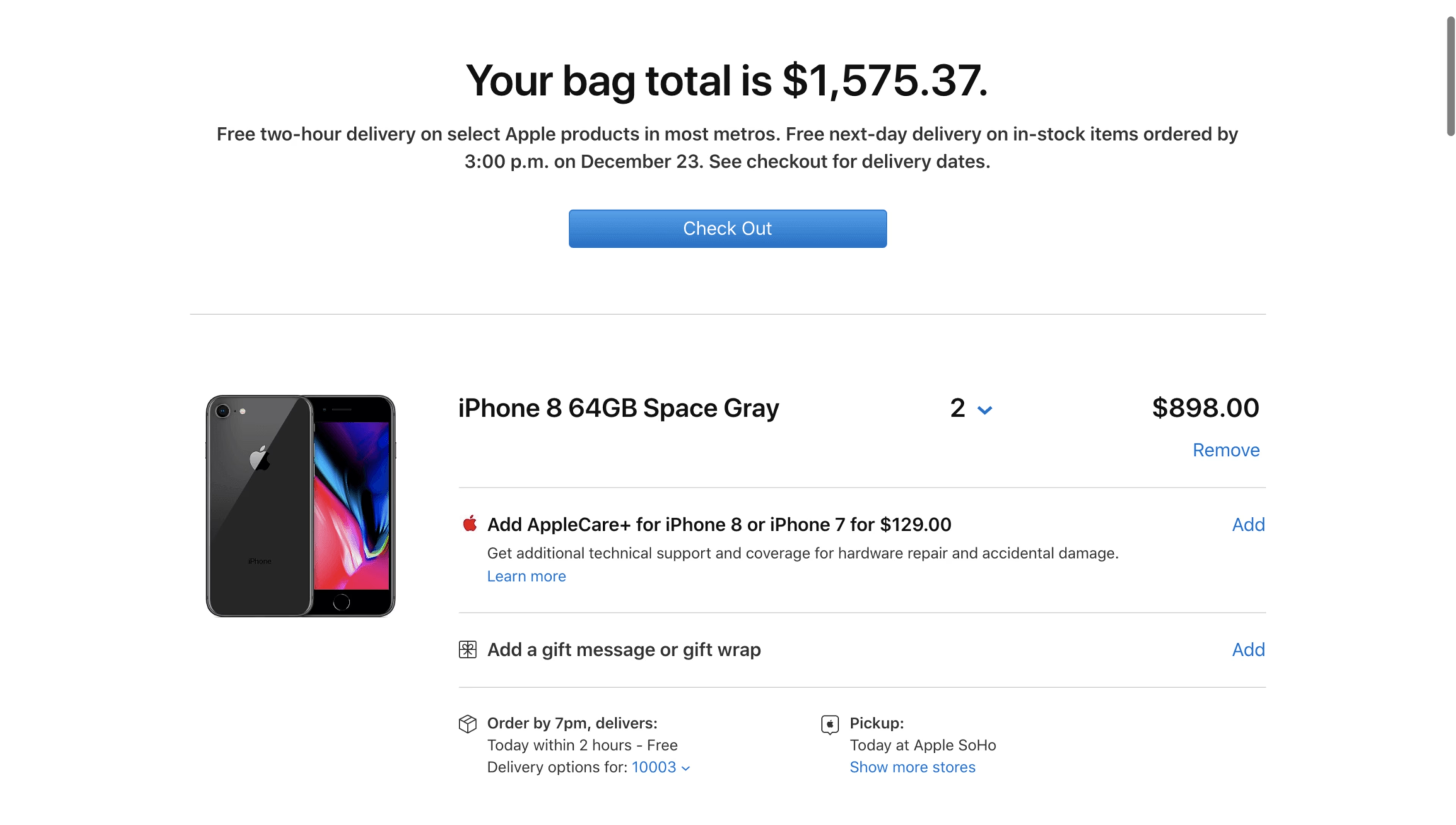
Apple’s upsell UX recommends add-ons and protection plans in the same container as the cart item. Users can use a simple ‘Add’ link to automatically add the coverage to their cart within the cart page, so they never have to leave the page and their checkout flow is not disrupted.
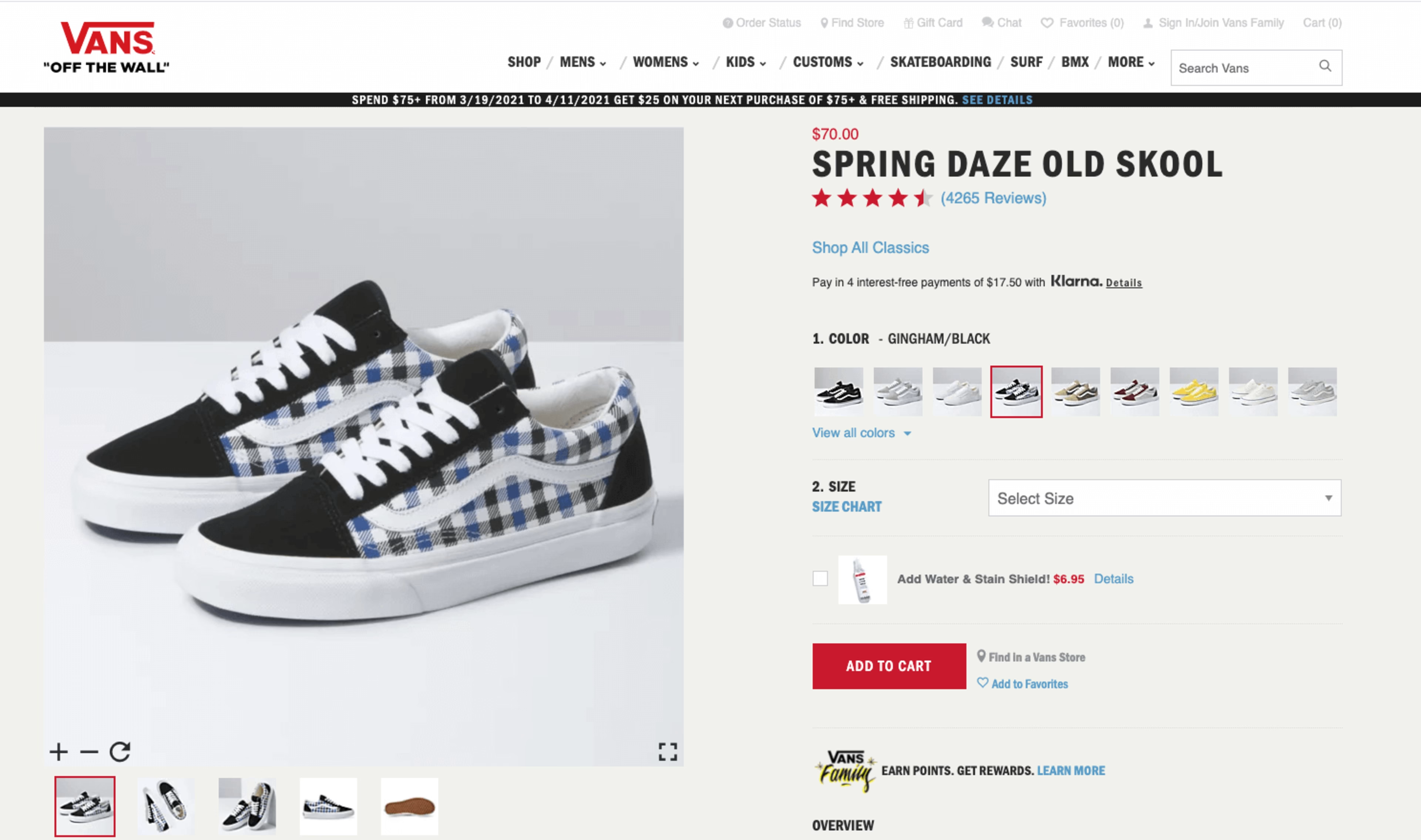
Another way to suggest related products to customers is on a product display page. Shoe company Vans offers its popular Water & Stain Shield product on the PDP for its shoes. Customers who are buying a new pair of Vans will probably want them to stay in good condition for as long as possible. So, they can easily add the spray to their cart and help protect their new shoes from stains and moisture.
Despite the difficulty of incorporating recommendations without being intrusive, cross-sell and upsell product recommendations can ultimately be very beneficial for users. It’s a great way to surface relevant products that a customer may have missed during their browsing journey. For you, it’s an opportunity to drive more sales, but also to increase the discoverability of your products and help your customers find what they need more easily and efficiently.
It can be an effective way to maximize their experience without the difficulty and time-consuming activity of looking for specific items that pair well together with the product they already plan on purchasing. At the end of the day, cross-sells should be considered as a seamless part of the experience rather than an afterthought to the design.
![[Visual] e-commerce home page - stock image](http://images.ctfassets.net/gwbpo1m641r7/48LwhhIBbtyQTIlfcYjn1a/dd9430036a248ce594ef151965365a7f/AdobeStock_846417258.png?w=3840&q=100&fit=fill&fm=avif)