
Whether it’s the holiday season or not, it’s imperative that your promotions and coupon codes work effectively for the user. Promotions and discounts go a long way in encouraging users to buy and makes it crucial to mitigate any confusion or friction. But, having confusing exceptions and bad promo code UX can sometimes do more harm than good.
In a recent survey we did with CommerceNEXT and BizRate Insights, we asked 1,000 online shoppers what they value when shopping online. The top two qualities they valued when picking where to shop online were price and deals and promotion. When we asked what would make them shop with an online brand time and time again, 68% of respondents said good value and price had the most influence over their decision to become a repeat customer.
While price is clearly top of mind for online shoppers, brands need to effectively showcase their sales to attract both new and existing customers. But, when you’re competing on a global scale, you need to ensure you’re highlighting your sales and deals in the right way to catch customers’ attention. Having a strong discount strategy is only half the battle. You also need a strong promo code UX to see positive results.
With over 900 global customers, we’ve put together a list of the best ways we’ve seen brands promote their coupon codes and deals to their customers to help you understand what makes a good promo code UX. Here’s a quick checklist to help you ensure you’ve optimized your coupons codes and promo code UX on your eCommerce site:
1. Clearly and succinctly explain how the user can take advantage of the promotion
Whether you are using an announcement banner across the top of your site or using standalone text on product pages, it’s imperative that your explanation of the deal is not confusing. If users have to use a specific code to redeem the promotion, answer the what, where/how, and why. Simply state what that code is, the benefit of using the code, and how users can redeem it – without any fluff.
If users have to reach a certain threshold for spending, clearly define that threshold and whether it is before or after tax. If certain categories or exclusions apply, make sure the user knows this prior to browsing. Nothing is more frustrating than to find out right before checkout that actually, the products that you are interested in are not valid for promotion.
2. Don’t overwhelm the user with too many details upfront
Have a lot of things to say about the promotion that’s running? Use clear links that open a pop-up rather than a new window that lists additional details about the promotion that can help the user understand what products and services are eligible as part of the deal.
Within the pop-up window, make sure that your design is simple and clean — keep your line heights and text sizes readable, avoiding text that resembles fine print. Keep the message as short as possible and avoid adding fluff. Your users are already spending the time to read additional details, you want to make it as easy and clear as possible for them to understand the details and terms of the offer. That way they can spend more time shopping your site and less time getting caught up in the details of your offer.

Clothing brand Abercrombie & Fitch uses space on their homepage to clearly outline the parameters of a promotion. The main benefit of the promotion is written right in the title and subtitle. Users are encouraged to use links to navigate to categories. Succinct phrases are used to further clarify any exceptions to the promotion, with a link to view the promotion in detail.
3. Surface product-specific promotions on PLPs and PDPs
Avoid inundating the homepage with product-specific promotions. Save these for the PLPs and PDPs so that users aren’t overwhelmed with information and discounts are surfaced in a timely manner. Don’t waste precious real estate on your homepage for product-specific promotions, as these deals may be irrelevant to users on the homepage who are not interested in those specific offerings. Save promotions that are site-wide for your announcement banners, as they should reach and apply to a more general audience.
On the other hand, you know a customer viewing that specific product page would be more interested in your deal, so it makes more sense to feature the deal on that PDP or PLP.
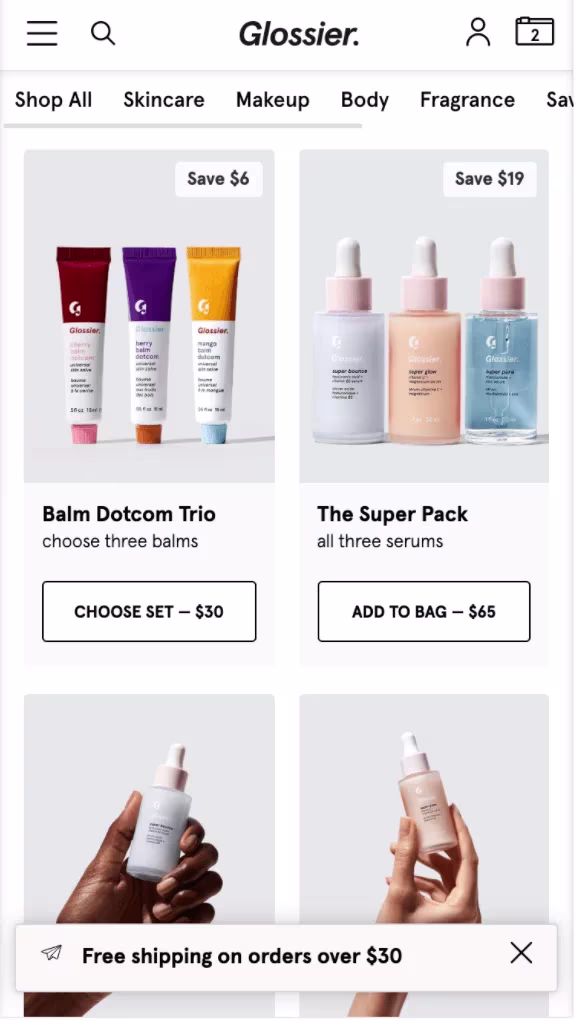
Cosmetics and skincare brand Glossier uses the floating announcement banner at the bottom of their mobile site to push site-wide promotions. However, product-specific discounts and promotions are pushed on the PLP using simple and easy-to-read badges that advertise product-specific discounts. In this example, discounts are focused on product bundles.
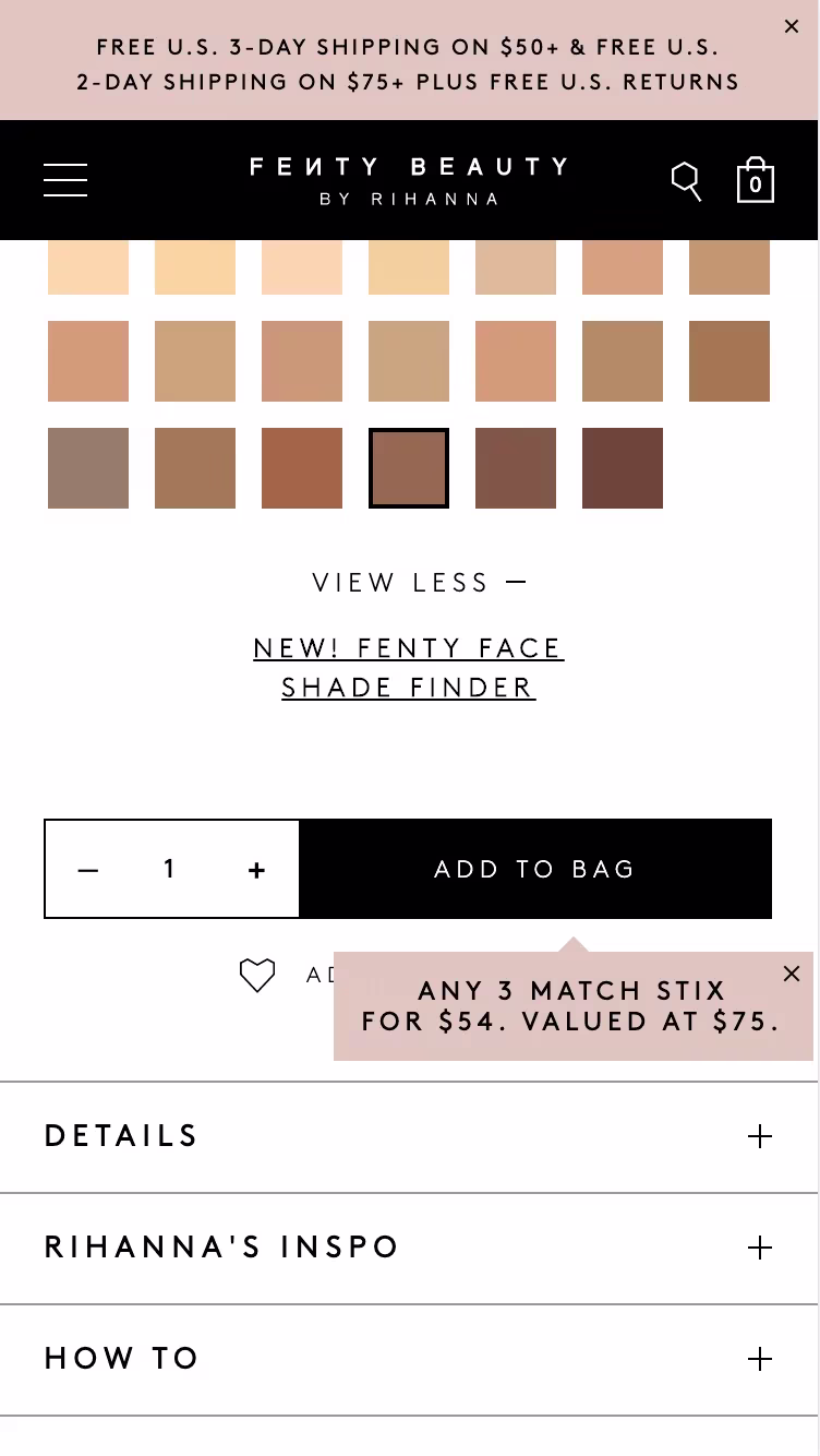
Similar to Glossier, cosmetics brand Fenty Beauty’s announcement banner at the top of the site alludes to a site-wide promotion. It is specific about the spending threshold users must reach in order to receive free shipping. In addition, a small pop-up is used next to the “Add to Bag” CTA on specific PDPs to alert users about product-specific promotions and discounts.
4. Automate the application of coupon codes
No one wants to have to remember coupon codes or jump from their cart to the homepage to copy and paste a discount code. Make it easy for your customers to see and apply codes with just a click of a button during your checkout process. This helps your users to avoid potential human error, like spelling errors, which can lead to frustration. Helping your user apply codes easily and automatically when promotional requirements have been met is an easy way to earn a brownie point from your user. Plus, it lessens the likelihood of them abandoning their cart to go in search of a coupon code on coupon sites, like RetailMeNot.
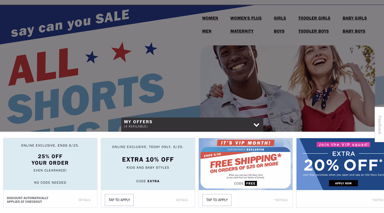
On clothing brand Old Navy’s desktop website, users can expand the available offers section at the bottom of the page and tap to apply a code automatically to their cart. Each offer clearly explains what code is being applied, or whether no code is needed.

On home goods store Bed, Bath, and Beyond’s desktop website experience, users can see whether there are coupons available to use directly from their cart. Users can simply click ‘Apply Coupons” to surface a pop-over with a list of promotions and browse deals. Each promotion has an “Apply” CTA that automatically applies the coupon to the cart. Users receive confirmation of the application and see the update automatically within the cart (without a page reload).
Overall, the types of promotions you implement for your customers will determine the best way to surface them within the digital experience. No matter what, communicating clearly and doing the work for your customers will improve the browsing and purchasing experience of your site.
Michelle is a UX/UI Designer who loves finding design solutions that marry both business and user needs. When she’s not designing, you can find her pursuing yet another new hobby, visiting a museum, or laughing a little too loudly somewhere in the distance.