Hello. I’m Matt, UX designer at Contentsquare.
I spend most of my day speaking to clients from all industries about how to improve their user experience. I share advice, best practices, and data insights from Contentsquare to help point them in the right direction when it comes to UX optimization.
Today, we’re looking at User Generated Content (UGC). Nope, I’m not talking about all those countless selfies you’ve been taking, but instead the importance of Instagram and its place within UX — its different uses, how it’s no longer just “a trend” and its effectiveness across the eCommerce space.
And not only that but how Covid-19 has forced a different approach on models and environment, from studio to bedroom photoshoots.
So ahead of the peak holiday shopping season, a time when UX optimization is more important than ever, here is how some of the best brands are using User Generated Content.
I hope these examples will inspire you to consider new tests, but ultimately it’s your customers who should guide your development roadmap. Make sure you’re collecting data, testing, and iterating.
Empathy and the feeling of familiarity
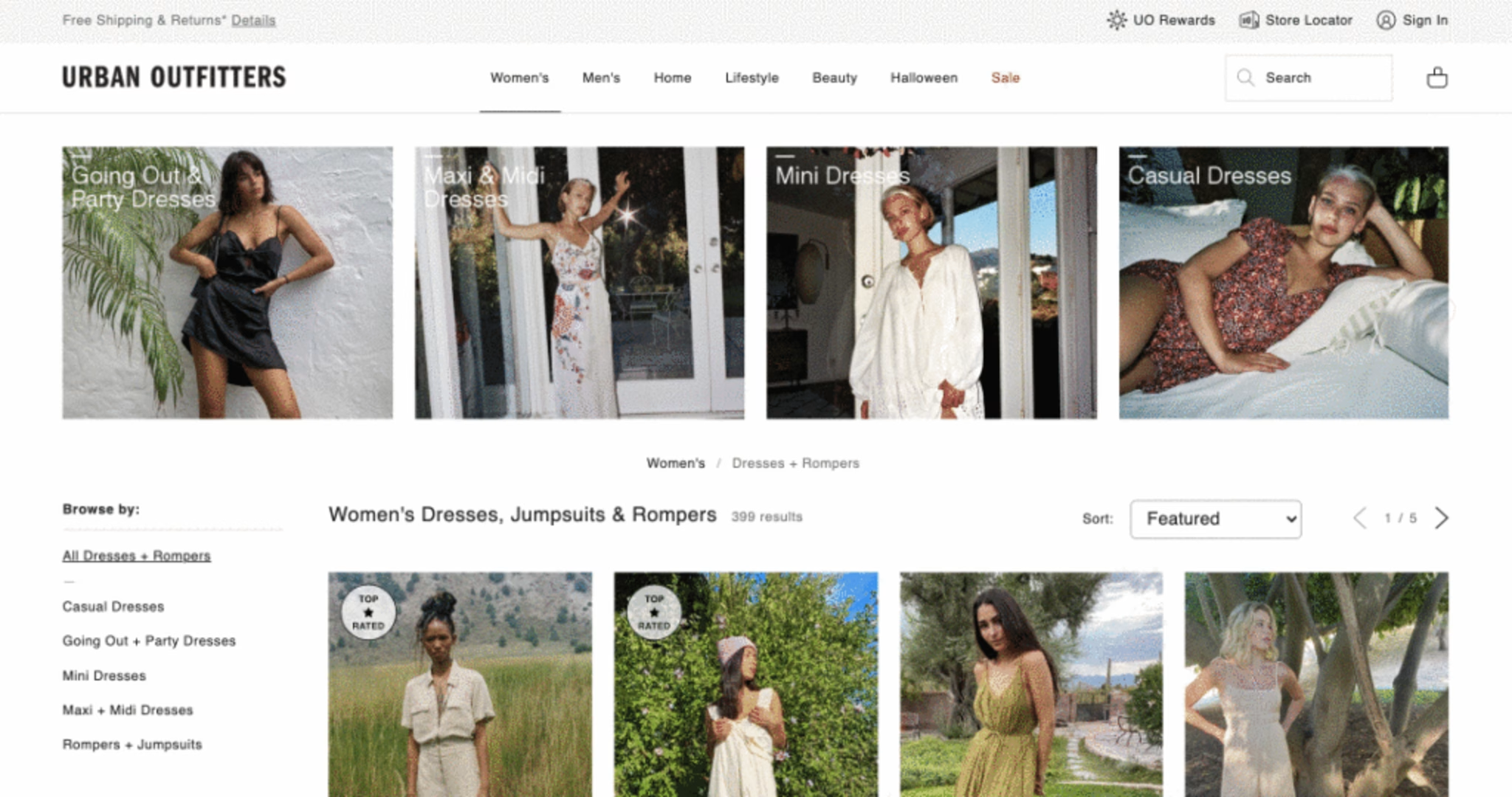
“Shop the Look” and Models at Home
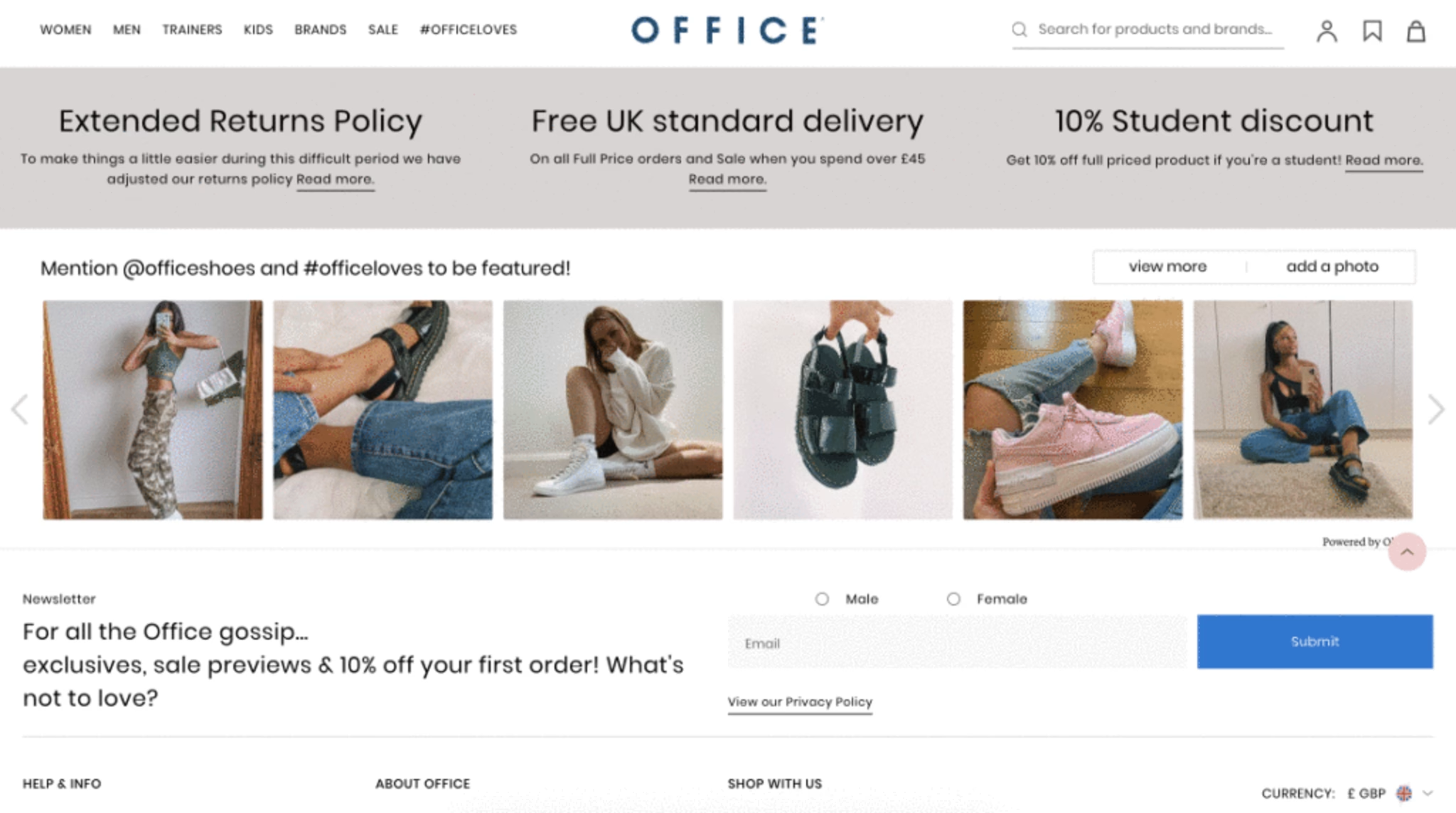
It’s no mistake this feature is becoming more popular. You might’ve seen it towards the bottom of your favorite site’s home page, or as a cross-sell on the product page.
A large content block with 3 to 6 images, showing real users wearing the item or similar. When clicked, it takes you to that specific product for further inspection.


Now more than ever we need to maintain brand awareness. Customers want to feel connected to the brands they use, and UGC is a great way to help customers identify with people like them who are using that same product (compared to a model in a studio).
Beyond fashion
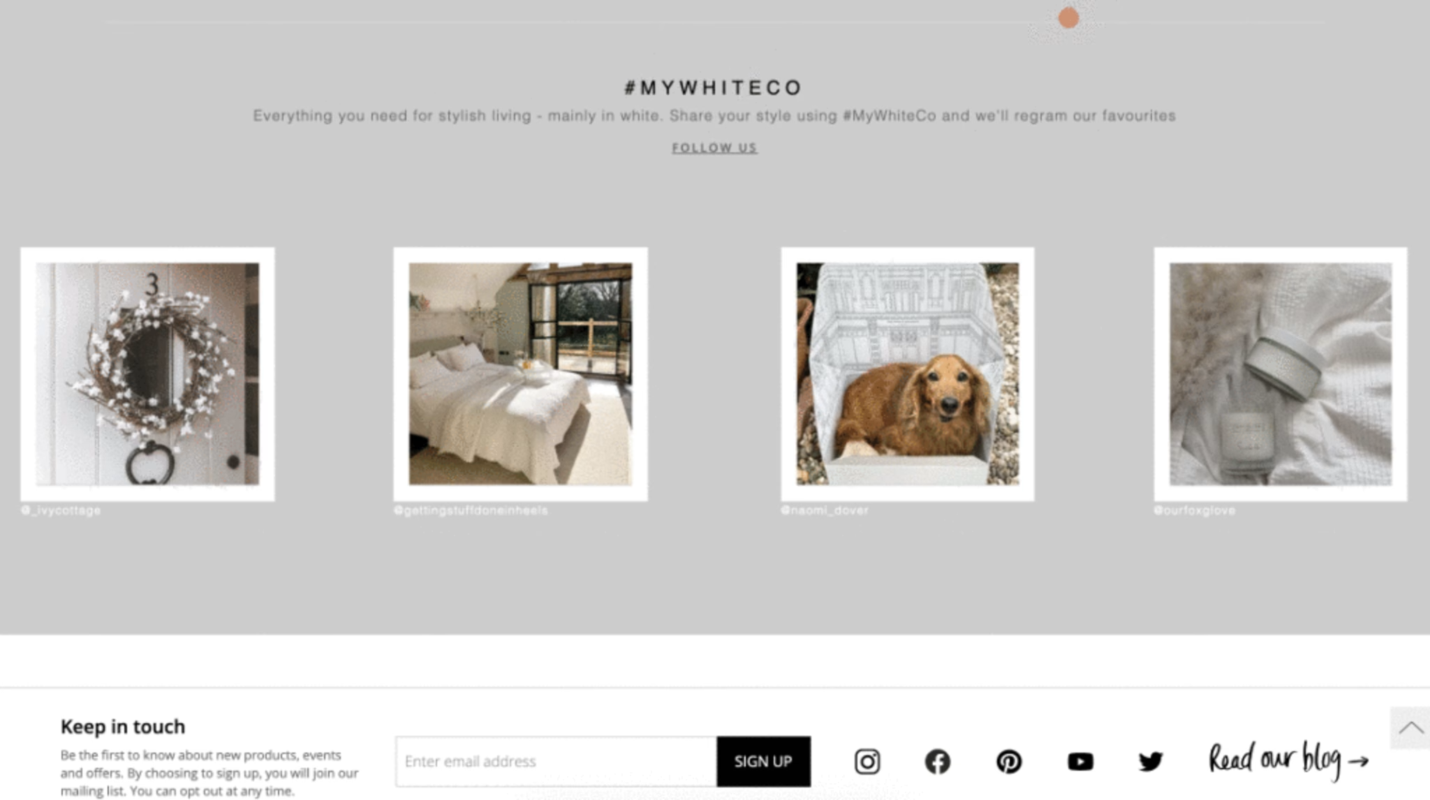
Fashion brands are using UGC, but so are homeware and furniture sites The White Company.
Allowing users to visualize some bed linen in a fellow user’s bedroom, or checking to see the garden table and chairs fit on someone else’s balcony is a great way to boost engagement. If you happen to see another user’s living room that looks eerily similar to yours, and that ornament looks fantastic, then it’s a no-brainer.

N.B. Cute pooch not for sale
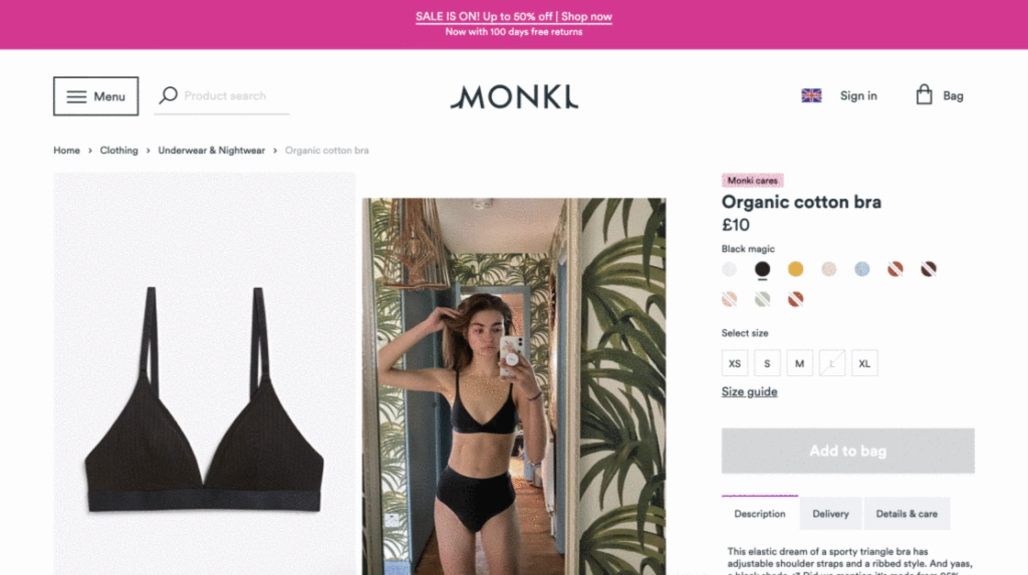
Highlighting size options using real people on PDPs
Many fashion brands now use product images that feature real customers at home instead of models in a studio. This allows customers to see the product worn by real people (of different shapes and sizes), helping to provide authenticity in its truest sense.

How to validate the improvement with CS Metrics
Monitor the click recurrence and exposure time over each product image to see if users are engaging.
As this feature is typically seen towards the lower half of the page, do you notice a higher than usual attractiveness rate?
When interacted with, do you notice an increase in PDP views and ‘add to bag’ rate?
Does this improve revenue overall?
Tracking success with Contentsquare
Find out how New Look used UGC to increase its product conversion by 19%.
“Contentsquare helped us look at the results in a much more visual way and also understand the customer journey as a whole.”
Faith Dallas, Test & Target Specialist at New Look
![[Visual] Matt Christie](http://images.ctfassets.net/gwbpo1m641r7/mkHAXnX1ZFeXGcB9MbUK7/7a4273986c08ae36b695cfeca0155cdf/T027K0ZC9-USK5B07QU-84ff0b52270c-512.jpeg?w=1080&q=100&fit=fill&fm=avif)
Matt Christie is a former UX Designer at Contentsquare. He spent much of his time speaking with clients across industries about improving their user experience, sharing advice, best practices, and data-driven insights from Contentsquare to guide effective UX optimization.
