![[Stock] Unlocking the power of customer journey visualization – Step by step — Cover Image](http://images.ctfassets.net/gwbpo1m641r7/1E3yKJe4En4Jq36yjJl4vW/f7befc254b7ce2102e5ebe1e4586814b/customer-journey-visualization-people-draw-1.jpg?w=1200&q=85&fit=scale&fm=avif)
In this article, we’ll show you how to create microinteractions which will delight your users.
Microinteractions are tiny interactions that allow the user to accomplish a single task within your product. Although small, microinteractions can have a huge impact on your user experience, evolving your product into something that’s engaging and outstanding.
Here are six best practices for creating successful microinteractions:
1. Be purposeful
Anything UX-related must have a solid understanding of the user. So before you create your microinteractions, ask yourself:
What does your user need?
Will this microinteraction fulfill that need?
And will this bring value to the user experience of your product?
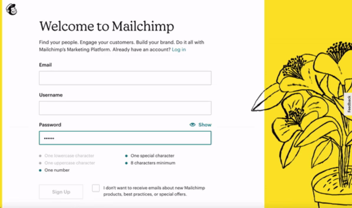
Mailchimp checks off each password requirement that the user meets. This avoids the need for the user to repeat work, or resubmit another password after they are told it does not meet the requirements.
2. Deliver feedback ASAP for your microinteractions in web-design
To avoid user confusion and frustration, deliver feedback immediately after the microinteraction has been triggered. Avoid using microinteractions that affect the functionality of your product as this does – and always should! – take priority.
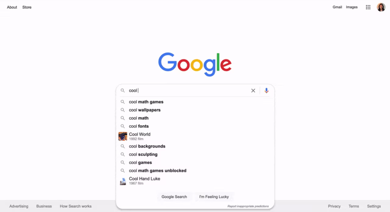
Google does an amazing job at bringing high-speed feedback to its users. In this example, the user immediately sees autosuggestions populate as they type into the search field.

Figma shows a loading screen immediately after the user clicks on a project. The progress bar and the page itself load in only a few seconds.
3. Keep it simple
Overcomplicated microinteractions will overwhelm the user, so keep your microinteractions as simple as you can. Remove any unnecessary details and elements. Simple microinteractions can lead to happier users, which can lead to increased user engagement.
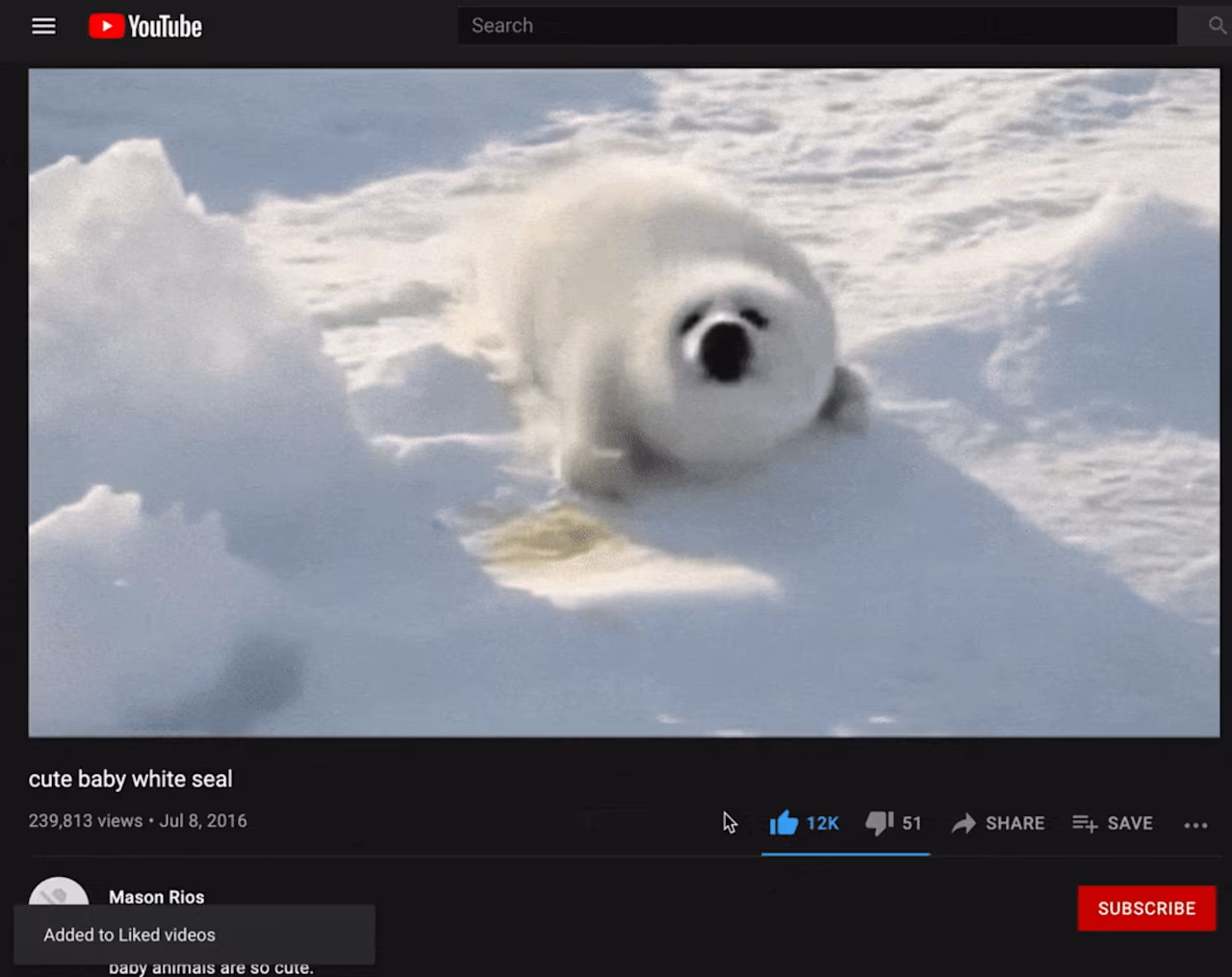
YouTube’s thumbs up/thumbs down system for liking videos is simple and memorable. Users only need to choose between two elements: like or dislike.
4. Keep it consistent
Build the user’s mental model of this microinteraction so they know what to expect every time. This consistency can help build user habits.

Swiping any mail to the left on Gmail will always move it to Trash. The user can perform this microinteraction instinctively every time.
5. Be human because microinteractions in web-design are human interactions
Incorporate elements that speak to user emotions, which can have a big impact on the user experience.
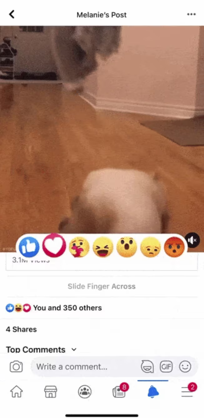
Facebook uses fun react features which allow the user to react with emotions beyond a simple thumbs up. The microinteraction is also very quick, allowing the user to react in no time.

iMessage lets you use stickers to reply to messages, but also as literal stickers which you can drag and drop onto specific messages.This adds an extra layer of personalization and humanization to the user experience.
6. Stay on-brand
Microinteractions are powerful tools that can help communicate your brand personality. Use simple and memorable elements that enhance your brand and make it stand out from others.
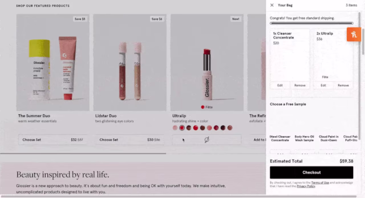
When the user clicks on the button to add the product to their cart on Glossier, the button indicates its loading state with a spinning planet, an element that aligns with their fun sticker branding.
Conclusion
Microinteractions are designed to help your users with a single task and, if done correctly, can add amazing value to your product’s experience.
Be purposeful by creating a microinteraction that fulfills the needs of users, and provide feedback immediately after the microinteraction has been triggered. Keep the microinteraction simple and consistent, tend to users’ emotions, and ensure that the microinteraction speaks your brand’s language.
![[Visual] Claudia Chang](http://images.ctfassets.net/gwbpo1m641r7/3XMTw3DX9T4GAjMWFJkJhu/a43ece586a2be2cc7ad614292a802660/T027K0ZC9-U01NEPF7UBH-5d9e19f83226-192.jpeg?w=192&q=85&fit=scale&fm=avif)