2022 Travel Digital Experience Benchmark Report
Get insights to deliver better, more human digital experiences.

If your site isn’t clear, seamless, and intuitive from the start, your visitors will leave. And within seconds, they’ll be on a competitor’s site. After all, the number of digital deals, promotions, and packages is endless.
So how do you combat booking abandonment and increase your website conversion rate? By improving your digital customer experience across the customer journey, from search and site entry to checkout.
Industry benchmarks provide insight into the expectations and preferences of the new travel customer. According to our 2022 Travel Digital Experience Benchmark Report, new users made up 54% of traffic in 2021. This means that after visiting a site once, many users chose not to return and instead explored other sites that offered a better customer experience.
2022 Travel Digital Experience Benchmark Report Get insights to deliver better, more human digital experiences.
Customers share their preferences and feedback through their online activity and in-page behaviors. Take conversions, for example—it’s a clear way to understand if a customer is satisfied enough to complete a purchase or action.
Well, in 2021 the average website conversion rate was 3.9%, a 63% increase over 2020 (when it was 2.4%). From 2020 to 2021 consumer expectations for digital shopping experiences changed drastically. And companies that can’t adapt and exceed those expectations will fall behind.
This means providing an exceptional experience across all platforms and devices is the only way to obtain new customers, increase the rate of returning visitors, and build customer trust, loyalty and advocacy.
Let’s dive into one crucial area of your CX: the checkout process. Here are three reasons why travelers are abandoning their carts at checkout and how you can combat these friction points and turn them into conversion-boosting opportunities.
Travel and hospitality purchases vary in price and sometimes include big-ticket items that aren’t purchased frequently. Customers need to be comfortable and feel like they’re in a low-risk situation in order to complete high-value transactions.
If visitors can’t find the cancellation policy for their booking, the purchase turns high risk. And risky transactions create distrust and cart abandonment.
Building consumer trust in industries with higher average order values means being transparent about critical legal, financial, and administrative information.
Transparency builds trust, which leads to loyal returning customers and brand advocates.
Sharing your cancellation policies, rules, and regulations prominently on your site before and during the checkout process resolves buyer hesitation and increases the likelihood of conversion.
Example: Wisecars gives visitors a list of policies, rules and regulations with explanations in addition to sharing the fuel and cancelation policies before asking for payment.
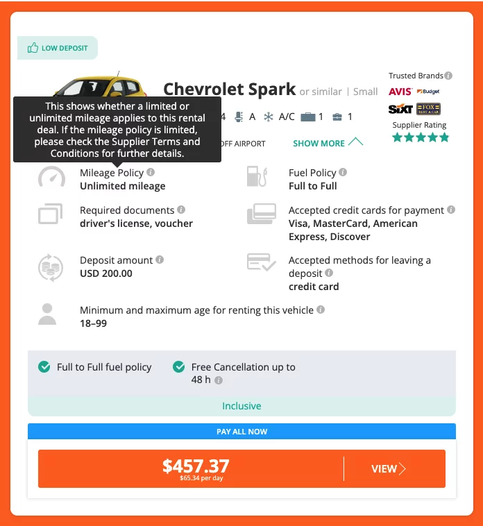
Image source: wisecars.com
Unexpected charges and fees added after the customer has taken the time to enter personal details create friction and frustration. A visitor can feel like they’ve been tricked or deceived, so they abandon their cart and find somewhere else to shop.
Provide a clear and simple explanation of all the taxes, fees, and charges that make up the total purchase price before asking a customer to fill in a form. A customer should understand the full price of their potential purchase before being prompted for personal information. This transparency builds brand trust and creates a better experience during checkout.
Example: Airbnb breaks down the price details for an online travel booking before asking for payment information. They also allow you to click on each line item for more information, so visitors understand the total cost before entering their information.
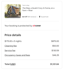
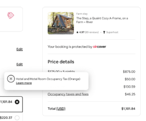
Image source: Airbnb.com
Travel and hospitality purchases sometimes include higher-cost purchases and customers may not be able to (or want to!) pay the entire price of the purchase immediately.
Not offering flexible payment options can hurt your conversion rate and cause visitors to abandon their carts, reduce your potential customer base, and create a negative CX that doesn’t lead to returning visitors.
Get tips from J.P. Morgan and PayPal on optimizing your payment experience
How to create a frictionless payment experience
Consumers like options, so let them choose when and how they pay. Offer options that allow customers to pay the total amount right away, when they arrive, or through a series of installments.
In addition to timing flexibility, partnering with banking and financial services like Paypal or Venmo can give your customers a variety of methods to complete their purchase. This adds convenience, builds trust and reduces the time from booking selection to order completion—increasing the chances of conversion while creating a positive CX.
Example: Expedia gives customers the option to pay now or pay later when they arrive at the hotel or property, building trust by exemplifying their statement that flexibility matters.
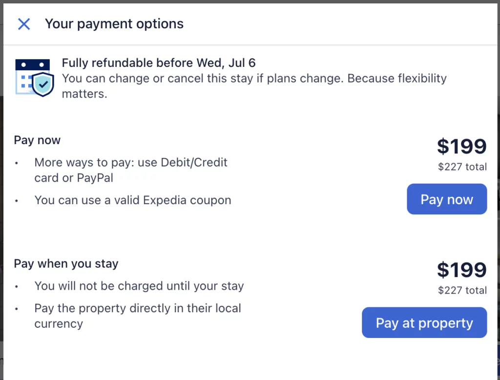
Image source: expedia.com
Resolving these three customer friction points during the checkout process will not only increase your conversion rate but also improve your customer experience—building trust, brand loyalty, and customer advocacy.
Reduce your abandonment rate and maximize your online travel booking conversion rate with a seamless, fast, and intuitive experience that rises above the competition.