
Marketers today are drowning in data. Between Google Analytics, ad platforms, and the rest of your tech stack, there’s no shortage of numbers to look at. But with so much to track, it may seem daunting to determine which metrics actually matter for your business goals, or how to turn them into insights you can use.
This guide breaks down 10 key web analytics KPIs to track, with examples and practical tips to give you a complete picture of the user experience and know exactly what to improve next.
Key insights
Let your business model and current goals guide which web analytics metrics you track. For example, if your main goal is to boost online sales, prioritize metrics like cart abandonment rate instead of trying to monitor every KPI in your dashboard.
Pair traditional metrics with behavioral insights so you see what happened and why. With the Google Analytics-Contentsquare integration, you can take quantitative metrics like top traffic sources and exit rate and layer on qualitative signals like rage clicks and scroll depth to get a complete picture of user behavior.
Use Contentsquare Dashboards and Alerts to stay ahead of issues and fix them faster. Dashboards pull your key metrics, UX signals, and GA4 data into one view, while smart alerts flag meaningful changes so you know which problems to investigate first and where fixes will have the most impact.
10 key web analytics metrics and KPIs to track
Web analytics metrics let you measure how people find and use your site, so you can see which channels and pages drive traffic, engagement, and conversions, and which ones do not.
But to turn these numbers into useful insights you can act on, you need to dig into what people actually do on your site and spot where they complete a goal, experience friction, or drop off.
We’ve grouped the web analytics metrics and KPIs in this guide into 4 categories so you can focus on the ones that match your current business goals:
Acquisition metrics show how people find your site, how often they visit, and which sources drive the most valuable traffic
Website engagement metrics reveal how visitors explore your content and how deeply they interact with your key pages
Conversion metrics understand how well your site turns visitors into leads and customers across the journey
Website performance metrics show how fast and accessible your site is, and how that affects user behavior
For each group, we’ll also highlight behavioral signals that add useful context.
Acquisition metrics
Acquisition metrics make it easier to double down on sources that drive the most engaged visits and spot underperforming ones.
Let’s go over 3 metrics in this category.
1. Sessions
Sessions measure how many visits your site gets over a selected period. Each session includes all the actions a user takes during that visit, like viewing pages, clicking links, or filling out a form. In Google Analytics 4 (GA4), you’ll also see:
Engaged sessions: those that last longer than 10 seconds, include at least 2 pageviews or screenviews, or trigger a key event such as a conversion
Engaged sessions per user: the ratio of engaged sessions to the total number of active users in that period
You can track these metrics in the User acquisition or Traffic acquisition reports in GA4. But to understand how people actually behaved in those sessions or where they ran into friction, connect GA4 to Contentsquare and import core GA4 audiences like Purchasers or an abandoned checkout audience. Use GA4 events, such as add_to_cart or purchase, as conditions to segment your session data and see how each audience behaves on your site.
💡 Pro tip: use Contentsquare’s Impact Quantification tool to compare different user segments and identify which ones have the most negative impact on conversions and revenue. From the same view, you can watch replays of those sessions to see where users struggled and what needs to change.
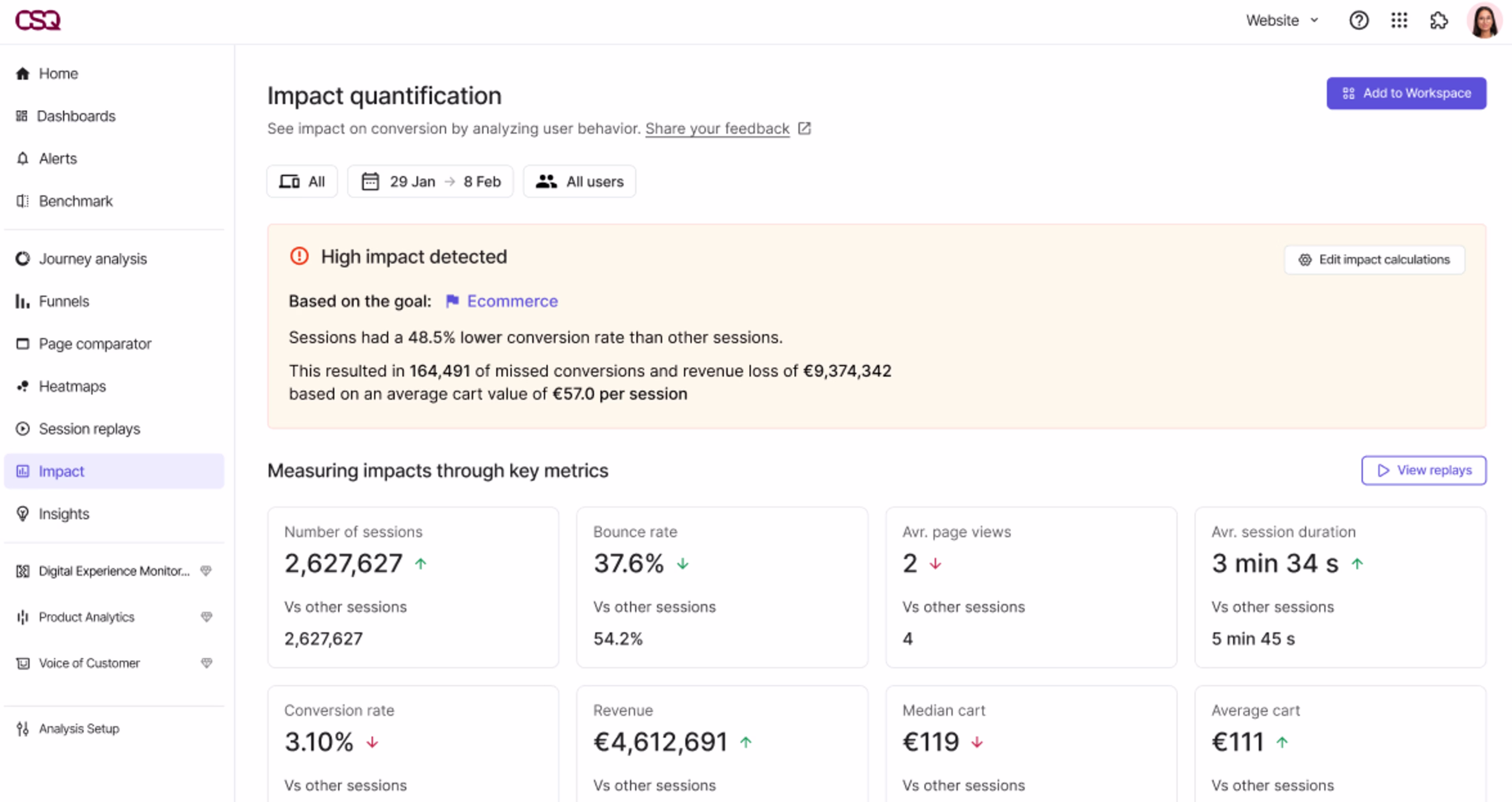
Contentsquare’s Impact Quantification, paired with Session Replay, helps you see exactly what users experienced and dig into why they dropped off
2. New vs. returning users
New vs. returning users shows how many people are discovering your site for the first time compared to those who have visited before and come back in that same period.
Looking at this ratio gives you a quick read on your site’s overall traffic health.
For example, if 70% of your users are first-time visitors, that signals strong acquisition. But if only a small share of those users come back or convert, you likely have a retention or engagement problem worth investigating. A higher share of returning users, however, means people find value in what you offer and are more likely to drive revenue over time.
You can see this breakdown in GA4 using the Retention report under Reports > Life cycle > Retention.
Did you know? Contentsquare’s Segmentation capabilities let you create segments for new users and high-value returning visitors, such as people who have visited at least 3 times or purchased in the last 90 days. This helps you uncover where they get stuck or drop off and identify improvements that can increase conversions and customer lifetime value.
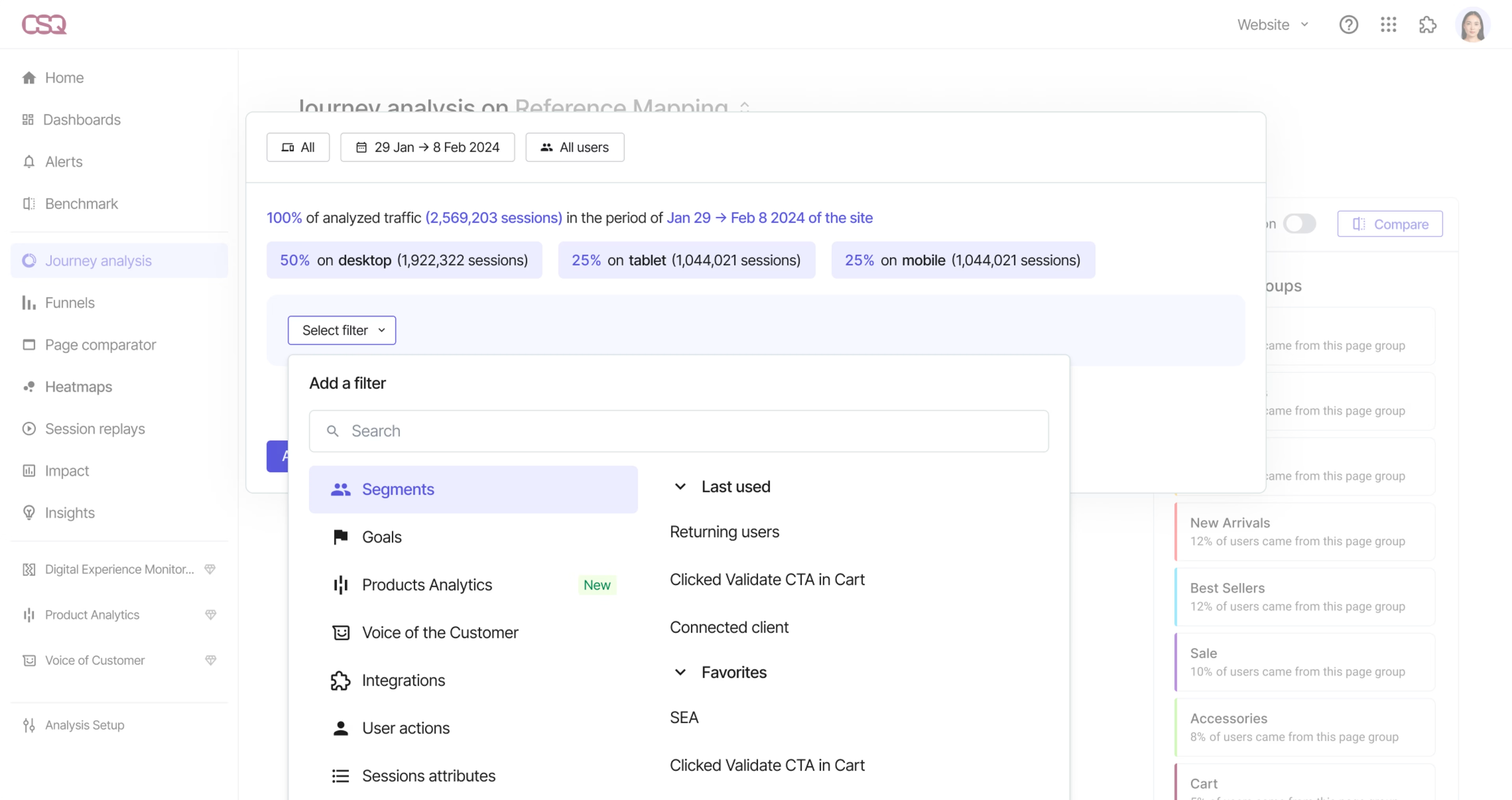
Contentsquare’s User Segmentation helps you compare how different audiences navigate your site and figure out what your repeat visitors need from you to stay longer as customers
3. Top traffic sources
Top traffic sources show which channels, like organic and paid search, social, email, and referrals, drive the most sessions, bring in engaged users, and contribute to the most conversions and revenue.
This breakdown helps you judge the quality of each channel so you can see where to invest more, what to optimize, and where to cut spend.
You can track this metric in Contentsquare using Acquisition Analysis, which lets you see where users come from and which sources lead to the best conversions. To do this, set the device, date range, and user segment, then filter by acquisition source to compare how channels drive acquisition, engagement, and conversion.
This way, it’s easier to identify top-performing channels, spot underperformers, and decide which landing pages to optimize to improve Return on Ad Spend (ROAS) and Customer Acquisition Cost (CAC).
![[Visual] Acquisition Analysis](http://images.ctfassets.net/gwbpo1m641r7/7r9TtocIVfUJ6gJT8YYO60/28d7d535071b8e07685e73106d3b5aea/With_Acquisition_Analysis__you_can_quickly_compare_how_different_marketing_channels_perform_by_device__campaign__and_landing.png?w=3840&q=100&fit=fill&fm=avif)
Use Acquisition Analysis to quickly compare how different marketing channels perform by device, campaign, and landing page
💡 Pro tip: use Sense Chat, Contentsquare’s AI, to ask questions about your acquisition sources—for example, which channels convert best or which campaigns drove the highest revenue—and get instant insights that show where to scale, fix, or cut back.
Website engagement metrics
Website engagement metrics show how people interact with your site once they arrive, so you see which pages keep visitors engaged and which ones don’t.
Let’s look at 3 metrics in this category.
4. Average engagement time per page
Average engagement time per page shows how long, on average, people actually stay on a page while it is open and in use in their browser. In GA4, this includes time spent on the last page of the session, not just the earlier ones.
On its own, it tells you which pages hold visitors’ attention, but paired with ‘views per session,’ it also helps you see whether people quickly skim lots of pages or spend more time engaging with a smaller set of key pages.
You can find average engagement time per page in GA4 under Reports > Engagement > Pages and screens, and customize that report to also include Views per session. But both metrics can be misleading on their own, because people might click through lots of pages without really reading or leave a page open while they do something else.
Contentsquare’s tools let you see what actually happened on those pages. For example, MyDeal, a leading Australian online marketplace, used Heatmaps to capture clicks, scrolls, hovers, and swipes, Journey Analysis to follow real user paths, and Session Replay to watch key sessions. Using those insights, they optimized their homepage “Trending Categories” carousel and saw a 3x return on investment and a 2% increase in conversion rate.
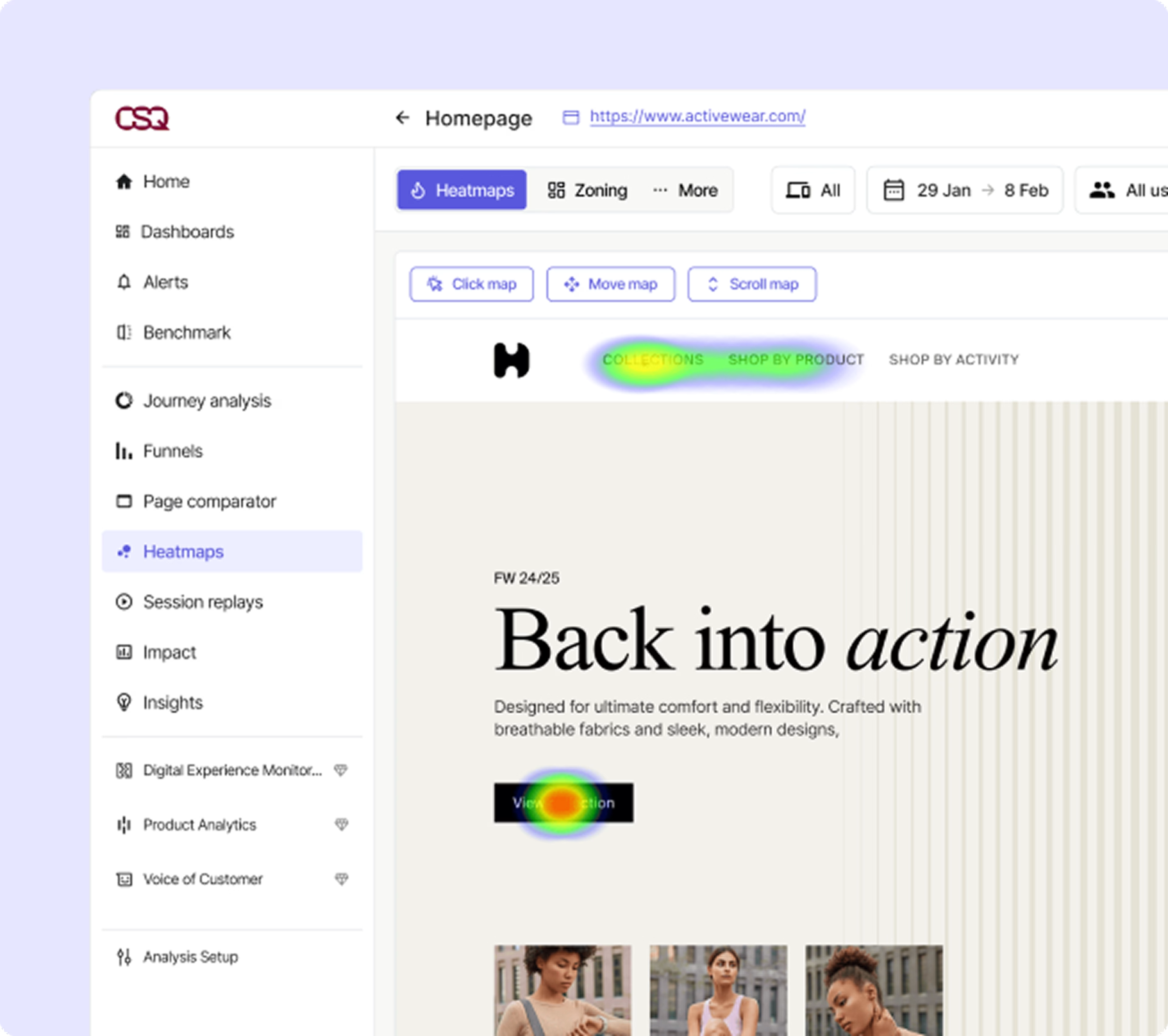
Heatmaps show how far people scroll, what they click on, and where they lose interest, so you can see what actually happened during those pageviews on your most important pages
With Contentsquare, we went from very basic tracking of content and data to a much more extensive view of what data is available to us. For example, we’re now able to see the number of clicks and hover time—something that we didn't have exposure to before.
5. Top landing pages
Top landing pages show which pages people see first when they land on your site. In GA4, any page that starts a session counts as a landing page, whether it’s a product page, blog post, sign-up page, or help article.
You can find this in the Landing page report under Reports > Engagement, where you can use filters to see which entry points drive the most traffic, generate the most conversions, and bring in the most revenue.
Did you know? After identifying your top landing pages in GA4, you can open those same pages in Chrome and use Contentsquare’s CS Live extension to see experience metrics like click rate, time before first click, hesitation time, hover rate, and revenue per click overlaid directly on the page. This makes it much easier to spot which landing page elements guide visitors smoothly to the next step and which ones don’t.
![[Visual] CS Live](http://images.ctfassets.net/gwbpo1m641r7/7p2C6Gq70865A3rua9S7cD/ac13e7233499e32af58c1e44725ea229/With_CS_Live__you_can_analyze_content_performance_right_on_your_site__create_new_segments_based_on_what_you_see__and_get_act.png?w=3840&q=100&fit=fill&fm=avif)
With CS Live, you can analyze content performance right on your site, create new segments based on what you see, and get actionable insights on the spot
6. Exits and exit rate
Exits and exit rate help you understand where visits tend to end on your site.
Exit rate is the number of exits on a page divided by the total pageviews for that page. Unlike bounce rate, which only looks at single-page sessions that end without further interaction, every session has an exit somewhere.
A high exit rate is normal on order confirmation pages but more worrying on product, pricing, and other high-value landing pages. You can track exit rate as a page-level metric in Contentsquare Dashboards. For example, in an e-merchandising dashboard, you can add single-value widgets for Views per session, Bounce rate, and Exit rate on key templates like category or product pages. It gives you a quick read on the overall health of those pages and, with comparison mode, helps you spot spikes or drops in exits over time.
![[Visual] Dashboard](http://images.ctfassets.net/gwbpo1m641r7/5VaX0tYOvlQ5ocxlifDnwn/5a1866d415f85085d7c90841f4245ff5/Contentsquare_Dashboards_lets_you_track_the_metrics_most_important_to_your_business_goals.png?w=3840&q=100&fit=fill&fm=avif)
Contentsquare Dashboards let you track the metrics most important to your business goals
For example, Diptyque saw too many visitors dropping off at the checkout login step and used User Segmentation, Journey Analysis, and Zone-based Heatmaps to pinpoint the problem and redesign the flow. The result was a 31% decrease in exits for new users and a 9% increase in conversion rate for mobile users.
Conversion metrics
Conversion metrics show how often visitors complete key actions on your site, like signing up or making a purchase.
Let’s go over 2 metrics in this category.
7. Goal completions
Goal completions measure how often people take key actions on your site, like completing a purchase, adding a product to cart, signing up, or submitting a form.
In Contentsquare, you track these using Goals & Key Events. A goal or key event is any user action that the Contentsquare tag captures, such as viewing a page, clicking “Add to cart,” or hovering over a key menu item. Every time a user does the action you’ve chosen as a goal, they count as a conversion and increase that goal’s conversion rate.
You can set up goals from Analysis setup > Goals, then use them across your analyses to see which pages or zones contribute most to that goal and how different segments behave when they do (or don’t) convert. That makes it much easier to see where people complete key actions and where journeys need improvement.
![[Visual] Goals & Key Events](http://images.ctfassets.net/gwbpo1m641r7/7nvBXHJOHKwnawzV1mF04O/12064fda75b859dbe71fafa7a893634d/Set_up_custom_goals_in_Goals___Key_Events_so_you_can_see_how_often_users_complete_important_actions_and_which_journeys_drive.png?w=3840&q=100&fit=fill&fm=avif)
Set up custom goals in Goals & Key Events so you can see how often users complete important actions and which journeys drive those conversions
8. Cart abandonment rate
Cart abandonment rate is the percentage of people who start a purchase but drop off before completing it. A high rate signals friction in your checkout flow, such as too many steps or unexpected costs.
In GA4, you can measure cart abandonment with the Checkout journey report or a Funnel exploration that follows users from the first key step through to purchase.
Did you know? Contentsquare's frustration scoring automatically highlights sessions and pages where users encounter the most friction, using signals like rage clicks, repeated field interactions, errors, or ‘no click’ behavior. This feature helped Harrods surface issues in their new checkout journey, and they paired those insights with the Session Replay tool to see what was going wrong. As a result, they saw an 8% reduction in cart abandonment and a 50% decrease in rage clicks.
Frustration Score helps you spot behaviors that signal frustration, so you can fix the issues causing people to abandon their carts
Website performance metrics
Website performance metrics show how effortless or frustrating it feels for visitors accessing your site—and how that affects engagement and conversions.
Let’s go over 2 metrics in this category.
9. Core web vitals
Core web vitals show how fast your pages load, how quickly they respond, and how stable the layout is while loading. They include:
Largest Contentful Paint (LCP): how long it takes for the main content on a page to fully load
Interaction to Next Paint (INP): how long the page takes to visually respond after someone interacts
Cumulative Layout Shift (CLS): how much content jumps around unexpectedly while the page loads
Contentsquare’s Speed Analysis lets you monitor core web vitals and see how they affect conversions, bounce rate, and other business outcomes. Specsavers used it to monitor these metrics across their site, segment users with good and bad scores, and quantify the impact of slow pages on conversion, which led to a 68% reduction in LCP and a 24% increase in ecommerce purchase rate.
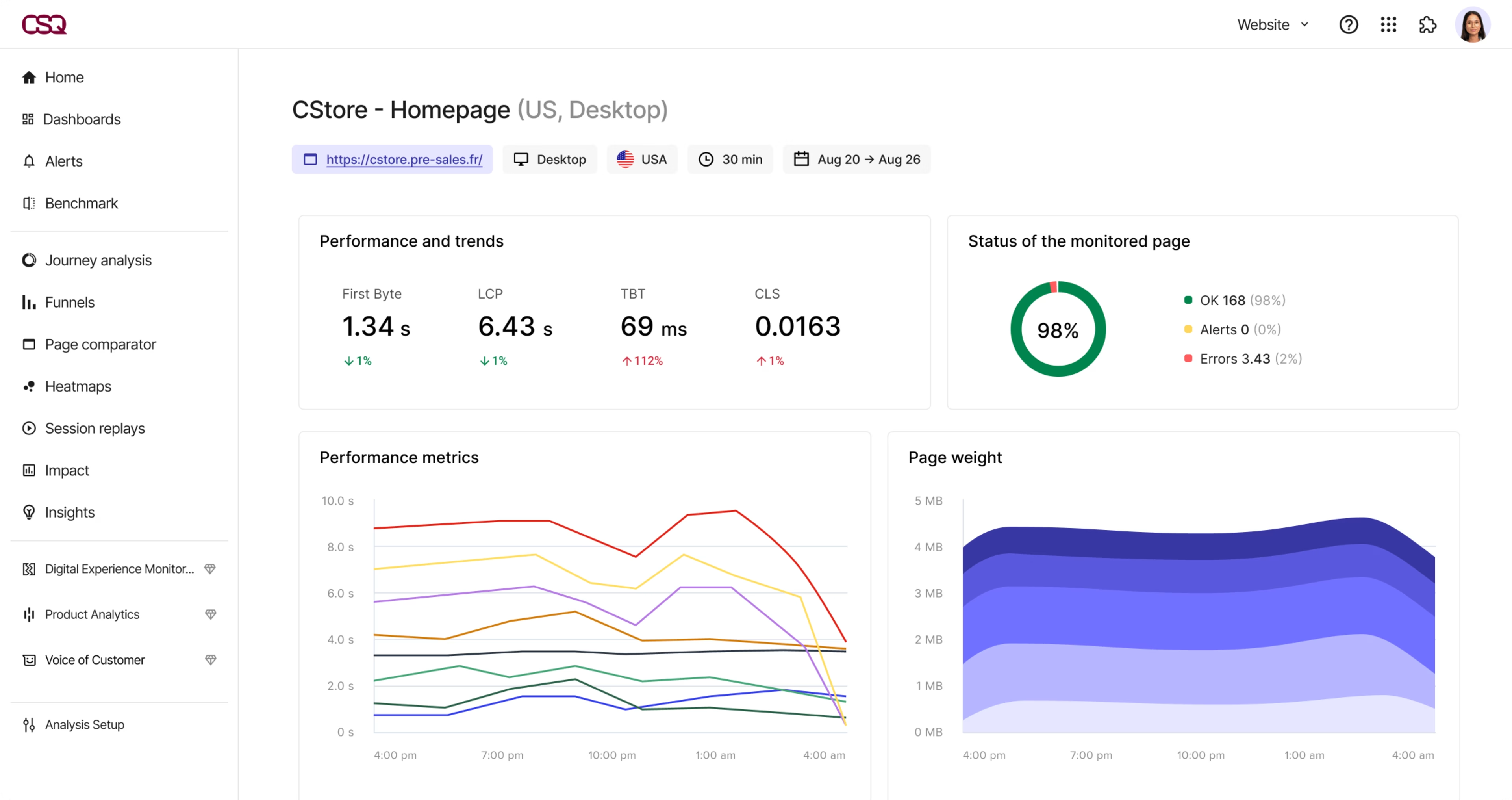
Speed Analysis links performance to conversions and bounce rate, so you can quickly find the root cause when issues appear
Before Contentsquare, we had no way of tying together website performance metrics like Core Web Vitals and conversion. With Contentsquare, we’re now able to make decisions based on data, and see the direct, quantifiable impact of changes on our customer behavior.
10. Average page load time
Average page load time shows how long it takes, on average, for your pages to fully load for visitors. It gives you a quick read on how fast your site feels overall and helps you flag slow pages or templates that may be hurting conversions.
You can track page load time with tools like PageSpeed Insights, and in Contentsquare by adding Load Time (LCP) as one of the performance metrics in your dashboard, so your team can quickly spot slow load times and where that might be affecting journeys.
💡 Pro tip: if you want to analyze performance data alongside the rest of your business metrics, use Data Connect to export Contentsquare behavioral and performance data straight into your data warehouse, then blend it with CRM, marketing, and revenue data in your BI dashboards. That way, you can tie slow page load times to signals like drop-offs, lower conversion rates, or higher churn and decide which fixes will have the biggest impact.
Turn these web analytics metrics into actionable insights
Choose a handful of metrics from each group that match your current business goals, and set up Smart Alerts in Contentsquare so your team gets notified in Slack when key metrics or UX signals suddenly change and can investigate issues quickly.
When an alert goes off, pair the affected metric with behavior data to see what users did on those pages or journeys. Turn what you find into specific changes, such as simplifying a form, moving or restyling a CTA, reducing steps in checkout, or speeding up a slow template, and watch how those updates shift the same KPIs over time.
This helps you proactively resolve issues and create faster experiences for new and returning users, and, at the same time make it more profitable for your business.
FAQs about web analytics metrics
Tracking website metrics helps you see what is working and what is not. When you know where traffic comes from, where people get stuck, and what leads to conversions, you can make targeted changes that improve user experience and results.
![[Visual] Contentsquare's Content Team](http://images.ctfassets.net/gwbpo1m641r7/3IVEUbRzFIoC9mf5EJ2qHY/f25ccd2131dfd63f5c63b5b92cc4ba20/Copy_of_Copy_of_BLOG-icp-8117438.jpeg?w=1920&q=100&fit=fill&fm=avif)