
Product analytics dashboards transform rows and rows of product usage data—every click, conversion, and churn event—into actionable and shareable charts so you can focus on what matters and make informed decisions.
At Contentsquare, we don't just develop product analytics dashboards, we use them to refine our own products and processes. In this guide, we distill insight from our product management team to show you what a good PA dashboard should include, break down some real dashboard examples, and explain how to build one that works for your team.
What is a product analytics dashboard?
A product analytics dashboard is a customizable hub of your key product data. Think of it like a window into what’s happening in your product—who’s signing up, what features are being used, who’s churning—all displayed visually in charts and graphs.
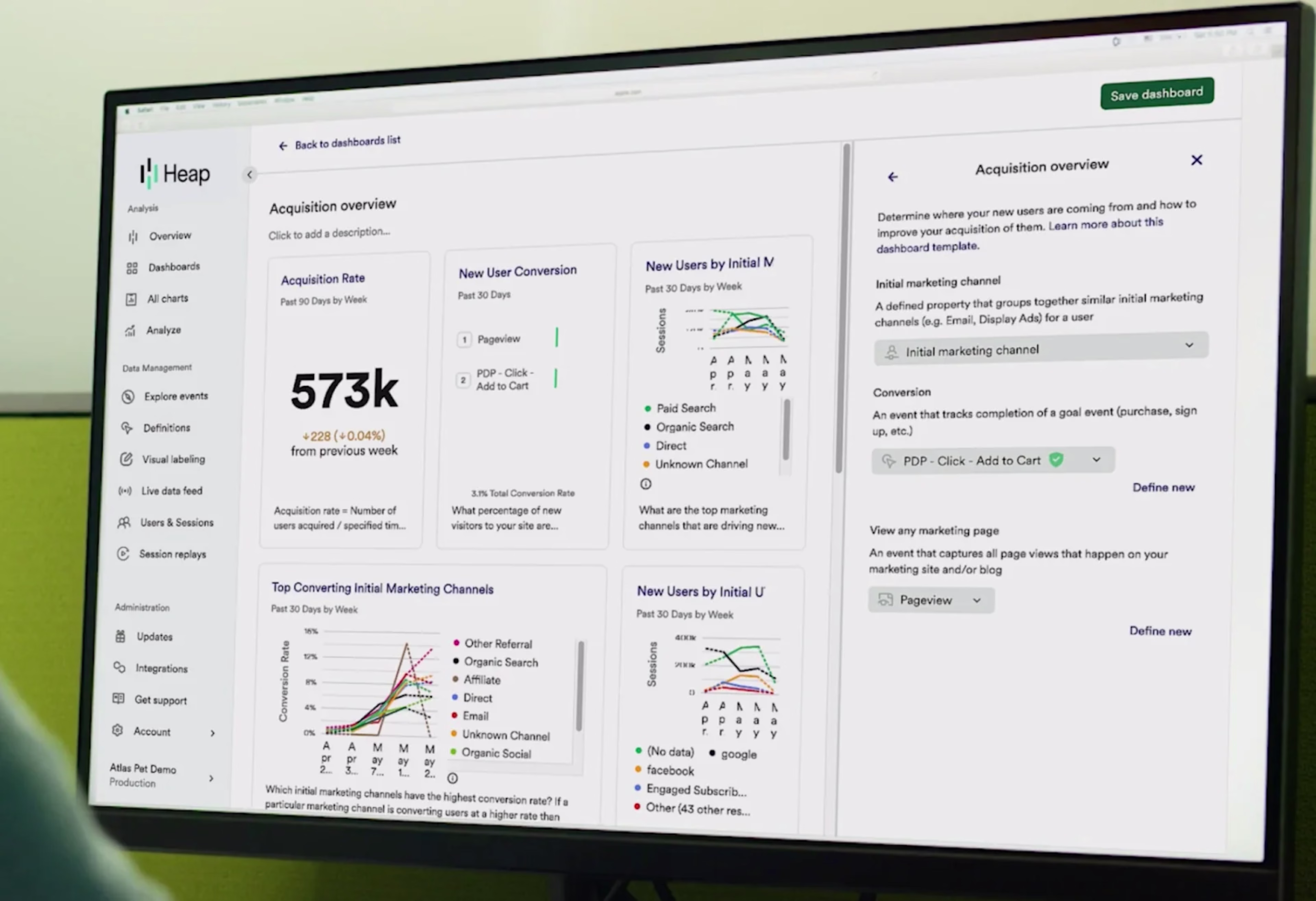
An example of Contentsquare’s acquisition analytics dashboard, powered by Heap
Most product analytics tools create dashboards by tracking product usage and combining it with data points from different sources. By visualizing all your product analytics data in one place, dashboards make it easier to
Monitor product performance
Identify trends and optimize for growth
Spot potential issues before they become major problems
Measure the impact of product changes and marketing campaigns
Collaborate and share product data across your organisation
Popular product analytics dashboard metrics and KPIs
While it might be tempting to monitor everything, effective product dashboards are like highlight reels. By focusing on key metrics that align with your product analytics strategy, you’ll find it easier to quickly identify trends and areas for improvement.
You can (and should) create different dashboards for different teams and projects. Depending on your team’s goals, consider including some of these popular product analytics metrics and KPIs:
Conversion rate: the percentage of visitors who take a desired action, like signing up for a free trial
Churn rate: the percentage of customers who stop using your product in a given period
Retention rate: the inverse of churn—the percentage of customers who continue using the product over time
Traffic: for example, the number of organic visitors to a landing page
Users: such as new users, daily active users (DAU), monthly active users (MAU) and user growth rate over time
Customer lifetime value (CLV or LTV): how much a customer spends during their relationship with your business
User feedback: quantifiable feedback scores like Net Promoter® Score (NPS®) or customer satisfaction (CSAT) to track user sentiment over time
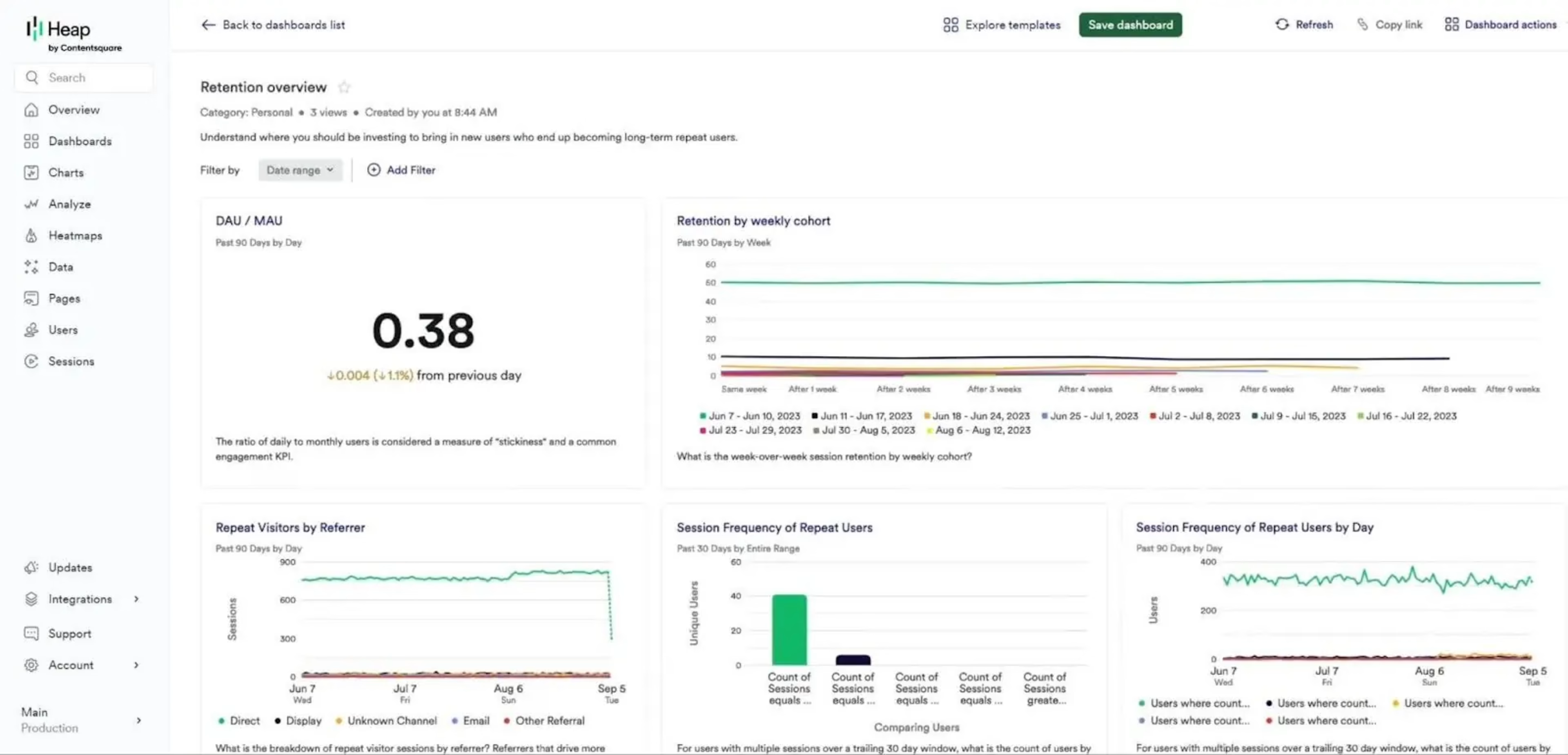
An example retention dashboard showing DAU/MAU and retention by weekly cohort in Contentsquare
Key features of effective product analytics dashboards
Not all dashboards are equal: the best product analytics tools make it easy to find actionable insights, generate the right visualizations, and share findings with your team. Here are some features to look out for:
Dashboard templates: out-of-the-box dashboards for common use cases will save you a lot of set-up time and help you figure out which metrics are worth tracking. For example, Contentsquare has one-click dashboard templates for different teams and goals.
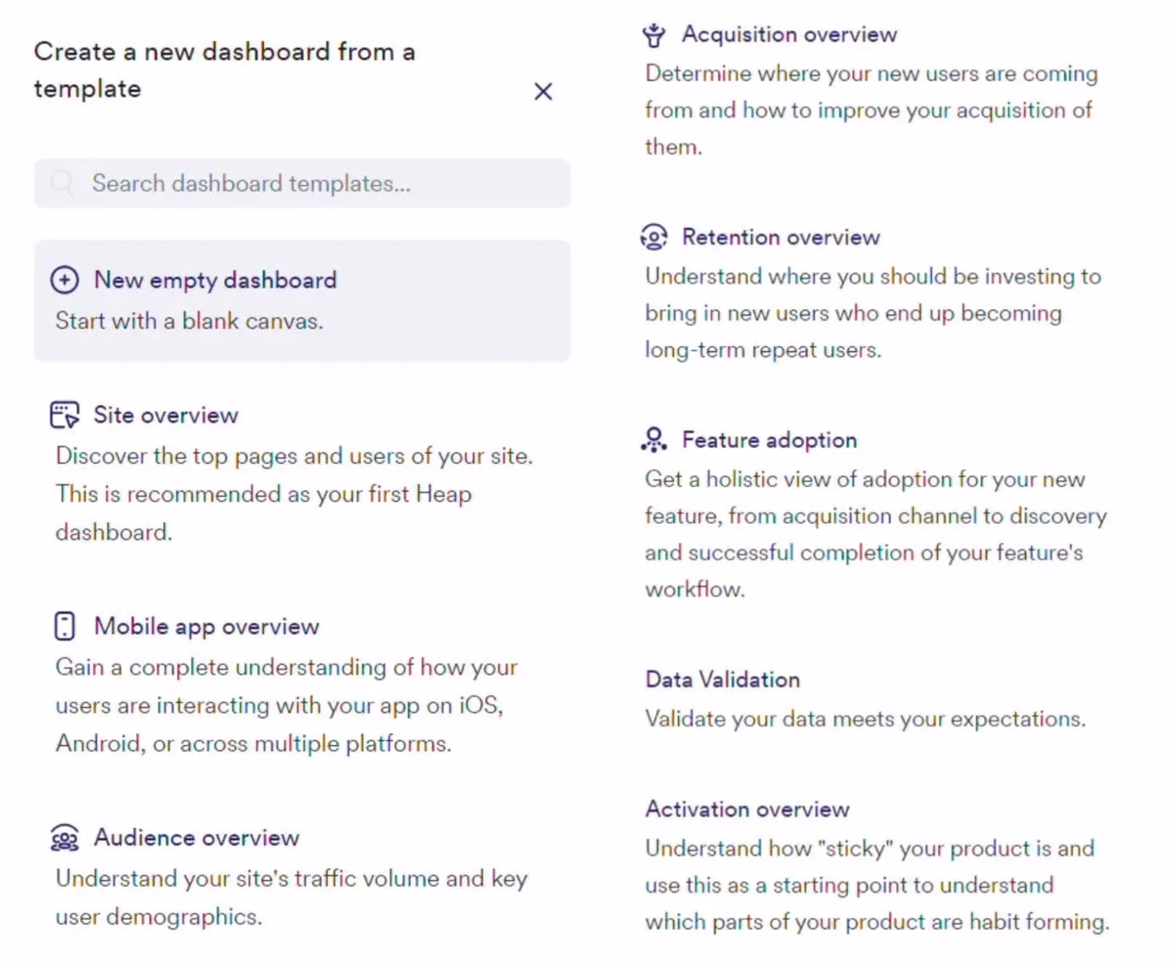
Some of Contentsquare’s product analytics dashboard templates
Tracking depth: the more data your dashboard tool tracks, the fewer gaps you’ll have. For example, Contentsquare automatically captures every user interaction across sessions and devices so it can outperform quantitative session-based tools like Google Analytics while also bringing together qualitative insights like session replay.
Integrations: you’ll still need to pull product data from multiple sources to get a complete picture of your product's performance. For example, Contentsquare integrates with over 100 different tools—including BigQuery, Stripe, and Salesforce—so you can visualize customer data from across the product journey in one place.
Different data visualizations: using the right visualization makes it easier to spot patterns. For example, funnels and journey maps help you identify drop-off points in a process, heatmaps highlight user engagement metrics like CTA clicks, and line charts show trends over time.
AI insights: intelligence tools help you surface valuable insights quicker. For example, Contentsquare’s Chat with Sense lets you easily chat with an AI expert and generates dashboard links and charts in response.
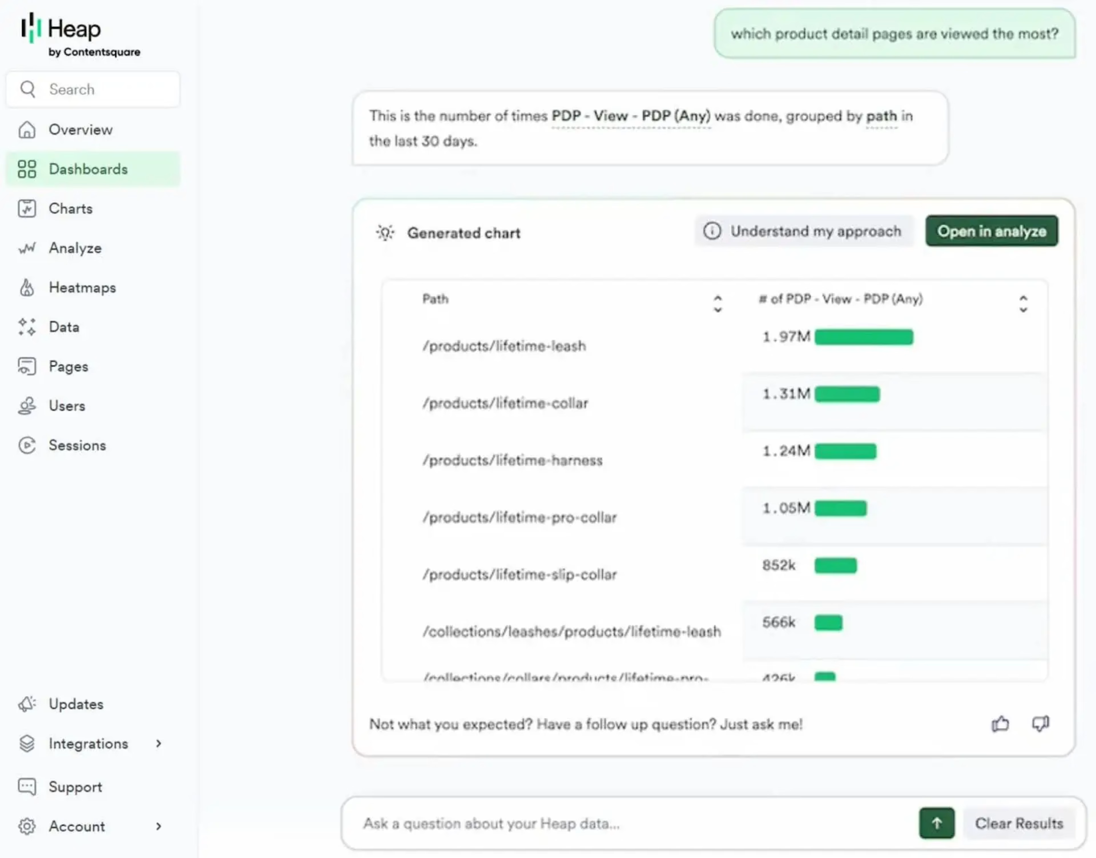
Chat with your product analytics data in Heap using Chat with Sense
Shareability: easy-to-share dashboards help you collaborate and communicate with your team and stakeholders. For example, Contentsquare allows you to share dashboards and charts with team members by email.
And here’s one feature you probably don’t need:
Real-time data: unless you’re glued to your screen 24/7, real-time dashboard updates don’t really impact your insights. However, if you need a real-time view of raw event data, Contentsquare has a live data feed.
4 real product analytics dashboard examples
Not many SaaS companies are transparent with their product analytics dashboards but we’ve found four real examples (no demo data in sight!) for you to get ideas for your own custom dashboards.
1. A customer acquisition dashboard from Contentsquare
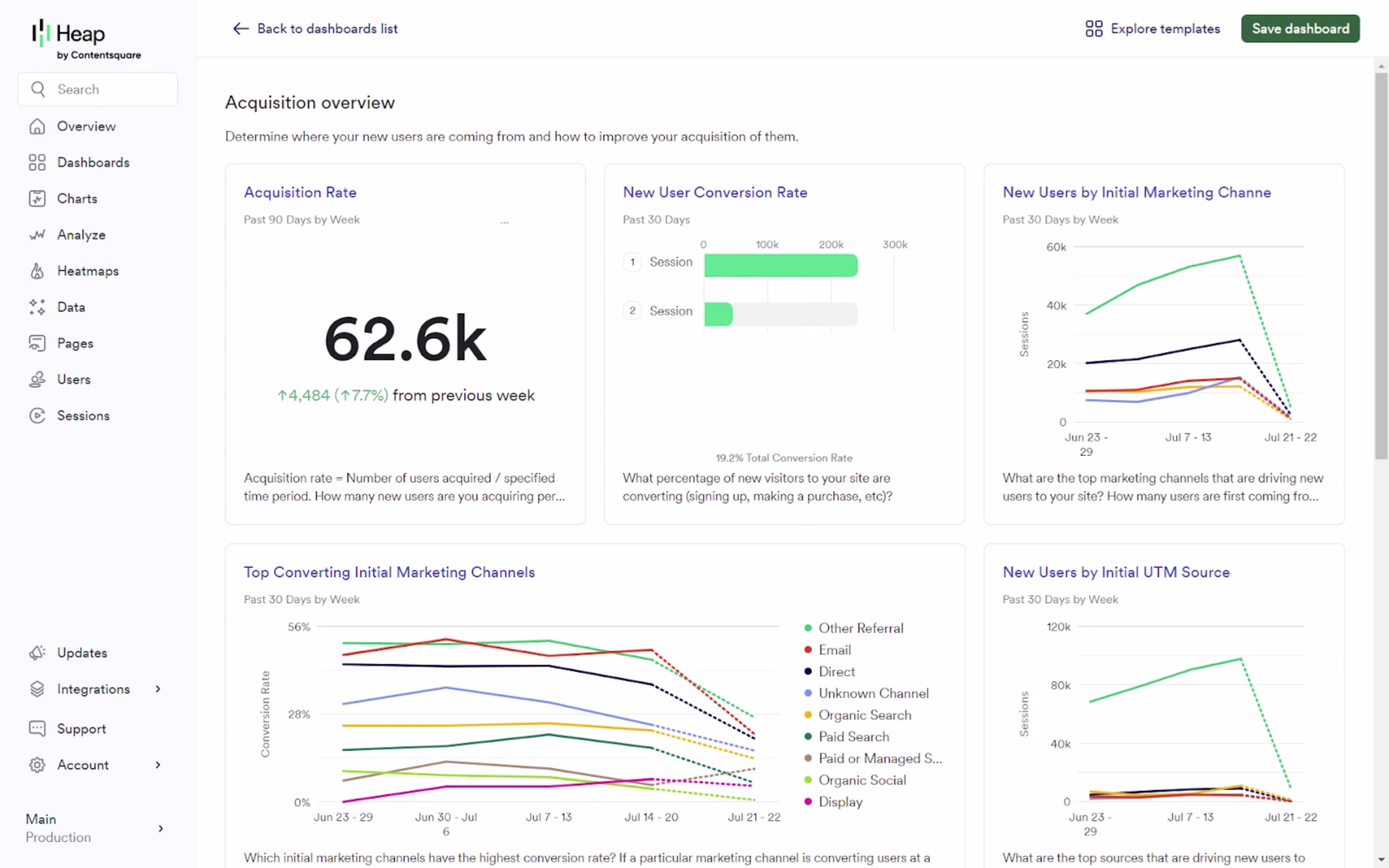
An example product analytics dashboard showing the acquisition performance of Heap by Contentsquare
Company: Contentsquare
Product analytics dashboard tool: Heap
Key metrics: acquisition rate, new user conversion rate, new users by initial marketing, top converting initial marketing channels
Who it’s for: marketing teams, growth teams
What you can learn: acquisition dashboards help you drill down into the effectiveness of your marketing efforts and identify which channels are driving the most valuable users to your product. To set up something similar yourself, start with Contentsquare’s built-in baseline acquisition performance template.
2. A retention dashboard from Contentsquare
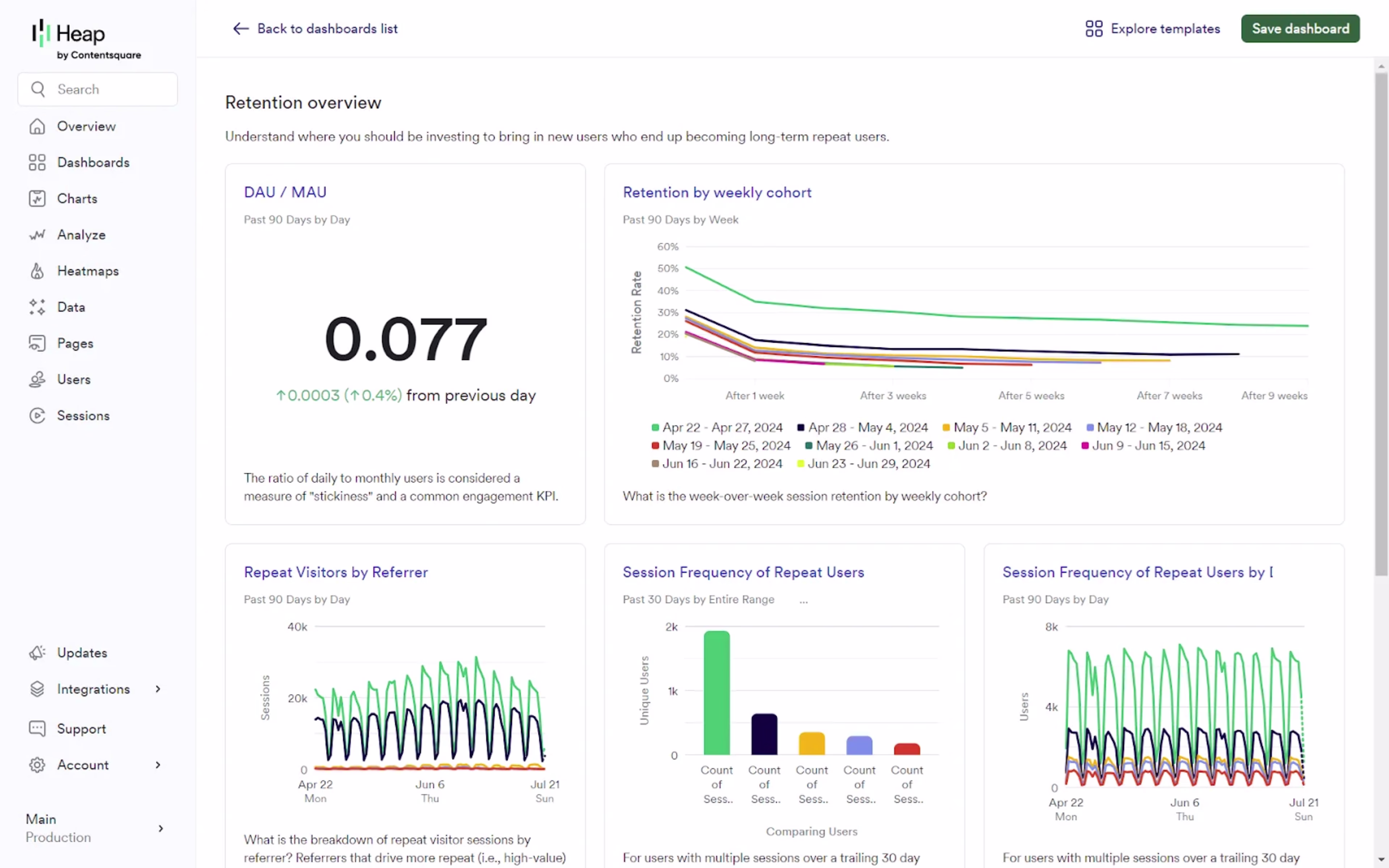
A Heap product analytics dashboard showing DAU/MAU, retention by weekly cohort, and repeat user metrics
Company: Contentsquare
Product analytics dashboard tool: Heap
Key metrics: DAU/MAU ratio, retention by weekly cohort, repeat visitors by referrer, session frequency of repeat users
Who it’s for: product teams
What you can learn: tracking retention metrics like DAU/MAU ratio helps you understand product stickiness and spot user behavior trends and potential churn risks early. Use Contentsquare's retention overview template as a starting point for your own retention dashboard.
3. A customer metrics dashboard from Buffer
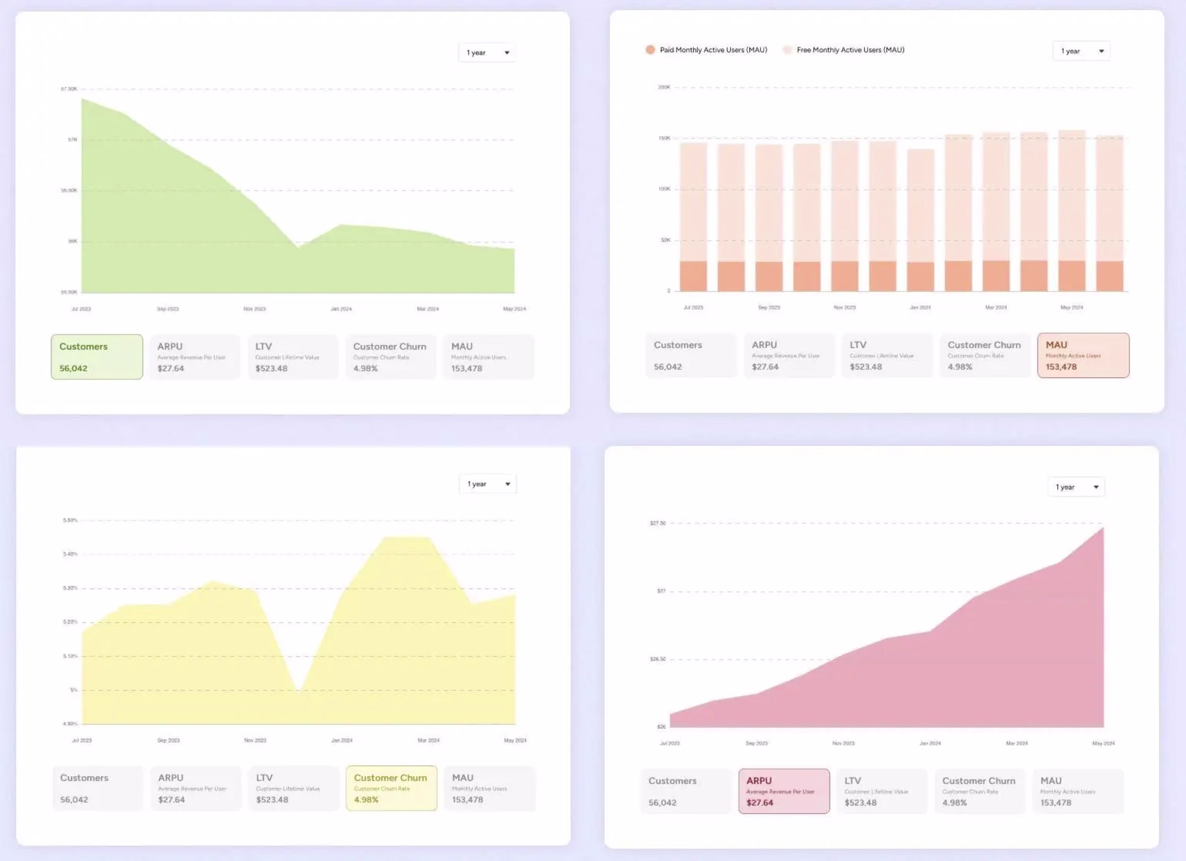
Metrics from Buffer’s self-hosted transparent customer dashboard
Company: Buffer
Product analytics dashboard tool: self-hosted
Key metrics: customers, MAU, customer churn, average revenue per user (ARPU)
Who it’s for: growth teams, sales teams, product teams
What you can learn: by combining customer metrics with revenue data, Buffer’s dashboard makes it clear that a reduction in customer numbers is offset by strong ARPU growth
4. A revenue metrics dashboard from ConvertKit
ConvertKit’s transparent revenue dashboard
Company: ConvertKit
Product analytics dashboard tool: Baremetrics
Key metrics: MRR, net revenue, average revenue per user, LTV, revenue churn
Who it’s for: growth teams, sales teams, revenue teams
What you can learn: revenue dashboards provide crucial insights into financial performance and growth trends. Tracking metrics like ARR and LTV help teams monitor overall business health, detect potential issues early, and allocate resources effectively.
How to set up a product analytics dashboard in Contentsquare
For this tutorial, we’ll assume you’ve already signed up for Heap, Contentsquare’s product analytics platform, and enabled autocapture.
Step 1. Create a new dashboard
Navigate to ‘Dashboards’ in the left menu, then click the ‘New dashboard’ button.
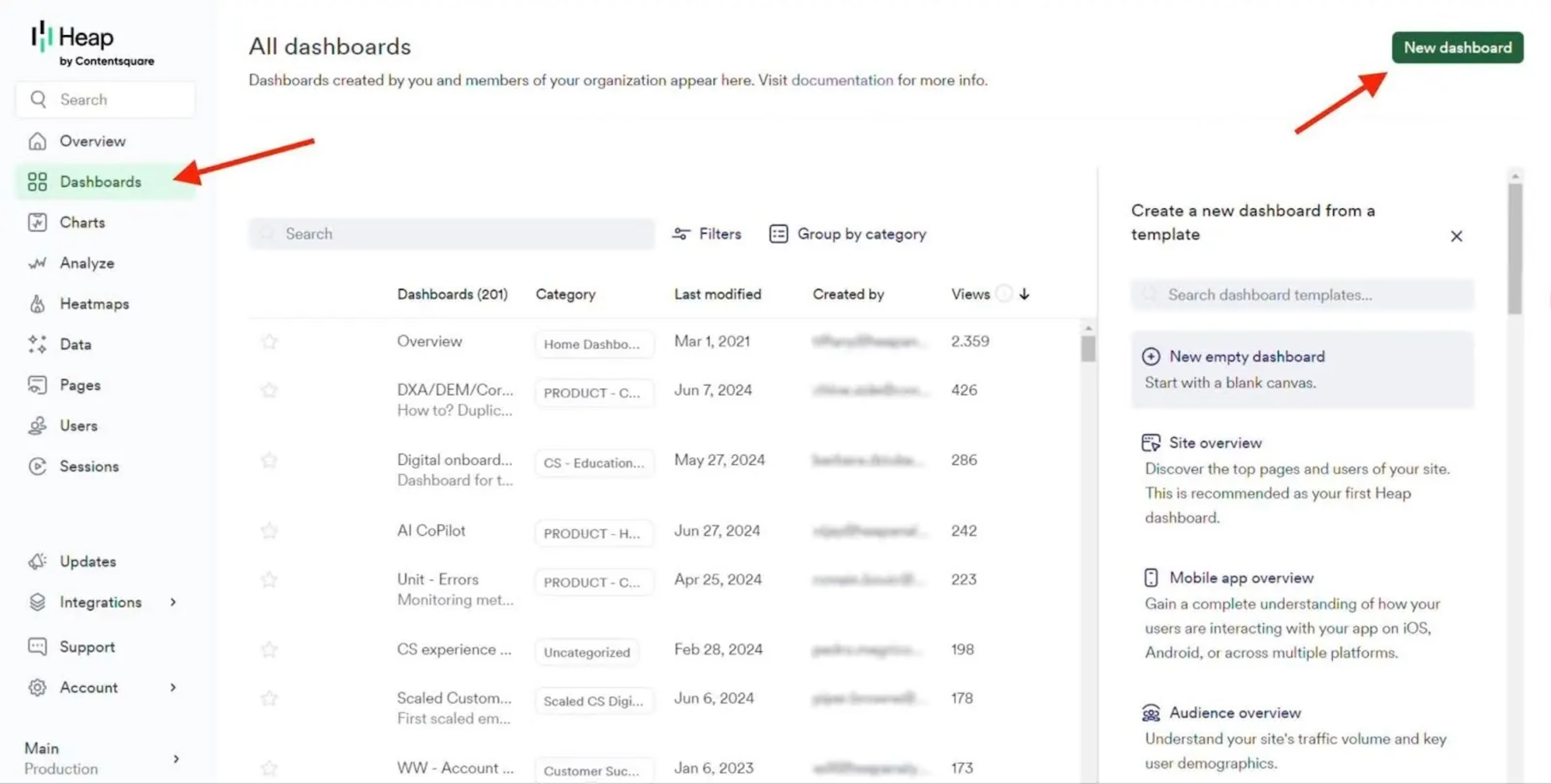
Start with an empty dashboard or use a product analytics dashboard template. Popular templates include:
Site overview: discover your site’s top pages
Acquisition overview: see where new users are coming from and improve acquisition strategies
Retention overview: understand what drives long-term users
Feature adoption: get a holistic view of adoption and retention following a new feature launch
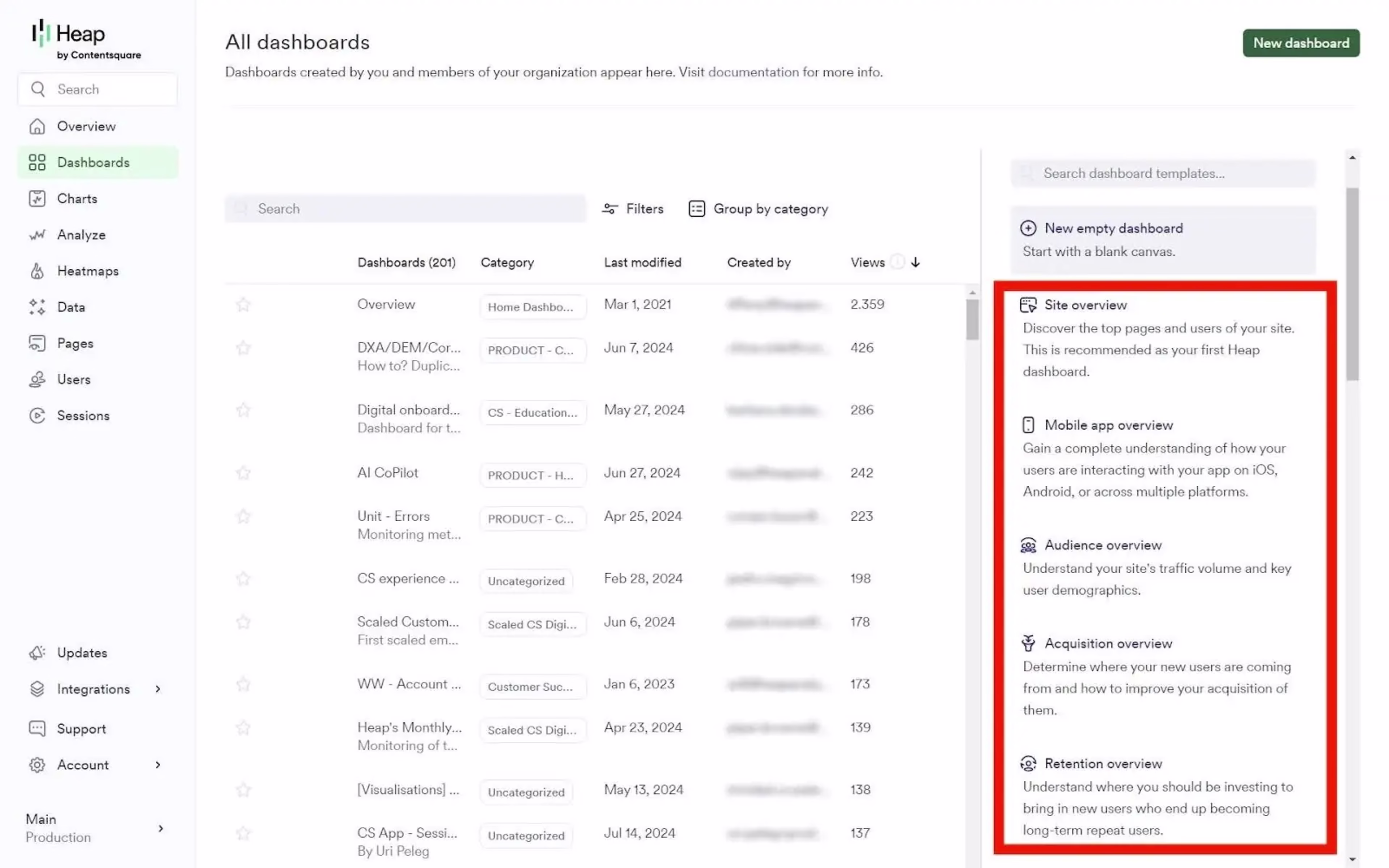
For this example, we’ll use the ‘Acquisition overview’ template. Define the baseline inputs from the dropdown menus—in this case, you’ll need to select a default marketing channel, a key conversion event, and an event that captures all page views.
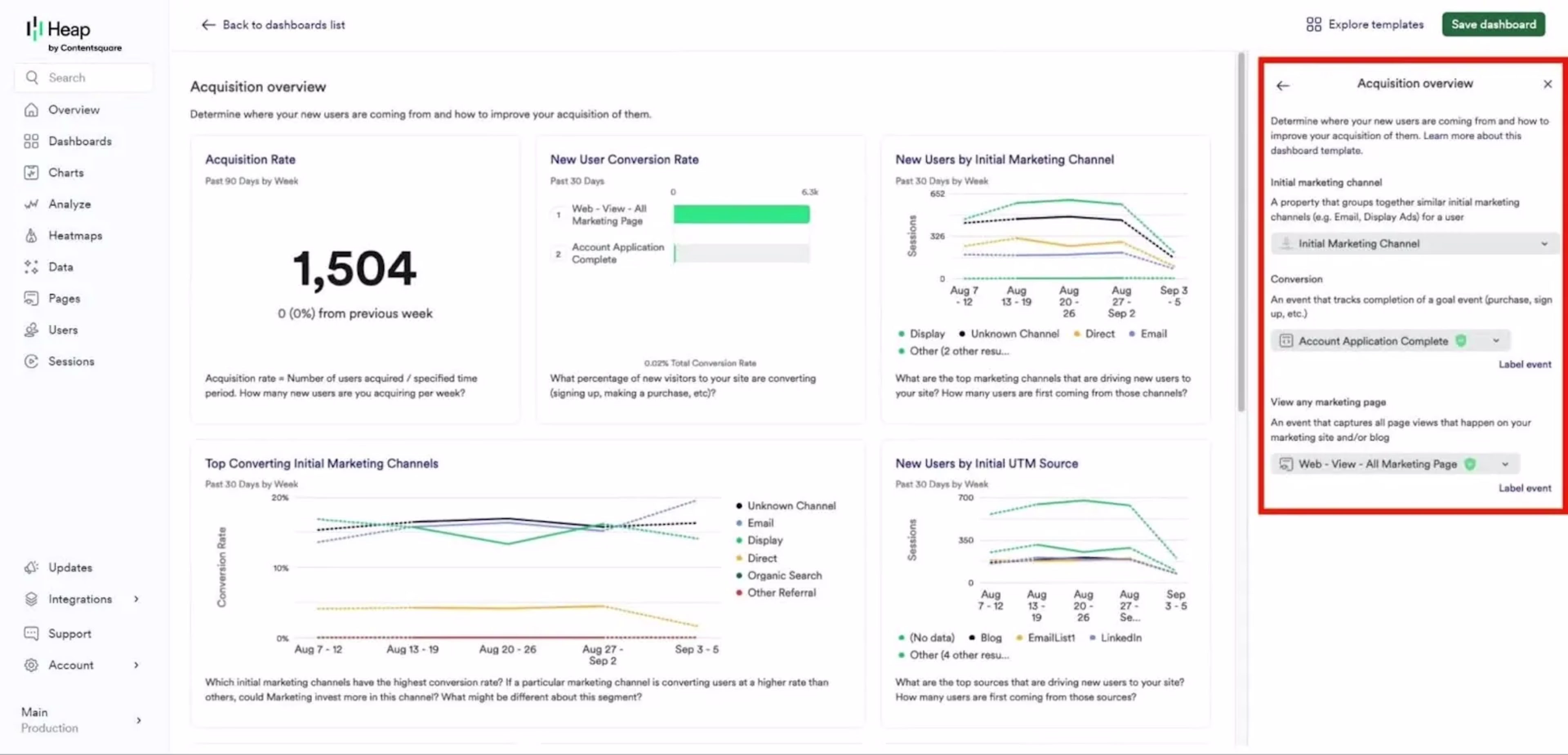
And that’s it, your dashboard is built! All data is retroactive to the point when you installed Heap’s tracking code so you'll see historical data populate immediately.
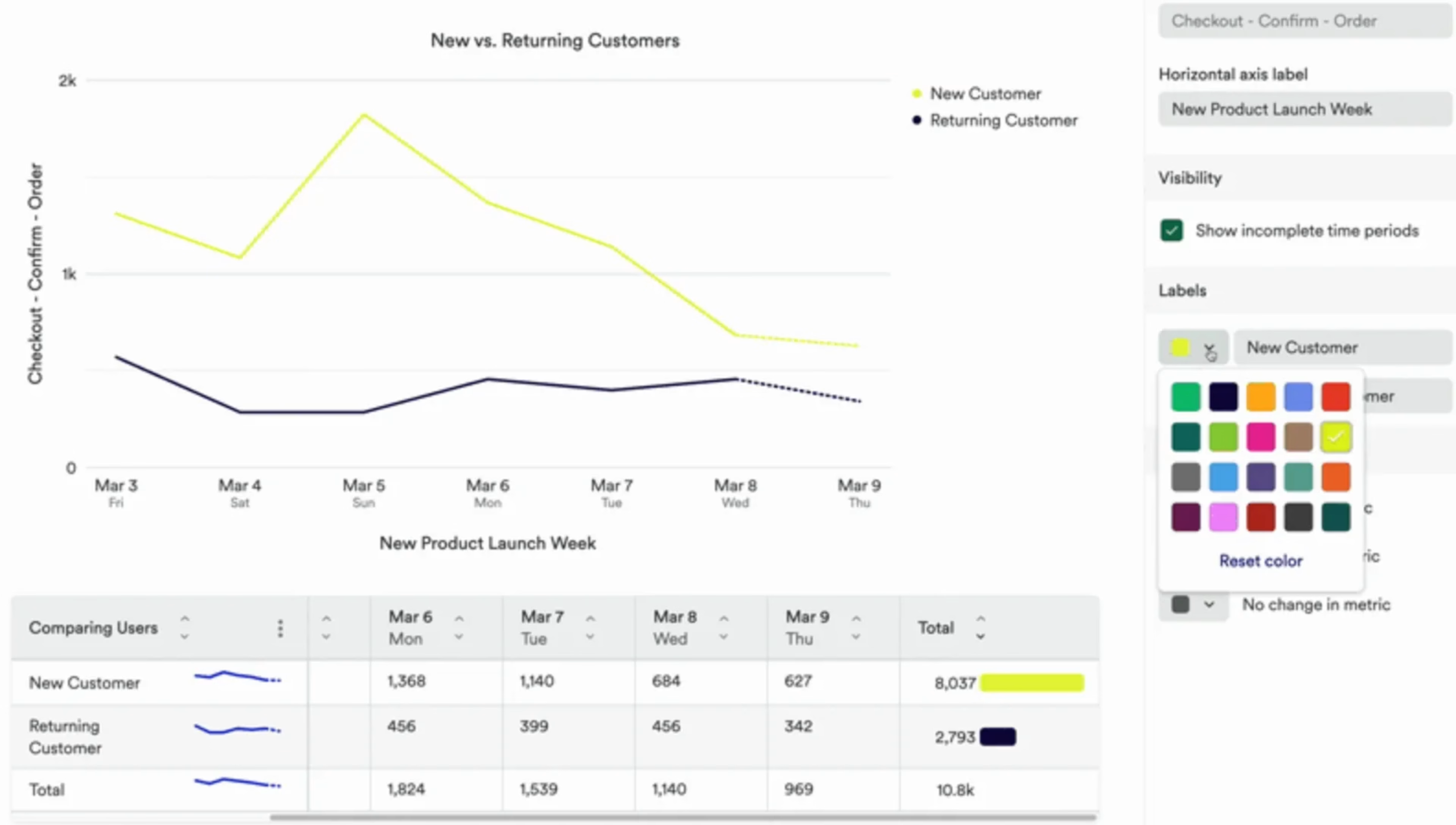
Step 2. Customize your dashboards
In Heap, metric visualizations are called Charts. Customize any dashboard by adding, removing, or modifying chart templates to visualize your most important metrics using Heap and supported third-party source data.
Navigate to ‘Charts’ in the left menu, then click the ‘Templates’ tab. Search or browse for charts that are relevant to your business goals.
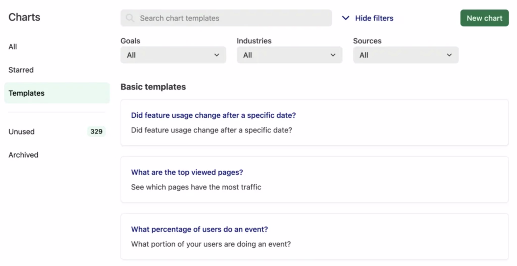
Each Heap dashboard can have up to 100 charts. Popular charts include
Feature usage: how many times a particular feature has been used
Repeat visitors by referrer: where repeat users are starting sessions from
Subscription churn: the percentage of customers who cancel subscriptions
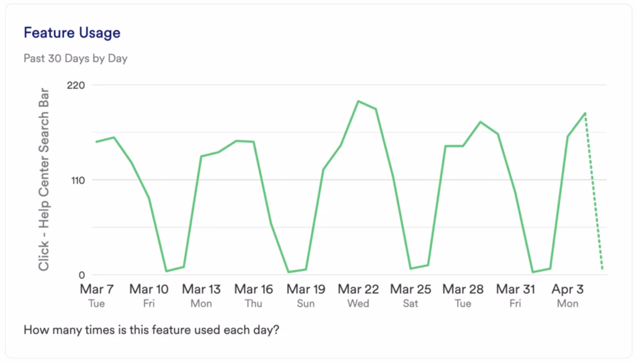
Once you’re happy with what’s on your dashboard, you can customize chart types from line charts (default) to bar charts, donut charts, metric cards, or table charts, and change the colors and names of axes where applicable.
Step 3. Combine dashboards with Contentsquare’s other tools
On their own, Heap’s product analytics dashboards show you what’s happening in your product, who’s using it, and when events occur. But you can go a step further and really dig into the why by combining them with Contentsquare’s digital experience analytics suite.
For example:
Click through from Contentsquare’s zone-based heatmaps to analyze pageviews, retention, and conversions from any page
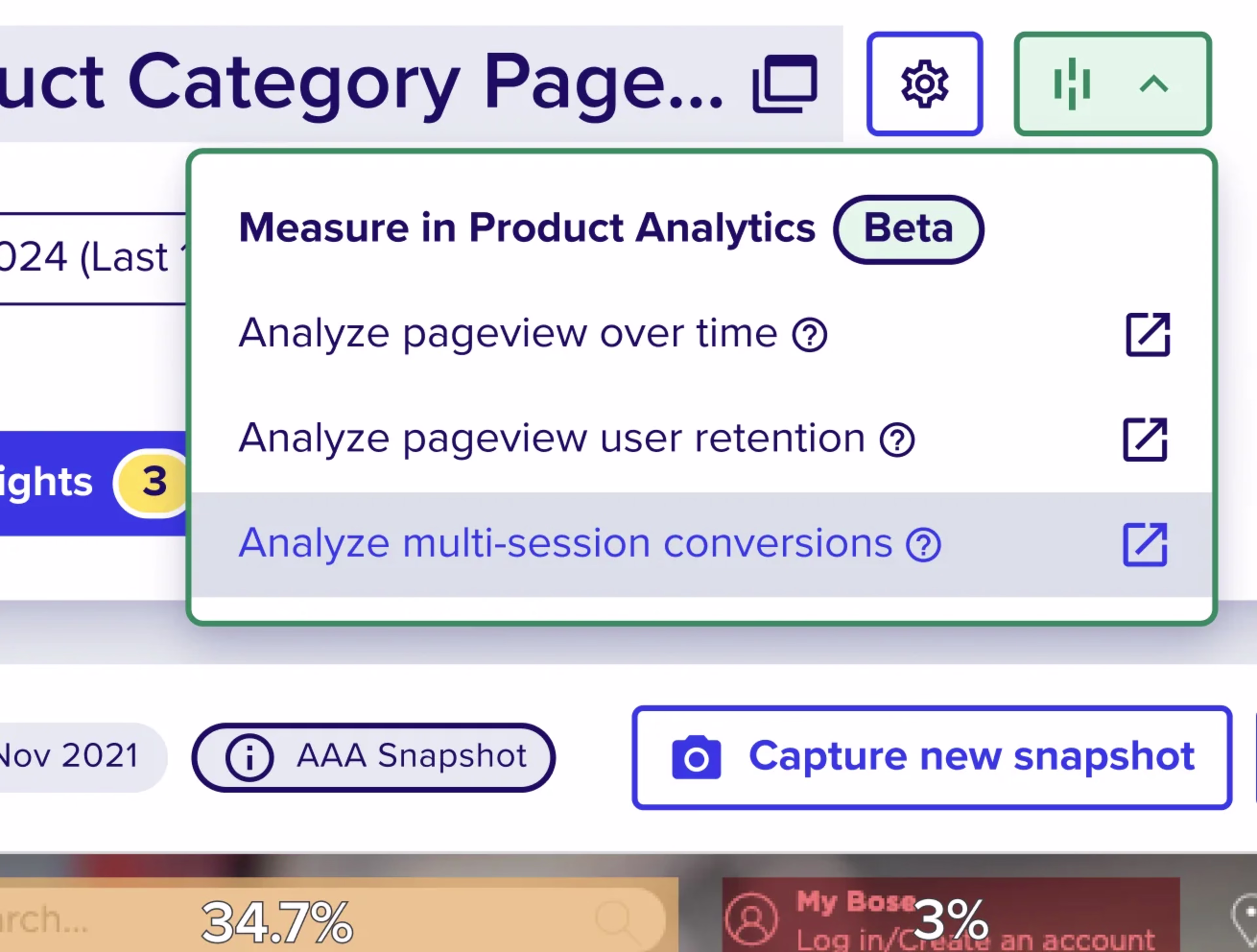
Use Contentsquare’s customer journey analysis, now integrated with Hotjar Surveys, to see what motivates user behavior using real feedback
Combining product analytics dashboards with user experience monitoring and voice-of-the-customer (VOC) tools will empower your team to align on goals, prioritize effectively, and, ultimately, build better products that users love.
Get more from your product analytics dashboards
Product analytics dashboards are excellent at transforming raw data into visual summaries of user behavior and product performance.
Ultimately, though, they only tell you what's happening in your product, leaving you to guess why—unless you choose a solution that also reveals the individual user actions and feedback that led to changes.
With Contentsquare, you can dive into the story behind every spike or dip in your dashboard metrics, watch actual user sessions that contributed to changes, and read real-time feedback from users explaining their frustrations or delights.
FAQs about product analytics dashboards
Product analytics dashboards provide a visual overview of key product metrics, helping teams identify trends and quickly make data-driven product decisions. They save time, improve collaboration, and enable faster responses to issues or opportunities.
![[Visual] Contentsquare's Content Team](http://images.ctfassets.net/gwbpo1m641r7/3IVEUbRzFIoC9mf5EJ2qHY/f25ccd2131dfd63f5c63b5b92cc4ba20/Copy_of_Copy_of_BLOG-icp-8117438.jpeg?w=1920&q=100&fit=fill&fm=avif)