
Users don’t always tell you when they experience frustration on your website or product, but they often show you.
Rage clicks (repeated clicks/taps in short succession) are no fun for the user, and they can be painful for you, too: they represent points of friction on the user’s path to conversion. But to eliminate these problem zones, you first need an efficient way to spot them.
Enter rage click maps, visualizations that show you exactly where rage clicks occur on a page. In this guide, we walk you through four ways to use this type of heatmap to improve the product experience and boost engagement, conversions, and retention.
4 ways to use rage click data to improve your site
A rage click map is a type of heatmap—a visualization of aggregate user behavior—that shows you all of the rage clicks on a page.
Rage click maps are a quick visual you can use to quickly spot patterns and trends, so you can hypothesize UX improvements.
![[Product screenshot] Heatmaps - Rage click map](http://images.ctfassets.net/gwbpo1m641r7/4Fc5v3WKisHxMY81xtdxP6/80d9582d2e5bb19cc12084d51c458c1e/-Product_screenshot-_Heatmaps_-_Rage_click_map.png?w=3840&q=100&fit=fill&fm=avif)
Contentsquare rage click maps help you visualize points of user friction on a page
Let’s look at four ways rage click maps make your life easier, lead to a better user experience, and increase conversions.
1. Reduce friction in the customer journey
Say you’re a product manager at an online travel agency, and you’re responsible for the ever-important search results listings that show travelers relevant hotel options.
The page seems simple, but a lot can go wrong for the user. Filters galore line the left side and top of the page. And each results page shows 20 hotels with each hotel listing showing 5 clickable links.
That’s a lot of content for users to navigate—and a lot of opportunities for frustration.
With rage click maps, you quickly see which elements might confuse and frustrate users (and send them straight to an alternative provider). Reducing these pain points keeps users engaged, on your site longer, and more likely to complete a purchase.
If conversions are down—or if you just want to get proactive—try these three steps:
Open Heatmaps in Contentsquare
Click on Rage Clicks in the Map Types side panel
Look for angry face icons—these show where repeated clicks occurred on the page
Hypothesize what’s causing the rage clicks and set forth a plan to fix the issue(s)
💡Pro tip: use session replays to dig into the why behind the rage clicks on your map. Seeing the moments right before and after the dreaded rage click can reveal what a user was thinking. You might realize that the page is loading slowly—or even discover that there isn’t any problem at all, and the rage click was accidental.
![[Visual] Session replay heatmaps](http://images.ctfassets.net/gwbpo1m641r7/7IE8qAr8XKvaN4iXOdwa75/15466f4aff66d9df1aaf65be00d92ede/Screenshot_2024-11-06_at_16.15.10.png?w=2048&q=100&fit=fill&fm=avif)
See that button at the bottom? It takes you straight to replays of users who visited this page!
2. Optimize your checkout flow
The checkout is a pivotal point in any ecommerce customer journey. If you’re a product designer or conversion rate optimization (CRO) specialist, you’re determined to get this part right.
But every so often, you discover shoppers are just inches away from the finish line—when they abruptly abandon checkout. A recent report revealed the average cart abandonment rate hovers around 70%. The key to reclaiming those lost conversions? Optimizing your checkout flow.
Uncover what’s hurting conversions. High-intent shoppers are dropping off before completing their purchase. Let’s uncover what’s getting in the way with a short interactive tour:
Rage click maps give you an at-a-glance overview of what’s wrong, so you can fix checkout issues like
A form field that doesn’t work due to a bug
Problems with payment, such as a broken digital wallet link
Unclear ‘required’ fields, so the shopper keeps clicking on the ‘Next’ button but can’t move forward
💡Pro tip: for an even better understanding of checkout issues, set up an exit-intent survey on your checkout page. Ask shoppers why they left and how you can improve.
How rage clicks helped Harrods reduce cart abandonment
Luxury retailer Harrods identified 2 key areas where rage clicks were impacting conversions:
Checkout page form: a high number of rage clicks appeared in the ‘First Name’ field. Session replays revealed that users were struggling to enter their names because special characters weren’t allowed—but the form didn’t indicate the restriction.
Click & Collect delivery option: users repeatedly clicked on this option out of frustration. With Contentsquare’s Error Analysis, the team traced the issue to slow load times.
Harrods made changes to fix the rage clicks and saw results right away:
A 50% decrease in rage clicks on the checkout form
"First Name" field rage clicks drop from 16% to 8% in 2 months
Cart abandonment reduced by 8%

We couldn’t have made all the improvements we’ve made without a tool like Contentsquare. We’ve made it available to different teams across the organization; for example, the content team can jump in and use the browser extension to understand page performance and make on-the-fly changes."
3. Improve the product experience (PX)
Imagine you’re a UX researcher at a software-as-a-service (SaaS) company. Your organization provides an incredible customer relationship management (CRM) platform, but you need to create a seamless experience to retain customers.
Rage click maps are a quick way to remove speedbumps in the SaaS customer experience.
For example, once you release a new product version, use a rage click heatmap to spot common PX and UX issues like
Form fields with unclear input hints
Buttons that are too small and difficult to click
Icons, images, or words that look clickable, but aren’t
Then, for an even deeper dive into the user experience, run a UX audit (a screen-by-screen evaluation of your website or web app from the user’s perspective). You’ll develop empathy for your users, and discover ways to delight them.
4. Optimize layouts to satisfy user expectations
The look and feel of your site has an impact on whether people stick around or hit the back button.
Rage click maps help you spot potential design flaws like
Areas above the fold with too much white space, causing confused visitors to think something’s missing
A visually appealing section divider that users really want to click (but can’t)
A drop-down menu that unfurls when users try to navigate the filters at the top of the page, blocking their view
If problems like these pop up, it’s time for a little reorganizing to ensure your site has a layout that aligns with users’ expectations.
💡Pro tip: combine insights from zone based heatmaps with rage click maps when optimizing your layout.
Zone based heatmaps assign different metrics to specific areas of your site, to help you get a quick view of the most valuable ‘zones’ on each page.
This helps you understand what your users find most useful, so you can hypothesize which areas you should redesign to improve UX and boost conversions.
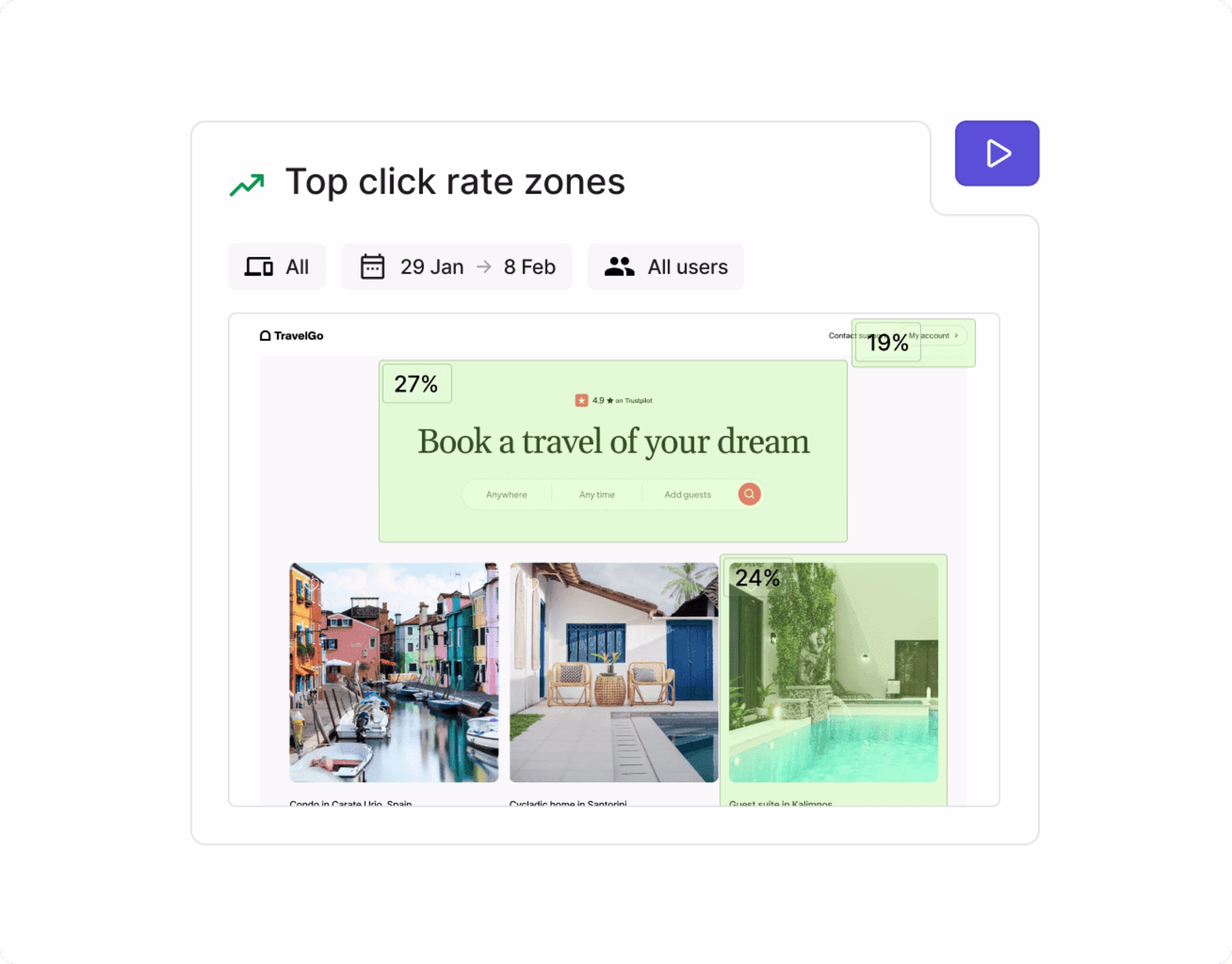
Use zone-based heatmaps to analyze specific sections of your site
Reduce friction and frustration to create happier customers
Rage click maps help you develop more empathy for your users’ needs and make customer-centric decisions. By finding—and quickly resolving—product experience problems, you earn your customers’ trust and loyalty. They know they can count on you to fix bugs, slow-loading pages, and confusing design elements every time. 💪
FAQs about rage click maps
A "rage click" is a term used in UX (user experience) design to describe a user repeatedly clicking or tapping on an element, often a button or link, multiple times in rapid succession . This behavior indicates frustration, typically because the user is expecting a response or action to happen, but the element isn't working as intended. Rage clicks are a sign that the user is having a negative experience and may indicate a problem with the design or functionality of the website or application.
![[Visual] Contentsquare's Content Team](http://images.ctfassets.net/gwbpo1m641r7/3IVEUbRzFIoC9mf5EJ2qHY/f25ccd2131dfd63f5c63b5b92cc4ba20/Copy_of_Copy_of_BLOG-icp-8117438.jpeg?w=1920&q=100&fit=fill&fm=avif)