Heatmaps is an umbrella term for color-coded visual representations of how users interact with a page online. Very different insights hide behind each type of heatmap.
In this chapter of the Heatmaps guide, we look at five heatmap examples and how to use them to improve your site.
1. Scroll maps show important content getting ignored
![[Visual] Long Scroll Map](http://images.ctfassets.net/gwbpo1m641r7/4wk1x366PQ0sJHdUDjNIDm/bb33860fa48c37a0d44530b4f1f027cb/image1__2_.jpg?w=1080&q=100&fit=fill&fm=avif)
Example scroll map
The heat map above is a scroll map, which shows how far down the page people scroll.
What the scroll map highlighted
When you look at the scroll map, you can immediately spot two sharp color gradient changes: one at the top of the page (from red to yellow), and one three-quarters down the page (from green to dark blue). In a scroll map, you generally expect colors to get gradually colder. A sharp change alerts you to the fact that a significant percentage of users has stopped scrolling after reaching a specific point.
Let’s focus on the green-to-blue change at the bottom. Based on the way the content is laid out, we can make two hypotheses:
Visitors think the page ends as soon as the ‘current openings’ section does, and they leave as a result
Prospective applicants are interested in the open positions and click to move to the next page
Either way, the bottom of the page only gets seen by about 20% of total visitors.
![[Visual] Scroll map 20%](http://images.ctfassets.net/gwbpo1m641r7/5rba4BC9Qev3nbyVoXfSuK/62dda172bedcae4b9b282fa9fcf6c733/image4__2_.jpg?w=1920&q=100&fit=fill&fm=avif)
And the Glassdoor rating of 5 out of 5 (which is above average) is an excellent social proof element for prospective candidates, but 80% of people who visit the page will never know about it.
Why was a scroll map insightful for this use case?
The heatmap data showed that 80% of visitors did not reach the bottom of the web page, and did not see the social proof section.
Now let’s look at the heatmap of the reworked page, which was shorter, and included employee testimonials just below the fold.
Now, 75% of visitors see the testimonial section and a whopping 69% reach the bottom of the page!
![[Visual] Scroll map jobs page](http://images.ctfassets.net/gwbpo1m641r7/8PiIL4uVXslV4t8xwF0fl/162ddb278a74967e97b4ffcb34778a90/image5__3_.jpg?w=1080&q=100&fit=fill&fm=avif)
💡Pro tip: combine numerical data from heatmaps with qualitative insights from Contentsquare’s Voice of Customer tools to gather feedback and improve the page even further.
In the example below, a user pointed out they couldn’t filter jobs by roles or location. Knowing this, you could then add that feature to help users navigate your site with ease.
![[Visual] Feedback response 275](http://images.ctfassets.net/gwbpo1m641r7/68RNGKTD0HLbZ6bpyDZX23/73227cdd9a01eaf6b6a797a18acfdb58/image11__1_.png?w=1920&q=100&fit=fill&fm=avif)
2. Click maps reveal that users ignore a video

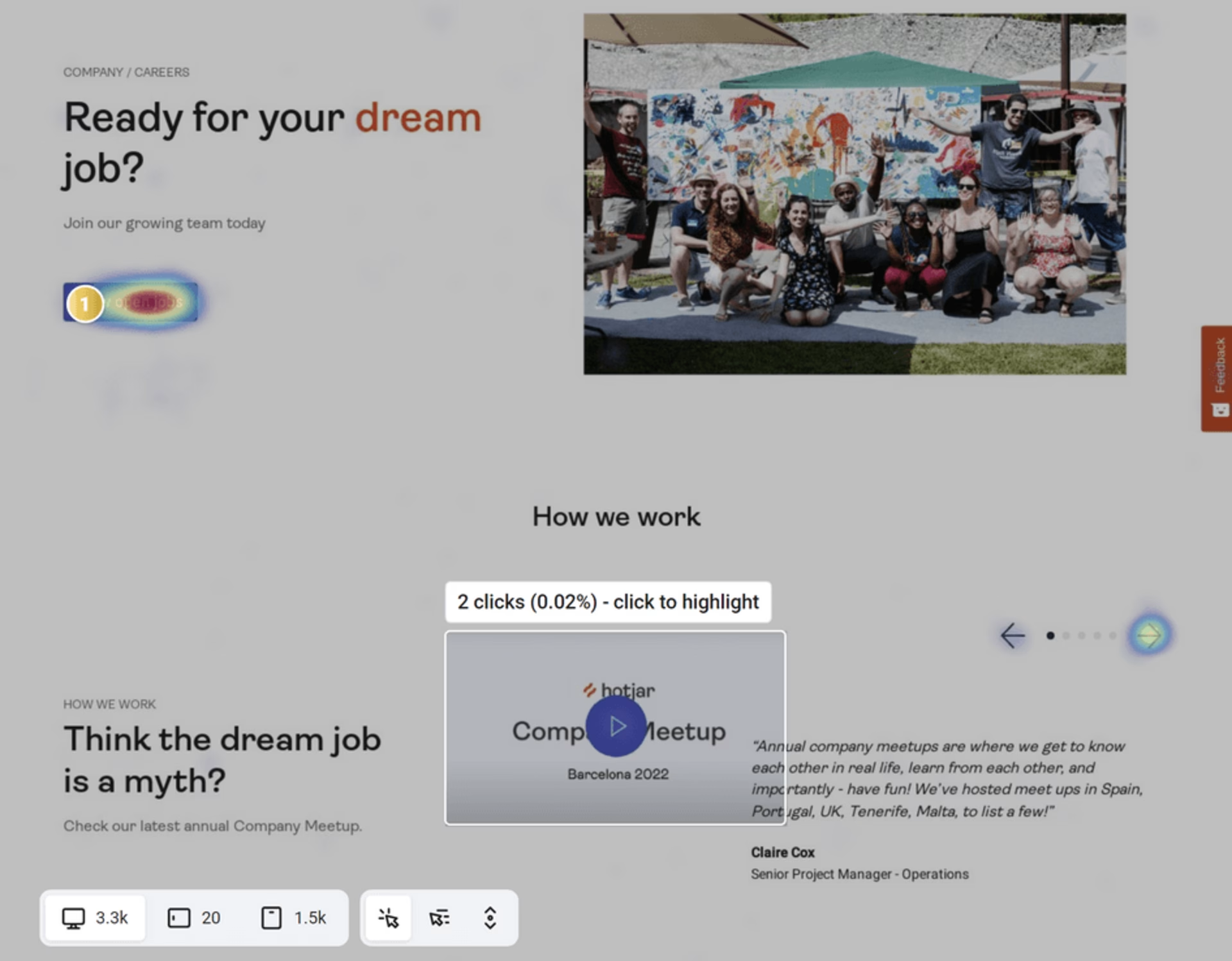
Example of a click map showing only two clicks on a video
The heatmap above is a click map or click heatmap, which shows the amount of user clicks as a lighter (few clicks) or darker (more clicks) color palette. It was placed on a redesigned version of a 'Careers' page to study interaction with the main elements.
What the click map highlighted
The redesigned career page includes a video in the testimonial section at the top. The assumption was that visitors would be eager to glimpse what the last company meetup looked like and click on the 'play' button. Except, they didn’t.
This lonely button was left largely unclicked, with only 2 clicks out of 3.3K sessions (that’s a 0.02 CTR)
Why was a click map insightful for this use case?
The click map provided an interesting data point on the assumption that users would want to watch a video.
This simple data analysis leads to two hypotheses to explain why visitors don’t play the video:
They’re not interested in it
They don’t realize this is a video and the button is clickable
To validate those hypotheses, we could set up an A/B test to change the layout or content of this section to improve the user experience.
💡 Pro tip: conducting user interviews with Contentsquare Interviews would give you direct feedback from users, so you know the ‘why’ behind their actions. In the above example, you could uncover why they don’t click on the video.
3. Move maps show where users move their mouse
![[Visual] Move map on the Heatmaps guide](http://images.ctfassets.net/gwbpo1m641r7/54pTfASCzIdTB2e8okR1pr/384fe3050863adc77e514aa260a4bc48/image2__2_.jpg?w=828&q=100&fit=fill&fm=avif)
The heat map above is a move map or mouse-tracking heatmap, which shows mouse movement as users navigate through a page. Unconsciously or not, users’ eyes follow the movements of the mouse as they click and hover over the different elements of the page. Move maps therefore could be used as a reliable eye-tracking technology.
What the move map highlighted
This move map comes from a guide article and informs what captures readers’ attention on this piece of long-form content. One interesting insight was that long blocks of text fail to hold the readers’ attention, as indicated by the lighter color scheme further down the paragraph:
![[Visual] Move map on What is a heatmap](http://images.ctfassets.net/gwbpo1m641r7/2u9DDgddPWR6GQnkHrf2Tt/85b152fd9de59f316fbfecda50ec423d/image9__2_.jpg?w=1920&q=100&fit=fill&fm=avif)
Why was a move map insightful for this use case?
Since fewer readers moved their mouse over the bottom of this text section, it’s safe to assume that the majority starts reading, but then ends up skimming instead.
This tells us that either
The content itself is not captivating enough, or
Readers get the information they need at the beginning of the section
In the first case, we might want to change the copy to make reading until the end more compelling. The second option tells us that we’ve managed to give the reader what they wanted up front—in which case we should consider shortening the section altogether.
But before making any decisions, we may need to understand the context of this behavior and validate our hypothesis—in this case, the move map is an excellent starting point for more advanced and in-depth research.
💡 Pro tip: a content feedback survey (built with Contentsquare Surveys) also helps you determine whether readers are satisfied with the page's content, what might be missing, or whether the layout isn’t to their liking.
![[Visual] Content feedback survey](http://images.ctfassets.net/gwbpo1m641r7/7qaiNidMVLrIyOmIx5yyah/d5e68ed705b5df8b8924ba6eb0dbe837/Website_Content_Feedback_Survey.png?w=1920&q=100&fit=fill&fm=avif)
4. Zone-based maps show how users interact with the page

Example of an engagement zone heatmap on an ‘About us’ page
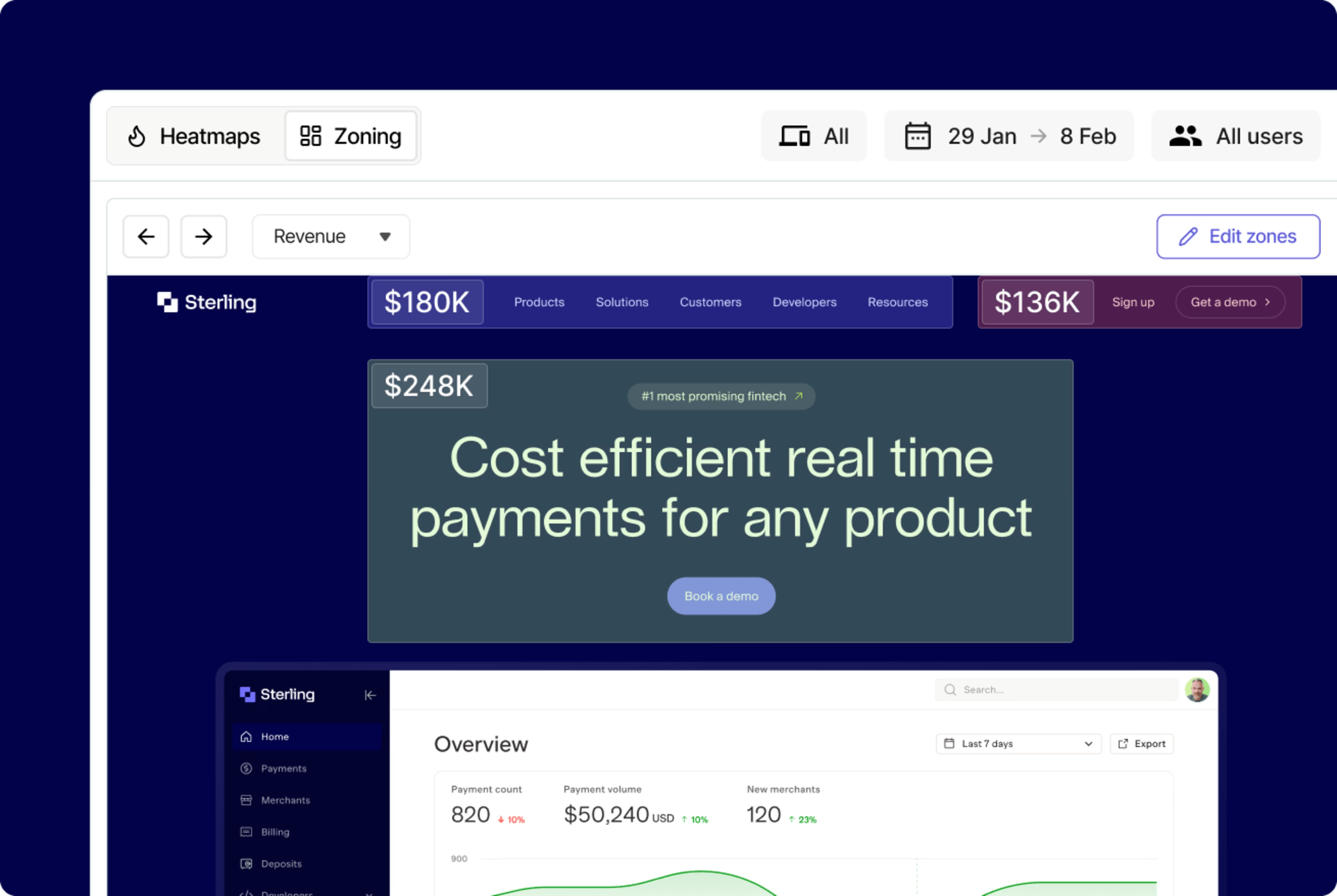
Zone-Based Heatmaps (an advanced version of engagement zone maps) combine data sets from clicks, moves, and scrolls for desktop—or taps and scrolls for mobile and tablets—into a single view. It’s the go-to heatmap analytics tool for data visualization.
What the zone-based heatmap highlighted
When looking at the testimonial section of this ‘About us’ page, the heatmap shows that users engage with the cards.
![[Visual] Zone based heatmap glassdoor logo](http://images.ctfassets.net/gwbpo1m641r7/oRT5NC9PUy0gvpSuDpl8g/ffadbcc5673cbafd46b61233451e86e3/image6__1_.jpg?w=1920&q=100&fit=fill&fm=avif)
The Glassdoor logo and the ‘Current Contentsquare employee’ component get the most engagement, as though users want to click through to see the review on Glassdoor. But neither of these components is clickable.
Worse: users completely ignore the clickable ‘Read the review.’
Why was a zone-based heatmap insightful for this use case?
User behavior on this section hints at the users’ desire to check the authenticity of the Glassdoor reviews. After all, it’d be fair to assume that a company that doesn’t link to the testimonials simply made those testimonials up.
Zone-based maps have highlighted a potential source of mistrust. With this actionable insight, you could revisit the design of the testimonial cards to confidently improve UX by
Making the Glassdoor logo and the bottom-left element clickable, and
Making the CTA to ‘Read the review’ more visible
5. Rage click maps help pinpoint exactly where users are getting frustrated on the page
![[Visual] Rage Click map pricing page](http://images.ctfassets.net/gwbpo1m641r7/1MLpas3KD2fa5CF4LkxLxp/25a9656b7e53eaf95b85a0adc4331bdc/Rage_Click_map.jpg?w=1920&q=100&fit=fill&fm=avif)
Example of a rage click map on a pricing page
As you might have guessed, a rage click map shows you where rage clicks occur on a page. Rage clicks are essential signs of user frustration—they indicate friction that hinders conversion rates.
What a rage click map highlighted
When looking at the pricing table, one thing that stands out in the rage click pattern is how it’s focused on the features included in each plan.
![[Visual] Rage click map features](http://images.ctfassets.net/gwbpo1m641r7/1UVFNOTEXiv7HcWkr9gTI8/6243e4acac9244acfac09b8b21d599e1/Rage-click-map-example.jpg?w=1920&q=100&fit=fill&fm=avif)
It suggests that users don’t understand what those features mean or would like more details. Users might expect each feature to link to an explanation, on the same page or a different one.
Why was a rage click map insightful for this use case?
The rage click pattern on this page tells us that the pricing page’s tables might need some extra work to improve user experience. Some options include:
Making the info bubbles more visible
Displaying the content of the info bubbles when users hover over the copy (not just the bubbles)
Replacing the info bubbles with a drop-down component instead
Renaming the features to make them more explicit
Adding a link to the features to send the users further down the page, where they’ll find a more detailed explanation
By pinpointing objects of user frustration, rage click maps provide you with UX improvement opportunities.Then, you can A/B test what changes best resonate with your users.
Gather more insights with the different types of heatmaps
Now that you know how to use each type of heatmap, there’s nothing keeping you from gathering actionable user behavior insights. Start collecting data to improve user experience on your site and increase conversions.
FAQ on heatmap examples
Click heatmaps show where users tap/click, which helps validate whether key CTAs, links, and interactive elements are being noticed and used.
Scroll heatmaps show how far people get down a page, making it easier to spot where attention drops off and whether important content is placed too low.
Move/hover heatmaps visualize cursor movement (desktop), which can correlate with reading/attention patterns—but it’s more directional than definitive, so it’s best used alongside clicks and scroll depth.
![[Visual] Stock photo for heatmap guide](http://images.ctfassets.net/gwbpo1m641r7/2iSvnDwHqHGIYW3ypzPqPU/97df0813e75a2dce8f53e3afa4ac9fc4/BLOG-SMB-survey-tools-5838317__1_.jpeg?w=3840&q=100&fit=fill&fm=avif)
![[Visual] Contentsquare's Content Team](http://images.ctfassets.net/gwbpo1m641r7/3IVEUbRzFIoC9mf5EJ2qHY/f25ccd2131dfd63f5c63b5b92cc4ba20/Copy_of_Copy_of_BLOG-icp-8117438.jpeg?w=1920&q=100&fit=fill&fm=avif)
