Mobile browsing isn’t just for on-the-go users anymore. People often pick up their phones or tablets to shop for mattresses or subscribe to accounting software, even if their desktop device is nearby.
To provide a smooth user experience (UX), mobile A/B testing is a must. By testing two different versions of your product or site, you learn which features work—and which need work.
Navigating the mobile A/B testing process can be challenging, as it’s easy to get overwhelmed with the sheer number of elements you could change or the various ways to set up your test.
This guide walks you through a 6-step process to conduct effective mobile A/B tests. Learn how to optimize your site or product to create a seamless UX, increase user engagement, and boost conversion rates.
6 steps to effective mobile A/B testing
Mobile usage has exploded in recent years, dominating other traffic sources. So much so that, in August 2024, the global mobile market share of web traffic was more than double that of desktop.
Mobile A/B testing is no longer a nice-to-have—it’s a necessity.
Desktop and mobile aren’t just devices with different screen sizes. Users approach each with a distinct mindset, and their experience needs to reflect that. They might pop onto an ecommerce site while waiting for their kid’s piano lesson to end, or check their email while waiting in line for their coffee. To avoid frustrating users, you need an easy and intuitive mobile experience.
"
Increasingly, optimization is moving ‘mobile only’. It’s been ‘mobile-first’ for a while. That means doing usability testing on mobile, ideating and designing for mobile, and reviewing test previews on mobile.
Johann Van Tonder
CEO, AWA digital
That means you need to design and test specifically for mobile. Not sure where to start? Read on for our 6-step process.
1. Review your data
Mobile A/B testing is a way to seek out the rough edges and spot problems in your design to figure out how to make it better.
Do a deep dive into your
Analytics to check key metrics like average session duration and bounce rate
Survey data like Net Promoter® Score (NPS) to gauge customer satisfaction, or an exit-intent survey to see why users bounce
Feedback to learn how mobile visitors feel about aspects of your site or product
Heatmap data to identify the areas, features, elements, and content that users engage with or ignore through color-coded overlays
Customer journeys to see where mobile users drop off, and how that compares to desktop users
Access all of this data from one centralized location—Contentsquare—to see what is happening (through quantitative or numerical data) and why (through qualitative or text-based data).
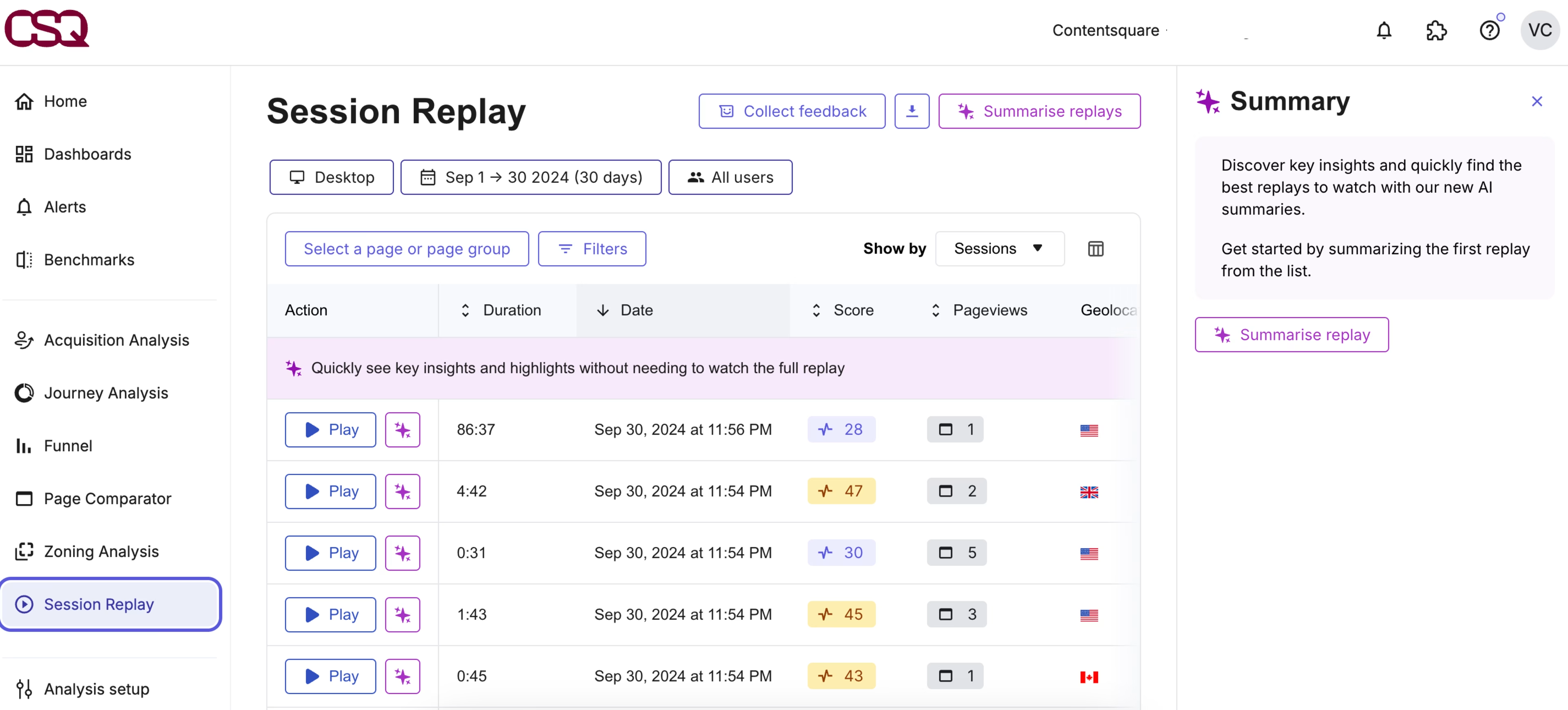
Make sure to apply the ‘mobile’ filter to home in on device-specific issues. If you spot one, Contentsquare lets you see relevant heatmaps, visual representations of how the average user views and interacts with your site, and session replays, which show individual visitors’ taps, swipes, and scrolls.

Contentsquare makes it easy to visualize and understand the experiences of mobile users
💡 Pro tip: make sure your user interface is user-friendly by harnessing AI-driven insights.
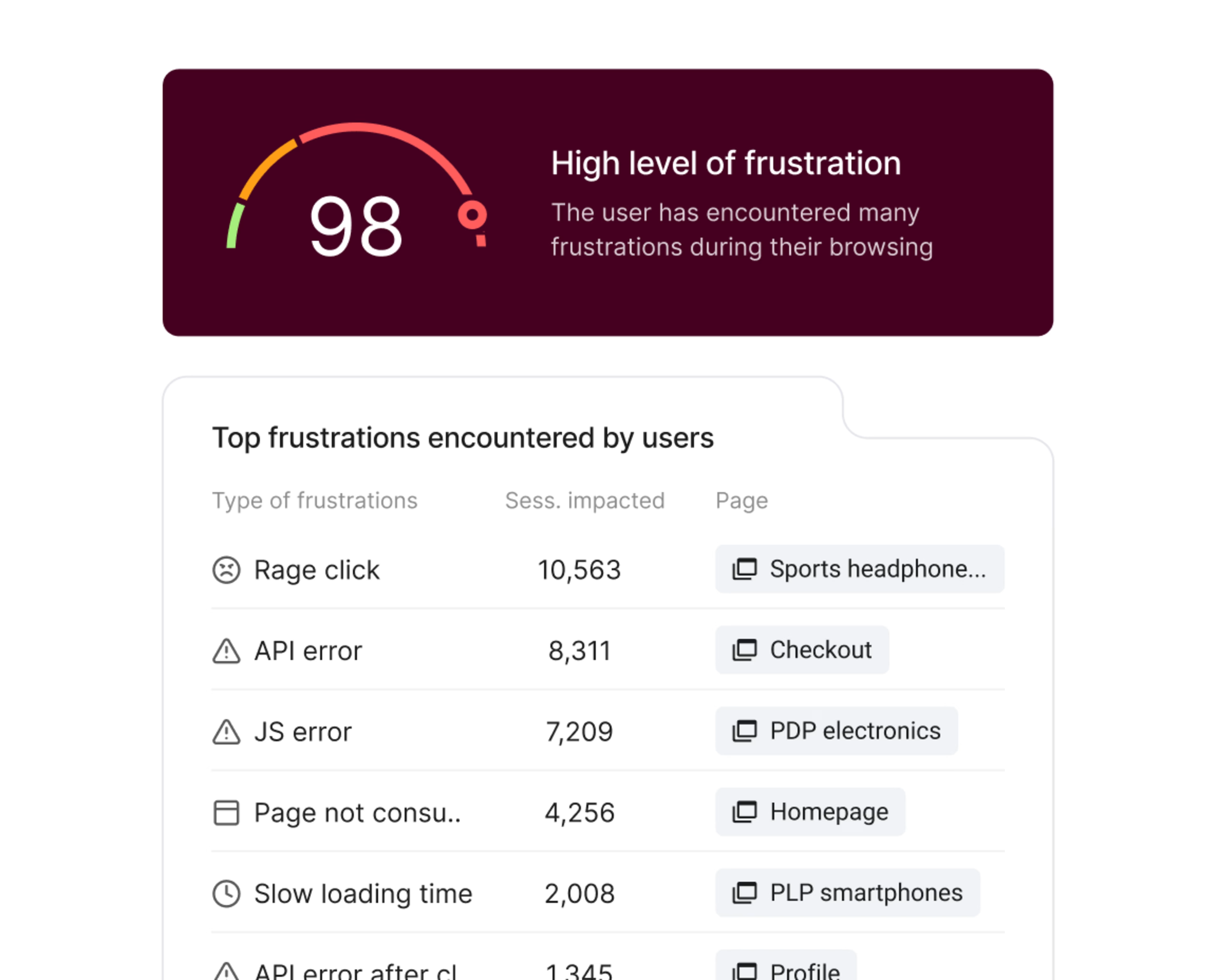
Mobile analytics help you visualize common areas of frustration—like rage taps on broken elements—so you can reduce drop-offs and build better experiences.
With Contentsquare, you get access to the Frustration Scoring feature that automatically highlights replays where people get frustrated and leave your site. It ranks the sessions where users experienced the most friction so you can cut to the chase and fix it once and for all.
2. Create your hypothesis
Once you’ve identified problem spots on mobile, choose one to prioritize and create a hypothesis for your experiment. A strong hypothesis outlines the problem, solution, and predicted result—typically in that order.
Let’s say you review data for your product’s landing page on mobile. You see the following
Average time on page is up, but conversions are down
Heatmaps show clusters of rage clicks appear on non-clickable descriptions of product features
Your Zone-Based Heatmap—which combines aggregate click, move, and scroll data to show you the most engaging parts of your site—reveals that the FAQ section at the bottom of your page is getting tons of attention
![[Visual] Side-by-side analysis Heatmaps](http://images.ctfassets.net/gwbpo1m641r7/3xBZNtb3Ie4QoEXjvcUSsE/64ab8e4a40407ee56f7b98b87289b473/Side-by-side_analysis__1_.png?w=3840&q=100&fit=fill&fm=avif)
A zone-based heatmap reveals the parts of the page users engage with the most, giving you more data to inform your hypothesis
Your takeaway could be that users need more information before they buy. Then, you’d create a problem-solution-result hypothesis like
“If users need more information before they buy…then we should move the FAQ section higher up the page…so that at least 10% more visitors convert.”
"
Within the Contentsquare platform, it’s very easy with just a few clicks to start looking at the impact we’ve made—whether it’s a new release and we want to see what happened before and after release or we want to compare last year’s performance to this year.
Martin Wood
UX Analyst, Motorpoint
3. Design your variant and test
The more time-intensive part of this process is to gather all the assets you need. Depending on your hypothesis, you may need
A wireframe from your UX design team
Code from your dev team
Copy from copywriters
Custom illustrations from your graphic design team
If you’re only testing button sizes or rearranging existing page elements, you’re ready to set up your experiment.
The good news is that the same A/B testing tools that offer desktop testing also let you design mobile tests. (If you don’t have one yet, consider options like Optimizely, Kameleoon, or AB Tasty—all of which integrate easily with Contentsquare. 🙌)
When building your test, consider how to distribute traffic to the two variants. If you run 2 brand-new homepage options side by side, you may opt to send an equal percentage of traffic to each. If you test an existing page against a new variant, consider diverting a smaller percentage of traffic, such as 25% or 30%, to the new option.
4. Segment your audience
The next step is deciding who sees each variant.
You already know you need to segment by mobile. For best results, you also want to target other specific segments of users relevant to the problem you called out in your hypothesis.
For example, say the issue is that new users abandon your mobile checkout flow much faster than existing customers. For your mobile A/B test, you’d need to target this particular segment. (An A/B testing platform makes this task simple.)
Also consider segmenting by
Demographics
Average order value (AOV), i.e. how much a customer typically spends on a transaction
Subscriber plan or tier type
Length of subscription
User operating system, like Android or iOS
Length of time since last visit
Different user groups have their own unique needs on your mobile site. Customer segmentation lets you collect the precise data you need to improve the experience for each group.
"
Define a segment and even context. Don’t expect all users to have the same needs and behavior.
Johann Van Tonder
CEO, AWA digital
5. Launch—and complete—the test
Once you hit launch on your mobile A/B test, you’re on your way to getting answers. But you still have 2 more aspects to consider: sample size and test duration. In other words, when do you end your experiment?
Without a background in statistics, calculating a statistically significant sample size—the number of visitors you need to run a test—is tricky. At the same time, you don’t want to simply pull a number out of thin air. That’s why most A/B testing tools include a test length calculator like this one.
Test duration—the length of time you let the test run—varies, too. If you can get enough visitors to test your variations on day 1, should you? The answer is no. For a well-rounded, representative sample of insights,most experts recommend running your test for 2 to 4 weeks.
💡 Pro tip: you don’t need to wait until the test is over to peek at your results. Monitor your test for bugs or issues, and check out how a new design performs while the test is still in action.
By integrating your A/B testing platform with Contentsquare, you get a window into how users experience your test variants.
Say you’re running a checkout flow A/B test in Optimizely. When users are having a bad experience—like showing signs of frustration through rage clicks—Contentsquare and Optimizely’s powerful Live Signals integration means you can take immediate action.
With live insights from Contentsquare, Optimizely simplifies the checkout flow, helping users complete their purchases faster and with fewer steps.

The Live Signals integration helps you recover frustrated users in real-time
6. Analyze your results
You’ve come full circle—from data analysis to, well, data analysis.
Once your test has run its course, look at the performance metrics. Ask yourself questions like
How did each of your variants perform?
How do these results compare to each other?
How do these results compare to your predicted outcome in your hypothesis?
Which version ‘won’?
But don’t stop there. Take a closer look at user behavior through relevant heatmaps and replays, and explore user opinions through feedback collection and surveys. These valuable qualitative insights show you why users prefer one page over another and help inform future iterations.
👀 How Sykes Holiday Cottages used Contentsquare’s mobile app heatmaps as part of their A/B testing process to optimize mobile UX
Product Owner Renan Medeiros used Contentsquare’s mobile app heatmaps to spot that users were tapping on a non-clickable search button.
App journey analysis showed these users often returned to the homepage, implying they were trying to refine their search. To solve this, the team A/B tested a clickable search button, leading to a better user experience.
Read more about how Renan used mobile app heatmaps in our guide on mobile app optimization.
![[Visual] mobile click map](http://images.ctfassets.net/gwbpo1m641r7/5Uhz4kE4Iipfizn8GDuK4H/8fa3242191216ab09c961685cdf44ffb/image11__3_.png?w=1080&q=100&fit=fill&fm=avif)
Contentsquare helps elevate your user experience across web, mobile and apps
Create an effortless, user-centric mobile experience
Following these 6 A/B testing steps gives you a glimpse into how users experience your mobile site—so you can take the next steps to improve it.
With results in hand, you’re ready to iterate and redesign to deliver a seamless mobile experience that delights your users and keeps them coming back for more.
FAQs about mobile A/B testing
Mobile A/B testing, or mobile split testing, involves seeing which of two assets users prefer on cell phones and tablets. For example, you can run experiments to see which landing page hero image, ad creative, or website copy users prefer.

![[Visual] Contentsquare's Content Team](http://images.ctfassets.net/gwbpo1m641r7/3IVEUbRzFIoC9mf5EJ2qHY/f25ccd2131dfd63f5c63b5b92cc4ba20/Copy_of_Copy_of_BLOG-icp-8117438.jpeg?w=1920&q=100&fit=fill&fm=avif)