
Most UX problems aren't hidden. They're sitting right there in the data, in the sessions where users click the same broken element 3 times, in the forms they abandon halfway through, in the pages they land on and immediately leave. The hard part isn't finding the data. It's knowing which methods actually surface what matters and which tools make that analysis feel less like archaeology.
UX analysis is the practice of studying how people interact with a product to understand what's working, what isn't, and why. Done well, it turns assumptions into evidence and gut-feel UX design decisions into ones backed by real behavior. Done poorly, it produces dashboards nobody looks at and reports that don't change anything.
This guide covers the methods worth building into a regular practice and the tools that support them, without the feature-list padding.
Key takeaways
UX analysis combines quantitative metrics (task success rates, error rates) with qualitative insights (user feedback, session recordings) to identify and fix friction points
The most effective UX analysis follows a structured 6-step process: identify issues, organize data, find patterns, prioritize fixes, share findings, and test improvements
Tools like heatmaps, session replays, and on-site surveys help you collect the data needed for comprehensive UX analysis
Prioritize fixes using severity ratings (critical, serious, minor) based on how much they block users from completing tasks
8 UX analysis methods to collect actionable data
Effective UX analysis relies on 2 types of data working together. Quantitative data tells you what's happening—how many users drop off, where they click, how long tasks take. Qualitative data tells you why—what's confusing them, what they're trying to accomplish, and what's getting in their way.
Here are 8 methods to collect both types of data for a complete view of your user experience.
Quantitative UX analysis methods
Quantitative data gives you measurable benchmarks for tracking UX improvements over time. Key metrics to track include:
Success rate: the percentage of users who complete a specified task, such as product onboarding, upgrading to a paid plan, or exploring a new feature
Error rate: the percentage of users who encounter an error or blocker—like a broken link, missing element, or confusing navigation—while trying to complete a task
Time to complete task: the average time users took to complete their task
Customer Satisfaction (CSAT): how users rate their satisfaction with your product or service on a numerical scale
Net Promoter Score® (NPS) : how likely users are to recommend your product or service to others
Customer Effort Score (CES): how much effort users have to make to complete a task within your product
How to collect quantitative UX data
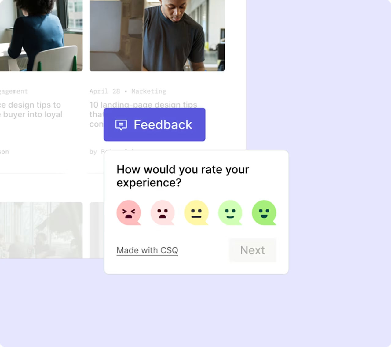
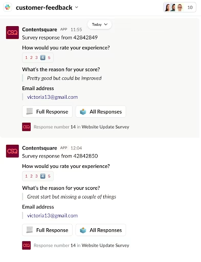
On-site surveys
On-site surveys help you collect user ratings and feedback with text answers, radio buttons, and checkboxes. Collect ratings on a numerical scale as they use your product to collect quantitative data about their experience. Ask closed-ended questions like:
How satisfied are you (on a scale of 1-5) with our [product or service]?
How likely are you to recommend our product or service to others (on a scale of 0-10)?
How much effort (on a scale of 1-5) did it take to [complete a task] within our product?
![[Visual] feedback survey](http://images.ctfassets.net/gwbpo1m641r7/14aoC8Q9xFWLyGGtFRw8eN/49f6b2c4e3fd312ea67e52d32f7af6e2/feedback_survey.png?w=1280&q=85&fit=scale&fm=avif)
Use Contentsquare Surveys to ask your users for the constructive feedback you need to improve your site
Unfavorable scores on any of these metrics can indicate UX issues. At this stage, you won't know what they are, but you will know they exist. The role of qualitative data is to help you identify UX issues more precisely—more on this later.
User feedback widgets
Feedback widgets are an easy way to collect feedback on specific elements or features of your product or service and are particularly helpful for A/B testing.
Data from feedback widgets helps you identify elements and features that are blocking or causing frustration for your users, but at this stage, you won't know exactly how to improve them. (You'll find this out in the qualitative data section of this guide.)
💡 Pro tip: feedback widgets tell you which element frustrated a user, but not what they were trying to do when it happened. Contentsquare's Sense can analyze patterns across all widget responses at once, grouping similar frustrations and surfacing the underlying cause, so you're acting on a trend rather than a single complaint.
![[Visual] sense ai](http://images.ctfassets.net/gwbpo1m641r7/1vmn0j4KtjZPRTrtnVObUA/017ab51caf979eba0555962031eea35b/sense_ai.png?w=1280&q=85&fit=scale&fm=avif)
Contentsquare surfaces AI-powered sentiment analysis and automated tags alongside response data, so patterns across feedback are visible without manual coding
Heatmaps
Heatmaps visualize user behavior on your pages, showing you exactly where attention goes and where it doesn't. Different heatmap types reveal different insights:
Click heatmaps: show where users click (or tap on mobile), revealing which elements attract interaction
Scroll heatmaps: show how far down the page users scroll, helping you understand if key content gets seen
Move heatmaps: track mouse movement, which often correlates with eye movement and attention
![[Visual] Heatmaps purple background](http://images.ctfassets.net/gwbpo1m641r7/48DLl2FNIKB3ej8WyOjIOc/4627722a196d94c01d9588c90aca15be/heatmaps.png?w=1280&q=85&fit=scale&fm=avif)
How can you use heatmaps to improve your website's UX? Zone-based heatmaps generate visual data to show what your users are doing on your web pages—where they click, how far they scroll, and what they look at.
Analyzing heatmap data helps you discover blockers in your user flow, but at this stage, you won't understand why they're happening or how to fix them. That's where qualitative data can help.
💡 Pro tip: staring at a heatmap and not sure what to make of it? Ask Contentsquare's Sense Analyst "what's causing the most friction on this page?" and it will surface the patterns worth acting on, pulling from click data, scroll depth, and frustration signals at once, without building a single report.
![[Visual] ask Sense Analyst](http://images.ctfassets.net/gwbpo1m641r7/7eSm7s3UBzrHepwRZ16F3L/636cd24d03a5f07200c582ae73aab6e3/ask_Sense_Analyst.png?w=1280&q=85&fit=scale&fm=avif)
Ask Sense Analyst a plain-language question directly from the heatmap view and it surfaces hesitation patterns, rage clicks, and friction zones without leaving the page
Qualitative UX analysis methods
Qualitative data comes from subjective insight. Direct voice of the customer (VoC) feedback and verbal or written user insights tell you why customers behave a certain way, and help you identify and remove pain points.
Qualitative data for UX can reveal:
The drivers generating user interest in your product or service
The barriers that stop users from completing an action
The hooks that persuade users to convert
How to collect qualitative UX data
On- and off-site surveys
On-site surveys are short and simple, so they don't disrupt the user journey. They typically pop up or slide in from the edge of the page with 1-3 quick open-ended questions. You can trigger on-site UX surveys to appear only on some pages or after a certain action, which makes them perfect for gathering feedback on specific elements of your product.
![[Visual] [Survey Goal AI]](http://images.ctfassets.net/gwbpo1m641r7/30i7uF6gKnbjEYq8uJaYPL/ecc49f753c6e217305bf91426765eca8/Screenshot_2025-02-23_003543.png?w=918&q=85&fit=scale&fm=avif)
Get started with a survey from scratch—or let AI write the questions for you
You can place off-site surveys on a standalone page and target them to user segments to learn about their experience in detail. Use off-site surveys to ask a long series of open-ended questions covering the whole user experience to understand the user's perspective in their own words.
Usability testing
Usability testing is all about watching real users as they interact with your product. Users complete tasks on computers or mobile devices while a moderator observes and notes areas of confusion and opportunities for optimization.
Teams run usability tests under standardized conditions, making them useful comparison tests between product variations. However, these tests can be expensive and may not reflect your user base or real-life situations.
Remote usability testing offers a more accessible alternative—users participate from their own devices and environments, which can reveal issues that wouldn't surface in a controlled lab setting. Tools like video conferencing and screen sharing make remote testing practical for teams of any size.
With the understanding of user behavior gained from usability tests, you can create and test product and design variations to optimize different parts of the user experience.
Session replays
Session replays are renderings of real users' actions on your website from page to page, like mouse movement, clicks, taps, and scrolling. Contentsquare's Session Replay capability shows you when and where users stumble, U-turn (return to a previous page), rage click (repeatedly click on the page), or exit.
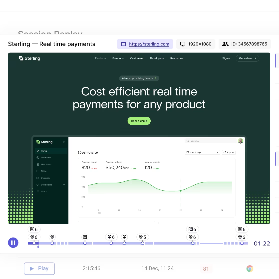
Analyzing session replays will help you identify UX issues, including blockers concerning functionality and accessibility, and show you how to fix them. AI-powered session summaries can identify key friction points automatically, saving hours of manual review by surfacing the moments that matter most.
💡 Pro tip: if you're using Contentsquare, connect feedback responses to session replays to understand how what your users said relates to what they experienced.
![[Visual] filter survey](http://images.ctfassets.net/gwbpo1m641r7/4TVfNp1RQ9mUhwt0qSzOOG/5137eff4ffc560217348a6e155e35048/filter_survey.png?w=1280&q=85&fit=scale&fm=avif)
Filter survey respondents by whether a session replay was captured, then jump to the replay to see what the user experienced before and after leaving their feedback
How quantitative and qualitative data work together
When you combine quantitative and qualitative data, you get a complete picture of the user experience:
Quantitative data helps you to identify what issues your users experience, and their degree of severity.
Qualitative data gives you an understanding of why and how these issues affect your users, and how to fix them.
For example, quantitative data might reveal that users interact with certain page elements, but they don't click your call to action (CTA) button. Once you've identified this issue, qualitative data can show you why users aren't taking the next step, and what you can do to persuade them.
💡 Pro tip: quantitative data tells you where users are struggling. Qualitative data tells you why. Contentsquare brings both together in one platform, so the connection between a drop-off rate and the session replay behind it is one click away, not a manual data-matching exercise.
6 steps to conduct a UX analysis
Now you've collected UX data through one or more of the methods mentioned above, it's time to make some sense of it: UX analysis is all about organizing your data and looking for patterns and recurring issues.
Here are 6 steps to UX analysis:
1. Identify user issues
When you first review your UX data you'll look at hundreds, possibly thousands of data points. Qualitative data will help you to identify the most common user issues.
Here are 3 examples of issues you might want to focus on:
Being unable to complete user onboarding
Not knowing how to upgrade to a paid plan
Difficulty accessing a product feature
2. Organize your UX data
Organize your UX data around issues your users encountered while performing certain tasks. These issues could include getting frustrated and abandoning a half-completed profile, not being able to process a payment, or feeling confused when navigating a product page.
Find out:
What was the issue?
What actions did they take?
What feedback did they give?
Add categories and tags so you can sort and filter your data. For example:
Category (location): payment, onboarding, upgrading
Tag 1 (element): payment, icons, menu
Tag 2 (experience): confusion, disappointment, hesitation
💡 Pro tip: record your UX data in a way that lets you sort it, move it around, add notes, and share it with your team. Take a look at the UX tools page of this guide to find the right tool for this job.
3. Look for recurring issues
Your UX data and user feedback will point you towards common user issues. Analyze session replays to understand why these issues exist, then:
Group issues involving the same tasks, like completing a profile, processing a payment, or navigating a menu.
Tally the number of users experiencing identical or closely related issues.
Look for patterns and repetition to identify recurring issues. If you notice that some users couldn't find your support center and other users found it hard to find your email address, you might conclude that your contact details are hard to find.
💡Pro tip: Contentsquare's Frustration Score helps you surface rage clicks and struggle signals at scale, automatically identifying sessions where users experienced the most friction.

Contentsquare's Frustration Score in action
4. Prioritize fixes
Now that you have a list of product issues and you know what's causing friction in the user experience, it's time to categorize and prioritize fixes.
Use a severity system like this one:
Critical: users find it impossible to complete tasks
Serious: users are frustrated with their experience and are quitting their tasks
Minor: users are annoyed, but not enough to quit
Beyond severity, consider using an impact vs. effort matrix to decide what to tackle first. Score each issue on 2 dimensions:
Impact: how much will fixing this improve conversion rates, retention, or satisfaction?
Effort: how much time and resources will the fix require?
High-impact, low-effort fixes should move to the top of your list. Low-impact, high-effort fixes can wait—or be reconsidered entirely.
Decide which UX metrics you want to prioritize. For example, if your metric is user retention, being unable to complete payments is more urgent than disliking the product design.
5. Share your findings and recommendations
You've evaluated your UX data and have prioritized the most urgent issues. Now it's time to compile a report to begin testing improvements and share your findings with your product team.
A good UX analysis report should:
Highlight the most urgent issues
Be specific about the nature of each issue
Include evidence like videos, screenshots, and transcripts
Recommend solutions that are effective and efficient
Include positive findings to let your team know what's working well
When presenting to stakeholders, lead with business impact. Connect UX issues to metrics they care about—lost revenue from checkout abandonment, support costs from confusing navigation, or churn from a poor customer experience at onboarding. Visual evidence from session replays and heatmaps makes issues tangible and harder to dismiss.
💡 Pro tip: Contentsquare makes it easy for cross-team collaboration by letting you forward replays and surveys to your team in Slack.
6. Build and test new features
The Lean UX model is a 3-phase approach for processing UX feedback:
THINK: product teams brainstorm possible areas of improvement
MAKE: product designers and developers build a new feature to solve a user problem
CHECK: product teams test the new feature with surveys and figure out if users respond well to it.
When your product team is doing UX analysis in the CHECK phase, you'll test changes and fixes to learn whether they work, see how users respond, and refine your approach.
Then, rinse and repeat.
💡Pro tip: using a combination of these tools will give you a mix of quantitative and qualitative data. Visit the UX tools page of this guide for a deeper look at how and when to use each tool in your UX analysis.
FAQs about UX analysis methods
UX analysis is the process of collecting and evaluating data about how users interact with your product, then using those insights to improve their experience. It combines quantitative metrics (like task success rates and error rates) with qualitative insights (like user feedback and session recordings) to identify friction points and prioritize fixes.

![[Guide] [Qualitative data analysis] methods - cover](http://images.ctfassets.net/gwbpo1m641r7/65Jwg78wpXeaUrZXJUQWSF/4ac44709e393fb8ab3382449dacddd90/surface-8HPLpr3hebU-unsplash.jpg?w=624&q=85&fit=scale&fm=avif)