The company
Rakuten is an ecommerce company founded in 1999 that lets customers earn cash back as they shop. The company also offers deals and shopping rewards across a large selection of products and services.
The challenge
The company noticed that 11.3% of users were viewing their shopping cart page, but this wasn't translating to the conversion rates they expected on the page.
The team wanted to understand why users weren't adding items to their carts, remove any customer frustration, and streamline user journeys on the cart page.


At Rakuten, we aim to offer a smooth and simple experience for our users. Contentsquare enabled our product and front-end design teams to detect that our shopping cart page was confusing visitors.
The solution
The Rakuten team kicked off their cart page analysis using Contentsquare's Experience Intelligence platform to look at the in-page behavior of 2 user segments: new visitors and returning customers.
For returning customers, the cart page was a central point of their navigation behavior. On the other hand, new users had higher scroll rates and were spending a longer time on the cart page, suggesting they had trouble understanding the page. Across both user segments, all non-buyers were spending 15 seconds longer on the page than converting users.
The team had a hunch that having a long, one-step checkout process on a single page was overwhelming customers and, ultimately, costing the company valuable sales.
The results
The Rakuten team used insights gained from Contentsquare's Experience Analytics product to rethink the design of their cart page.
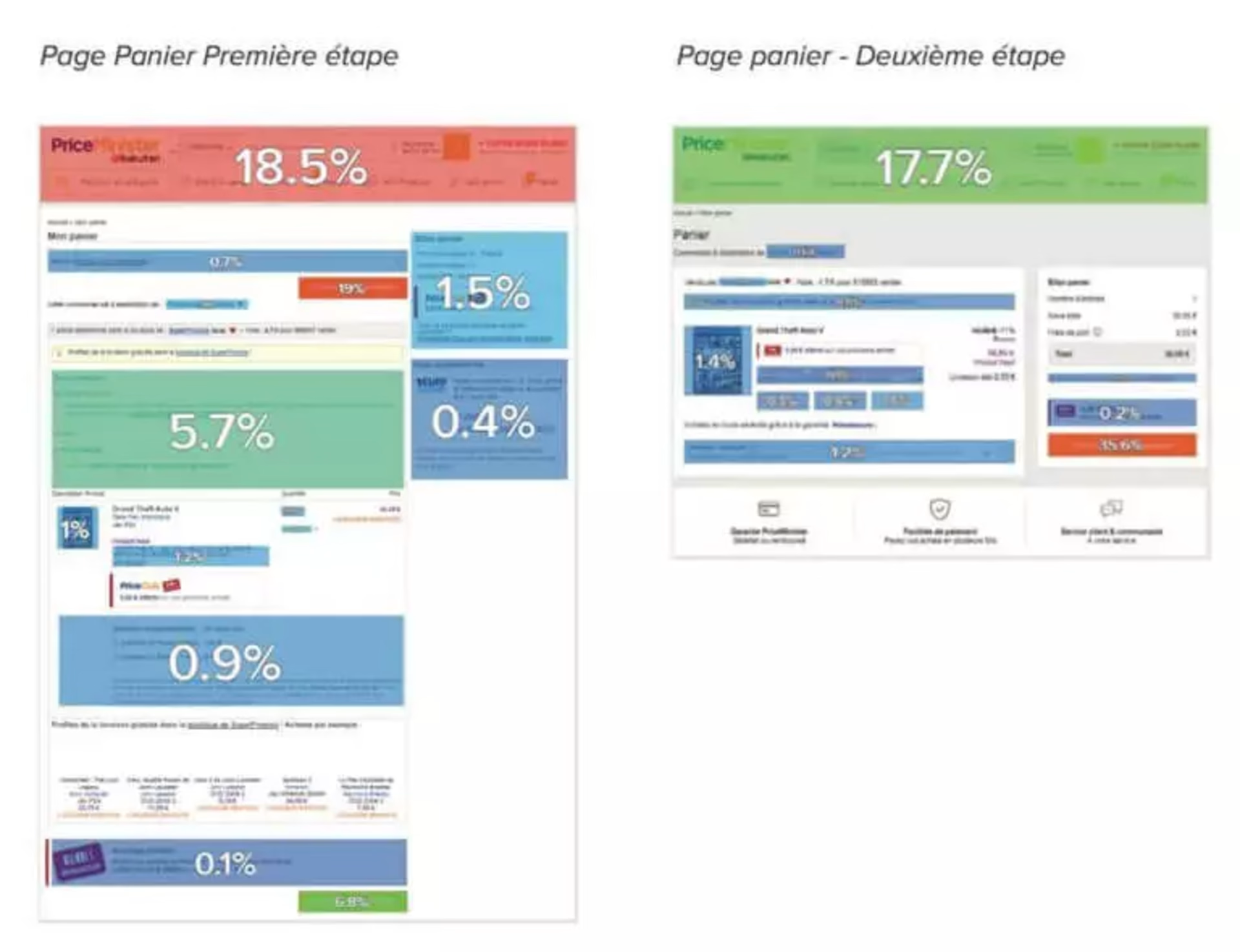
Instead of one long checkout page, the company split the checkout process into 4 quick steps: initiate checkout, shipping, payment, and order confirmation. Adding multiple steps helped customers better understand their options and purchase with confidence.
Ultimately, the conversion rate between initiating the checkout process and progressing to the shipping step increased by +10%.

Contentsquare's Heatmap analysis of the first step of Rakuten's cart page (left) and the second step (right) showing conversion rate.

Contentsquare is the perfect ally for working on user experience (UX). It not only allows us to better understand areas of our site that are confusing users, but also allows us to study the right way to address problems.
