The company
Established in 2015 to address a gap in the market for high-quality and trustworthy sleep solutions, Ecosa is now one of Australia’s leading online e-retailers for mattresses, pillows, bedding and bedroom furniture.
As their products are only available online, the company needed to understand how their customers were interacting with their mobile and desktop channels in order to deliver the best online experience possible.
The challenge
Any ecommerce retailer will tell you that user experience testing is crucial. Without it, it’s impossible to know if your product really meets the users’ needs or if you are providing a positive experience that helps drive conversion.
Constant experimentation is key to Ecosa's success, so they turned to Contentsquare to uncover opportunities and drive experimentation efforts.
The solution
Opportunity #1
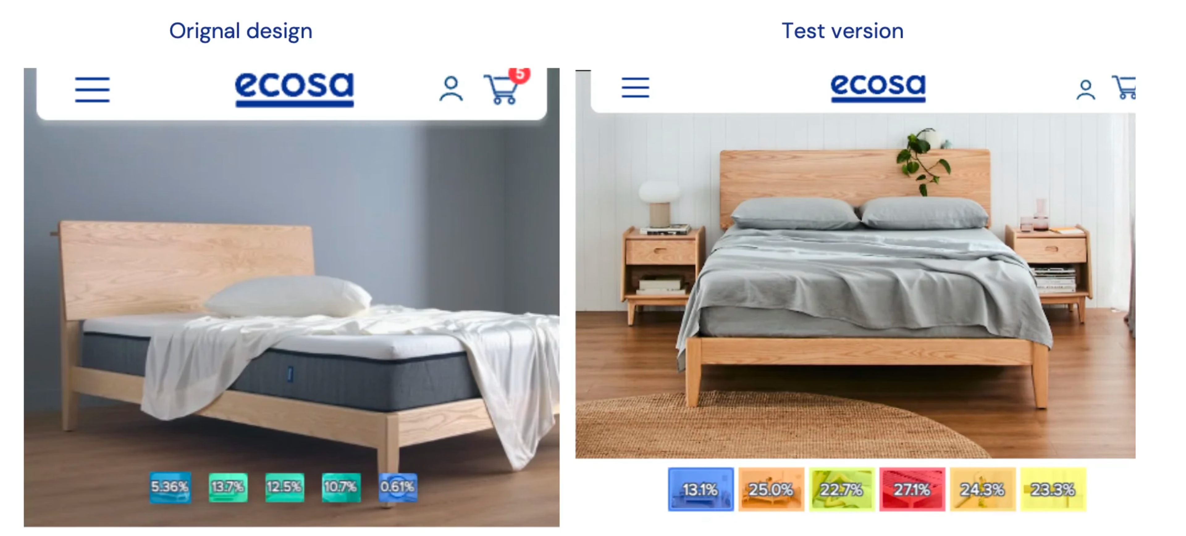
In their original mobile product pages, additional images of a product were overlaid at the bottom of the hero image.
This meant that during photoshoots, the team would need to consider and make allowance for extra space to fit the thumbnails.
The team hypothesized that moving these thumbnails off the hero image would encourage customers to click and engage more with the content, leading to increased conversion.

I like that I can see the entire customer journey. With other platforms, you need to specify journeys you think customers are taking, but in Contentsquare, I get a holistic view which allows me to identify any issues we might be having right off the bat. I don’t need to guess as it gives me big picture understanding and then allows me to hone in on specifics later.

Opportunity #2
Using Journey Analysis, the team realised that customers were adding products to cart, emptying it and then exiting without converting.
Off the back of this insight, the team ran a test where they added their highest converting product category pages to the empty cart page to see if it would improve conversion.
![[Visual] Ecosa mobile A/B test](http://images.ctfassets.net/gwbpo1m641r7/1ScaBaF6QXbWa6Izxx98UG/425711f861c2860b7d3492999f046f7d/Image-2.png?w=2048&q=100&fit=fill&fm=avif)
The results
The new layout that the team tested won and was validated by the increase in tap rate metric using Heatmaps.
Overall, they saw conversion rates increase by +71.57% (111% for mobile, 28% for desktop). This new layout has since been rolled out to all product pages and images.
Just by adding their highest-converting product category pages to the empty cart page, the test version saw a total conversion increase of +6.4% (9.5% in mobile, 2.1% in desktop).
I can now ask the questions about the customers that I want to ask. I can ask, ‘Is a customer using or interacting with this feature, or are they interacting with it the way we had intended by design?’. Overall, it has really changed the process of our design team - everything from start to finish always starts and ends with Contentsquare.


![[Customer logo] Electrolux](http://images.ctfassets.net/gwbpo1m641r7/4UWQy34sz4Pery8OC5TV6S/40bd0d48ad0a5b359a9064a026baaf3d/Electrolux-logo.png?w=3840&q=100&fit=fill&fm=avif)
