The company
Dune London is a luxury footwear and accessories brand, with more than 20 years of experience in the industry and more than 300 stores worldwide.
The challenge
Steve Thomson, Lead UX and Digital Designer, and Elaine Smith, former Head of Digital Product, were approaching a full website redesign on dunelondon.com. Having worked with Contentsquare for more than a year already, they knew the kind of behavioral insights offered would be valuable for many different teams, including designers and the performance marketing team.
Steve and Elaine wanted to get a solid understanding of the site’s current experience to better understand how to improve. They began by giving the site a comprehensive audit.

We’ve always had a really positive relationship with the Contentsquare team, both in terms of wanting us to succeedand to help us action the insights that Contentsquare is exposing to us. We’ve always had a really strong dialogue with both the customer success managers and the technical team. It’s been very successful.
The solution
Steve and Elaine identified several areas of focus from the audit.
With Contentsquare, they could see customers were using the basket in a wishlist capacity—adding and subtracting from the basket multiple times. They hypothesized this was driven by users starting their journey on mobile and then continuing on desktop.
Based on the audit, they wanted to reduce the amount of page clutter to give the site a cleaner feel and expose users to more product color selectors at the product listing page (PLP) level. Steve had tested and made some improvements but knew there was still work to do, especially in making the filters more mobile-friendly.
From his own research, Steve understood there were limitations in the guest checkout. The login page was cluttered and had several areas of unnecessary data entry which was frustrating and confusing users.
Armed with these advanced insights, the team made the following changes:
Transformed the PLP design
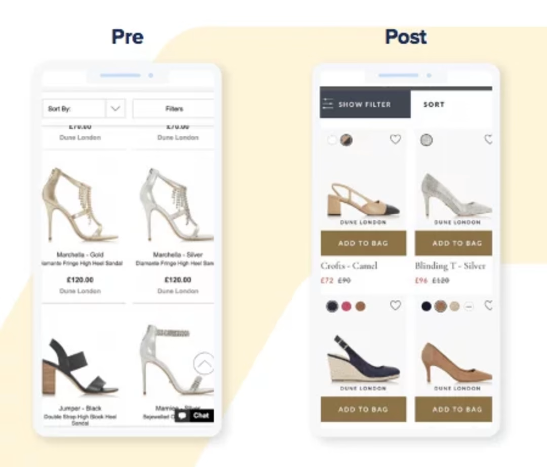
The team redesigned the PLP by adding a wishlist button, a shorter product description, and additional information on each thumbnail.

Pre- and post-PLP redesign, showing a clearer CTA, and shorter description.
More visually-engaging filter options
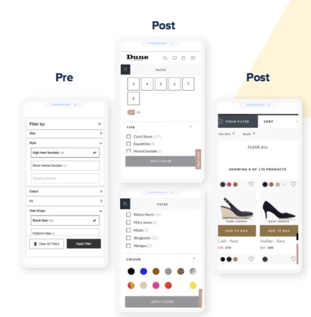
The team made the filters more visual, engaging, and mobile-friendly by using color selectors and checklist options.

Filters were updated to be more user-friendly.
Streamlined the checkout process
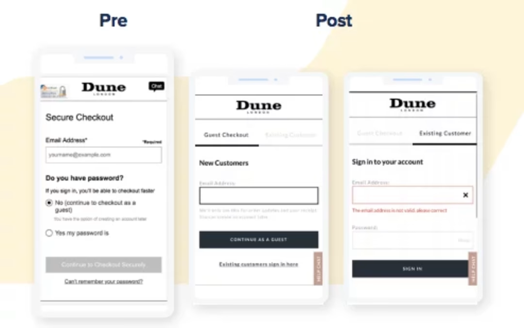
The team moved to a tabbed approach with guest checkout. They also merged the order review and delivery pages in the checkout flow to reduce the number of steps from 6 to 5.

Guest checkout was updated to make the process easier.
The results
+14% increase in average order value
-30% decrease in bounce rate
+4% increase in conversion
Their new sign-in page in checkout reduced exit rates from 12% to 9%, which was a great result given most of Dune London's users were new visitors.
They also saw customers who visited their wishlist via the PLP convert at a much higher rate than those that didn’t.
What's next
Steve says this redesign isn't the end, it's just the beginning. "We really want to make this part of our ongoing roadmap, constantly making iterative improvements.
"That’s where we really see Contentsquare coming into its own, enabling us to make those small, context-driven changes throughout the funnel," he says.

