What is form conversion?
Form conversion is when a website visitor completes and successfully submits an online form from a homepage, landing page, or any other page on a website. Form conversion is a micro-conversion, which leads to a macro-conversion such as a newsletter sign-up or a purchase.
Why is form conversion important?
Creating straightforward, easy-to-complete forms is key to a successful conversion rate optimization (CRO) strategy, and form submissions are usually the final hurdle in the conversion process.
It’s easy to overlook the value of a well-designed form. It’s not nearly as exciting as choosing bold imagery or writing persuasive copy, but it’s just as important to the user experience.
If a visitor starts to fill out your form, you’ve already sold them on the idea of converting—you’ve successfully countered their objections, and they’re willing to give you their personal information. Having to enter their data (name, email address, phone number, credit card info, etc.) requires trust and effort though, so if the form isn’t straightforward and easy to fill out, your visitor might move on to the next website.
What is a good form conversion rate?
There isn’t a one-size-fits-all ‘good’ form conversion rate—people will either fill out your form, or they won’t. The best way to learn how to improve your form conversion rate is to analyze and test your current forms, and use what you find to build better sign-up forms that people are more likely to fill out.
Contentsquare’s Form analysis provides insights to help you increase form conversion rates
Building a better sign-up form
Here are a few tips for building a form that converts:
Keep the number of fields to a minimum and only ask what you really need to know
Start with the easiest questions and move on to the most complex ones
Present a logical flow from one form field to the next
You can find the above concepts in articles about best practices for web form optimization, but understand that these are only guidelines. If you follow other people’s ideas about how a form should look without testing them, you might fall victim to something we call ‘death by best practices.’
Death by best practices occurs when companies follow design advice based on what works for other companies. Sure, those companies know what works for their customers and their market, but your customers and your market might want something else entirely.
How to analyze your forms
Form analysis will help you understand how users behave and interact with your forms so you can learn how to improve form conversion rates. By discovering the number of form fields left blank, which fields take too long to fill, and why your visitors aren't clicking the 'submit' button, you can learn what changes to make to your forms to make them straightforward and easy-to-use.
💡Use Contentsquare’s Form analysis to analyze user behavior on forms:
Analyze how your form is performing in general, thanks to the global report and the conversion report.
Deep dive into each step of your form with drop rate, blank rate and refill rate metrics to pinpoint the problematic fields.
Form analysis lets you:
Improve form conversion
Reveal and resolve errors
Optimize completion and reduce abandonment
Improve your forms through A/B testing
The best ways to find out what your customers want is to study their behavior, and to perform A/B tests or multivariate tests based on the insight you collect. A/B testing is never the place to stumble across new ideas though: you need to come up with data-driven hypotheses before you run a test.
And that’s just as true for testing your forms as it is for other page elements: you want to collect insight about what is stopping people from completing your forms, and make hypotheses about what will get more people to complete them. Behavior analytics tools such as Contentsquare’s Zone-Based Heatmaps and Session Replays can help you do just that.
Step 1: study heatmaps
Heatmaps show you a visual representation of where visitors click, scroll, and hover their mouse pointers in aggregate. They also show where visitors tap their screens on mobile devices.
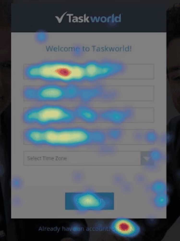
A heatmap will show you where most people give up when filling out a low-converting form:

In the example above, there are three issues with the form that the heatmap immediately picks up:
This is a registration page, but the main ‘sign up’ gets clicked less than the competing ‘sign in’ link (the red blob at the bottom)
The fields get progressively less attention, giving people several opportunities to abandon the form before submission
The fifth field is getting bypassed—but it is a mandatory one, so if people click on ‘sign up’ after skipping it they receive an error
These are just a few examples of what you can learn about the effectiveness of your forms from a strategically placed heatmap.
2. Watch Session Replays
When you’ve got a sense of how visitors as a whole interact with your forms, you can dive into session replays and see how individual visitors behave around them.
Playing a session replay of a form being filled in and submitted is like looking over the shoulder of a user as they attempt to complete the task. You will not see their private information, but you will be able to observe where they stumble or get hung up while they try to fill out your form.
Once you’ve got the data, it’s time to come up with a hypothesis about what you could change to increase conversions. Now you can focus on the things that will likely offer the biggest return, and A/B test them.
![[Visual] Person looking at phone stock](http://images.ctfassets.net/gwbpo1m641r7/5l4auiJ8tgBKWFOqJUkYbz/0ef9ad53e90a51b995dff92b818875d2/AdobeStock_248831473.png?w=3840&q=100&fit=fill&fm=avif)
![[Visual] Contentsquare's Content Team](http://images.ctfassets.net/gwbpo1m641r7/3IVEUbRzFIoC9mf5EJ2qHY/f25ccd2131dfd63f5c63b5b92cc4ba20/Copy_of_Copy_of_BLOG-icp-8117438.jpeg?w=1920&q=100&fit=fill&fm=avif)