
Revamping your site’s user experience (UX) has been on your ever-growing to-do list for…a while now. In the midst of your other marketing and design priorities, figuring out how to improve your UX seems more than a little daunting.
The good news is that improving UX doesn’t require a complete overhaul. With the right approach, you can make targeted, intentional changes that drive more conversions and keep visitors coming back.
This article shows you how to optimize UX in 6 simple steps that will give you measurable results you’ll be proud to share with your team.
Key insights
Improving your site’s UX doesn’t require starting from scratch. To make meaningful improvements:
Start with observation, not assumptions: use digital experience analytics tools to understand what users actually do on your site (versus what you think they do) before making any design changes
Prioritize friction points that impact revenue: focus on fixing the UX design issues that cause the most frustration and abandonment in your important user journeys
Segment your data: mobile users often experience different usability friction points than desktop users, so analyze and optimize each experience separately
1. Observe user behavior
Making UX design changes without watching users is like a chef rewriting a recipe without ever tasting the original dish. Real-life observation is key (unless you want to experience some really expensive mistakes).
Start your UX research process by tracking key metrics, like bounce rates, exits, click-through rates, and conversions in your analytics platform. Contentsquare (👋) neatly displays all of these with dashboards, giving you metrics that show you what users are doing on your site.
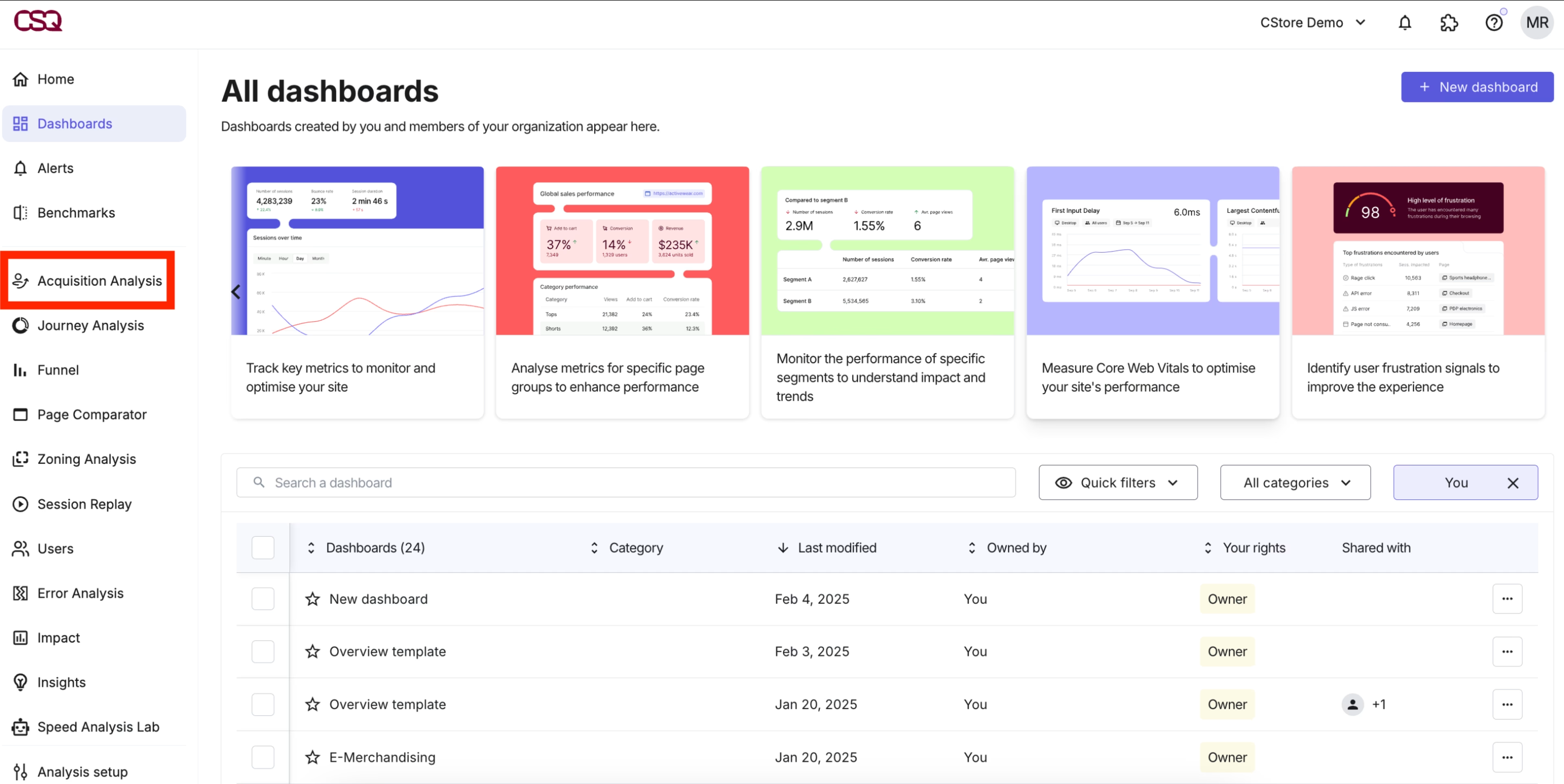
Choose from a variety of dashboard templates in Contentsquare to organize your essential metrics
Then, layer in behavior analytics to find out why users act the way they do. A tool like Contentsquare captures every mouse movement, hover, scroll, hesitation, rage click, and u-turn—giving you a complete picture of the user experience and helping you discover user needs.
For example, use Contentsquare Heatmaps to improve UX, visualizing which elements attract attention and which get ignored. Spot something interesting? Click through to Session Replay to watch relevant user sessions to spot friction points that metrics alone might miss.
![[Visual] Session replay](http://images.ctfassets.net/gwbpo1m641r7/7i5Z627hqgzsfHxDvi9xol/d58530298a1437c7841ee01b6a1839e5/Screenshot_2024-11-04_at_19.22.27.png?w=3840&q=100&fit=fill&fm=avif)
Watch session replays for a closer look at what’s causing users frustration
💡Pro tip: use Contentsquare’s Frustration Score feature to automatically spot moments when users struggle the most—from rage clicks on non-clickable elements or error messages that block progress. This helps you understand what to fix first to improve the user experience (and your bottom line).
![[Visual] Frustation score data](http://images.ctfassets.net/gwbpo1m641r7/5fm4YmDhuQoaaD36Os1DgR/a4f3d028c3329a10fca152820ffd877b/Get_more_done.svg?w=1920&q=100&fit=fill)
Contentsquare’s Frustration Score tips you off about when to investigate UX issues
2. Map the entire user journey
Journey mapping helps you see where users succeed, where they get stuck, and where they abandon your site or product entirely. While the task itself is not always so simple—modern user journeys are anything but a straight line—the information you can uncover to help shape your UX is well worth it.
Start by identifying your most important user journeys: the paths users take from entry to conversion.
For an ecommerce site, this could be Homepage → category page → product detail page → cart → checkout
For a SaaS product, it might be
Landing page → feature page → signup form → activation
Or, it could be completely different! That’s why it’s easiest to use a specialized tool for this.
Contentsquare’s Journey Analysis tool lets you visualize how users move through these paths, showing complicated journeys in an easily understandable way.
With Journey Analysis, you see
Which entry points lead to the highest conversion rates
Where users drop off most frequently
Alternative routes users take when they can’t complete their intended journey
How segments (new vs. returning visitors, mobile vs. desktop) navigate differently
This data often reveals surprising insights. Maybe users who land on your site through a blog post convert at higher rates than those from paid ads. Or, perhaps mobile users abandon at a step that works just fine on desktop.
![[Visual] Journey-analysis-sense](http://images.ctfassets.net/gwbpo1m641r7/3YF1vgtNFaqqWjjaxSZbgl/b37170520a1dc52508425883c909ace1/Journey-analysis-sense.png?w=3840&q=100&fit=fill&fm=avif)
Contentsquare’s Journey Analysis tool shows user journeys in an easily understandable way. Ask our AI assistant Chat with Sense questions to make the data even easier to interpret!
3. Fix what’s broken (or problematic)
Once you’ve identified and prioritized any UX pain points, it’s time to take action.
For problem pages, address both technical and content issues. Here are a few of the most common ones, along with potential fixes and helpful tools.
👉 If users struggle with form fields based on what you see in session replays, pare down the number of fields and make sure their labels are clear
👉 If a page has too much content, break it into shorter sections, add white space, or remove unnecessary elements
👉 If page load times cause exits—use Contentsquare’s Speed Analysis to figure this out!—optimize images, and minify front-end languages such as JavaScript, HTML, and CSS
👉 If calls to action (CTAs) are confusing, use visual hierarchy (size, color, position) to make your primary button more obvious, and experiment with different wording
Testing and iteration are key here. Use A/B testing to validate your changes before rolling them out site-wide.
💡 Pro tip: still not sure where to start? Sense Analyst, Contentsquare’s AI agent, can help. Ask natural language questions about friction in your UX, and get insights and next steps in minutes.
![[Visual] Sense-analyst-recommendations](http://images.ctfassets.net/gwbpo1m641r7/2TfAorzYm3du89ehIEpeVf/9e1d0ab2f4af2a3269fae1445911d25c/Sense-analyst-recommendations.png?w=3840&q=100&fit=fill&fm=avif)
Get data-driven recommendations on how to improve your UX in minutes with Contentsquare Sense
4. Give your navigation a once-over
When users can’t find what they’re looking for—or don’t know where to go next—they’re likely to freeze or even bounce.
Effective navigation should be invisible. Users shouldn’t have to think about how to move through your site—it should feel effortless and intuitive.
Start with these navigation fundamentals:
Limit the number of options in your top-level menus to around 5–7 items to avoid confusing users
Use clear language in menu items (‘About us’) over clever catch-phrases (‘Our crew’) that may take some interpretation
Organize items so your most-used or important pages appear closer to the top
Check for broken links—these are dead ends for users
Need help spotting these issues? Ask your users. Add an on-site survey or feedback button on any page to let users tell you what bugs them while it’s still fresh in their minds.
![[Visual] Feedback-Button rate your experience](http://images.ctfassets.net/gwbpo1m641r7/1jtKOa90vakvficfgrrXTz/81dc0f40dff6d9257d91872c4efed9cb/Feedback_button__1_.png?w=3840&q=100&fit=fill&fm=avif)
Add a user feedback button to any page to get UX feedback directly from users
5. Optimize for mobile
According to the 2025 Contentsquare DIgital Experience Benchmark Report, mobile traffic share (69.7%) was more than twice that of desktop (30.3%). A site that works beautifully on desktop but not on mobile frustrates the majority of your target audience.
To optimize on mobile, you need
A responsive design that adapts to your users’ screen sizes
Fast loading times since mobile networks are often slower
Form options like drop-down lists that make it easier for users to input information
Hamburger menus and sticky menus to help visitors get from Point A to Point B
Text users can read without zooming—at least 16 pixels for body font
Buttons and links that are easy to tap (WCAG guidelines recommend a target size of 44x44 pixels)
💡 Pro tip: segment your Contentsquare data to compare mobile vs. desktop behavior. You might find that mobile users have higher frustration signals and lower conversion rates—not because they’re less interested in your product or content, but because the experience isn’t optimized for their mobile devices.
![[Visual] Segment-by-device](http://images.ctfassets.net/gwbpo1m641r7/2jCTjUnmuv5WZ6gi2ktgR6/1b6591369af1eaa2e6734f2a9c807329/Segment-by-device.png?w=3840&q=100&fit=fill&fm=avif)
Create personalized experiences by segmenting your user journeys by device
6. Test, measure, and iterate again
Improving UX isn’t a one-time project—it’s an ongoing cycle. User expectations change, your business evolves, and new friction points emerge.
Establish a testing rhythm:
Track key performance indicators (KPIs) like conversion rate, time on site, retention rate, or rage clicks that connect to your business goals
Run regular A/B tests on high-traffic pages
Review your behavioral analytics monthly to spot new patterns
Conduct user testing sessions at least quarterly to learn how to improve usability
When in doubt about what to fix next, use Contentsquare’s Impact Quantification tool to translate UX changes into measurable business results. Identify how any user interaction, event, or issue impacts revenue, so you can gauge the return on investment of potential changes or conversion rate optimization.
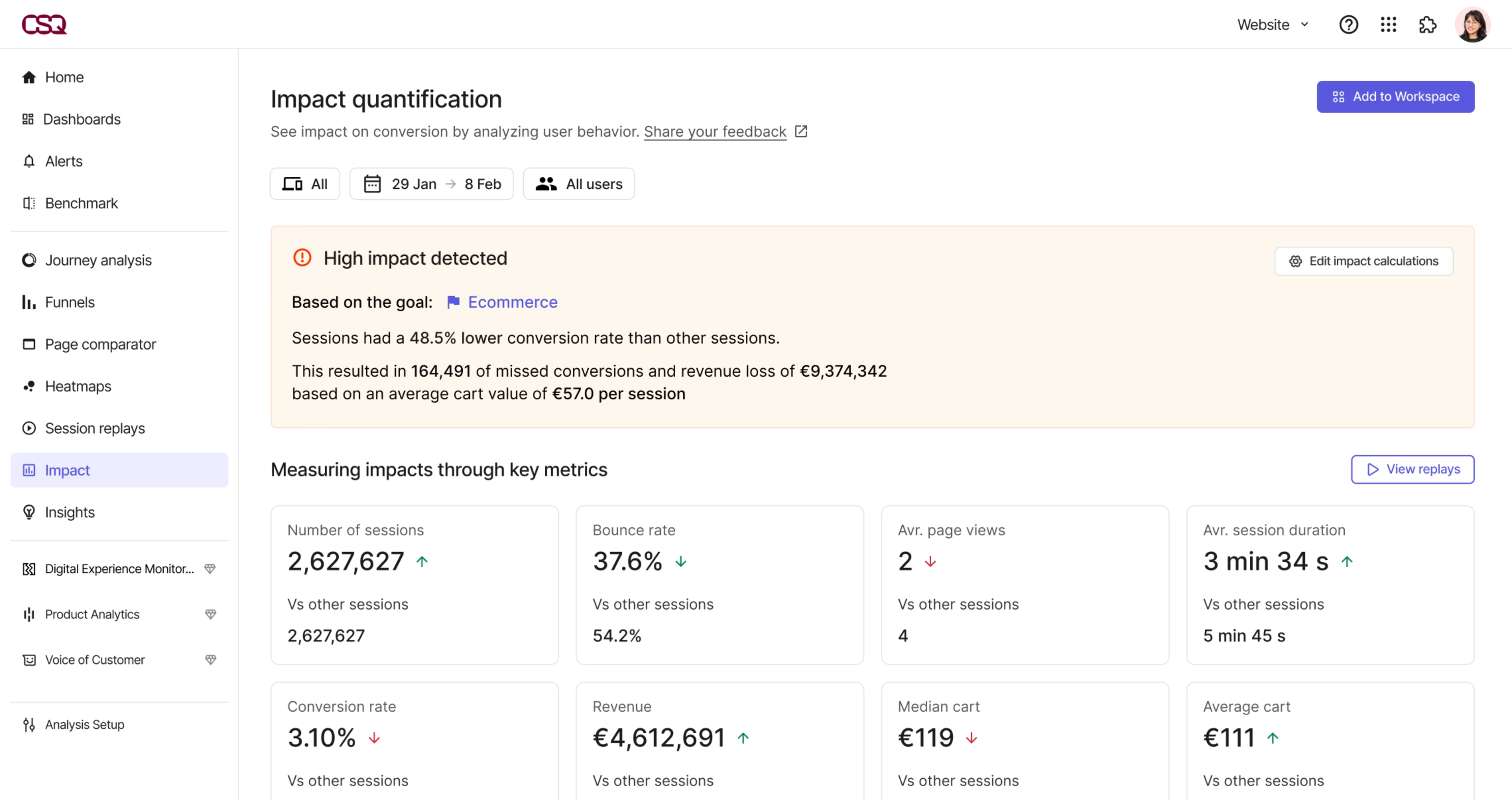
Impact Quantification helps you prioritize UX improvement strategies based on their effect on your ROI
Start improving your UX today
Better UX isn’t about perfection—it’s about progress. By making continuous, data-driven changes anchored in user behavior, you create a site that works harder for both your users and your business.
Contentsquare makes this process easy, combining big-picture and granular insights to help you make confident UX decisions and deliver higher ROI. Request a demo to see how our all-in-one platform enables you to deliver the seamless experiences your users expect.
FAQs about how to improve your UX
User experience (UX) is the way people feel when they interact with your website or product. It includes everything from how easy it is to navigate your site to whether real users can complete their tasks without frustration.
Good UX matters because it directly impacts your bottom line—sites with better user experiences typically see more conversions and more repeat visitors.
![[Visual] Contentsquare's Content Team](http://images.ctfassets.net/gwbpo1m641r7/3IVEUbRzFIoC9mf5EJ2qHY/f25ccd2131dfd63f5c63b5b92cc4ba20/Copy_of_Copy_of_BLOG-icp-8117438.jpeg?w=1920&q=100&fit=fill&fm=avif)