![[Stock] Analyse mobile](http://images.ctfassets.net/gwbpo1m641r7/7gmMbrNsaNsDLbLXdY98Kz/7be0c2c52fe689c4508a97f8321c8560/analyse-mobile-guide-complet.png?w=946&q=85&fit=scale&fm=avif)
Apps that don’t drive conversions fail fast; those that manage it flourish. Keep reading to find out how top brands optimize their app conversion rate—and how you can, too.
For app developers, conversions are very much the bottom line. If you fail to drive conversions, your app will sink fast under operational and promotional costs. Succeed, and your app will succeed.
In this article, we’ll share five ways to optimize your in-app design to encourage conversions—backed up by examples of how top brands like Uber Eats, ASOS and Hotels.com do it.
Excited? Us too.
But before we get to that, we need to briefly address the question of what an ‘app conversion’ actually is and what an app conversion rate should measure.
That might seem self-evident, but (as we’ll see) a ‘conversion’ can refer to many things, and knowing what it should mean for your app is an essential first step in conversion rate optimization.
What is an app conversion?
Your app conversion rate is based on the percentage of your app’s users who complete a desired action (an ‘app conversion’).
Broadly speaking, there are two types of app conversion that you can measure
App store conversions: The percentage of the visitors to your app’s web page downloaded or (if on Apple’s App Store, where apps can be downloaded via search) installed your app.
In-app conversion events: The percentage of your app users are performing a desired action (or series of actions) within your app.
App store conversions are relatively easy to measure and benchmark.
But it gets a little—okay, a lot—more complicated, when it comes to in-app conversion events.
While the most obvious conversion events that spring to mind are financial transactions (e.g. purchasing an item), there’s actually a multitude of actions you might want users to take, depending on what type of app you’re running.
So before you do anything else regarding your app conversion rate, you’ll need to define your conversion goals.
Here’s a few examples of conversion events you might target as part of your app conversion rate optimization strategy, depending on your industry.
mCommerce
Product viewed
Item added to cart
Checkout started/completed
Banking/Finserv
Log in completed (banking apps require log ins each time the app is opened)
Account opened
Check cashed
Media and content
Content viewed/shared
Subscription started
Comment made
Travel
Flight booked
Flight check in completed
Reward points used
Social
Invited friends
Posted content
Followed X number of accounts
Game
In-game item bought
In-app purchase made
Achievement earned
Once you’ve defined the conversion events you want to see more of, it’s time to generate as many of them as you can.
Here’s five tried and tested ways you can do that.
5 strategies for optimizing in-app conversions (and boosting your app conversion rate)
1. Get new users onboarded and ready to convert (fast)
Whatever your conversion goals are, your first priority should be making sure new users stick around long enough to convert.
This means teaching them both why and how to use your app with an effective app onboarding process.
A balance needs to be struck here between showing new users why and how to convert, and ensuring your onboarding process doesn’t become an overlong obstacle to use—and to conversion.
For tips on how to strike that balance, and to optimize your onboarding process in general, check out our article on app onboarding.
2. Make app navigation a (flexible) pathway to conversion
Clear, intuitive navigation is critical to providing your users with a slick, seamless and satisfying experience. But it’s also critical for providing pathways to conversion.
The developers of food delivery app Uber Eats clearly know all about using navigation as a tool to encourage conversion (while never neglecting to give users the freedom to find what they want in their own way).
This starts with the app’s homescreen, which is set up to encourage users to convert from the moment they fire up the app.
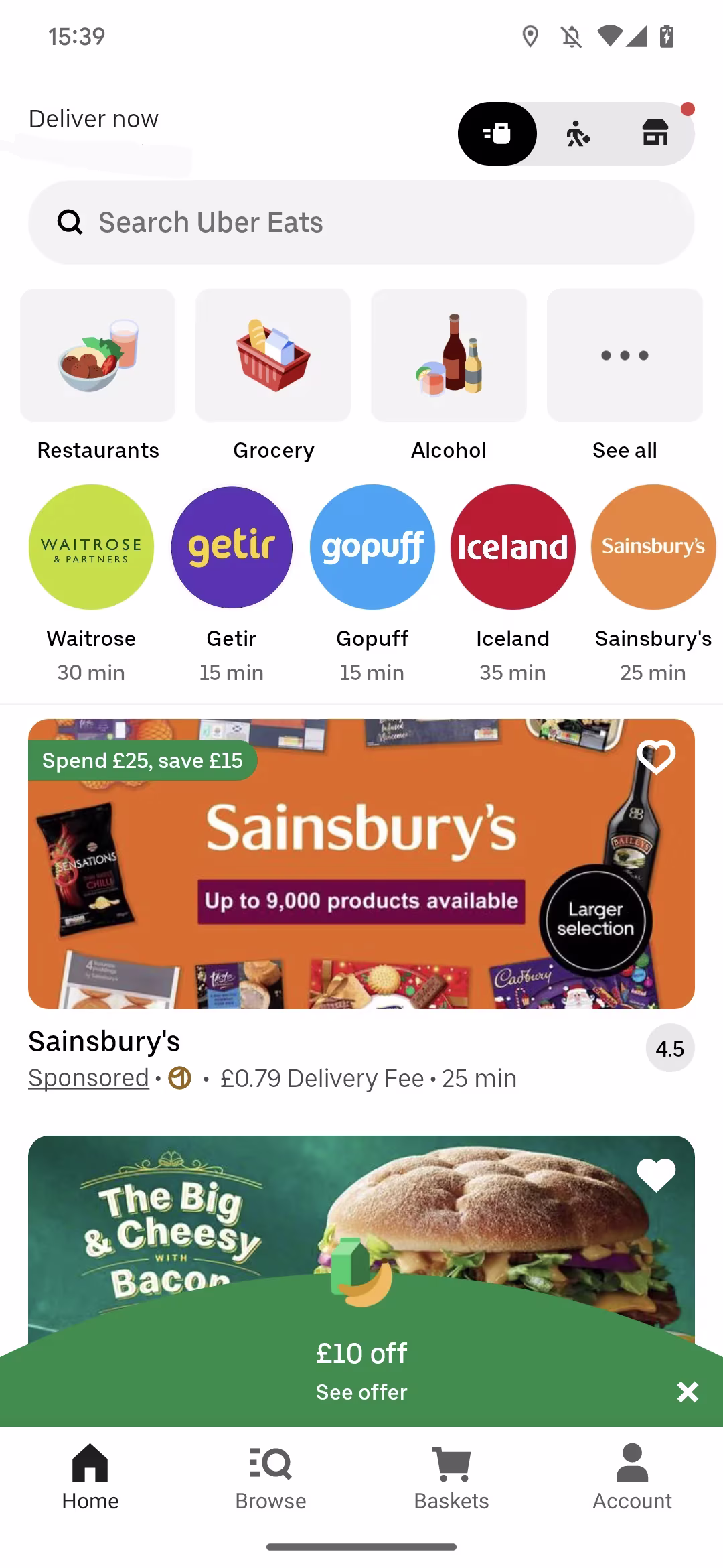
Notice how users are offered a discount deal (in the form of an eye-catching pop up) and served a sponsored ad that offers another deal.
Users can also easily find and dive into popular categories and brands, with estimated delivery times that signal to them they won’t have long to wait once they’ve ordered.
Giving users the option to filter is essential, as it provides a fast lane to conversions, helping users eliminate what they don’t want and focus on what they do want.
Your app’s search function should play a role in enabling users to find exactly what they want so they can convert. It should always be accessible, and it should use filtering, autocomplete and suggestions to make searching as easy as possible.
For example, if Uber Eats users are looking for ‘Thai’ food, they won’t find it in the app’s most popular categories page.
Options are limited to the size of the user’s phone screen. This is good design: it discourages the user from scrolling down a longer list and (potentially) becoming paralyzed with choice.
The last navigational element we’ll look at here is the Uber Eats app’s menu bar.
This bar remains sticky and within easy reach at the bottom of the screen throughout most of the app experience, so users don’t have to cycle back to get out of a category.
However, there is a notable exception: When the user has selected a specific restaurant (or grocery store), the menu bar at the bottom disappears, as shown in the screenshot below:
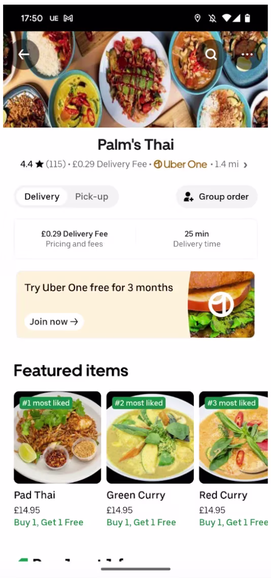
The app’s developers know that most users who end up on this screen have shown a high level of intent, and are therefore highly likely to order from this restaurant.
Removing the menu bar at the bottom subtly helps focus their attention on items to add to their basket, and nudges them forward, in the direction of checkout.
3. Make your PDPs ROI machines
Assuming your app has products to sell, one of your prime conversion goals will undoubtedly be to get app users to add items to their basket.
Product description pages (or PDPs) are, therefore, a clear and crucial inflection point for conversion.
Let’s look at how fashion and cosmetics retailer ASOS pushes and enables conversions through its PDPs.
The screenshot below immediately points us to a couple of ways you can optimize your PDPs.
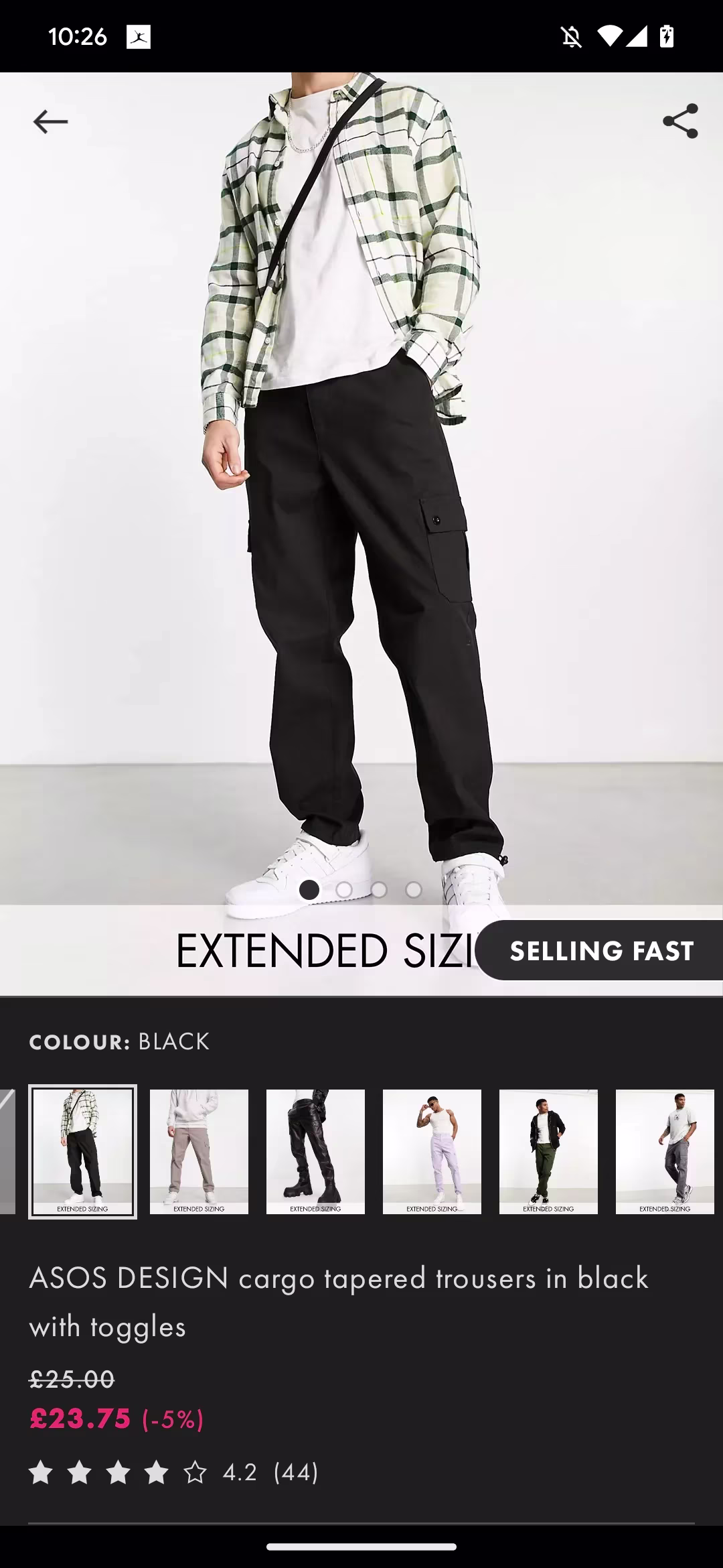
Firstly, that little “selling fast” label subtly emphasizes how popular these cargo pants are and makes users feel they have to act fast to secure themselves a pair.
Secondly, users are immediately offered alternative products in the form of a carousel of alternative colorways. If they scroll down they’re offered more alternatives, in the form of “You might also like”, “People also bought” and “Style it with” carousels.
PDPs should always provide users with alternatives, so users who decide they’re not interested in a product can keep browsing, rather than backing out or exiting your app entirely.
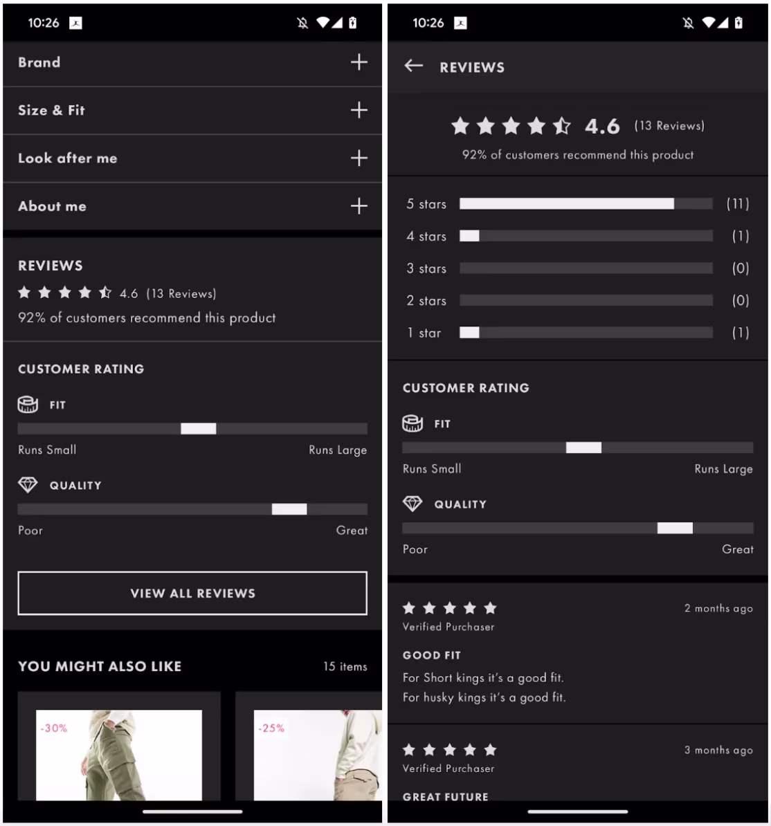
Thirdly, there’s a star rating above the scroll. User reviews give instant credibility to a product (assuming the reviews are good!), so you should always include a star rating like this as far up the screen as possible.
Nowadays, customers are going to look for reviews of products before they buy them, so you might as well make it easy for them to find without having to leave your app.
Take a leaf out of ASOS’s book and make it easy for them by jumping those who tap on the star rating down to a user review section, with the option of expanding to read reviews in detail.
4. Make your checkout a knockout
Clearly, users who reach your app’s checkout screen have a high propensity to convert.
But they might still need or benefit from a little more persuasion, and could be dissuaded by an overly complicated and/or inflexible process.
Your mission here (and you should choose to accept it) is to make it super easy for your users to check (and change) their order, enter their payment and shipping details, and pay in whatever way suits them.
The Hotels.com app has an effective checkout screen—although there is arguably some room for improvement.
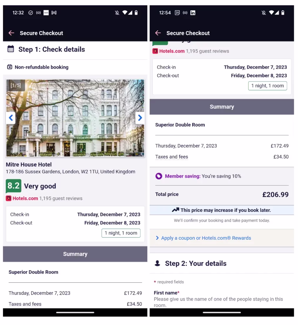
First thing to note here is that users can cycle through photos of the hotel they’re booking without having to back out.
This helps reinforce their decision (while giving them the information they need to reverse it)—as does the highlighting of the average customer rating.
Notice, also, that once they’ve scrolled down to the order summary, they can apply a coupon code or reward to get a discount.
For reasons best known to the app’s developers, users can’t edit their order (specifically the dates) via the checkout screen. If you can make this possible, you should, as it keeps users on the threshold of conversion rather than backing out.
Once we get to the payment section of the checkout screen, you’ll see that the app’s users can select a wide range of payment options—though not, for some reason, Google and Apple Pay services.
We don’t know why Hotels.com doesn’t provide this option. However, since both services are among the most convenient payment options for hundreds of millions of smartphone users out there, it might be wise to enable them on your app.
5. Maximize engagement, minimize frustration
The four previous tips have focused on specific screens and stages of the app experience, but our fifth tip is a principle that you should apply everywhere you can. (In fact, we’ve seen examples of its application throughout the other points we’ve covered.)
Put simply, engaging experiences drive conversions and frustrating experiences impede them—particularly buggy experiences that cause crashes.
For tips on making your app more engaging and less frustrating, you should read our articles on maximizing app engagement and reducing app crashes immediately.
Smash your app conversion rate goals with Contentsquare
To effectively apply the design principles we’ve just shared (and to drive conversions via your app in general) you need to measure not just in-app conversions, but every aspect of your in-app experience.
And traditional, quantitative analytics will fall short here.
Yes: A traditional analytics platform will give you a high-level overview of your app’s metrics (including conversion at the most general level).
No: It won’t give you the deep, contextual insights into those metrics, and the behavior behind those metrics—that you need to understand why those metrics are at the level they are.
To truly understand where and how your app experience is helping and hindering conversions, you need a digital experience analytics solution.
A growing number of top brands would recommend Mobile Analytics.
To see why, you should book a demo right away.
![[Visual] Jack Law](http://images.ctfassets.net/gwbpo1m641r7/6K99ulcVqLqKGyNZUaPiF8/145af0b27131005d862c790ddcafb3c5/Jack_Law.jpg?w=1280&q=85&fit=scale&fm=avif)