Scott Adams, the creator of the Dilbert comic strip, has spent the past 30 years making fun of inefficiency in business—including our efforts to reduce inefficiency.

The truth is, it’s hard to get everyone on the same page in any organization, big or small. That’s why Doodle, a Software-as-a-Service (SaaS) company with just over 50 employees and 250 million active users, turned to Lean UX to improve its products in an efficient, evidence-based, customer-centric way. In other words, Lean UX principles help Doodle’s product teams make the changes their customers want in a smart, efficient way, so they can grow faster and boost their bottom line.
We sat down with Jack Berglund, Chief Product Officer at Doodle, to talk about his product development strategy. He was very transparent, so if you’re looking for a real-life example of how to use Lean UX for digital product design, you’ve come to the right place.
Lean UX case study: what is Doodle and who is Jack Berglund?
Doodle is an online tool that helps people schedule meetings more efficiently. It syncs with all the major calendaring systems (Google, Outlook, Apple’s iCal, etc.), and it lets users poll meeting invitees to find a time that works for everyone.
Founded in 2007, Doodle is headquartered in Zurich with offices in Berlin, Tel Aviv, Israel, and Belgrade. Today, more than 250 million people use Doodle each year, and it’s available in more than 25 languages.
As Doodle’s Chief Product Officer, Jack Berglund uses Lean UX to guide agile, cross-functional teams to develop products that customers love.
Does that sound a little too jargon-heavy? Don’t worry, we’ll unpack it all for you… and we promise it won’t sound so much like a Dilbert cartoon by the time we’re done.

What is Lean UX?
Lean user experience (UX) design is a user-centered design process that embraces Lean and Agile development methodologies to reduce waste and build products centered around the users. Lean user experience design relies on a collaborative approach and rapid experimentation/prototyping, to get user feedback by exposing a minimum viable product (MVP) to users as early as possible.
The Lean UX process grew out of earlier process management systems like Lean Manufacturing, which has been used by major companies (such as Intel, Nike, Toyota, and Ford) to eliminate waste in production. Lean UX took principles originally designed for physical products and adapted them for software development.
What makes software production different? For one thing, you don’t have to follow the old “measure twice, cut once” idea. Instead, your Agile product teams (which are composed of experts from different departments) can come up with ideas, test them out quickly, and revise them based on customer responses and usability.
As Jeff Gothelf puts it in Lean UX: Designing Great Products with Agile Teams, “You can measure once, cut once, measure once, cut once, measure once, cut once, forever.” That’s the luxury that SaaS and e-commerce product design teams have. Since they work in a virtual space, they just don’t have the same physical restrictions to user experience design as Toyota or Nike.
How so? If you’re Toyota, you can’t try out five different steering wheels in one month to see which one improves the customer experience. But if you’re Doodle, you can add a new checkbox to the 'Make a Poll' product, see if it gets any use, and tweak it accordingly.
Lean UX in action: Doodle saw a 54% increase in the number of free trial signups by changing the language on their homepage to focus on business use cases, which was a greater increase than expected.
3 phases of lean UX: think, make, check
In the Lean UX model, product teams are usually made up of members from different departments (e.g., engineers, product managers, UX designers). Each team works to improve a specific product by focusing on improving processes that cycle through three phases: Think, Make, and Check.
1. Think
Teams brainstorm possible areas for improvement based on customer feedback, customer research, competitor comparisons, and observing their product in use. They develop a problem statement and then decide which areas they want to improve.
2. Make
Designers and developers build a new feature that will (hopefully) solve a problem and/or improve the product.
3. Check
Product teams test the new feature, using tools like UX surveys and A/B testing, to figure out whether their hypothesis is correct. If customers respond well to the new feature, it becomes part of the new design. If it doesn’t improve the customer experience, they return to the Think phase and try something new.
Lean UX development process at Doodle
The Doodle team uses Lean UX to anticipate their users’ needs. This design-thinking approach allows them to build cutting-edge products their customers will gladly pay for, and keeps them one step ahead of the competition.
They have five product teams, and each team is usually composed of at least one product manager, one product designer, and a collection of engineers—possibly including data scientists or data engineers, as needed.
The idea is to create a cross-functional team (meaning, teams from different departments) who come together to work on specific product improvements (such as Doodle’s 'MeetMe' product, Polls, etc.). Each team has a slightly different makeup depending on the product they manage.
Lean UX in action: Doodle tested out a new calendar invite feature that put the agreed-upon meeting time in all attendees’ calendars, and 40% of their customers used the first version of this feature. This demonstrated how strong the demand was for the feature, and gave the team a clear sense of where to go next because there was already plenty of room for improvement on that initial version.
What does the lean UX process begin with? Here’s how Doodle approaches their Think, Make, Check phases:
Step 1: the thinking phase at Doodle
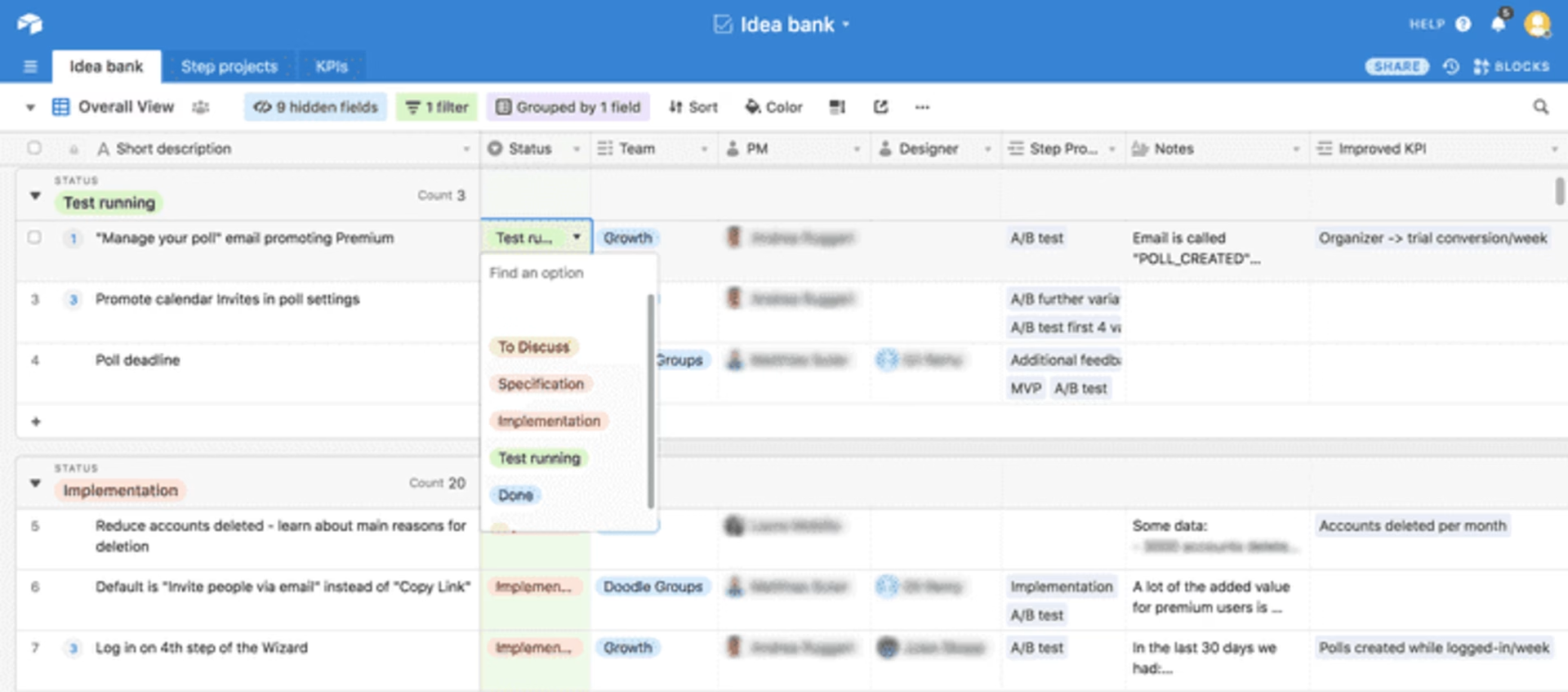
Doodle uses Airtable to maintain their 'idea bank,' a collection of all ideas submitted for improvement.

Doodle uses Airtable to collect and prioritize ideas.
“We use the idea bank to capture all ideas, wherever they come from. Even if we think they're terrible ideas, we still write them down, and that serves two purposes. One, we want the person who made the suggestion to know that it's been captured and it's up for consideration. Two, we do this because what might not be a great idea now, for whatever reason, might become a great idea in the future.” - Jack Berglund - Chief Product Officer, Doodle
Of course, ideas don’t come out of thin air! The product teams at Doodle use the following tools to gather qualitative research from their customers and capture ideas for product improvement.
3 Lean UX tools Doodle uses to find areas for improvement
Google Analytics: “Google Analytics is a good source for us in terms of user behavior within the product,” says Jack. Doodle uses Google Analytics for cohort analysis, which is all about breaking users down into groups (cohorts) and studying the behavior of each group. For example, Doodle can tell whether a user who connected through their Calendar Connect product is retained better than those who have not. They have their own data warehouse to complement this information. Note that they could do the same, and more, with Contentsquare’s Product Analytics!
Desk.com: Desk.com, a Salesforce product, allows customer success (CS) to tag different types of issues that arise. “For obvious bugs,” Jack says, “it’s a bit easier: if something isn’t working the way it’s supposed to, it’s pretty obvious that you need to fix it. Where it becomes more complicated is when you receive input, either from research or CS, that speaks to something that isn’t so black and white, like a feature we could add down the line. At that point, it goes from an engineering/problem-solving matter to a question of prioritizing and using your judgment,” he says.
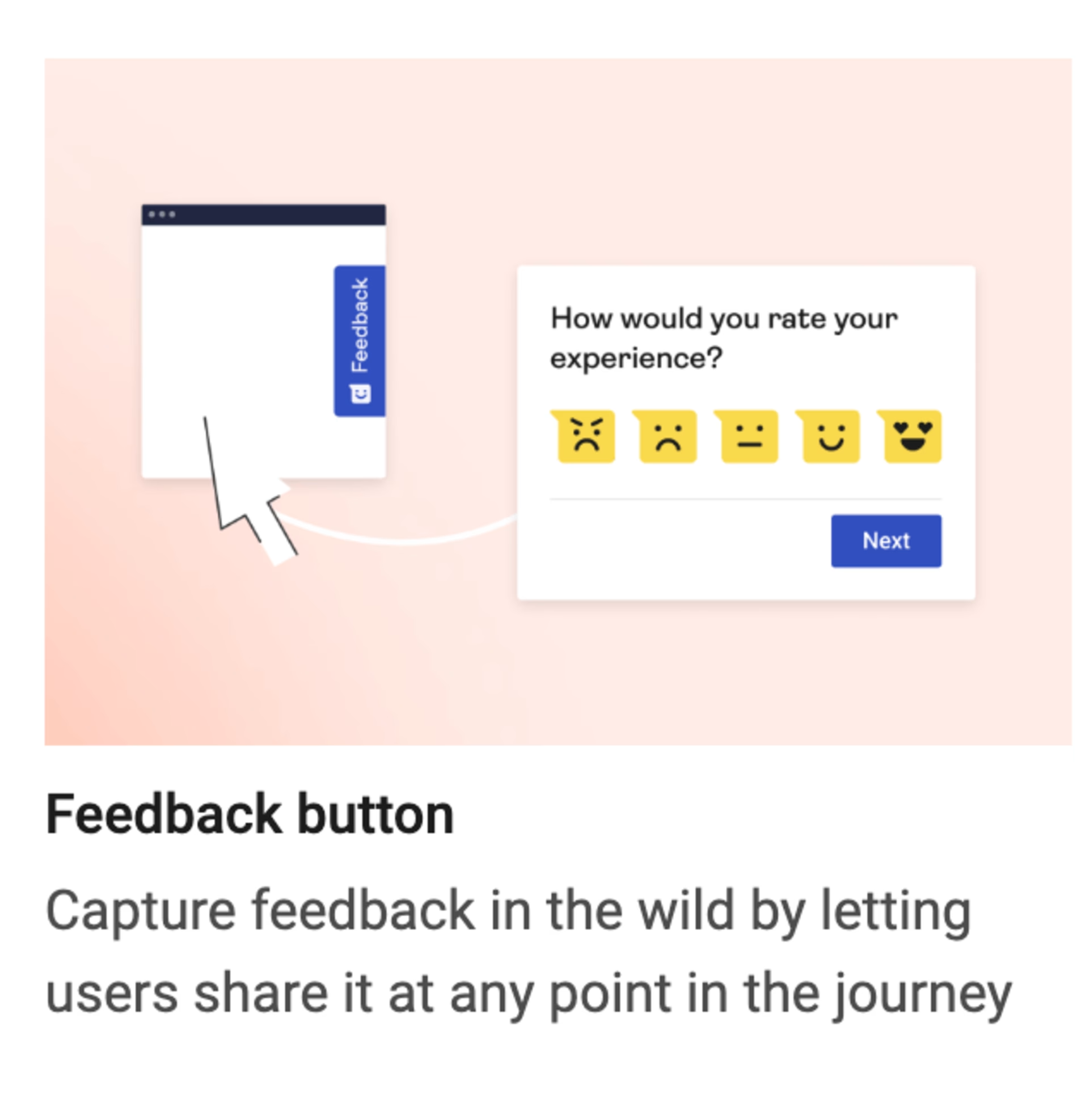
Voice of customer (VoC) software: Doodle uses a user feedback collection tool to have users rate their level of satisfaction and describe their experience using website feedback. If the customers provide an email address, someone responds. “However,” Jack says, “even the anonymous feedback can be helpful.”

Put a Contentsquare feedback button on any page of your website to check in with users about their experience.
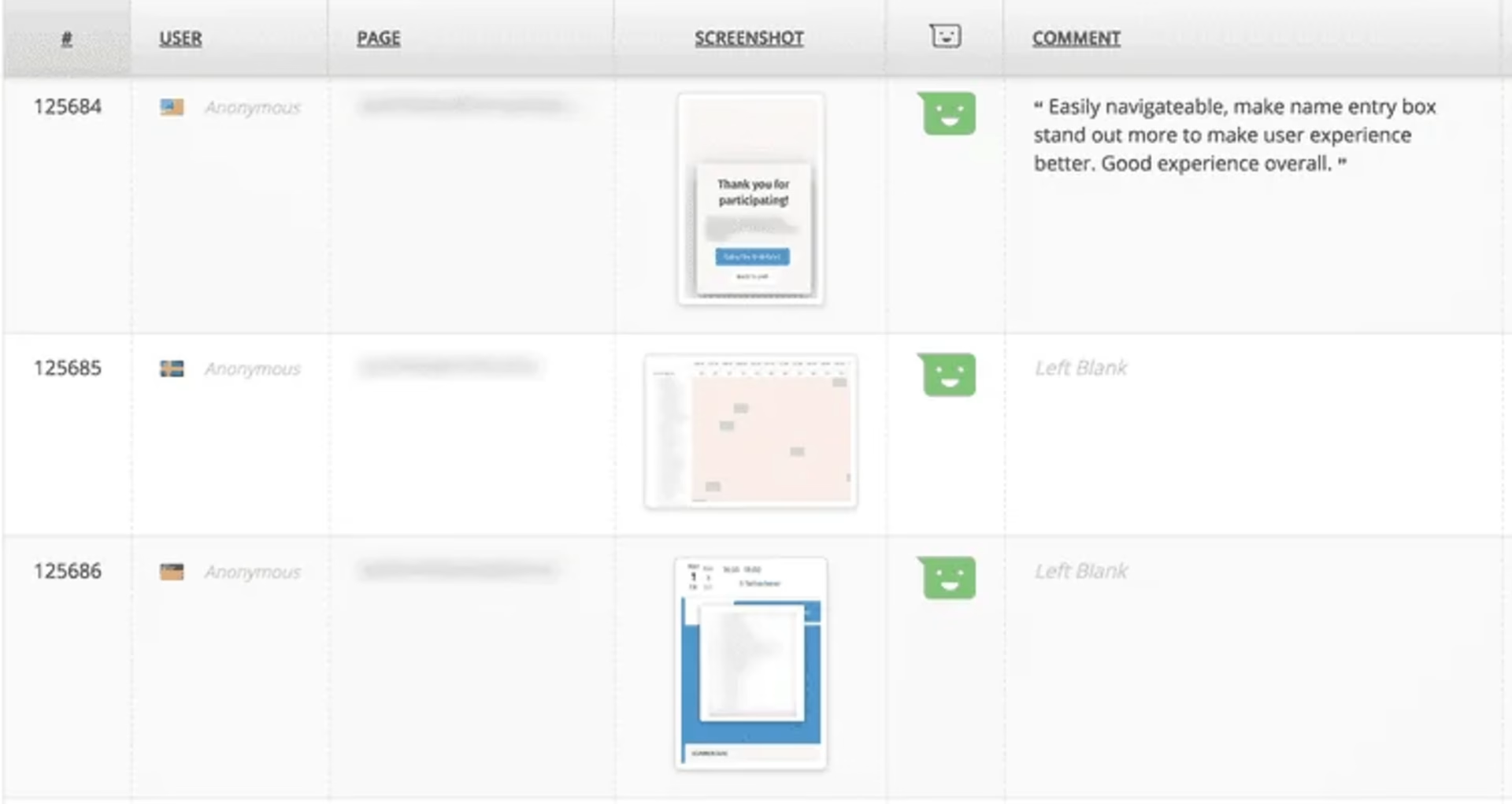
Doodle collects feedback from different types of users, segmenting the data according to each group. In particular, they want to know which product the respondents are using (e.g., MeetMe, Polls), whether they are the ones who created the poll or simply participated in it, and whether they’re using the paid version of the product.
Product managers and product designers read the replies and look for patterns.

Doodle collects feedback from users at scale and in context.
Categorizing projects according to goals
Once they submit ideas, Doodle’s project teams categorize each one based on the goals they want to achieve, and those goals are grouped into objectives and key results (OKRs). OKRs, in short, describe big-picture objectives, such as “convert more users after the trial ends.” To learn more about organizing by OKRs, take a look at this article by Jeff Gothelf (the author of Lean UX, mentioned above).
Doodle uses OKRs to identify larger goals. Then they break their OKRs down to identify the smaller goals that will hopefully help them achieve their objectives. For example, the “convert more users after the trial period ends” objective might be achieved by encouraging users to create more polls since Doodle’s research shows that users who create polls are more likely to convert.
Therefore, “get users to create a poll during the trial period” could become a key result, and that KR would fall under the “convert more users” objective.
As the team captures more ideas, they tag them according to the appropriate OKR. Then, when they discuss plans for reaching those goals, they can use Airtable to filter the results, only showing those that relate to certain objectives and key results.
Idea generation and problem-solving: a tale of two meetings
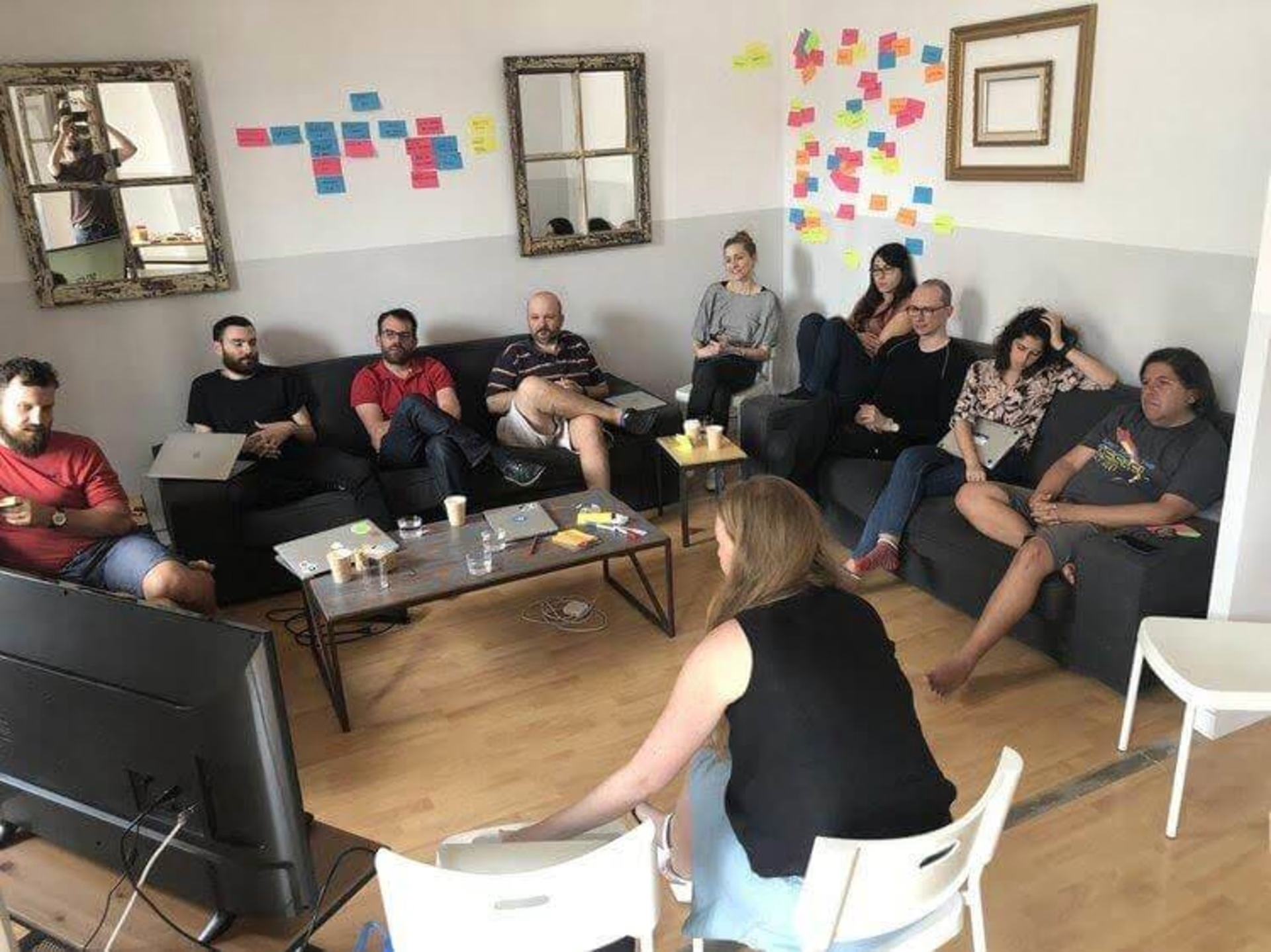
In the beginning, the product teams would brainstorm new ideas and discuss the progress they’d made on current projects at one meeting, but that got confusing.
These days, they have two separate meetings: one for brainstorming and generating new ideas (monthly), and the other. for discussing their progress on current projects (weekly).
“To get a balance there, we have two different versions of the same meeting. One is weekly, where we go through the stuff we're working on, making sure that it's progressing. And then there’s a separate meeting where we generate ideas and talk about what we want to do next.”
Jack Berglund
Chief Product Officer, Doodle
Step 2: the make phase at Doodle
In the make phase, a team of designers and developers builds a new feature to address previously highlighted problems and/or improve the product. But when ideas abound, as is likely to be the case, a crucial step is choosing what to build first.
How Doodle prioritizes projects
During the monthly meetings, whoever owns or champions an idea gives a 60-second talk about the idea, the data related to it, and how they might approach it as an improvement project. After the team reviews all new ideas they take a vote, pick the two or three most promising ideas, set deliverables, and really dive into them. The best ideas get added to the list of active projects.
The ICE framework
Doodle uses a system called ICE, designed by Sean Ellis. ICE stands for Impact, Certainty, and Effort, and potential projects are evaluated on these qualities. Here’s what the ideal project would look like in the ICE model:
Impact (on user experience): High
Certainty (whether it will work): High
Effort (what it would take to make the change and test it): Low
Of course, most projects aren’t so straightforward. Jack says, “There are ones where you say, ‘Look, the effort is significant. We think the impact is high, but we're not completely sure.’ In that case, before we spend that full effort, we see if there’s something simpler we can work on.”
Jack stressed that they don’t take anything for granted when they assess certainty. If the idea’s champion thinks it’s a great project to work on, that counts for .01 on a certainty scale of 0 to 10. If the stakeholders love the idea and think it’s brilliant, that might bump you up another 0.1, but you’re still a long way from a 1, much less a 10.

The Doodle team prioritizes ideas using the ICE framework.
“What I really like about this approach,” he concludes, “is that it pushes us to do the necessary things to validate our ideas.” Whether it’s asking very specific questions to customers, bringing out specific data, or doing more A/B tests (see below), this framework allows Jack and his teams to save a lot of time down the line and make sure that all the work they are doing counts. That said, the ICE model isn’t a rigid scoring system. It’s a simple tool that gives you a rough idea of what to prioritize.
Step 3: the check phase at Doodle
Lean UX doesn’t rely on gut feel to decide whether a change has been successful, and neither does Jack Berglund. The teams at Doodle test their changes to see how users respond and later refine their approach accordingly.
A/B tests
If you have a lot of traffic to your website, A/B tests (or split tests) are a great way to validate your hypotheses scientifically and determine if the changes you made are working. Once you’ve got that result, you can go ahead and implement the changes confidently.
“We have a good amount of traffic, so we can do a lot of A/B testing. And if we're smart about the tests we run, we can save ourselves a lot of time by not implementing things that are basically low confidence,” says Jack.
Example #1: An 800% increase in the use of a feature
Sometimes the results can be surprising—like, “an eight-fold increase in feature use” surprising. When users create a poll, which they send to meeting invitees to determine which date works best for everyone, they can add a “Yes, if need be” option. This allows invitees to select their preferred date (a green checkmark) along with any dates that are less than ideal but would still work (a yellow checkmark).
Originally, this was an advanced option, meaning that it didn’t pop up in the 'Make a Poll' wizard that the average user sees. The product team assumed most users wouldn’t be interested in that feature, but they questioned their assumptions and tested it out by adding it to the wizard as a checkbox.
The result? They saw an 800% increase in the use of that feature. Who knew?
Example #2: The fake door that got them nowhere
Jack shared a cautionary tale—the story of a time they set out to study a problem with A/B testing but ended up studying the wrong thing. They didn’t get the information they needed to move to the next steps, but they learned a valuable lesson.
Doodle wanted to see whether having a 'Poll Deadline' button, which allowed poll creators to set a deadline for respondents to reply, would get any traction. They set up a fake door, which is a button that offers a feature that isn’t actually available, so the UX team can see whether people will use it before spending the time and money to develop it. When users click on a fake door, they receive a message telling them: “Sorry! This feature is not yet available.”
Doodle showed the fake door to a portion of their users, and people clicked, but the team soon realized they had no way of knowing how useful the feature would be to their clients. Sure, they got plenty of clicks… but was the button valuable enough to influence buying behavior? Would it increase conversions? They couldn't tell from this A/B test.
To answer that question, Doodle went back to the drawing board. They’re currently planning to run a test that measures how likely this feature is to influence a user’s decision to start a free trial, which is a more complicated and business-focused question than whether or not a user will click.
“The core lesson is that we need to measure behavior change that demonstrates real value to the user.” - Jack Berglund - Chief Product Officer, Doodle
By designing smart, strategic A/B tests that answer basic questions about buying behavior, the teams at Doodle can prioritize their tasks and focus on those that offer a greater return.
Starbucks tests
It’s not always practical to do A/B testing, even when you have a ton of traffic, because sometimes you need to move quickly to see if an idea is worth looking into at all. You can always do more structured testing later if an idea shows promise after ‘guerilla testing’ it (an idea that Jeff Gothelf introduces in Lean UX).
Guerilla tests are ‘quick and dirty’ user tests that give you a sense of how your ideal users might respond. Much like focus groups, which advertising agencies have been using for more than 70 years, guerilla testing gives you quick feedback when you need it.
Since Doodle has 250 million users (that’s the population of Indonesia, by the way), and since many of these users are similar to people the Doodle team members rub shoulders with at their local Starbucks, they like to use Starbucks for guerilla testing new features. They go down to the Starbucks near their office and offer people a voucher for a free cup of coffee to test out new features.
Starbucks testing is just one form of anecdotal feedback they use. Doodle also goes to customers, employees (including marketers), and product management stakeholders to get their input.
The guerrilla testing approach of Lean UX works better for SaaS and eCommerce than it does for companies that build physical products because, again, you can make changes quickly and reverse them if they don’t work. And in many ways, that points to the basic difference between Lean manufacturing and Lean UX.
Lean UX is all about agility, experimentation, testing, and reassessing in a continuous cycle. It has allowed companies like Doodle to scale to 250 million active users—and it’s helped them thrive in a competitive market.
Lean UX in Action: Doodle had the 'Settings' page automatically appear as the third step in their poll creation wizard, which increased the number of free trial signups by 25%, boosted the use of their 'Ask Attendees for Contact Information' option by 300%, and increased the use of the 'Hidden Polls' feature (which allows the creator to keep poll results hidden) by 400%.
Lean UX: a simple roadmap to get started
If you were inspired by Jack's story or simply want to give Lean UX a try in your own business, here is a simple three-step roadmap to get started:
Step 1: think phase
Gather customer feedback using tools like Contentsquare’s Voice of Customer and review insights from your customer success or sales team.
Process this info in an idea bank using a simple spreadsheet or a tool like Airtable.
Step 2: make phase
Set up a meeting to prioritize projects according to their Impact, Certainty, and Effort (keeping in mind that certainty is determined by facts, not stakeholder opinions).
Step 3: check phase
Use guerilla testing to get quick feedback where appropriate.
Use A/B testing—if your traffic is large enough—to get scientifically valid results.
FAQs about lean UX
Agile and lean UX involves applying the principles of these methodologies to the sphere of UX. Agile and Lean both focus on creating quick iterations of products and features, testing them with users, and creating a tight feedback loop between users and product teams as they iterate in the future.

![[Visual] Contentsquare's Content Team](http://images.ctfassets.net/gwbpo1m641r7/3IVEUbRzFIoC9mf5EJ2qHY/f25ccd2131dfd63f5c63b5b92cc4ba20/Copy_of_Copy_of_BLOG-icp-8117438.jpeg?w=1920&q=100&fit=fill&fm=avif)