User interface and website design are at the forefront of improving user experience (UX). When users have smooth, positive interactions with your site, they’re more likely to stick around—and convert.
In this guide, we’ll show you 10 strategies to improve your website’s UX. Then, we dive into four action-oriented tips to boost conversions, as well as a look at why your user experience and user interface matter.
10 strategic techniques to improve user experience
User experience plays a pivotal role in driving user engagement and customer satisfaction. Here are 10 ways to improve your UX:
Simplify the design: Keep the design clean and minimalistic to avoid overwhelming users. Use white space effectively and ensure that the interface is intuitive and easy to navigate.
Optimize website speed: Slow-loading websites can lead to frustration and high bounce rates. Optimize the website’s performance by compressing images, minifying code, and utilizing caching techniques.
Enhance mobile responsiveness: With the increasing use of mobile devices, make sure your website is fully responsive and provides a seamless experience across different screen sizes.
Improve website accessibility: Make your website accessible to all users, including those with disabilities. Follow accessibility guidelines, such as providing alternative text for images and ensuring keyboard navigation.
Conduct user research: Gain insights into your target audience by conducting user research. Understand their needs, preferences, and pain points to tailor the user experience accordingly.
Implement intuitive navigation: Design a clear and logical navigation structure that allows users to easily find what they need. Use descriptive labels and organize content in a hierarchical manner.
Provide relevant and engaging content: Deliver high-quality and relevant content that aligns with your target audience’s interests and needs. Use visuals, videos, and interactive elements to make the content more engaging.
Incorporate social proof: Build trust and credibility by incorporating social proof, such as customer testimonials, reviews, and ratings. This can help users make informed decisions and feel more confident in their interactions with your brand.
Implement a user-friendly checkout process: If you have an ecommerce website, optimize the checkout process to be smooth and intuitive. Minimize the number of steps required and offer guest checkout options.
Continuously test and iterate: Regularly test your website’s usability and gather feedback from users. Use tools like A/B testing to identify areas for improvement and make iterative changes to enhance the user experience. By implementing these strategies and techniques, you can create a positive user experience that will not only satisfy your users but also drive business growth and success.
4 user experience tips to boost conversions
Here are some content-oriented tips to ensure the foundation of your lead-generation experience is headed in the right direction.
🚀 Improve conversion rate by ensuring CTAs are consistent and noticeable
CTAs that lead to the same form or site page should be styled consistently, both in color and copy. Use specific CTA copy to help users understand exactly what to expect. For example, are they being directed to contact someone or to view another informational page? Make sure you clearly tell the user.
Using generic wording too frequently with the same style of CTA can confuse users, leading to a lack of context which doesn’t help instill confidence. On the other hand, CTAs that lead to different types of experience should be differentiated. For example, contacting Sales and Support should be presented differently.
If you have multiple CTAs that lead to different actions or pages, make sure to prioritize them efficiently—especially when placed alongside each other. Use button-styled CTAs for primary actions, and text links or ‘ghost’ CTAs (buttons with no solid fill color) for secondary CTAs. The level or lack of color and size can help determine their priority.

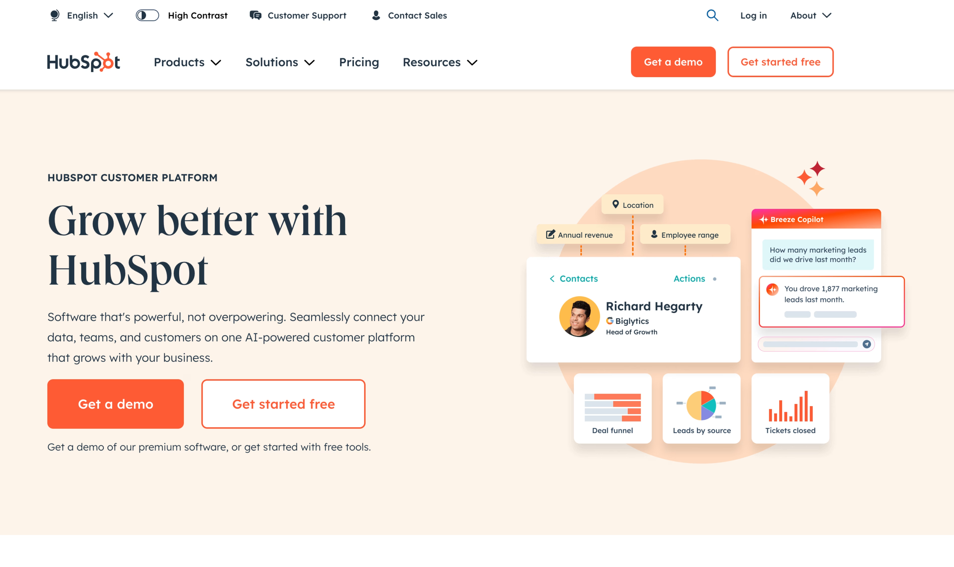
All CTAs in this example labeled ‘Get started’ are styled in the same color and font. The size varies based on its placement.

The primary CTA has a fill color of green and is placed on the left, while the secondary CTA uses a simple border and is placed on the right. A tertiary action is a simple text link at the bottom of the viewport. All CTAs describe the action that will be triggered.
📌 Provide a ‘softer’ action in addition to the primary CTA
If you only offer one CTA, users who are not ready to commit to the ‘ideal’ conversion may not take any action at all. Instead, providing a secondary action that’s informative, valuable, and assists them during the research phase can help nurture them until they’re ready to buy.
Improve your conversion rate metric by understanding the likelihood of interaction or conversion between primary and secondary CTAs. Does this differ between new and returning users?

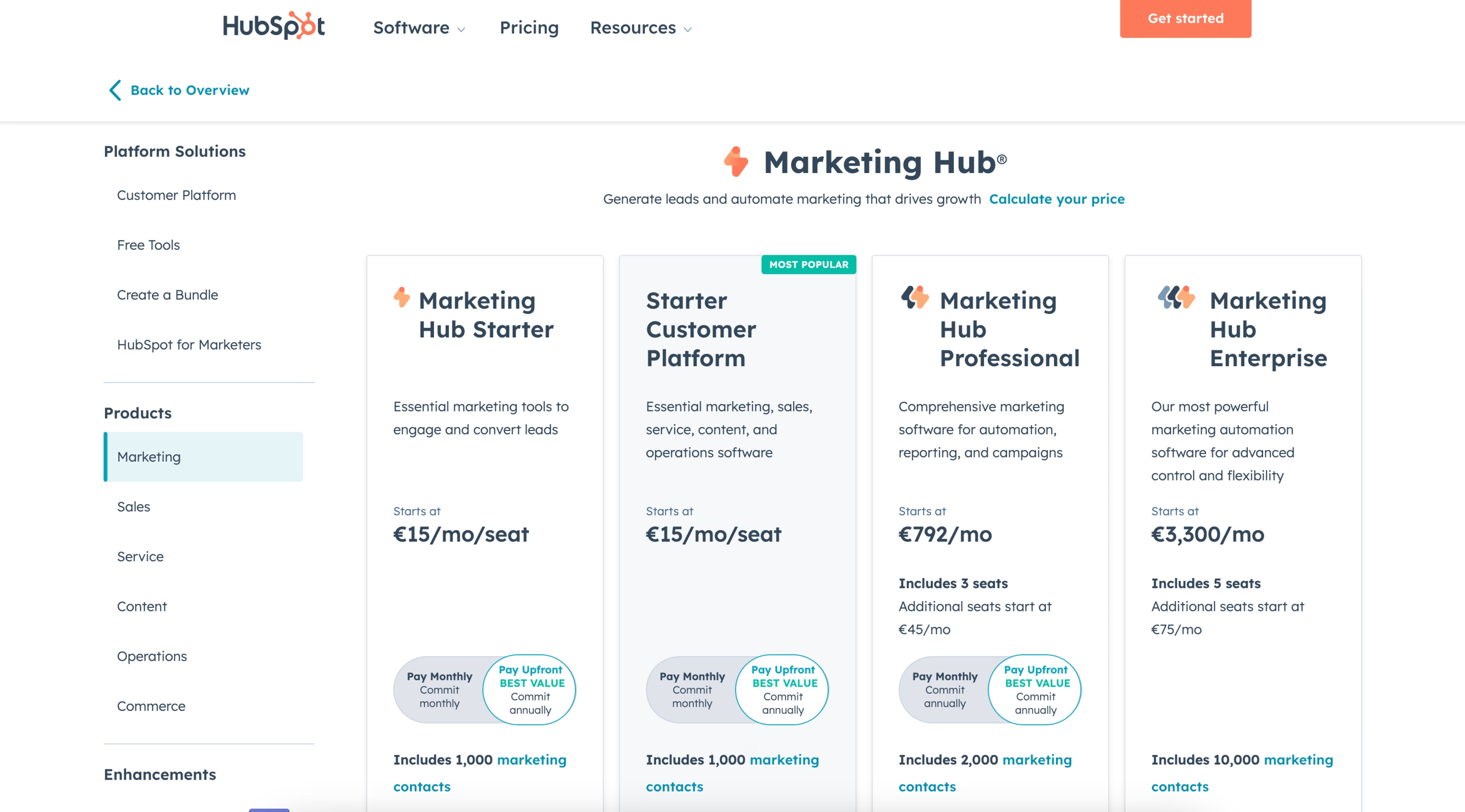
A user gets the option to sign up immediately or receive a demo instead, catering to users who aren’t ready to convert. The softer action does not use a fill color to avoid overpowering the main CTA. Both CTAs use specific copy to let users know exactly what to expect.

The user can watch a product demo video if they’re not ready to commit to a trial or purchase.
💡 Gate valuable content and insights without disrupting the experience
Users are much more likely to provide contact information in exchange for helpful content. Although not directly related to purchasing or trialing a product, it builds credibility and trust between the audience and brand.
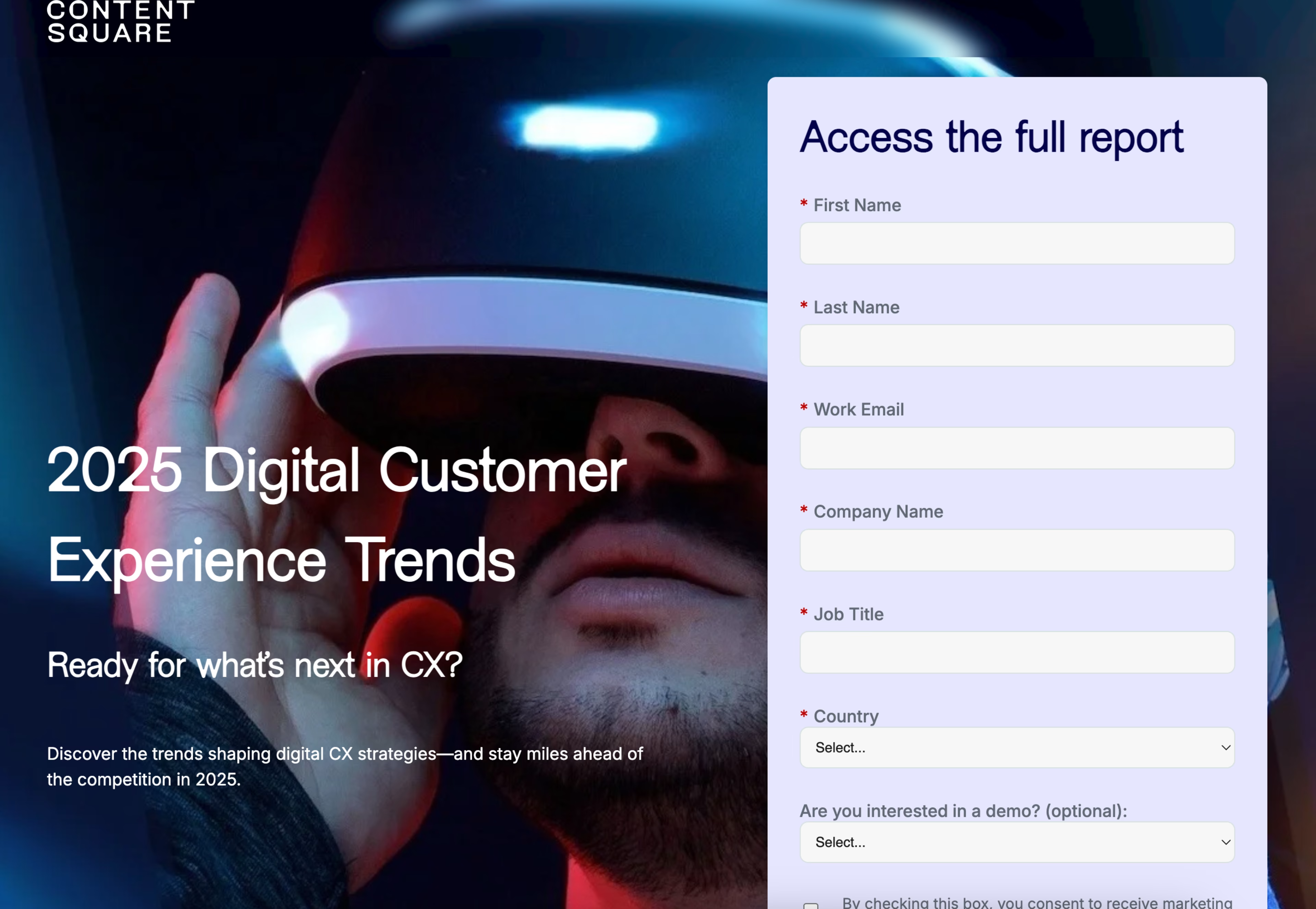
To avoid disrupting the experience, surface a modal rather than directing users to a new page to fill out a form to view content. Depending on the content, avoid asking for too much information as this can be a deterrent for users.
You can use Contentsquare’s Form Analysis to understand what percentage of users left the form without interacting, or how many fields users filled before submitting to better understand what users are willing to fill out. You can also use Form Analysis to identify which fields are causing users to drop off or are difficult to complete.
With this information, you can optimize your forms to ensure users complete them quickly and easily.

The download form appears in a modal rather than redirecting the user to a new page. It is easily removable and a dark overlay is placed behind to focus the user on the form.
🎨 Visualize important concepts and products as much as possible
Avoid using purely decorative visuals for the sake of breaking up text. Visuals should be contextual, informative, and aesthetically pleasing. If your product is complicated, visualize the concept in a way that users can quickly understand while skimming the page. Visuals should not be difficult to read or understand. This is an important rule to follow in your B2B lead generation, sales, and other strategies in the future.
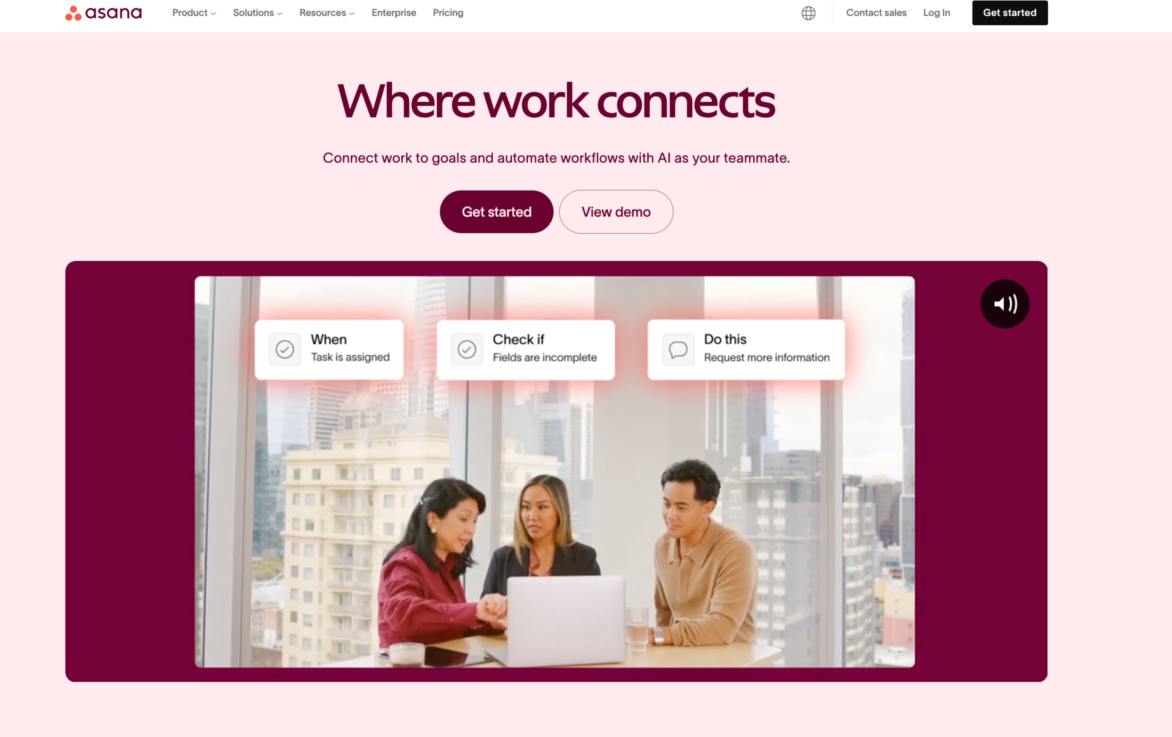
If previewing a digital software product, simplify the platform for visuals on the site rather than animate an exact replica, as most users will not be able to understand the level of detail presented. If users can interact with visuals, this adds another level of engagement.
The user sees a simple and interactive visualization of a concept to more quickly understand how a product works. The user can interact with different tabs that represent different product use cases, adding another, more interesting level of engagement.
Why is user experience crucial?
When users have a positive experience on your website, facilitated by an intuitive user interface and smooth interaction design, they are more likely to engage with your content and return in the future. This can lead to increased website traffic, higher conversion rates, and improved customer satisfaction.
Moreover, user experience significantly impacts your website’s search engine ranking. Search engines consider user experience factors, such as website speed and navigation optimization, when ranking websites in search results. By enhancing these aspects, you can improve your search engine ranking, thereby increasing your online visibility. Finally, user experience can influence your brand’s reputation.
A positive user experience, achieved through thorough usability testing and user research, can enhance your brand’s reputation. Conversely, a negative user experience can harm it.
Therefore, prioritizing user experience is crucial for building a strong brand reputation.
The importance of user experience
In today’s competitive digital landscape, providing a positive user experience can set your website apart. A positive user experience, characterized by an intuitive user interface, optimized navigation, and efficient website speed, can make users feel valued, leading to increased loyalty and customer satisfaction. Furthermore, user experience can influence purchasing decisions.
A positive user experience can encourage users to make a purchase, while a negative one can deter them. By improving your website’s user experience through usability testing, user research, and feedback, you can increase your conversion rates and boost your revenue. Lastly, user experience can impact your website’s accessibility. Users with disabilities may feel frustrated when they face a website with poor user experience. By prioritizing user experience and ensuring mobile responsiveness, your website can be accessible to all users, regardless of their abilities.
UX vs UI: understanding the difference
The user experience (UX) and user interface (UI) are two distinct yet interrelated facets of website design. UX design is a comprehensive, multidisciplinary approach encompassing all aspects of the end-user’s interaction with a company, its services, and its products. It is a complex process involving elements of psychology, sociology, and design. UX design aims to optimize customer satisfaction by creating products that offer meaningful and relevant experiences. This involves designing the entire process of acquiring and integrating the product, including branding, design, usability testing, and function.
User interface (UI) design, on the other hand, is a digital domain that focuses on a product’s sensory and interactive qualities. It’s the space where the user interacts with the product.
UI design involves the selection of color schemes, button shapes, font choices, and all the minute details that a user will encounter. UI design is about creating an intuitive, aesthetically pleasing interface that is easy to use and enjoyable for the user. It is a crucial part of interaction design that focuses on the look and layout of the product interface. While UX and UI design both play crucial roles in a product and work closely together, their roles are quite different. UX design is more concerned with the conceptual aspects, while UI design is more about the tangible elements. The UX designer maps out the bare bones of the user journey, determining how the user will navigate through the product or website.
They conduct user research, create user personas, design wireframes, and perform usability testing. Their goal is to create a seamless, simple, and enjoyable journey for the user from start to finish. In contrast, the UI designer takes the framework laid out by the UX designer and brings it to life. They decide on the visual aspects of the product, such as the color scheme, typography, and interactive elements.
They focus on navigation optimization, website speed, and mobile responsiveness to ensure a smooth user interface. They create the look and feel of the product, ensuring that the interface is visually cohesive and aesthetically pleasing. Feedback surveys are often used to gauge the effectiveness of the UI design and to further enhance user satisfaction.
FAQ on UX
UX is the sum of how people experience your site or product—how easy it is to navigate, how fast it feels, how clear your content is, and how confidently users can complete key tasks. Strong UX increases engagement, repeat visits, and conversion; poor UX increases frustration and abandonment. The UX guide itself calls out that smooth interactions are more likely to lead to users sticking around and converting.

![[Visual] Contentsquare's Content Team](http://images.ctfassets.net/gwbpo1m641r7/3IVEUbRzFIoC9mf5EJ2qHY/f25ccd2131dfd63f5c63b5b92cc4ba20/Copy_of_Copy_of_BLOG-icp-8117438.jpeg?w=1920&q=100&fit=fill&fm=avif)